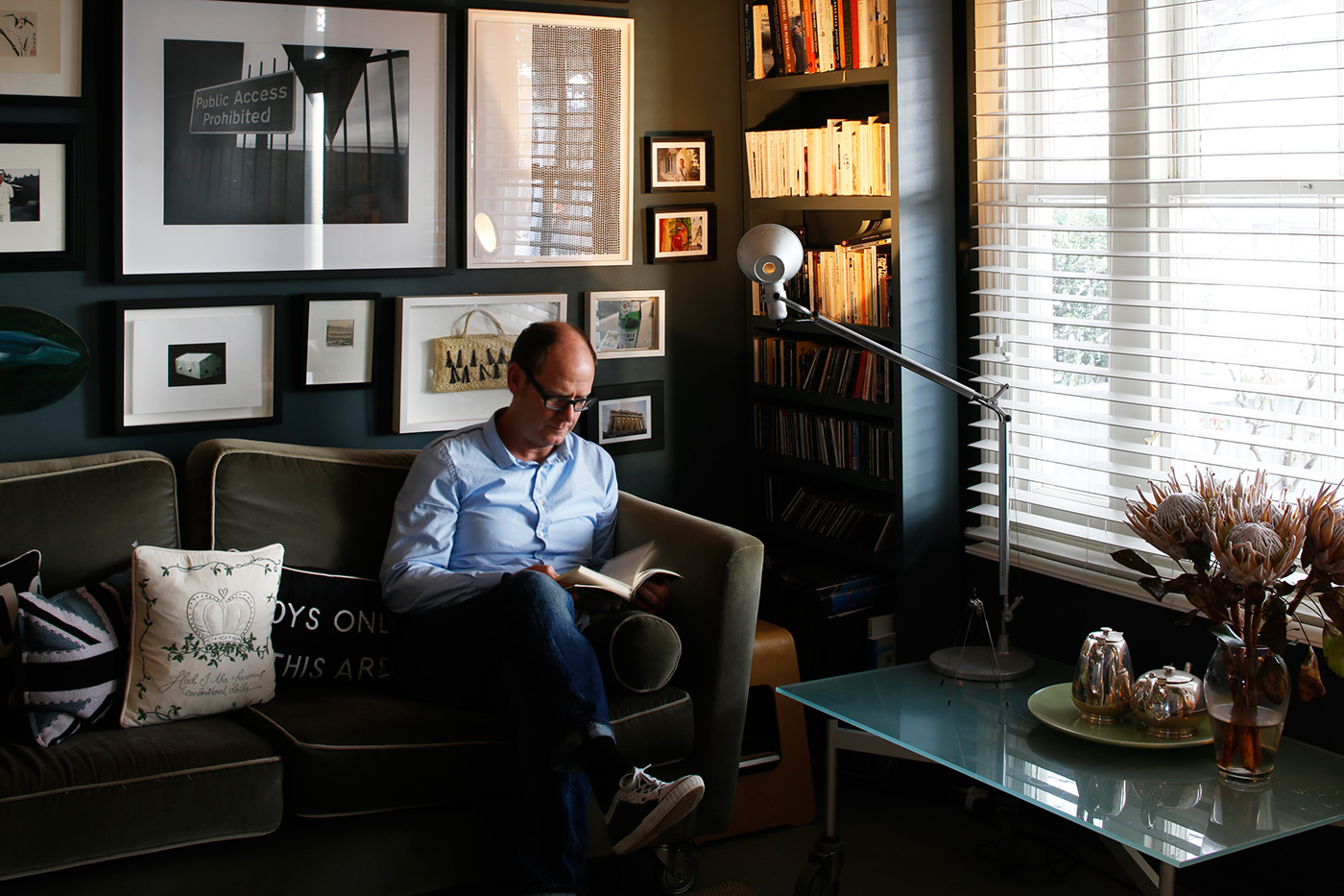
Architect Pam Ingram collaborated with graphic designer Peter Roband to renovate the Arch Hill apartment he shares with his partner Lindsay Spedding. The apartment now has a completely fresh feel without any changes to the existing footprint.
“He could visualise what I was talking about,” says Ingram, “and he wanted something that was well-designed. We both speak the same language. We both believe in good design.”
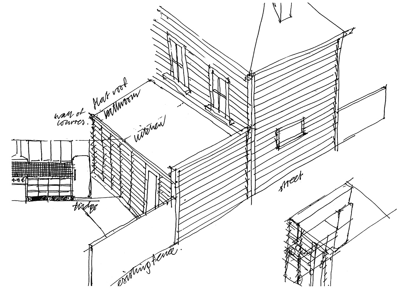
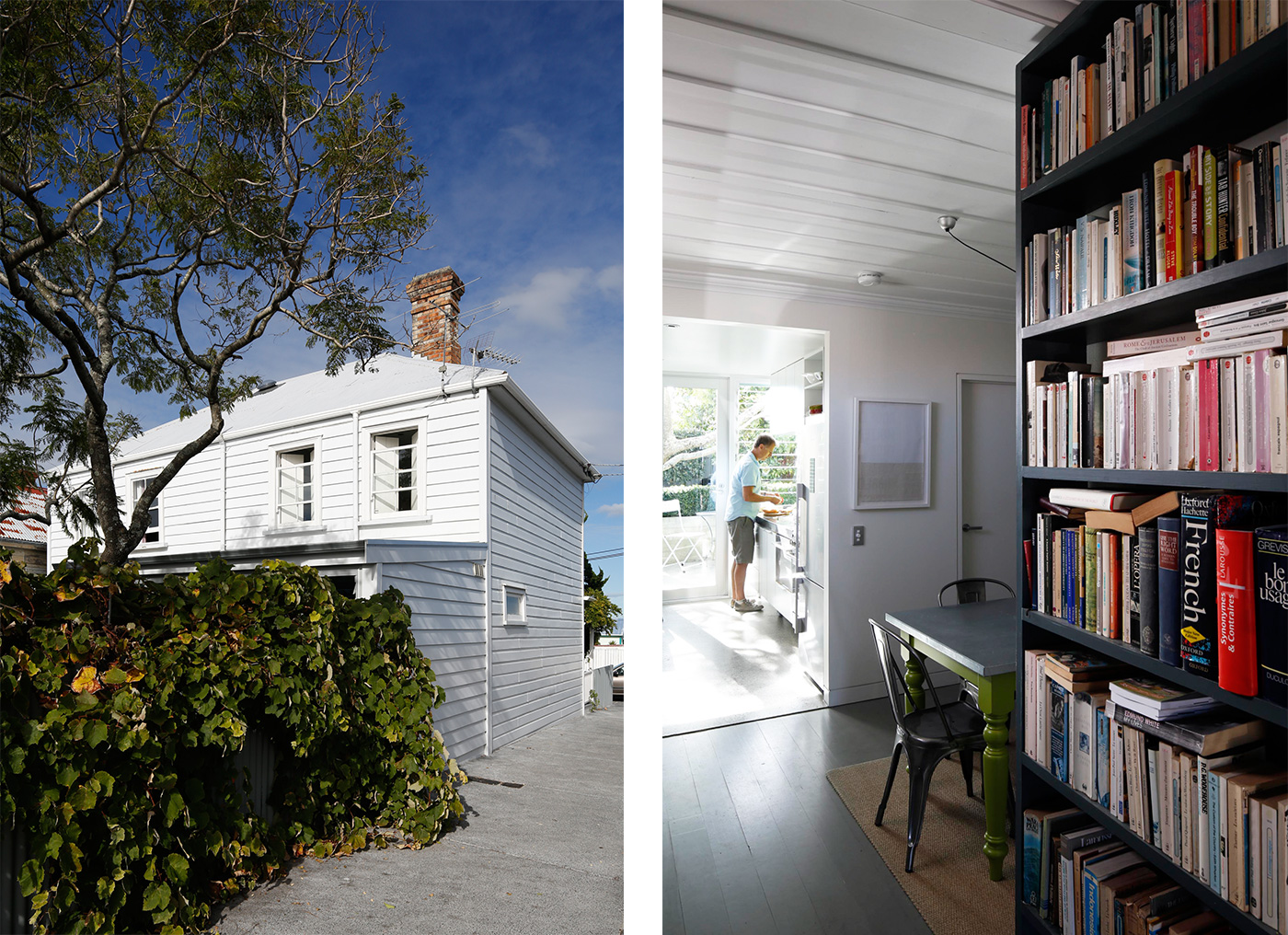
Sometimes small change can yield big results. Case in point: the Victorian semi-detached home in the Auckland suburb of Arch Hill owned by Peter Roband and his partner Lindsay Spedding. The aim of a recent renovation was to better connect the lean-to containing the home’s kitchen and bathroom to the north-facing garden behind it. The surprising outcome was how this renovation added not a bit of floor space to the house, but transformed the feeling of even the spaces that weren’t touched by it. “It’s had a huge effect on the house,” says architect Pam Ingram, who collaborated with Peter on the design. “More people these days are approaching their projects this way – not doing very much but achieving a lot. People are more savvy about what good design can achieve.”
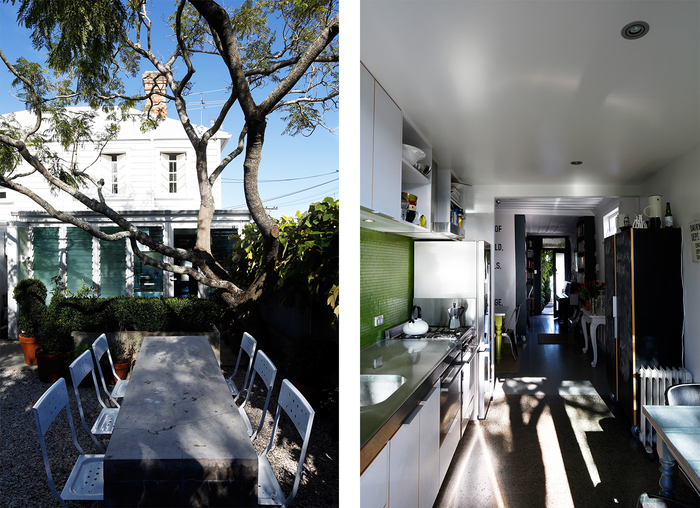
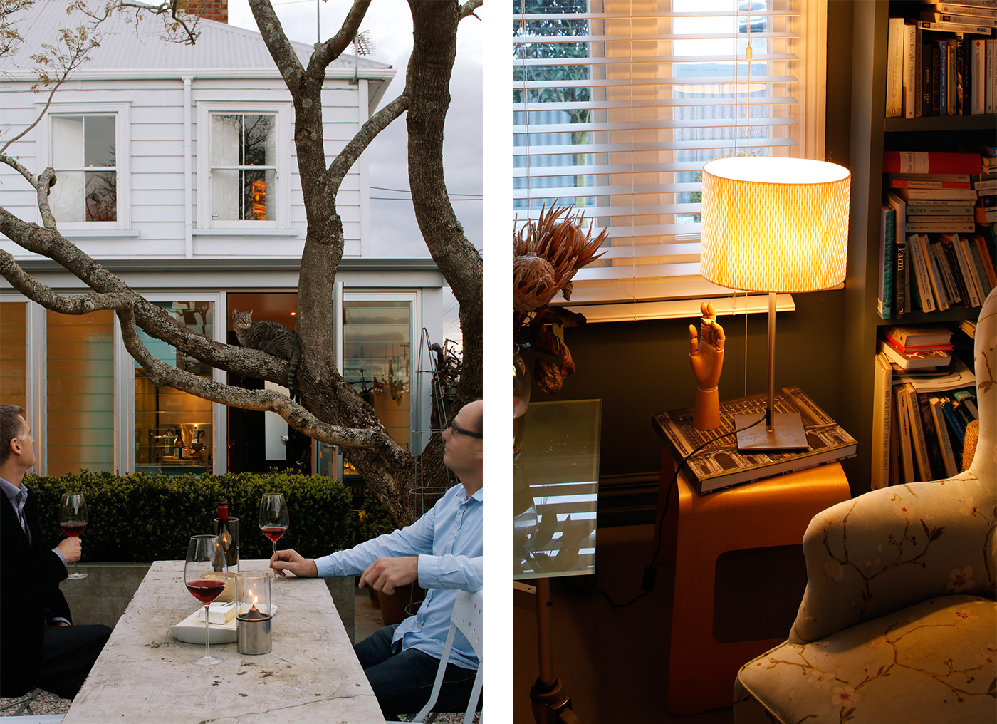
When Peter, a co-founder of the Auckland graphic and product design firm pHd3, purchased the house almost 18 years ago, the kitchen looked forlornly at the garden through a small window above the sink; the only way to reach it was via a “dippy door” that opened off the bathroom. These days, a wall of glass louvres and a door from the kitchen open to the back yard, making the garden visible from the front door and bringing light deep into the house. It feels like a completely different place.
Before he met Pam to discuss the project, Peter had prepared a sketch of what he envisaged, a drawing that is remarkably close to the finished result. Presenting this to Pam challenged his self-imposed dictum that “designers should stick to their own discipline.” But despite having a clear picture of what he thought the house could be, he recognised the potential pitfalls of the journey from drawing to reality, and the need for an expert to smooth out the potential bumps in that process. For her part, Pam – who had completed a renovation for Peter’s sister over a decade earlier – was happy with the concept Peter had developed, and immediately started work resolving the details. “It was a superb sketch,” she says. “I loved the idea”.
One of the first tasks was to assess whether the design would be energy efficient. The louvres are not double-glazed, so to get building consent Pam had to prove that the renovation would make the building more thermally efficient. This was achieved by insulating the slab on which the bathroom and kitchen were constructed, and adding insulation to the walls and ceiling. (In addition, the new north-facing glass wall warms up the home by allowing so much more sunlight into it, with the heat retained in the concrete floor.) For much of the year, the louvres are open, allowing cooling breezes to circulate through the house.
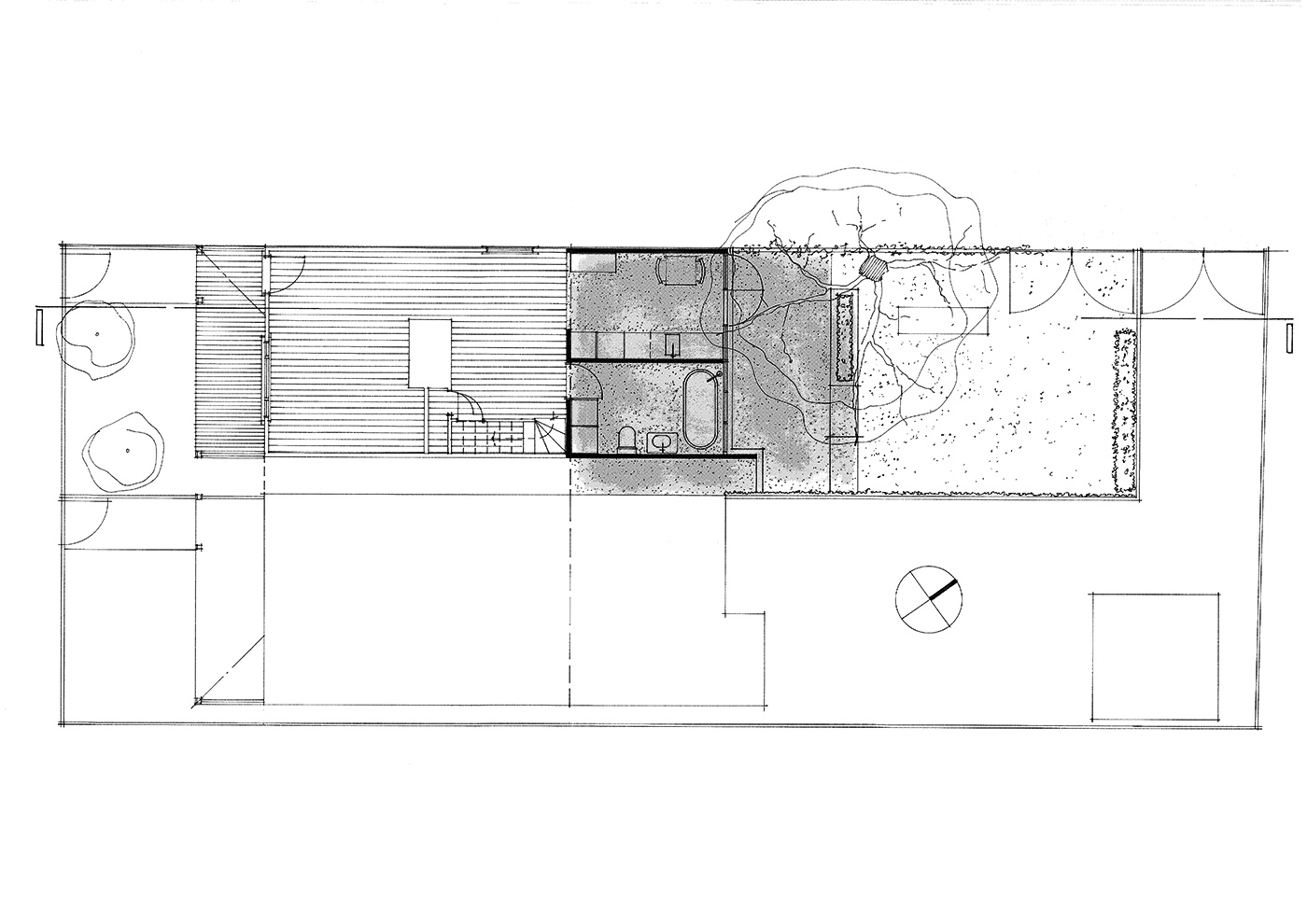
There were other details to resolve: the bathroom was reconfigured and reduced a little in size so that a sliver of space could be donated to the kitchen. The level connection between the indoors and outdoors required careful consideration of flashing and drainage beneath. There were long discussions over the spacing and width of the mullions on the back wall. Peter and Pam are designers from different disciplines, but they enjoyed the collaboration. “We both spoke the same language,” Pam says. “We both believe in good design.”
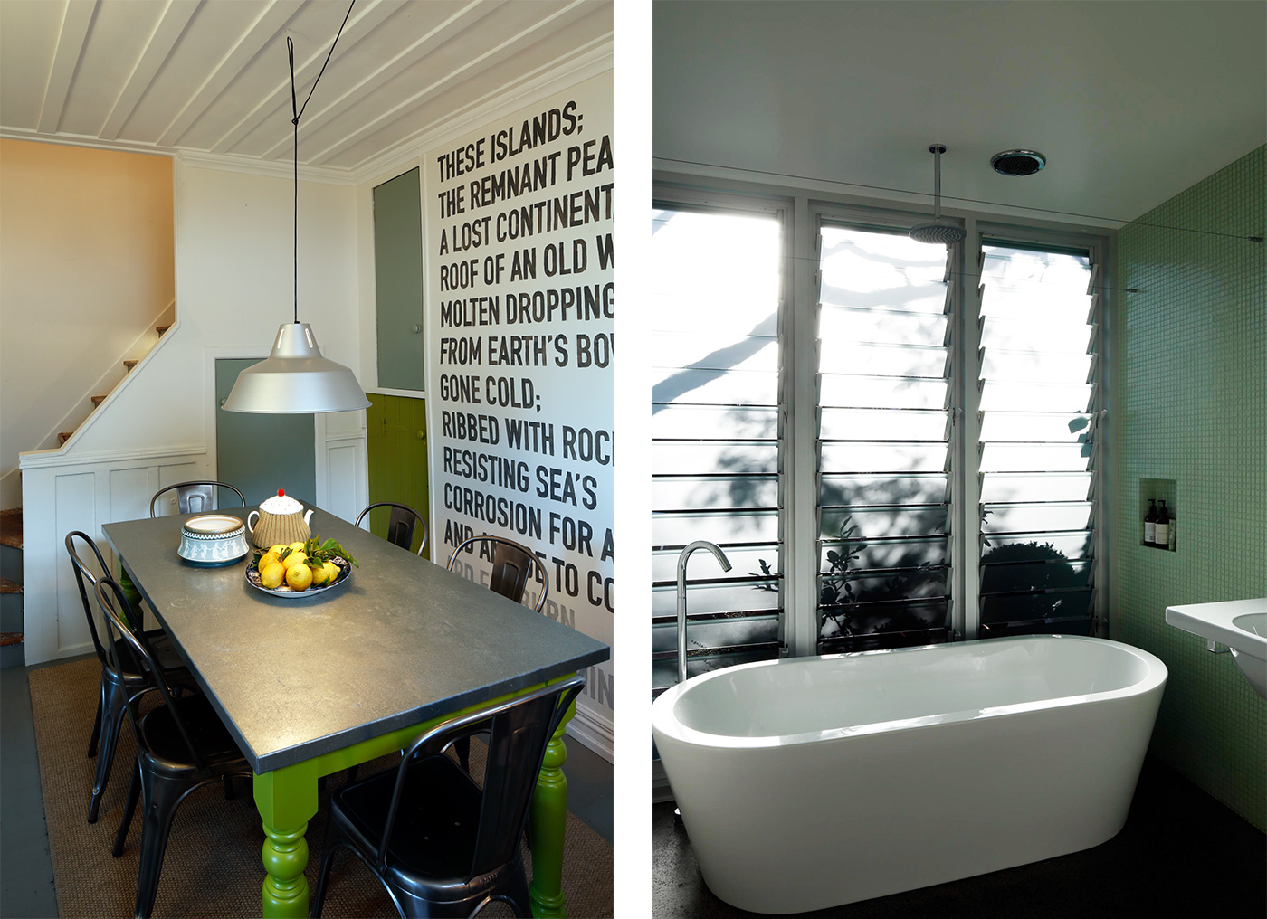
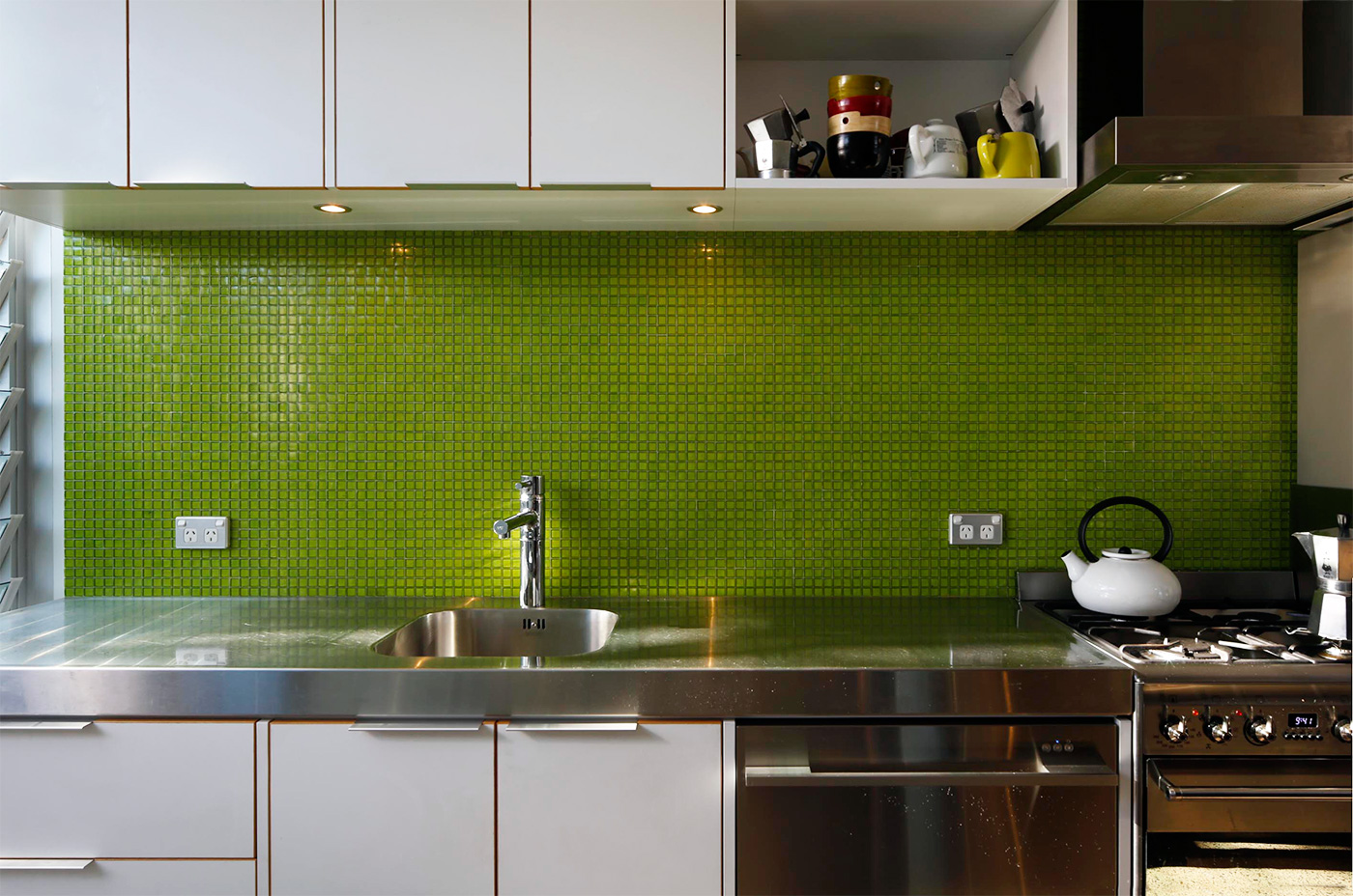
The end result, of course, belies the sweat that went into the details. The simple galley kitchen features a long bench, the oven and cabinetry on one side and a small table on the other where Peter and Lindsay eat breakfast and dinner if they’re not entertaining. A simple stainless-steel bench makes the space appear to shimmer in the sunlight. In the bathroom, where the louvres are opaque to allow privacy, Pam moved the bathtub to a position beside the louvres and placed the shower over it. She also enlarged the space by combining it with the separate toilet. She designed floor to ceiling cupboards adjacent to the stacked washing machine and dryer, a general decluttering that makes the space feel clean and serene.
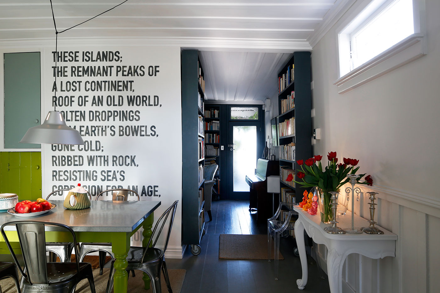
The renovation inspired a minor do-up of the home’s other spaces, with new paint colours in the small living area facing the street and, in the dining area, the striking addition on one wall of a stanza from a poem by A.R.D. Fairburn that Peter hand-painted in DIN Engschrift font.
The renovation is unabashedly contemporary, but thoughtfully in tune with the rest of the house. Pam points out how the wall of louvres echoes the rhythm of the exterior weatherboards, and how the proportions of the revamped kitchen and bathroom mimic those of the original lean-to. “I think that it’s very important to allow existing buildings to maintain their own qualities, to be what they are while accommodating the necessities of modern life,” she says. “It’s respecting the scale and proportions and material and the density of them.” –Jeremy Hansen
Q&A with Pam Ingram
HOME You’ve added no space to the house, yet it feels entirely different. How’d you do it?
Pam Ingram That’s right, we didn’t change the footprint. More people are looking to approach their projects this way – people are more savvy about what good design can achieve. Anyway, to build anything bigger would have had the neighbouring property in shadow, which wouldn’t have been a nice thing to do. I have to give Peter credit for coming to me with a superb sketch. I was very enthusiastic about the wall of louvred glass, but we had to make sure the wall could work thermally and then solve the technical problems. The louvres replicate the pattern of the weatherboards, and I like that you go through the front door and your eye is drawn towards the garden. It continues the notional hallway to the exterior. It just broke down the barrier. It has had a huge effect on the house.
HOME You’re an architect, and Peter is a graphic designer who presented you with a pretty detailed sketch. How well did you work together?
Pam Ingram The process was a shared decision-making process. We talked about size and spacing of mullions, how there’s no step between inside and out to create a seamless flow. He could visualise what I was talking about, and he wanted something that was well-designed. We both speak the same language. We both believe in good design.