A young couple re-imagines suburban back-section living with a compact optimistic new home.
A compact new home in Auckland reimagines suburban living
Never mind it was in the suburbs. It wasn’t the possibility of a picket fence that drew Henri Sayes and Nicole Stock to a rundown 1940s cottage in Onehunga, not too far from Auckland’s Maungakiekie (One Tree Hill). It was the cottage’s large, flat, north-facing back lawn, 400-odd square metres on which to build a house. More particularly, it was a chance for Sayes, who works in the office of architect Malcolm Walker, to design a house, regardless of the fact that, at that point, he had just one previous home and a toilet block to his name.
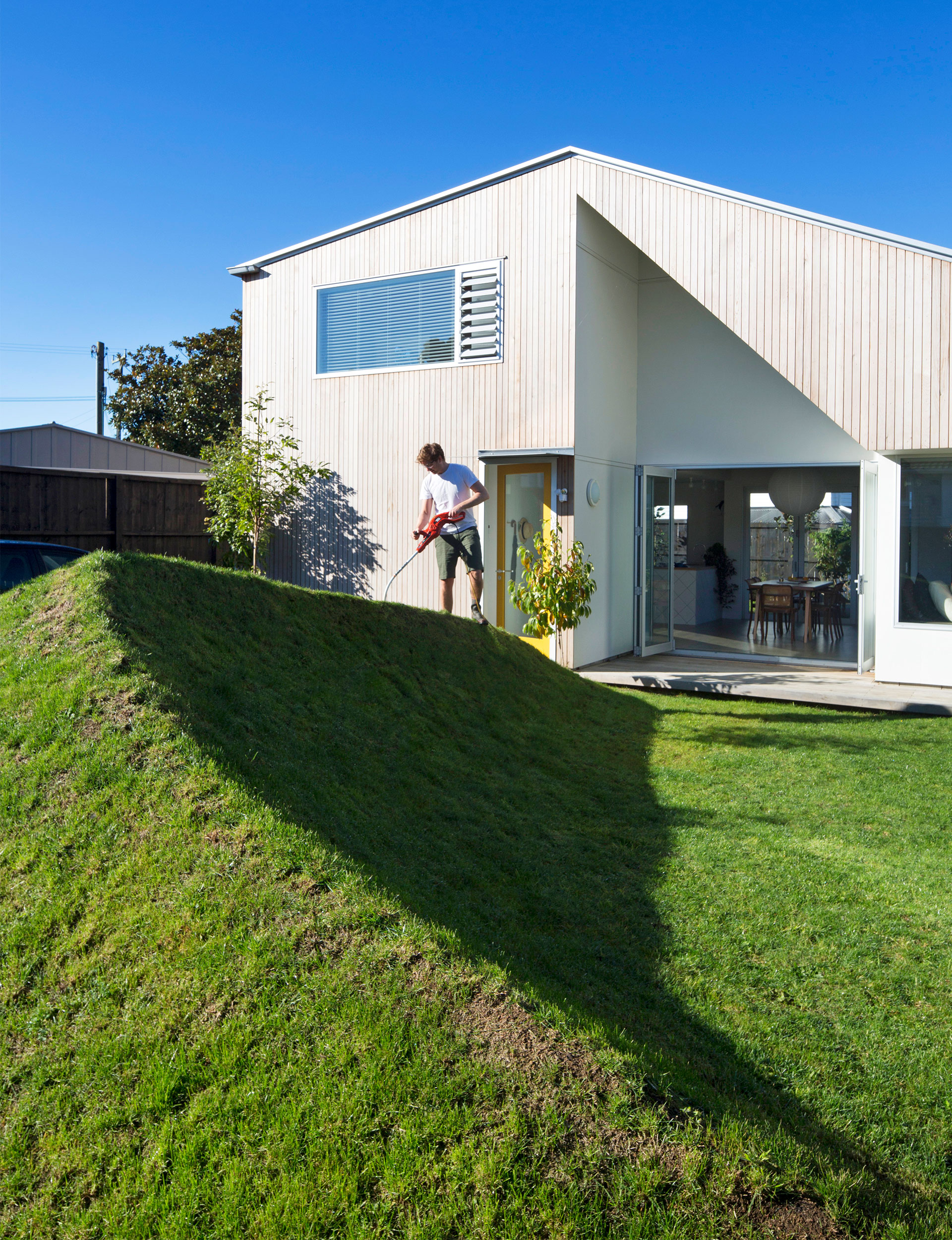
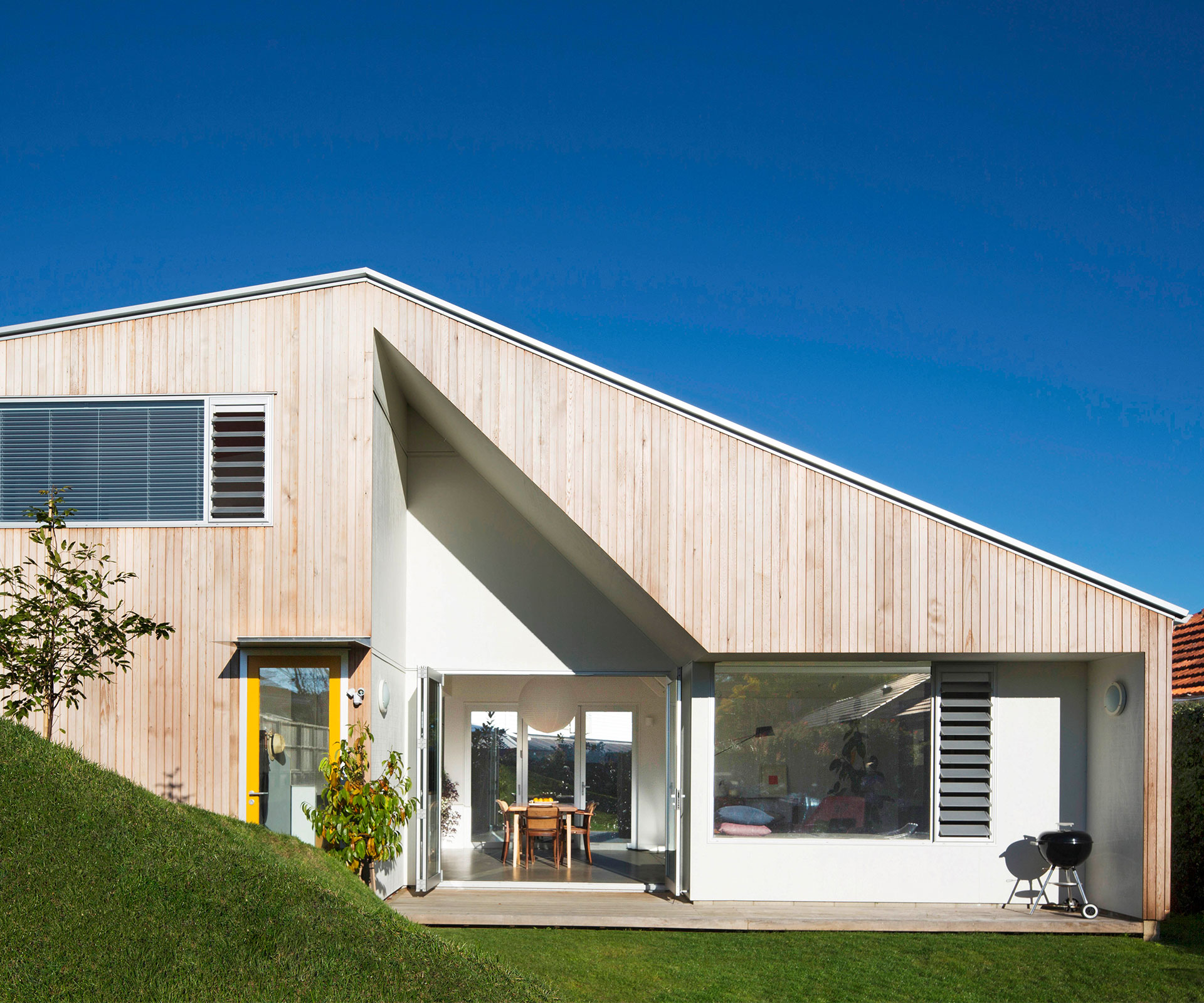
The result is delightful. From the street, you look down the driveway, past the original cottage (which the couple sold after subdividing the site) at a simple, elegant form. The 116-square-metre home is a confident intrusion into an established street of weatherboard and brick bungalows, its asymmetric pitched roof and vertical cedar weatherboards somehow sympathetic to the local vernacular.
It might be infill housing, but it doesn’t share much with its counterparts. Noticeably, when you come down the driveway, there’s no double garage door confronting you. Instead, there’s a grassed parking area and a playful berm planted with titoki trees to delineate the front courtyard from the driveway. There’s a glass front door with a bright yellow frame, through which you step straight into the living room.
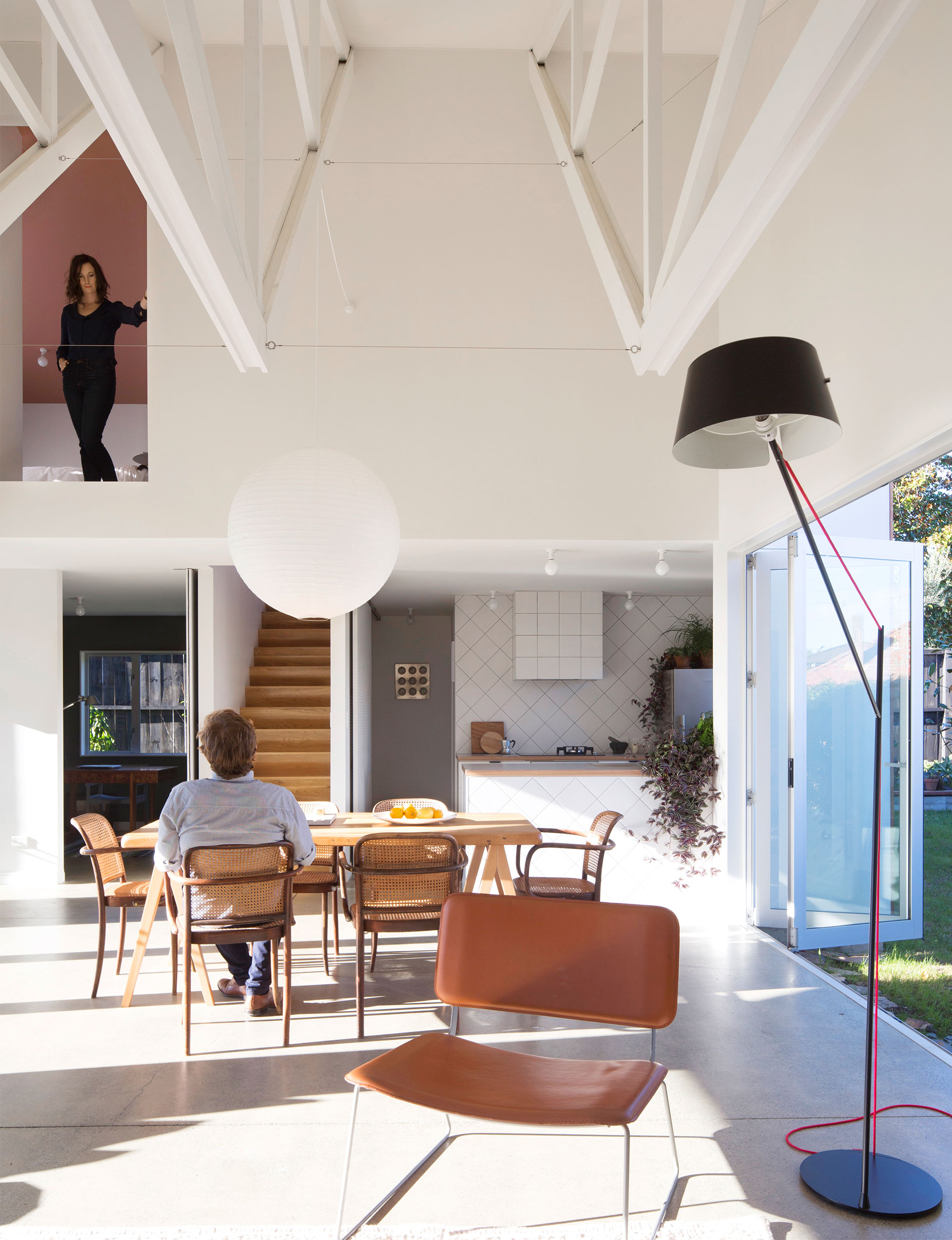
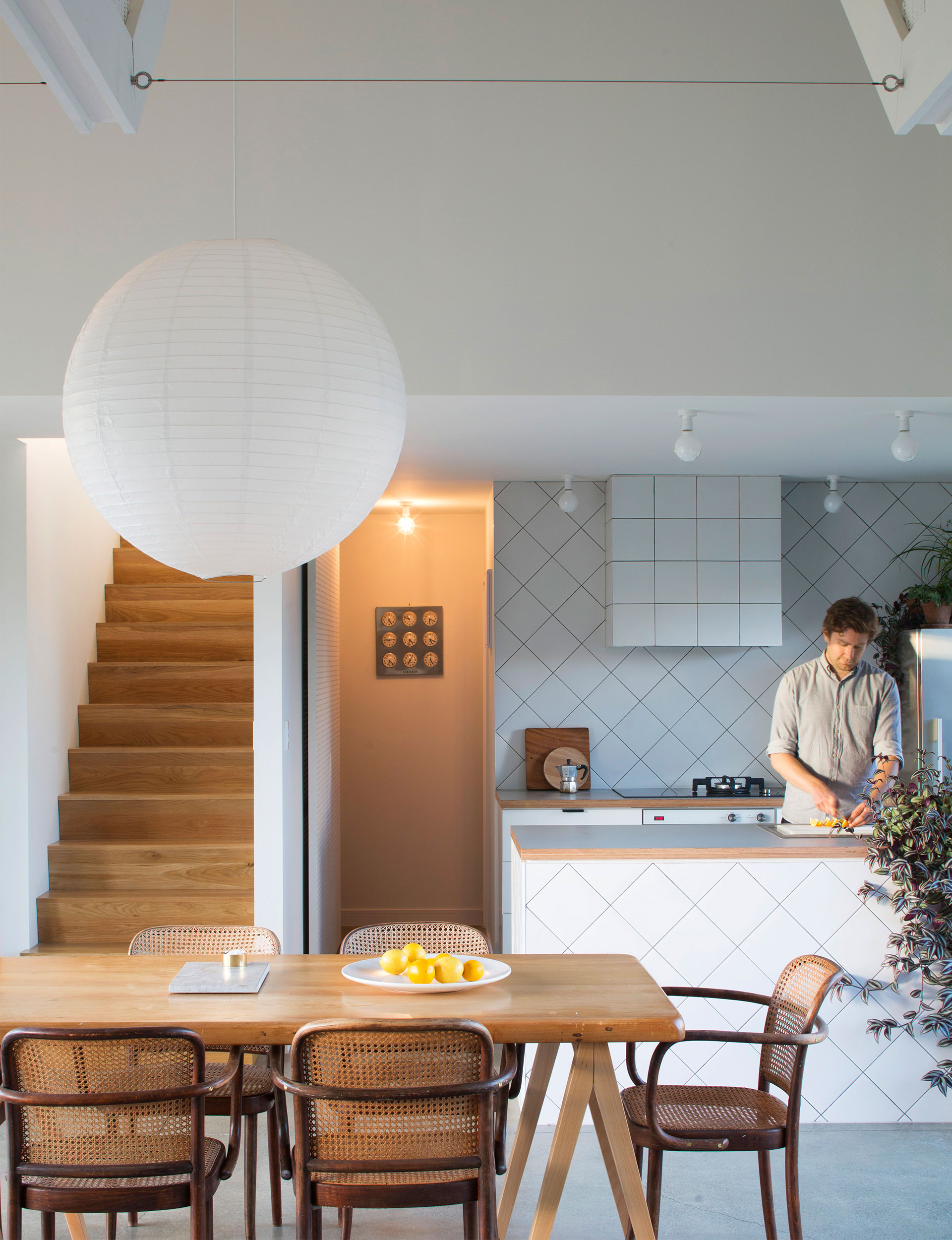
It’s at this point that you realise this is not the usual suburban infill. There is a soaring, double-height ceiling with exposed trusses. There are views out through windows and up into other rooms, most noticeably the main bedroom with its soft pink ceiling. For a small house, it has a sense of elegance and spaciousness. “What you tend to find when you squeeze down plans is that you lose the poetry,” says Sayes. “The trick with this house is that everything comes off the dining area. You’re always borrowing space.”
Effective planning was key. “The brief started with spatial things,” says Stock, a marketing executive. “We wanted volume and height, and we wanted to create a sense of space through volume because we knew we wouldn’t have a big footprint. And then it was defining how those spaces would fit together and how you actually live.”
Not everyone was convinced: the day the council inspector came to survey the newly laid concrete pad, he looked perplexed. He wandered out the back, looked around, and said: “What, are you just building a garage?” In fact, the couple considered a garage, before realising their car was only worth about $500: what would be the point?
So many houses for younger people on a budget are all about budget, but this home doesn’t feel constrained in conventional ways. The footprint is small, with 78 square metres at ground level housing the living room, kitchen, laundry, bathroom and a spare bedroom that the couple uses as a study. Upstairs, two more bedrooms and a bathroom occupy 38 square metres of space. It is tightly planned but never feels mean. There is minimal circulation space and what there is doubles as something else – the hallway to the bathroom has one big long cupboard beside it housing a pantry and glassware, for example. The home is of a size that makes it easy for two busy professionals to maintain and clean, and it’s easy to heat thanks to the Studio woodburner and double glazing.
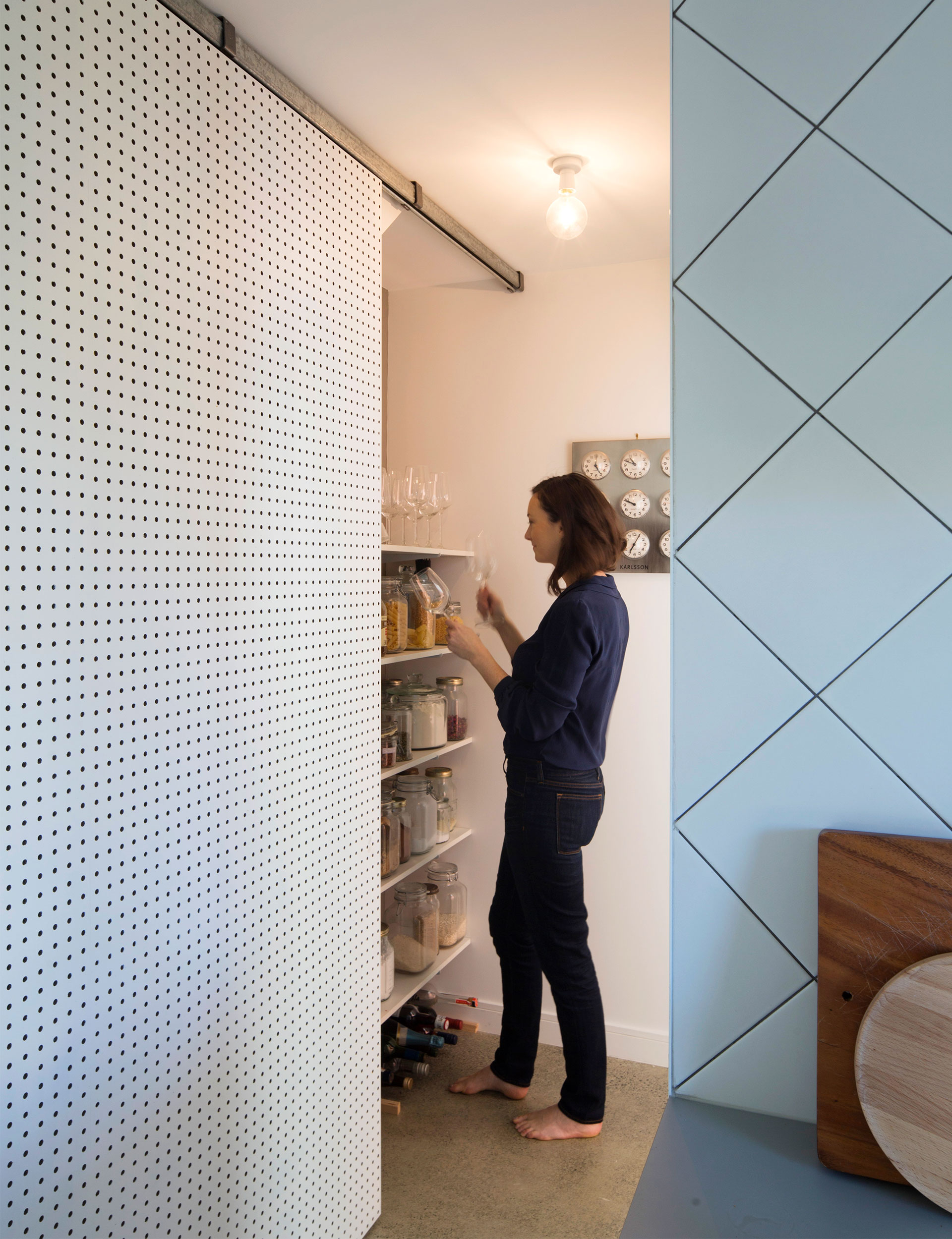
Sayes kept things practical in the planning. The house is designed around standard sheet sizes, so there was very little cutting and very little waste. Materials are prosaic, but nicely treated. The floor in the living room is the concrete foundation slab, which has been polished up. The ceiling is lined with grooved ply, and the couple used pegboard – more commonly found in old men’s workshops – to cover the pantry doors in the kitchen and the cupboard doors for the laundry.
And, thanks to the intervention of stylist and colour consultant Amelia Holmes, the place is playful, almost whimsical in its use of colour. There is that pink ceiling, but there are also mustard yellows, a beautiful green in the study and another soft pink on the laundry doors. In a clever move, every recess in the place is grey.

Many things changed as the design progressed, but one thing stayed the same: that main volume. In a way, the house was designed from the inside out, creating the volumes of space, stacking them up on top of each other, then draping the pitched roof around them. In essence, it’s a barn: the house uses standard trusses partly for their elegant form and partly because they’re so cost efficient. For a long time, they were used in a standard triangle before, late one night, Sayes wondered what would happen if they were turned over, creating the asymmetric triangle that both sets the angle for the roof and defines the interior spaces.

The small size and simple material palette allowed them to spend in all the right places. Windows are consistently oversized – there are big expanses of glass throughout the house that both let light in and lead the eye outside. There is a generous window seat in the living room, big enough for two people to comfortably sprawl. The door to the study downstairs – which could also function as another bedroom – is on a pivot rather than standard hinges, which further makes the space feel like one. “Henri’s just done a lovely job of mixing real life with poetry,” says Stock.
“We were careful with where we spent our money and if there wasn’t a payback which was more than what it cost to do, then we wouldn’t do it,” says Sayes. “We took a few key moves and did them properly.”
Words by: Simon Farrell-Green. Photography by: Patrick Reynolds.
