In a villa renovation by Jones Architects, interior firm Sticks+Stones Design crafted a small, unassuming en suite that packs a big punch.
The clients — a young family of four — wanted to fit as much as they could into a relatively modest extension to the back of a villa. At the same time, they sought to modify the front end so that it was updated in keeping with the rest of the extension. Their wish list included: a walk-in wardrobe and an en suite, all to be fitted into a relatively small space.
For Katie Scott of Sticks+Stones Design, the main question was how to create something new, with cohesion, in a classic-looking villa — or any traditional-style house?
“The way I see it is that living in the space needs to still feel like you’re in a villa,” says Scott. “You need to feel connected to the history of it, retain that classic touch.”
The solution was to institute a flow between the new and the old, gradually blending the style at the middle where the two met.
“It’s a link between the old and the new, and that was done as a gradual thing — not too contrasting and polarising as you walk in.”
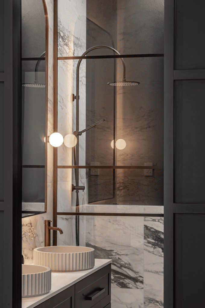
As far as the en suite design went, the designer sought a “blend of the classic looks and tones with quite a contemporary exaggeration of the height and the light that you get from the skylight.”
The latter was a necessary addition, mainly because the en suite is surrounded by a firewall that cannot have any openings, and natural light had to be sourced from above.
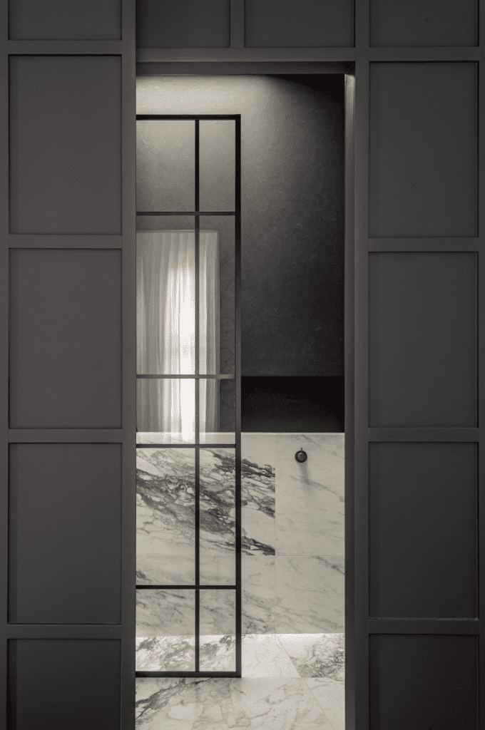
“I thought putting that light in the shower area sort of exaggerated the texture of that render on the wall, giving you this big impact when you look in. Then it has got a classic touch with the style of mirror, the choice of tiles, the lattice-look glass shower frame, and the aged brass taps. So it feels like it belongs in the home.”
Scott, who was involved right at the spatial layout and the planning stages of this renovation, had a chance to influence the dimensions that best fitted the villa, the layouts, and beyond.
Another interesting aspect of this en suite is that it is beside a walk-in wardrobe, and the two spaces share overlapping sliding doors. This has allowed the designer to create a surface that, when closed, looks like a traditional panelled wall. However, when the black door of the en suite is thrown open, the light-coloured en suite reveals itself with a serious dramatic contrast and texture.
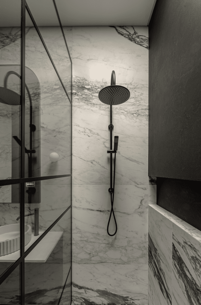
To add to the drama of the space, Scott added some subtle but quite effective lighting design.
“Instead of having lots of downlights, which are very directional, [the en suite] has full-length LEDs that are plastered up into the ceiling in between the skylight and the wall, so light flushes down over the movement and exaggerates shadows.”
More functional lighting and under vanity light (with a sensor) ensure a very practical and comfortable space. The lighting is all quite tasteful.
“Kind of like in a boutique hotel,” says Scott. “It creates a little bit of luxury but through quite a simple idea.
“The brief was to create an adults’ retreat in a busy family home, and we feel that was achieved with this contemporary yet elegant space.”
Words: Federico Monsalve
Images: John Williams
Judges’ Citation
The ‘black and white’ palette with plastered walls and a richly veined floor creates a dynamic and elevated bathing space. The contrast of the light floor wrapping up to meet the dark wall is a particularly inspired choice. A bold, elemental, unique design that is conscious of its heritage context, daring without being over the top, and accomplished on a relatively low budget.

