Inspired by confectionery and brutalism, this year’s Kitchen of the Year winning entry, designed by Annika Rowson, is a recipe for domestic and viral success.
Annika Rowson’s own New Plymouth kitchen showroom design caused a bit of a flurry in 2020. Hundreds of ‘shares’ and ‘likes’ worldwide led to significant media and industry attention for its stark-white, fluted, curved Corian masterfully matched to fittings, lighting, and finger tiling. It was daring yet mature in its execution and — fitting for an era obsessed with memorable images — very instagrammable.
So, when the designer was due to refresh her showroom in 2024, a question that often arises for people who have enjoyed sudden limelight was firmly in her mind: how does one follow on from that?
For Rowson, the answer was marshmallows.
“I watched [the fabricators] lay out the first part of the kitchen and something clicked,” she says. “I thought, ‘We’re getting there, but we’re not quite there yet.’ So I asked them to pause and said I would come back to them [the next day].”
Rowson went home and continued to play with ideas and forms. “I was eating some marshmallows,” she says, mentioning how she squashed three of them. That moment of playfulness went on to inform the sculptural beauty that she ended up concocting.
“I woke up that night and thought, ‘That’s it; that’s what we’ll do!’”
The fan of mid-century design and pink marshmallows (“The white ones don’t have that much flavour!” she insists) retained some successful elements from her previous design, yet pushed the recipe to a new level.
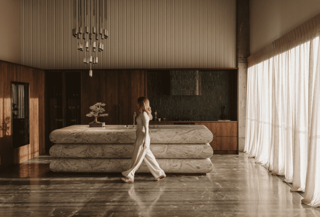
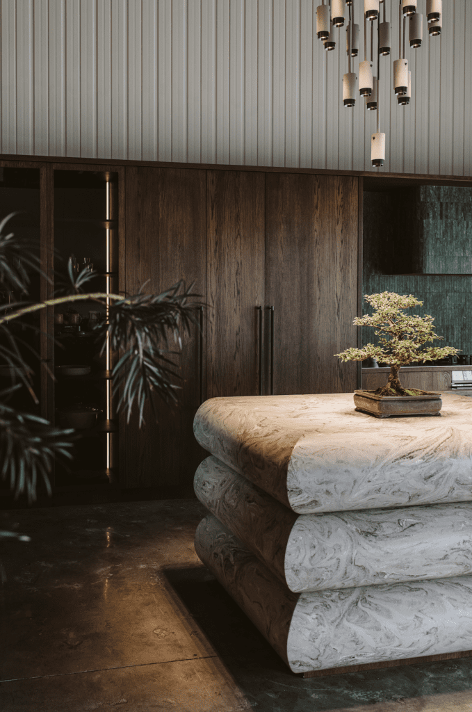
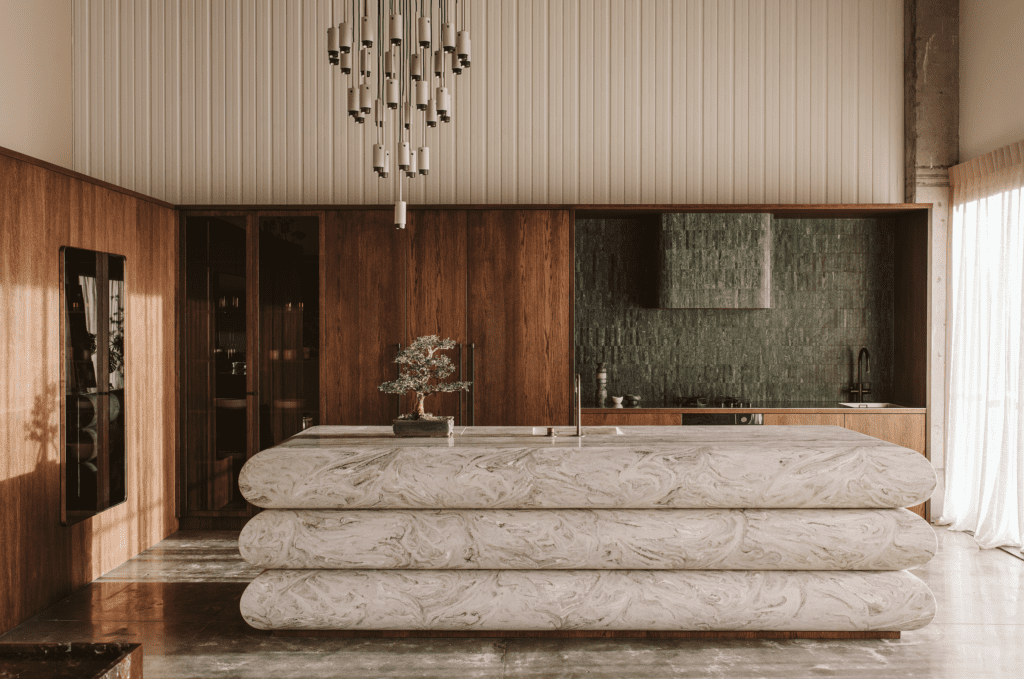
Proportions of the island have been blown out to further accentuate the designer’s fascination with brutalism. The delicate rhythm of the fluted frontage has given way to an almost liquidy swirl of marbled veins. The robustness and solidity of the island is counterbalanced beautifully by the round playfulness of the marshmallow bull-noses. The Corian, which can be shaped by heat, allowed for such things as recessed drainers and integrated sinks, nearly invisible joint edges, and curved negative detailing.
“We watched the island go together and layered it up like a cake in the showroom,” says Rowson. “When it sat in place, it was so sculptural that it took me a day to get used to it. I kept looking at it, peeking around at it, running my hands over, and just familiarising myself with it.”
She is not the only one to find the end result entirely magnetic and tactile.
“A lot of clients that I’ve been working with lately have seen this develop. They have come in to see it, and they just run their hands over it. The radiuses are so smooth and quite generous that you can’t help but feel the form of it.”
As with Annika’s previous showroom kitchen, the remainder of the project is a slightly more subtle yet completely congruous backdrop. However, whereas in 2020 she sought to echo the island’s language, in this project she went a little more left field, complementing without repeating motifs.
Buster + Punch — a London brand she relies on often — provides a touch of industrial flair via cabinet handles and an impressive, off-centre chandelier, while warm veneers, Indian Green marble tiles, and cloth-filtered sunlight create a flavour balance that is … truly scrumptious.
Words: Federico Monsalve
Images: Gina Fabish
Judges’ Citation
Captivating and fearless use of new forms and material juxtapositions make this a standout design. Influenced by brutalism and a passion for strong geometries, this kitchen is highly original, with a serious wow factor and an internationalist potential and perspective. The island with pillow cushion folds is a showstopper.

