Tim Heath designs a compact home and painting studio perched above Otago Harbour
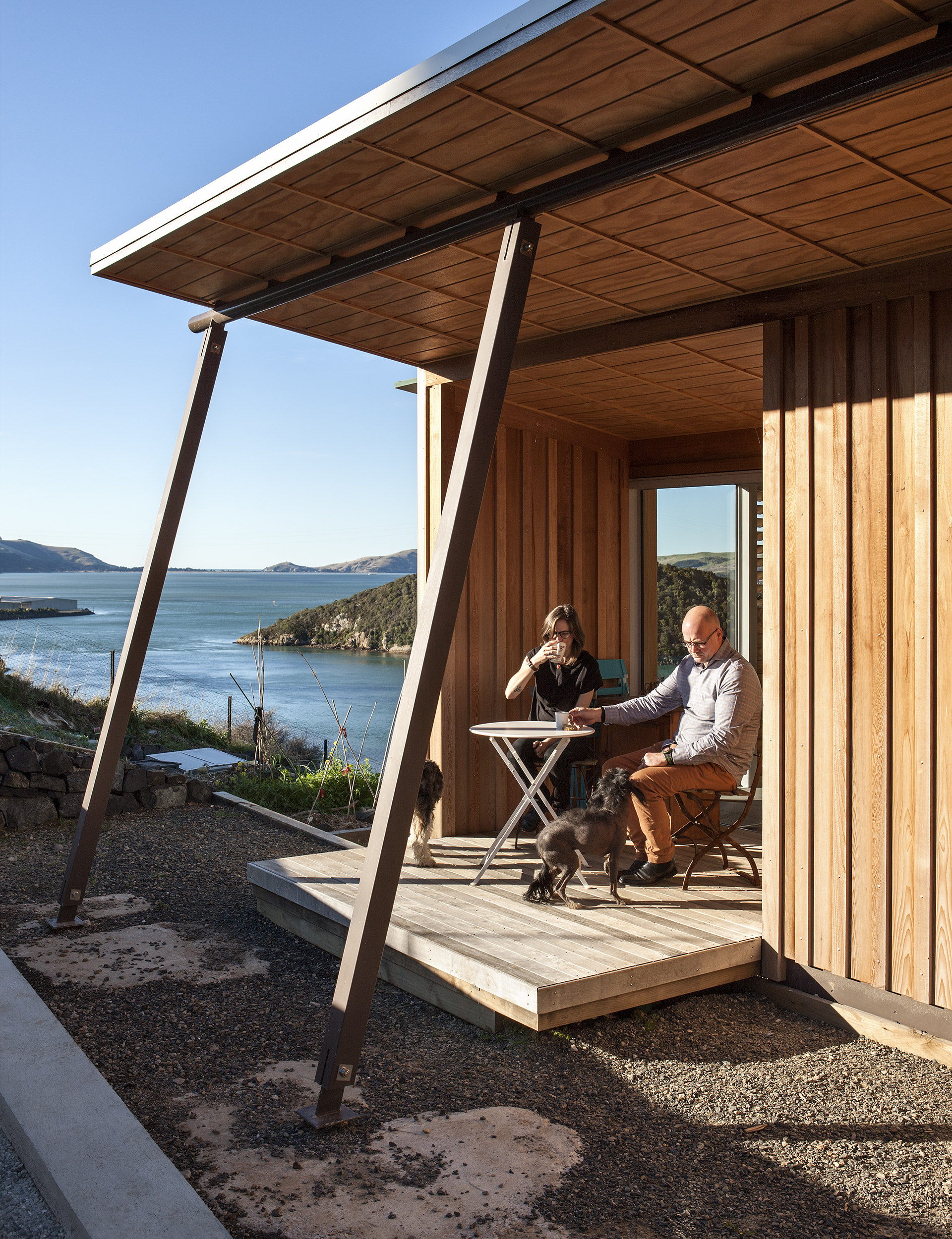
“They wanted a small house on a minimal budget.” These words are not always music to an architect’s ears, but it’s just the sort of challenge relished by Tim Heath, founder of the Dunedin-based firm Architectural Ecology. Inspired by a “cracker site” with amazing views on the edge of Otago Harbour at Port Chalmers and the desire of his clients, Blair Kennedy and Andrea McSweeney, for more than a standard-issue “processed house”, he felt excited about the potential of what good architecture could deliver. “When you’re an architect and you’re designing something middle of the road it’s hard to make it effective,” he says, “but when you’ve got a challenging climate or fairly extreme conditions you can make a hell of a big difference.”
Heath has designed significant buildings for schools and universities as well as the beautiful visitor centre at Otago’s Orokonui Ecosanctuary, which in 2011 won a National Architecture Award from the New Zealand Institute of Architects. But he still believes architecture has plenty to prove. He worries that his profession has become too elitist, and that its benefits are available to an ever-narrowing group of people. “People who do use architects are spending lots of money, and that’s not where design is most effective,” he says.
In Kennedy and McSweeney he found clients who could help him prove that architecture is not a luxury indulgence, but something that brings huge benefits to people who might think they can’t afford it. “They didn’t have a lot of money, they had a lovely site and they’re lovely people,” Heath says. “A designer can’t really want more than that. It’s challenging, but that’s what we’re there for. To answer the questions.”
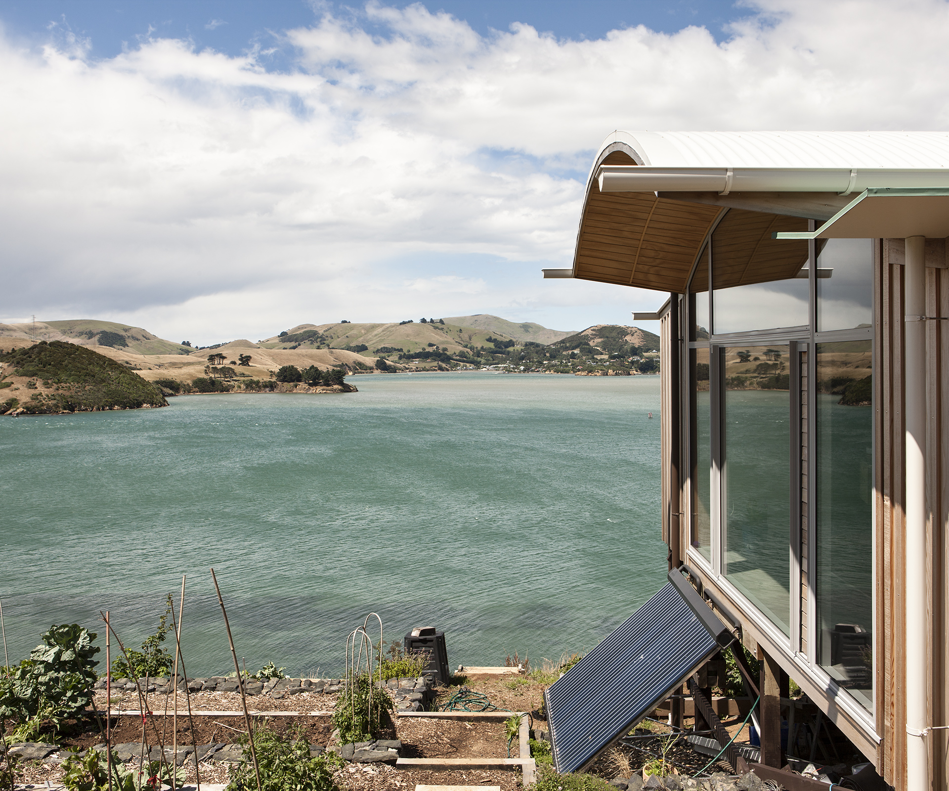
In this case, the questions were manifold. How do you design efficiently on a steep site that receives minimal afternoon sun in winter and gets regularly belted by icy southerly winds that gust up the harbour? How do you maximise views when those views are to the south and east, and keep the house warm in the process (south-facing glass, of course, can equal serious heat loss). Most of all, Heath says, “how do you put those things together in a way that’s magic and fits the site and those people?”
Kennedy and McSweeney are both high-school art teachers and wanted a space in which they could create their artworks at home (Kennedy paints, and McSweeney fills much of her non-teaching time with photography and print-making). They also like to entertain, and asked for the kitchen and dining areas to be at the centre of their home. As Heath says, this short list of requirements meant “you’re almost back to what you’d normally do in a bach – that communal coming together.”
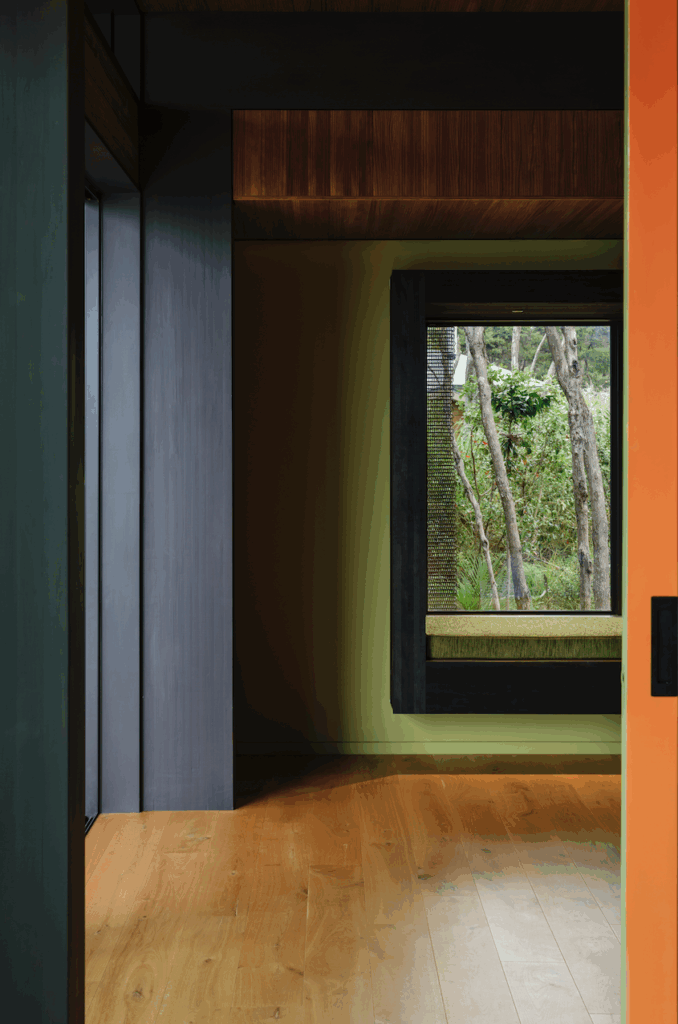
There’s a strong commitment to sustainability in all of Heath’s work, but this site didn’t allow for standard-issue solutions. Laying a simple concrete pad was impossible, so Heath designed a system of pre-cast concrete slabs that were laid onto the floor framework. Heavy insulation beneath them created a thermal store. He lined the home’s southern wall with utility areas such as the bathrooms and a storage zone, then broke it open with a viewing bay that offers incredible floor-to-ceiling views past Goat and Quarantine Islands to Portobello on the opposite side of the harbour. It’s a vista that demands you spend time to take it in. “One of the great things Tim has done is to amplify the things we like about the section,” Kennedy says. “We have people who get vertigo when they come here. They get to the sofa and eventually sit down and realise they won’t drop off.”
[gallery_link num_photos=”21″ media=”https://homemagazine.nz/wp-content/uploads/2016/03/HE0216_HME_Portchalmers_E5146.jpg” link=”/inside-homes/home-features/a-cracker-site-above-otago-harbour-with-amazing-views” title=”See more of this house”]
Heath’s other key move was to open the home’s northern side to the sun as much as he could. Here, the roof line tips upwards so that late light streams in over the kitchen bench in the middle of winter. The main bedroom, with its view up the harbour to Taiaroa Head, gets sun all day. Outdoor living is tucked in a sunny, sheltered spot outside the kitchen, and on a petite deck that extends off the bedroom.
The home’s layout has a lovely symmetry, with one bedroom at each end and the kitchen, dining and living areas spanning its centre. The space Blair uses as a painting studio is a comfortable alcove off the living room. This openness creates a feeling of spaciousness greater than the home’s 140-square-metre size. Sliding doors to the bedrooms are usually left open, which means there are almost always views along the full length of the home and through the windows beyond – all of it across what feels like acres of flowery ‘Summer Bouquet’ carpet by Feltex, a recently re-released classic. As Kennedy says, “you stand in the lounge and can see in every direction.” I quizzed Heath about what seemed a counter-intuitive decision to locate the main bedroom in the sunniest part of the home, and he told me that his clients “don’t see the bedrooms as secluded spaces – they like to sit in the bedroom in the morning and have a cup of coffee and use it as a living space. They’re quite fluid.” The openness of the home’s layout certainly supports this.
Many people find home-building a budget-stretching, highly stressful exercise, but this wasn’t the case; Kennedy and McSweeney found it far more convivial than that. In fact, they saw it as a highly satisfying creative collaboration with their architect. “The process was great,” McSweeney says. “It was like a massive art project.” Adds Kennedy: “It’s like living in an artwork. There are things that surprise me about it every day.”
Words by: Jeremy Hansen. Photography by: Simon Devitt.

