There are moments when colour infiltrates the mood, the memory, the very being of a place. At this year’s Dulux Colour Awards, two projects — on opposite sides of the Tasman, and with vastly different intentions — proved the potency of a well-chosen hue.
Both Grand Prix winners, Lava Flow by Pac Studio in New Zealand and the Sarah & Sebastian store by Richards Stanisich in Australia, presented remarkable restraint while pushing the boundaries of their respective genres.
One erupts with subterranean fire; the other floats, kelp-like, beneath imagined waves. Together, they mark a turning point in how colour can anchor architecture to both site and spirit.
“It never ceases to amaze us how conceptually courageous and strategically sophisticated the colour schematics are,” Dulux colour specialist Davina Harper says. “Our aim with the Dulux Colour Awards is to reveal and reward the ultimate exemplars of architectural innovation using Dulux Colour as a central design device.”
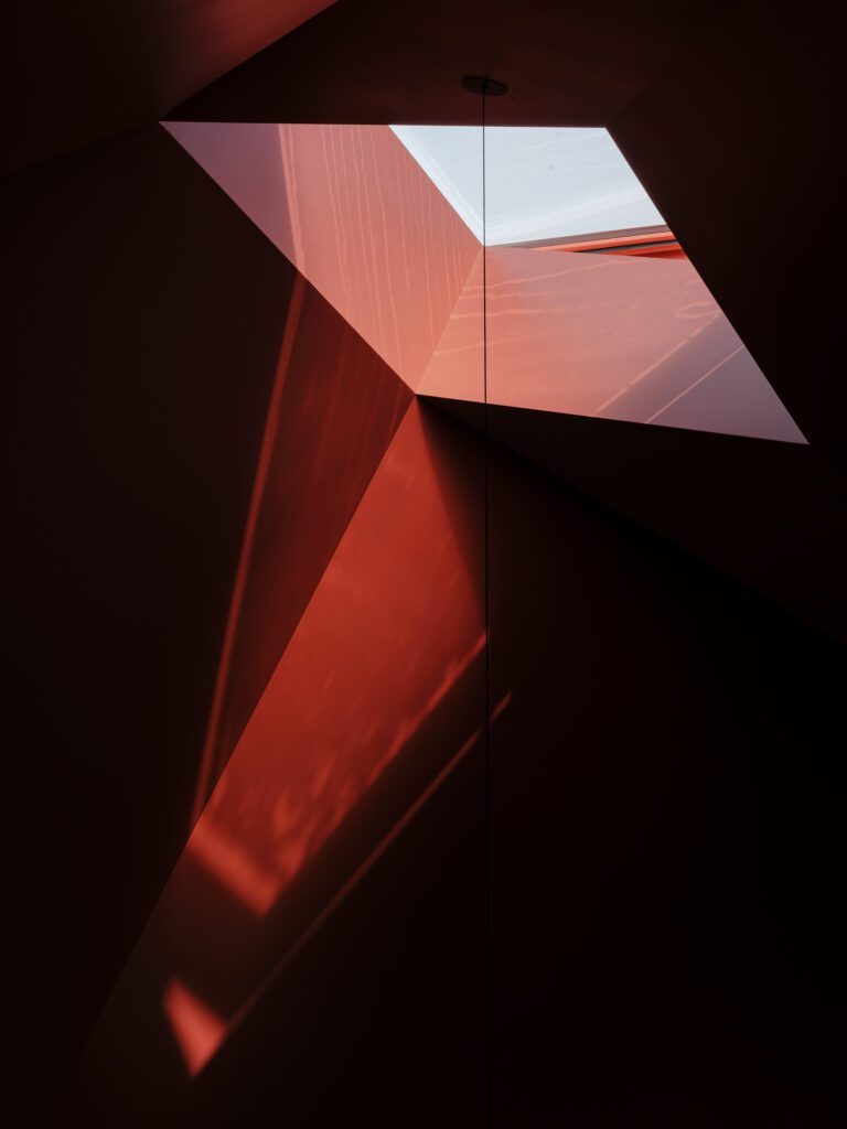
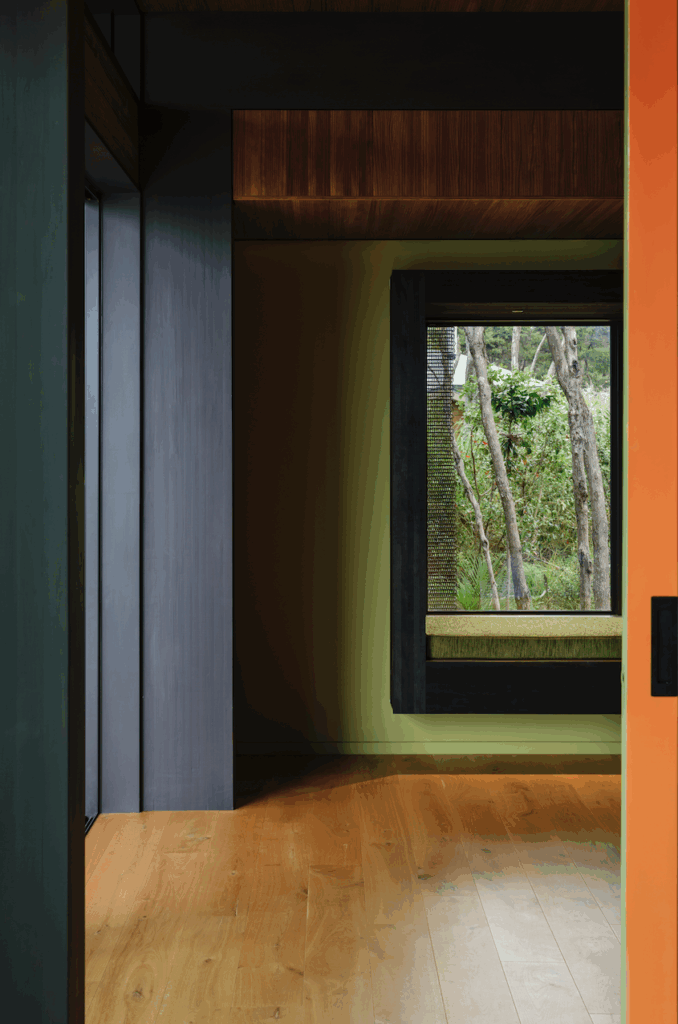
Lava Flow by Pac Studio
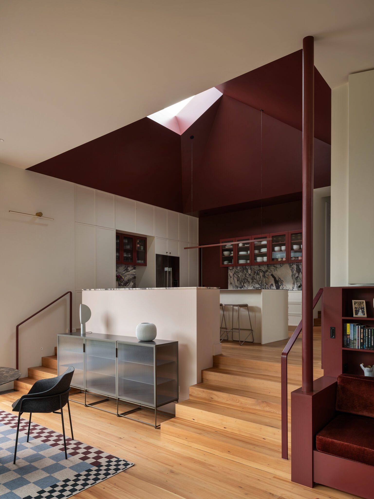
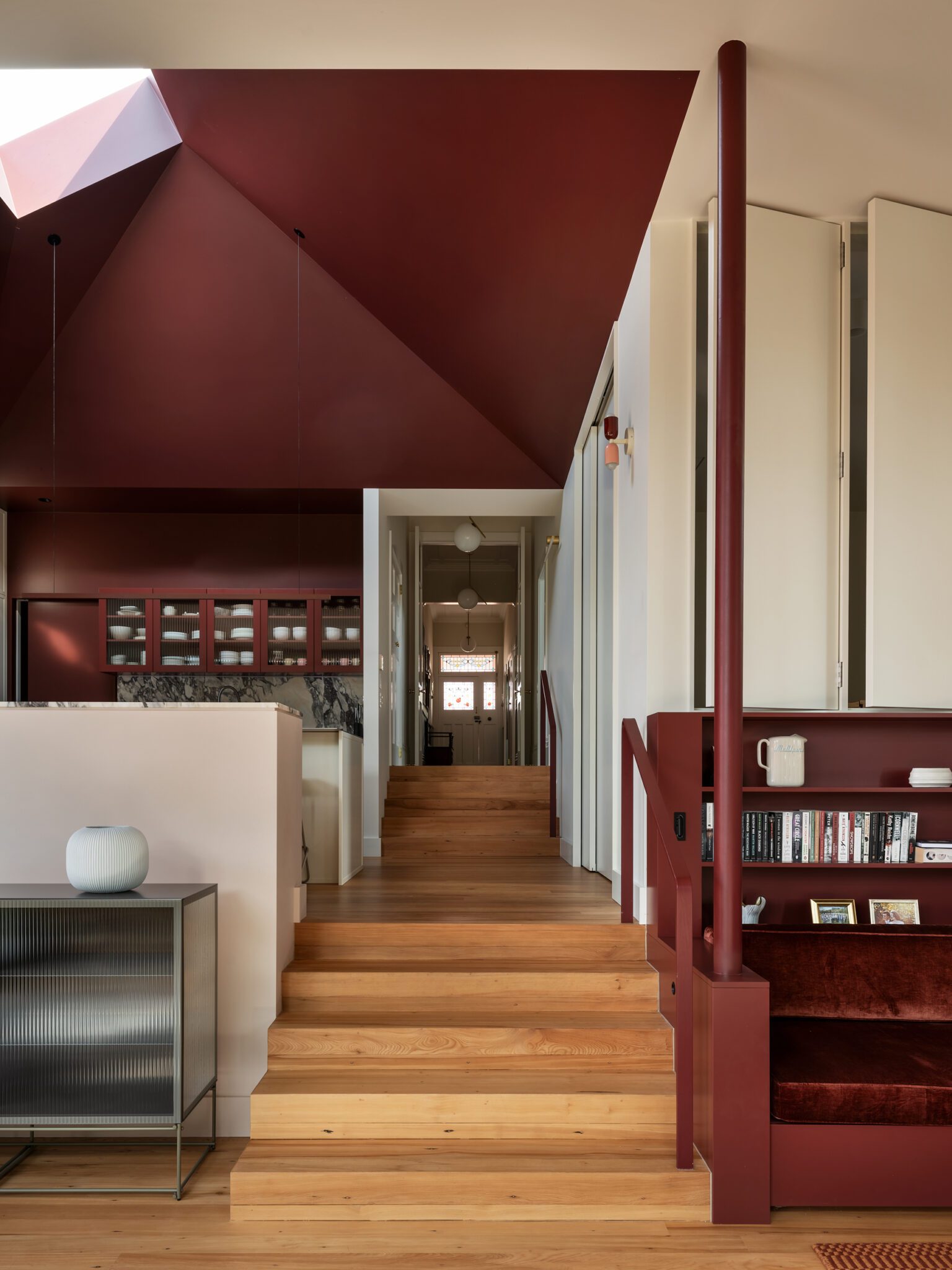
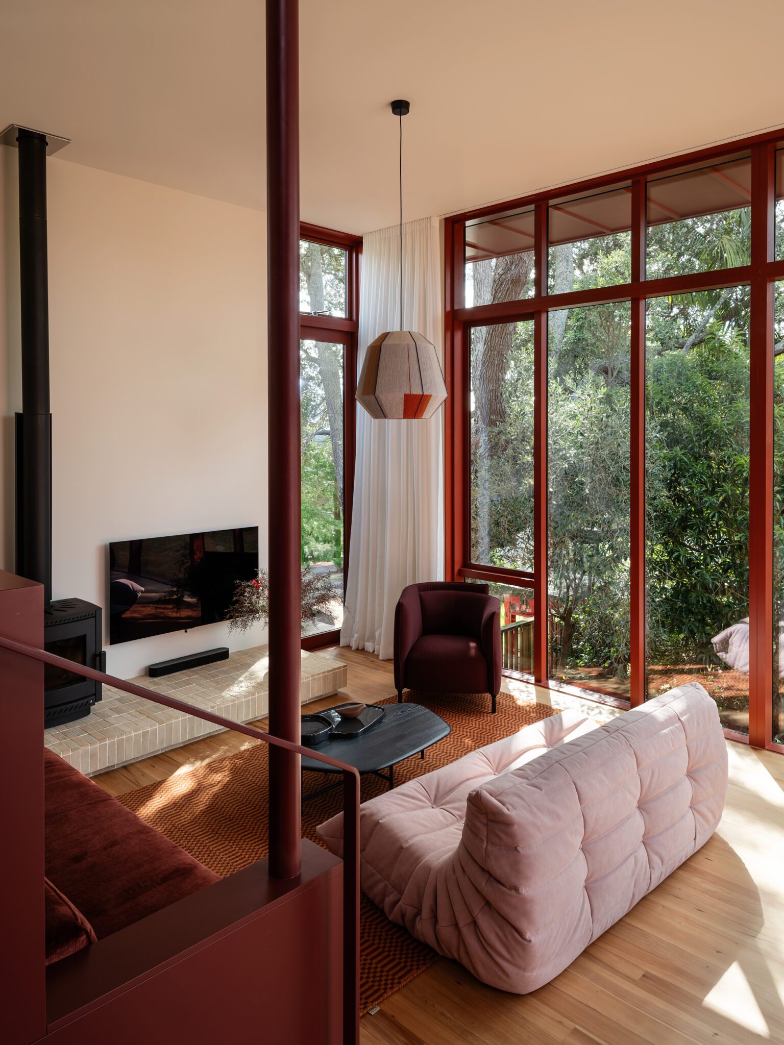
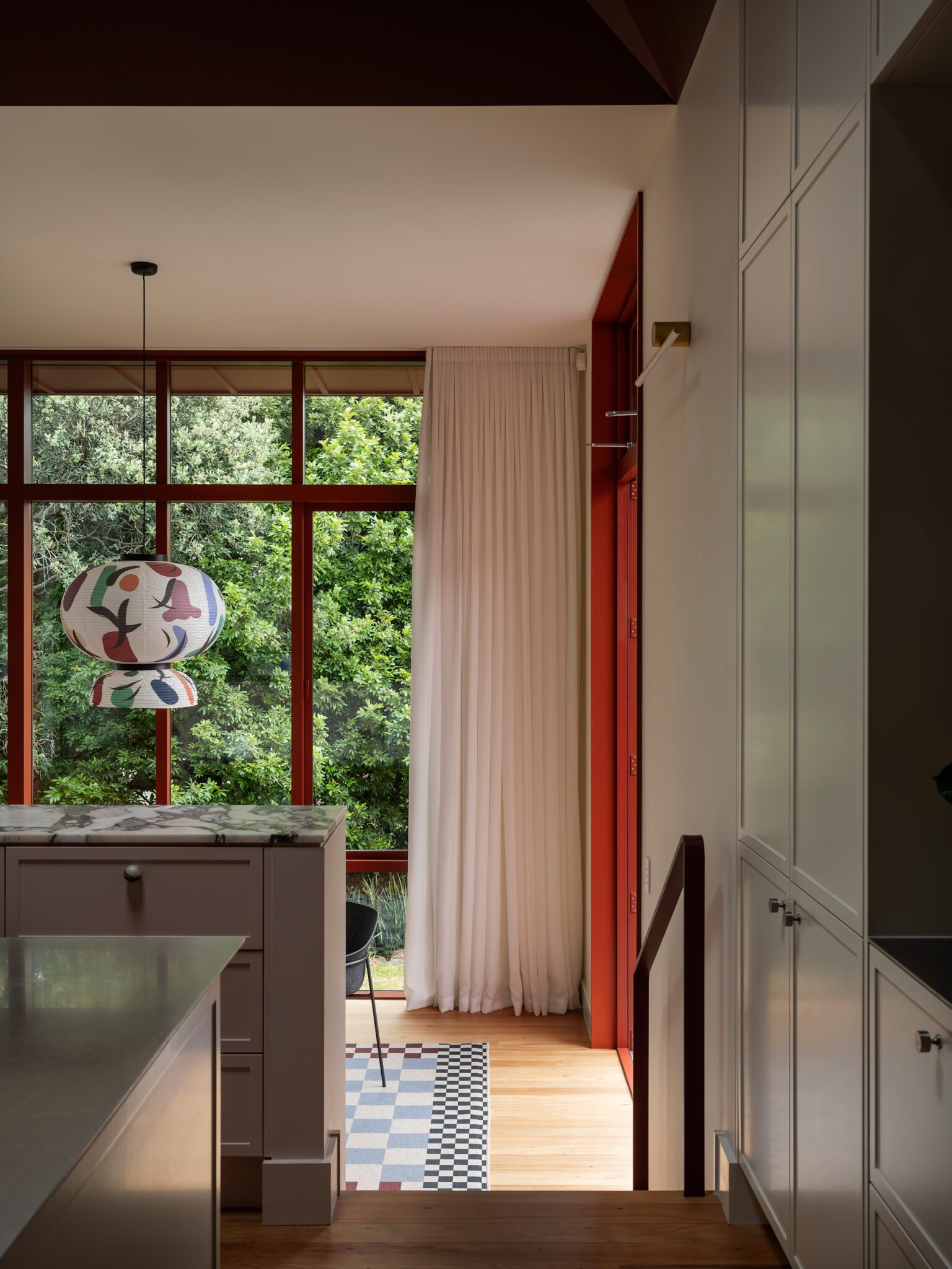
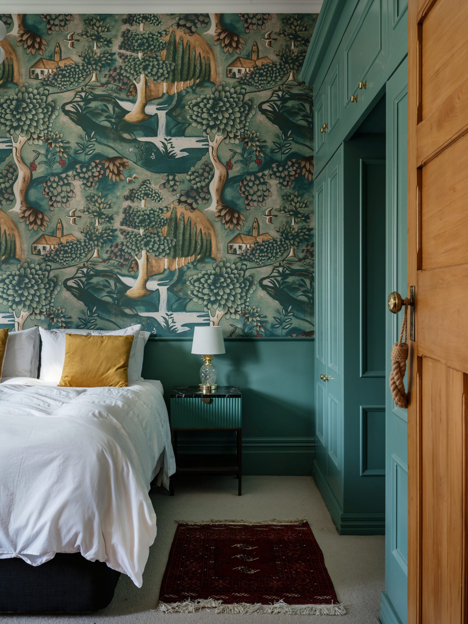
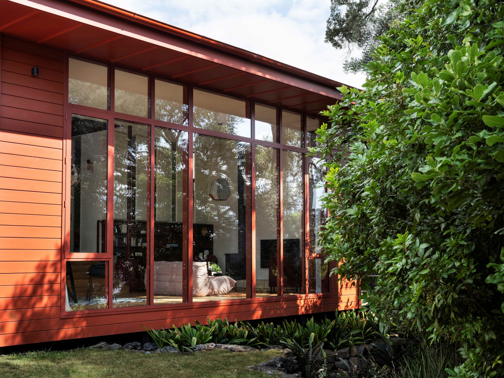
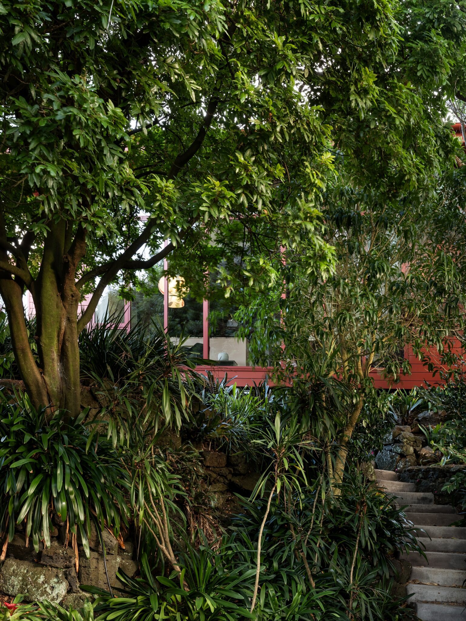
In Auckland’s Lava Flow, Pac Studio has taken the city’s volcanic lineage and rendered it visceral. A single, saturated note — Dulux Silo Park, a deep, earthy crimson — is poured across the ceiling and skylight like molten lava, dragging the eye upward, against expectation. It’s a move as bold as it is conceptual: by inverting the colour’s placement, light is not absorbed but reflected, washing the interior in a rich, ambient glow. Below, walls and joinery continue the tone, met in contrast by Dulux Duvauchelle, a soft, warm white that calms the chromatic punch without diluting its power.
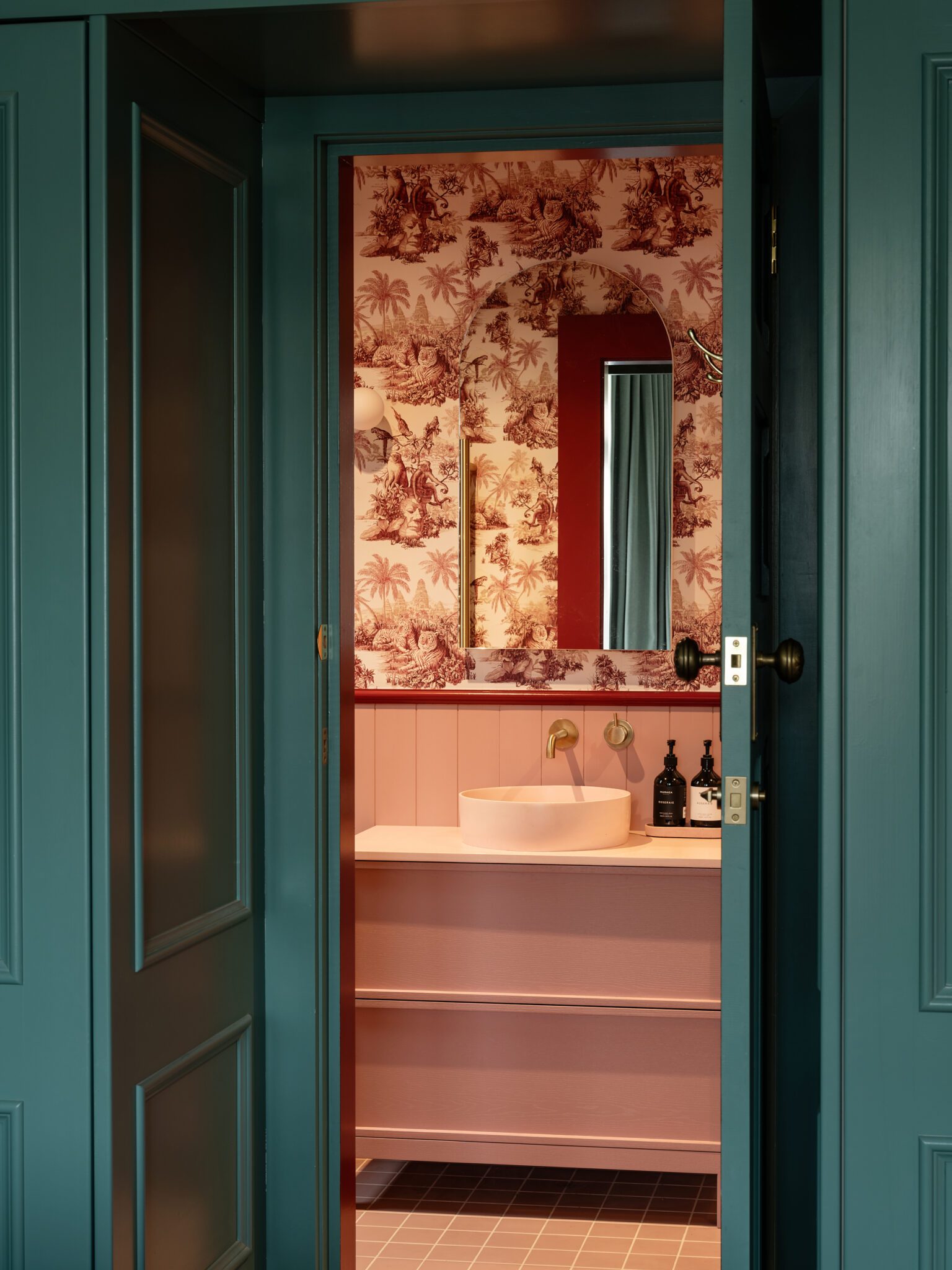
The effect is at once sculptural and emotional — a graphic gesture grounded in geologic truth. From the angular skylight to the pattern-dense wallpaper of the private zones, every chromatic choice plays a role in shaping perception. Bedrooms drop into deep green-blues; a bathroom softens in muted pink. It is not a riot of colour, but a symphony — considered, complex, and executed with an understanding of how colour defines mood and identity. The jury applauded the architects’ courage, remarkable chromatic restraint, spatial understanding, and precise execution, noting how the project “exemplifies the power of a single colour to define a built work.” It is, in every sense, grounded — and yet it sings.
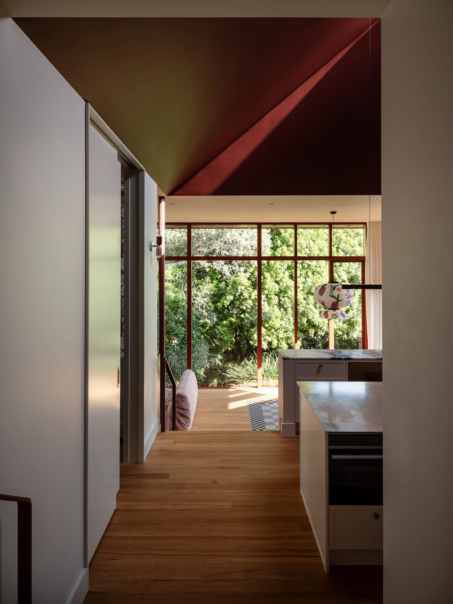
Sarah & Sebastian Armadale Store by Richards Stanisich
Across the Tasman in Armadale, Victoria, another single-colour strategy delivers a different kind of immersion. In the Sarah & Sebastian flagship by Richards Stanisich, Dulux Delta Break — a saturated, seaweed-toned green — swells across reflective surfaces and faceted forms to evoke an underwater world. Here, the jewel-box-like interior is less a shop than a shimmering tide pool, where velvet and gloss, metal and mirror, drift together in delicate tension. It is elemental and ethereal — a setting not just to showcase jewellery, but to reframe the act of looking.
This project, too, is bold in its restraint. The commitment to one dominant hue, especially in a high-end retail context that traditionally favours neutrality, is a decision that asks the customer to feel before they see — to be absorbed, suspended, submerged. It calls to mind kelp forests and light-dappled shallows, where movement is slowed and sound is softened. “Timeless and transformative,” said the judges, who commended the designers’ uncompromising rigour and the experiential ambition that places this project beyond category — not just exceptional retail, but a benchmark for spatial storytelling.
Images: Sam Hartnett & Lillie Thompson