On a Mangawhai golf course, a glass-box pavilion is ruptured by three inverted cones. Architect Pip Cheshire discusses the ideas and process that turned this seemingly simple concept into something entirely magnetic.
“A long time ago Pete Bossley and I used to laugh about Palladio, whose books wrote [the letter] S as an F,” says Auckland architect Pip Cheshire of the Italian Renaissance architect Andrea Palladio and the typographical quirk so common in manuscripts of that era. “So, we would joke about what Palladio would call the ‘neceffary’ rooms. You would have, for example, the Villa Rotonda … which would have all these beautiful salons, and there were kind of interstitial spaces that were ‘neceffary’ — one presumes there would be kitchens or toilets in there — instead of ‘capital’ rooms.
“I was interested in what would happen if you inverted that,” continues Pip. “What if you played on that and had the salon being the entirety of the house, and the ‘neceffary’ rooms being contained within some sort of objects which, rather than being interstitial, were somehow structural and enclosures at the same time.”

This idea — reminiscent perhaps of mid-century modernism such as Ludwig Mies van der Rohe’s Farnsworth House and Philip Johnson’s Glass House — begat a series of hand-drawn sketches by Pip, which eventually informed this seaside holiday ‘houfe’ on the outskirts of Northland’s Mangawhai.
Sporting a simple material palette of pine, concrete, glass and steel, the house is robust against the coastal elements. According to Pip, the initial questions were of a practical nature: could you get everything required in a house into those sorts of spaces, into a glass box and some enclosed volumes? How would it work thermally and in terms of privacy?
There were also more mundane requirements such as providing spaces dark enough to nurse jet lag — the owners live on the West Coast of the United States — to work under different time zones while others in the house sleep, to use screens without glare issues while also retaining the minimalism of the design.
Pip calls his design quest here as one for purity: “I am interested in taking things away; while taking things away everything keeps getting better but if you take too much it just falls apart. You have to get to that edge, the edge of that cliff and stay there. For me, designing is removing things.”

The three cones act both as structural forms and objects in their own right. They house the kitchen, bathrooms, and other services while at the same time define hallways and rooms.
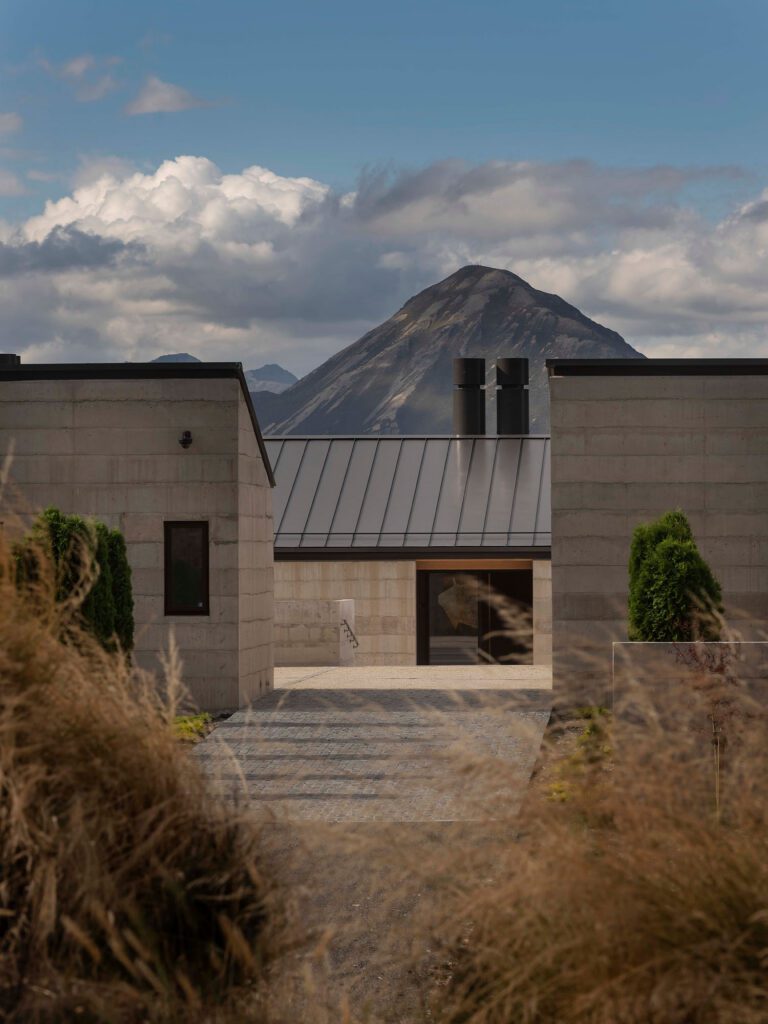
Within this Northland landscape, this editing or sculpting back until a form is revealed works particularly well. Set in the Tara Iti gated community — a sort of golf and architectural Disneyland — the house borders the remnants of a pine forest and the Tom Doak–designed links.
Undulating dunes — some sandy, others covered in fescue grass — extend to the ocean’s edge, while on the horizon Hen Island bobs in the misty distance.
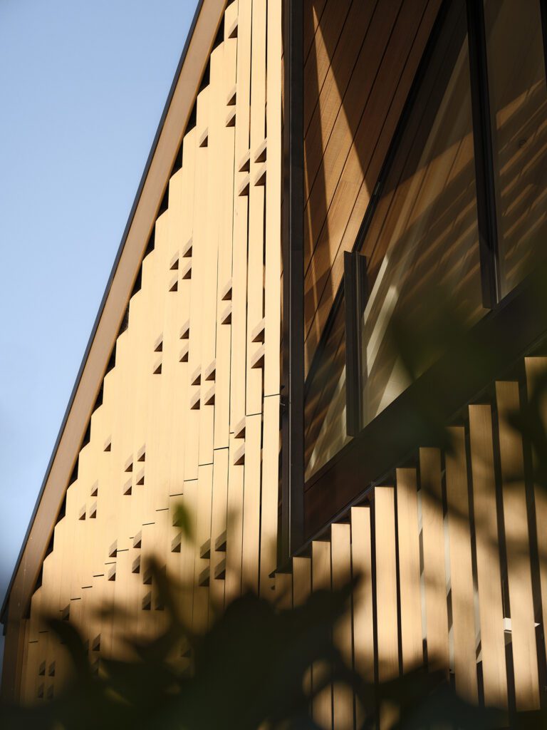
Looking at the house from the island’s perspective, one might be able to read its design as a simple pavilion with three inverted cones seemingly erupting through the rooftop and into the main salon. There is a solidity to these cones but their vertical timber cladding and the lightness of their rooftop edges lend them a certain lightness, as if sheets of paper had been twisted into darts of varying girths and inserted into a glass box.

Joinery has been embedded into the floors, sliding doors hide in the cones, and air-conditioning ducts and other services are buried into the ceiling in an attempt to maintain the minimalist design.
The composition is well balanced and much attention has been paid to expressing a sense of minimalist transparency in the salon.
“We spent a lot of time trying to figure out how to keep the openness … and how to keep this pavilion idea going,” says Pip, pointing out that there are very few internal walls here and most of them don’t reach up to the ceiling, opting instead to continue the external clerestory windows or ending almost a full metre before reaching the top.
Hallways are defined by gently sloping conical walls and the exterior glazing. All air conditioning ducts have been recessed into the ceiling, glass doors slide back into the cones, joinery sections are buried below floor level, and there are no internal stairs connecting both levels of this house. Even the TV set has had an architectural intervention to maintain the purity of the space; it lives inside one of the conical structures and, when in use, it extends and cantilevers above the floor.
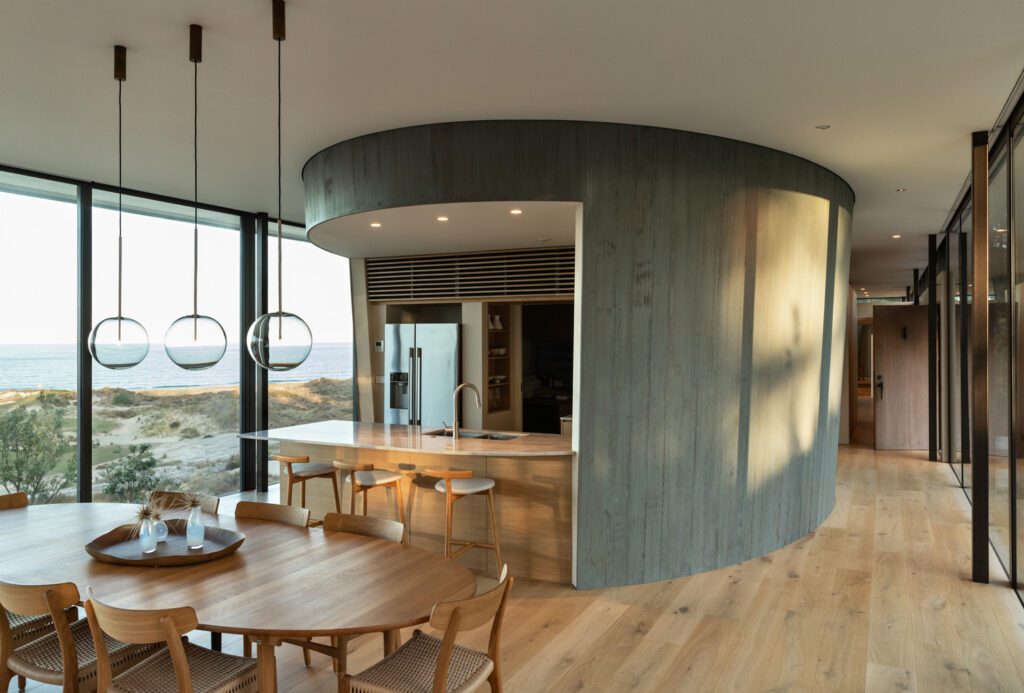
The cones required significant design and construction solutions to ensure that their inherent beauty did not lessen their practicality. Regardless of the apparent simplicity of the cones, their design and manufacturing was not a straightforward undertaking.
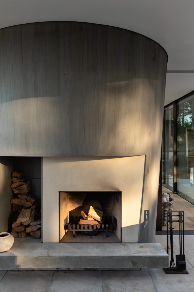
These sculptural objects are, at points, load bearing; at others they hide services, chimneys, and ensuites and inform the semicircular motif that makes this abode so simple yet magnetic.
“We had to find a way of burying air conditioning and it was hard work,” explains Pip. “There is a pivoting door making a conic plane — working out those angles was a big challenge.” He quotes his firm’s previous work at Rore Kāhu, Peter Cooper’s house up north, and Milse, in Britomart, as examples of what he calls his predilection for ‘wonky geometries’ and their expertise in computer modelling such apparently simple but demanding architectural shapes.
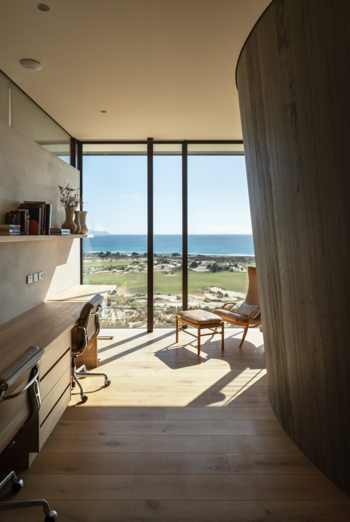
There are very few internal walls here and most of them don’t reach up to the ceiling, opting instead to continue the external clerestory windows or ending almost a full metre before reaching the top.
“This is an internal issue where people would [prioritise] the utility of the inside spaces, whereas I said no, the hard part is going to be building this. We have to have a simple geometry … constructional issues had to [prioritise] design.”
As such, this beach house required serious numbers of bespoke solutions — many by long-time Cheshire collaborators Guyco and Lindesay Construction.
Nowhere is that more apparent than in the main bathroom and in the surprisingly diminutive kitchen, their blatant curvature alluding in part to art deco, in part to jet turbines; a form that echoes California and grand old cars from the 1930s but with detailing and palettes that are undeniably now. It is an old Chrysler with the rooftop down while on the stereo, instead of Louis Armstrong, something a lot more contemporary is wafting through the airwaves.
During our conversation about this project, Pip also talks about the other, myriad parallel influences that might (or might not) have made their way into this design — creativity, he owns, is not so prescriptive.
A simple basement level houses a fairly independent studio and garage accessible only via lift.
There is talk of the Eames and their predilection for manipulating existing objects into something new. Pip talks about road trips through Los Angeles visiting the owners of this house. He talks about having slept outdoors, on beaches near Tara Iti, during surfing expeditions. He chats about how Māori myths and even Shakespearean plays could be conjured up while interpreting this place.
However, he warns, “It’s hard to know where those clarities come from. All those things and influences clatter around and then they come out through a painful process of endless drawing and sketching and drinking and the full anxiety of it all! It’s an iterative process, and I am not a straightliner.”

