The refurbishment of Wellington’s St James Theatre received a coveted accolade at the 2023 Dulux Colour Awards, being named the New Zealand Grand Prix winner. We talk to the designer behind this majestic restoration, Mitchell Burrows of Shand Shelton.
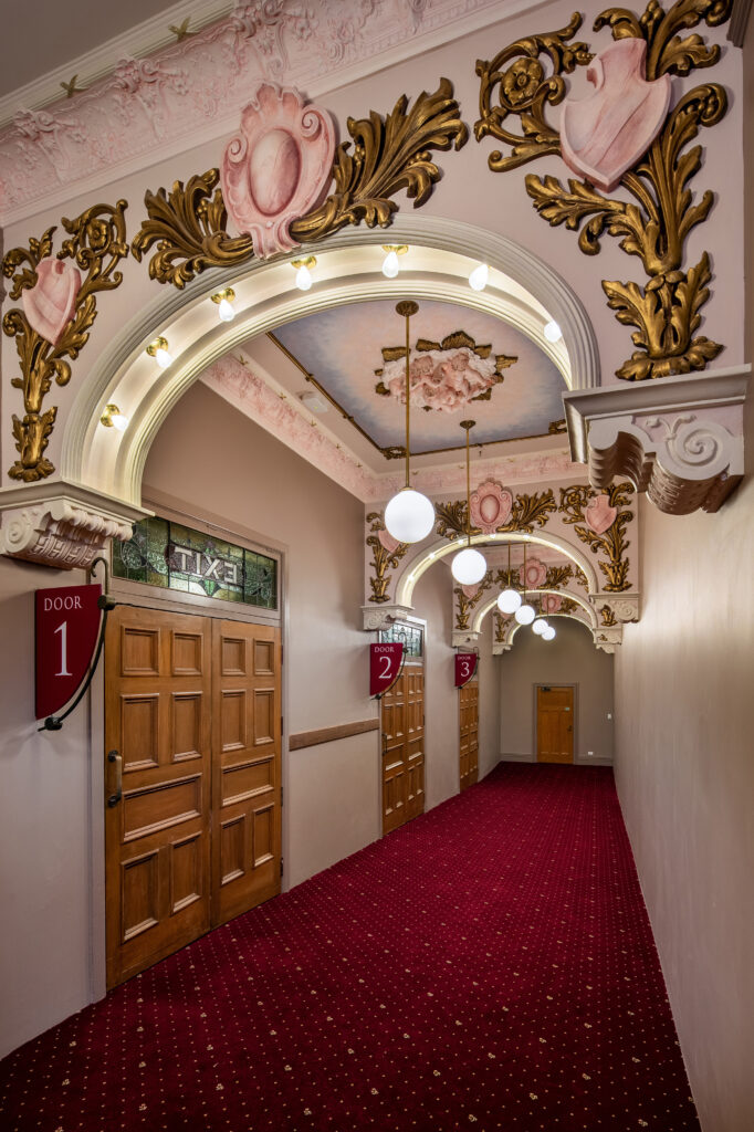
Constructed in 1912, St James Theatre is a heritage-listed building that has seen various upgrades over the years, most notably in 1993 with a large addition that included the retrofitting of an adjacent building to serve as the theatre’s new foyer and a home for the Royal New Zealand Ballet.
However, in 2015 changes to structural codes resulted in the complex being identified as earthquake prone. Work began to strengthen the building; alongside that, an extensive refurbishment project was undertaken, incorporating a full redecoration of the auditorium, restoration of stained-glass windows, and upgrades to the public foyers.
“The St James Theatre is a significant contribution to New Zealand’s theatre history, with the auditorium, entrance, and façade having remained in a largely unaltered condition since [the theatre’s] opening in 1912. It was therefore paramount that any interventions, structural or otherwise, would ensure the building’s heritage values were upheld,” Mitchell explains.
“The inspiration for the theatre’s colour scheme took cues from 1912 article references, which describe impressions of the auditorium scheme on opening day, while considering the modern‐day use and practical requirements of the theatre,” he continues.
“Full artistic samples were applied in situ when finalising the colour scheme, with adjustments made to consider authenticity, reflectivity values, and light balance to ensure the scheme would perform under actual theatre conditions.”
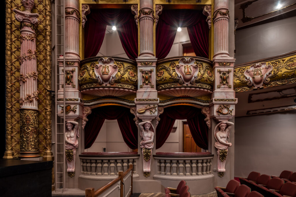
Within the theatre, artistic effects have been applied to enhance the opulence of the intricate plasterwork embellishments that decorate the auditorium. Metallics and blushes of rich colour — including Dulux Rosewood, Dulux Waiau Bay Half, and Dulux Vintage Gold — are strategically arranged to accentuate the scale of space and draw focus towards the proscenium arch and stage.
“The complexity of the scheme condenses within the adjoining egress spaces, such as the heritage corridor, to better sympathise with the scale of these spaces. The colour balance is also lighter in tone to allow these transitional spaces to perform as an intermediary between the auditorium and foyer spaces. While the auditorium presents as experiential, in contrast, the foyer spaces adopt a neutral colour scheme to emphasise the theatre’s materiality, which permeates throughout the foyer. Links in colour are encompassed in the foyer’s new bespoke patterned Marmoleum floor, constructed with over 2000 individual pieces; the colours meld the neutral, modern setting of the foyer spaces in the backdrop of the pattern, while integrating colours of warmth and golden highlights which harken back to the auditorium palette, connecting the spaces,” Mitchell explains.
Custom seating fabric was colour matched to Dulux Shaded Fuchsia and Dulux Raspberry Fool, to complement the paint colour scheme.
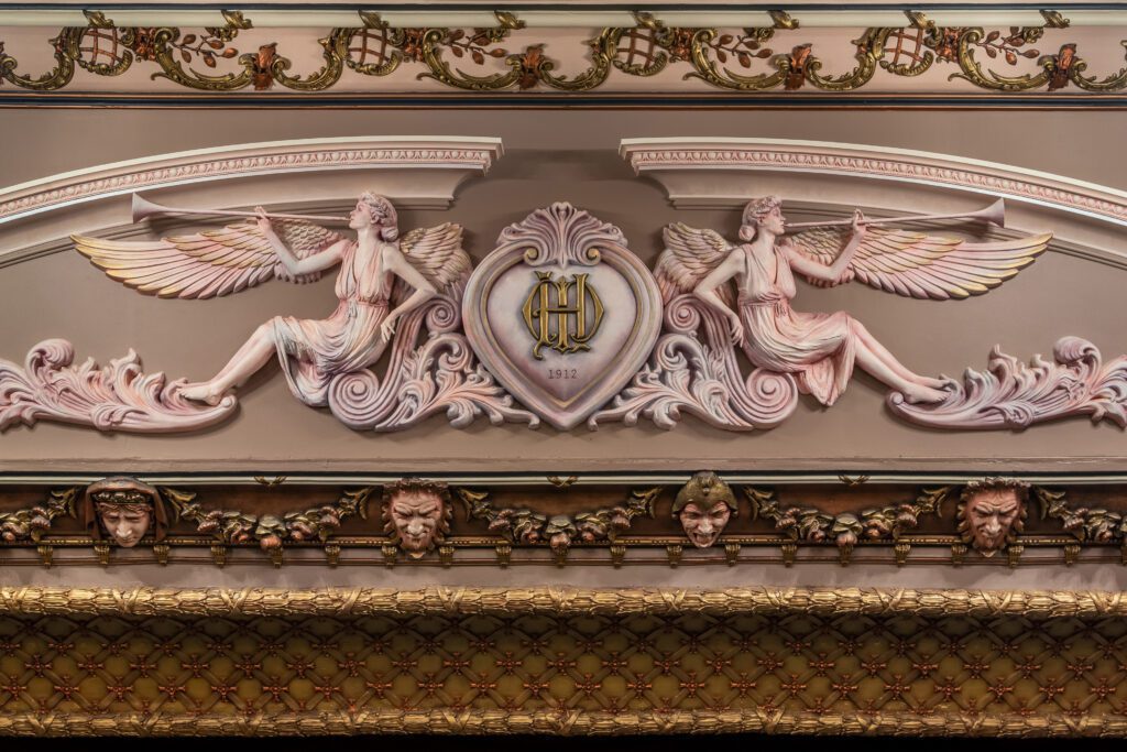
Feature colours are reserved to provide focal points, with a similar philosophy applied to the back‐of‐house to communicate floor levels and spaces to users.
The judges spoke of the intricacy and commitment to process, noting that the project is “a celebration of craftsmanship and a gift to the community”. As the city’s premier lyric theatre for more than 100 years, “the significance of the undertaking was potentially daunting and there were undoubtedly ‘safer’ strategies, but the architects have embraced the challenge, specifying a complex palette, inspired by early drawings of the heritage-listed building. Prioritising an investment in artisans to execute the intricate colour scheme has paid off, for this attention to detail has achieved optimal authenticity and light balance for theatre conditions. These artistic effects enhance the intricate plasterwork within the auditorium. It is an impressive display of colour conceptualisation and workmanship”.

