The architect behind this design, Patrick Clifford, discusses how the design of the Wynyard apartments came to be. See more of these homes below
Q&A with Patrick Clifford of Architectus
Could you explain the creative thinking that went into deciding the final design?
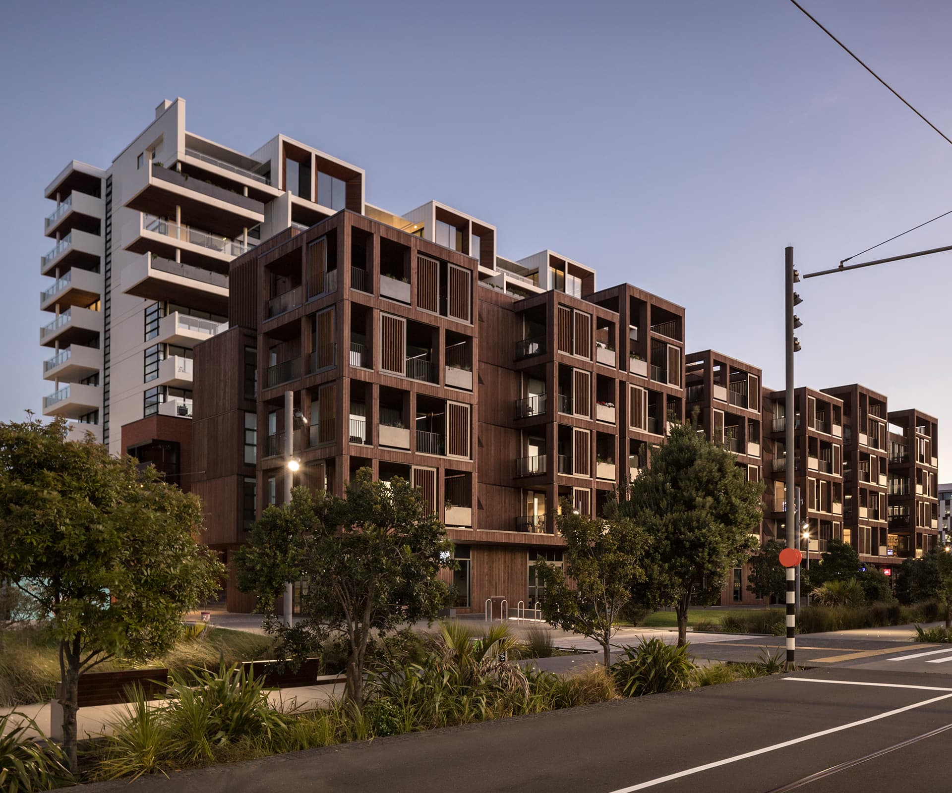
The process was quite a collaborative one with three firms of architects, Willis Bond and history of the project. The reference design that was provided as part of the project was critiqued. In the bid phase, the question was raised about the building’s most appropriate relationship with the park – the default position was to put the tallest building at the park edge, but Mark McGuinness [of Willis Bond] asked the question of putting a lower-scale building adjacent to the park and a taller one behind it. This triggered the response that followed. From that simple question, the design response flowed – interesting outcomes can evolve from these group interactions.
You say that the design offers the opportunity for the public to be part of the project. Could you please expand on this.
There’s quite a bit of porosity to the ground plane and site organisation. There’s the lane adjacent to the old Southern Spas [Mason Brothers] building, there’s the street, mews and small lanes between buildings – we were able to make more opportunity for people to move through the site on the ground. This seems to be quite appropriate to development that had happened previously on the site. The public, and public spaces, weren’t simply constrained by the primary streets – a greater degree of movement was allowed. In turn, that set up the opportunity for quite a lot of edges and the development of a range of retail and small-business spaces.
Also, with the provision of good balconies, we hope that people will occupy them and that they become part of the character of the space. With plantings they become an amenity to the apartments and street. We hope that the life of the building will be somewhat visible from the public domain.
What aspect of the development do you most enjoy?
The richness and life that it brings to this part of the city. To see people enjoying and occupying this part of Auckland is a very rewarding and satisfying aspect.

