Christchurch-based architect Nicholas Faith designs a home for a relatively small Auckland site that’s so robust, it’s basically bullet-proof
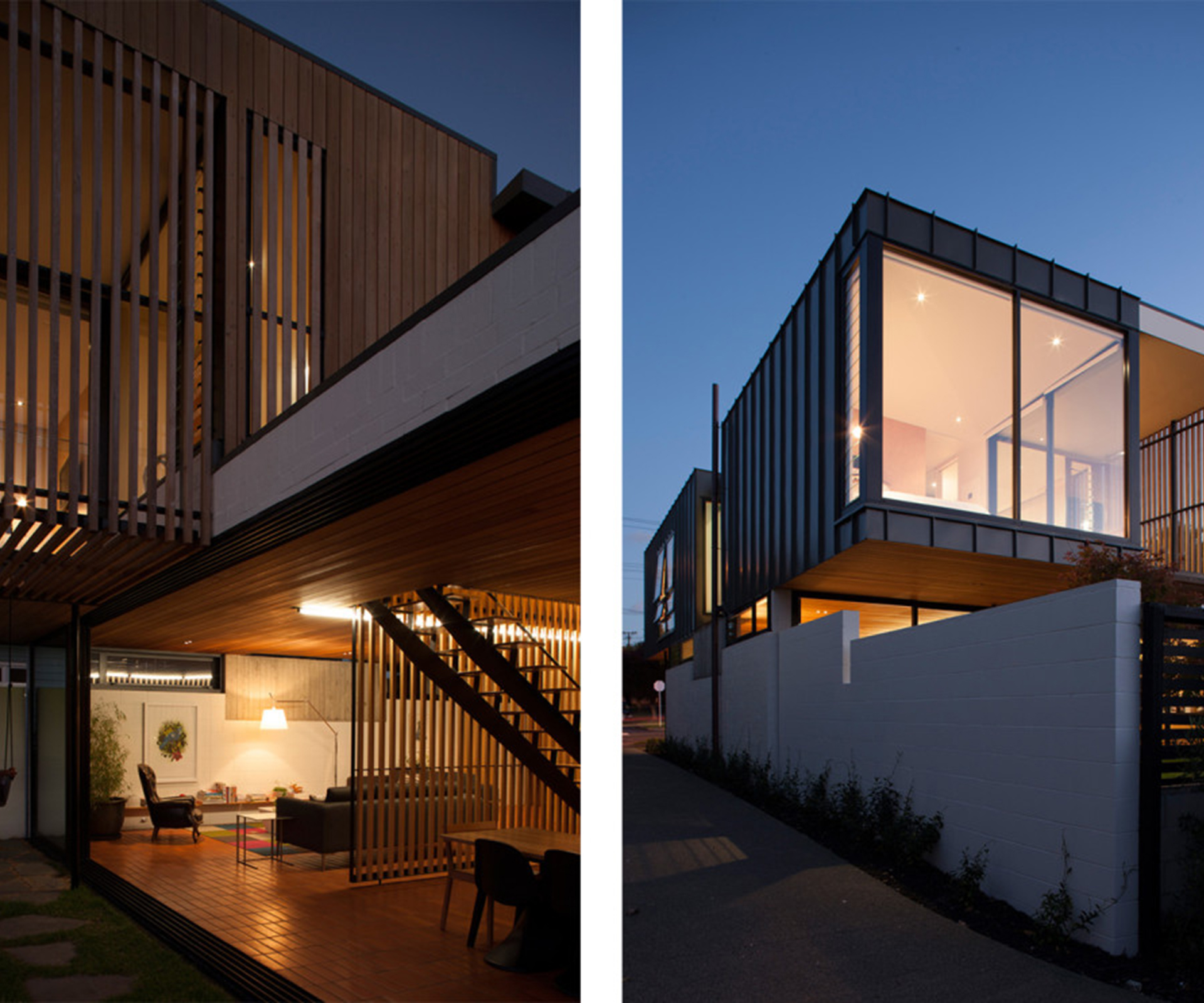
This Auckland new-build is inspired by Californian modernism
For an all-new home, this one was built for a relatively modest sum compared to the skyrocketing prices of its neighbours in this central Auckland suburb. Plus isn’t so large – about 190 square metres – it doesn’t have a garage and sits on a relatively modest 400-square-metre lot.
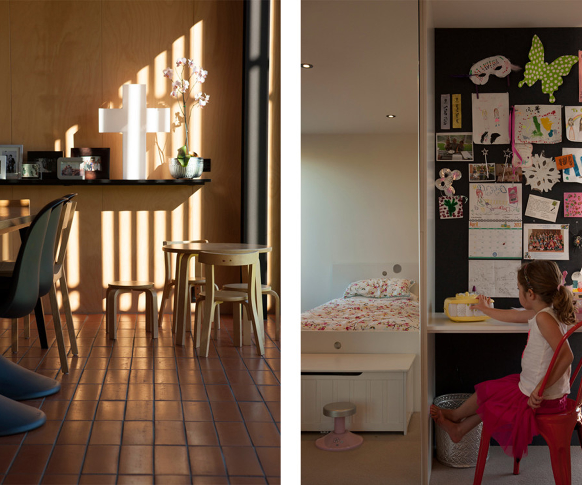
It is an exercise in restraint and careful thinking by an architecturally literate client and an architect who began the design without a real brief. The owners only real instruction to their friend, Christchurch-based architect Nicholas Faith, was that they didn’t want a white-on-white minimalist box. They also wanted their children to be able to ride their bikes around the living room, which meant the place basically needed to be bulletproof. “They wanted to see what I would come up with,” says Nich.
Nich and the owner had attended architecture school together “so we had a shared departure point in terms of materials and forms,” says Nich. They also share enthusiasm for Californian modernism and mid-century Christchurch architecture designed by Sir Miles Warren, whose influence is clear throughout the home and its material palette.
The site is a subdivided section in an established harbour-side suburb. The original house had been moved to the rear of the site, leaving a patch of land adjacent to the street. When the owners bought it, they weren’t actually looking to build, but they couldn’t find anything they liked.
“You’re dreaming,” said one to the other when her husband spotted the section. He persevered and they bought the place. “It was more of an interview,” says one of the owners of the buying process. The vendors were very keen to ensure the site was bought by someone who intended to build a house and live in it.
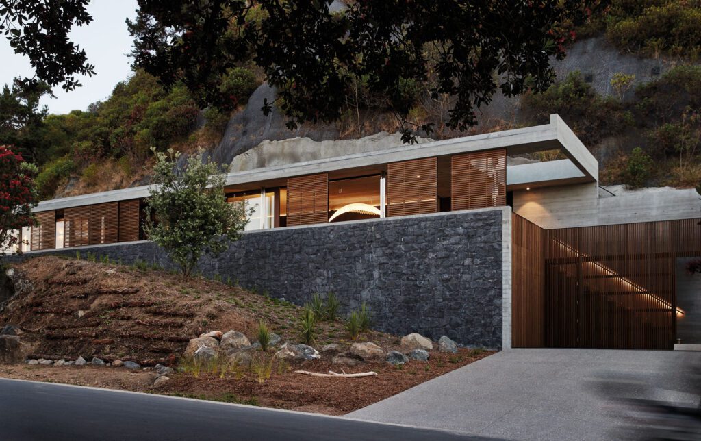
In the face of its challenges – a small rectangular site on a busy main road, and a need to be mindful of the neighbours – Nich developed a robust design that was driven by two very pragmatic realities: the need to create as much room as possible at the back for a north-facing courtyard, and the fact that there’s a driveway running down the side of the house. You step off the busy road, behind a white-painted concrete block wall, past the cars – a “proper” garage, all blank door to the street, was off the agenda from the start – and across a gravel court to a cedar-clad front door.
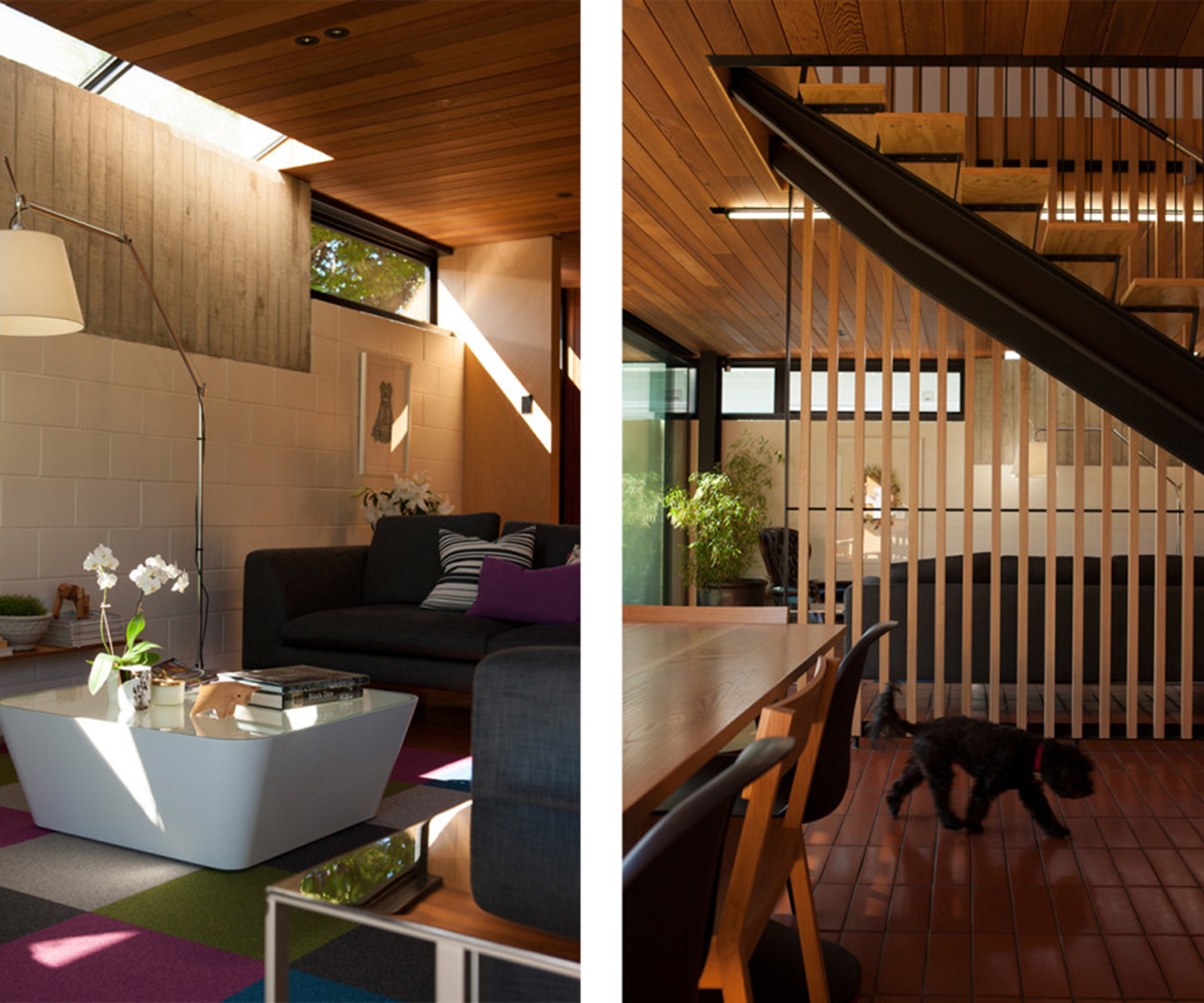
Then, you step into a small foyer and into the living room. It feels warm – there is plywood, painted concrete block, cedar screens and a glorious terracotta tiled floor instead of polished concrete, calling to mind the palette of a classic Warren and Mahoney abode. In the middle of the room is a staircase built from ply and black steel and framed by cedar battens. The solidity of the concrete block and brick exterior combined with the double glazing means there is virtually no traffic noise.
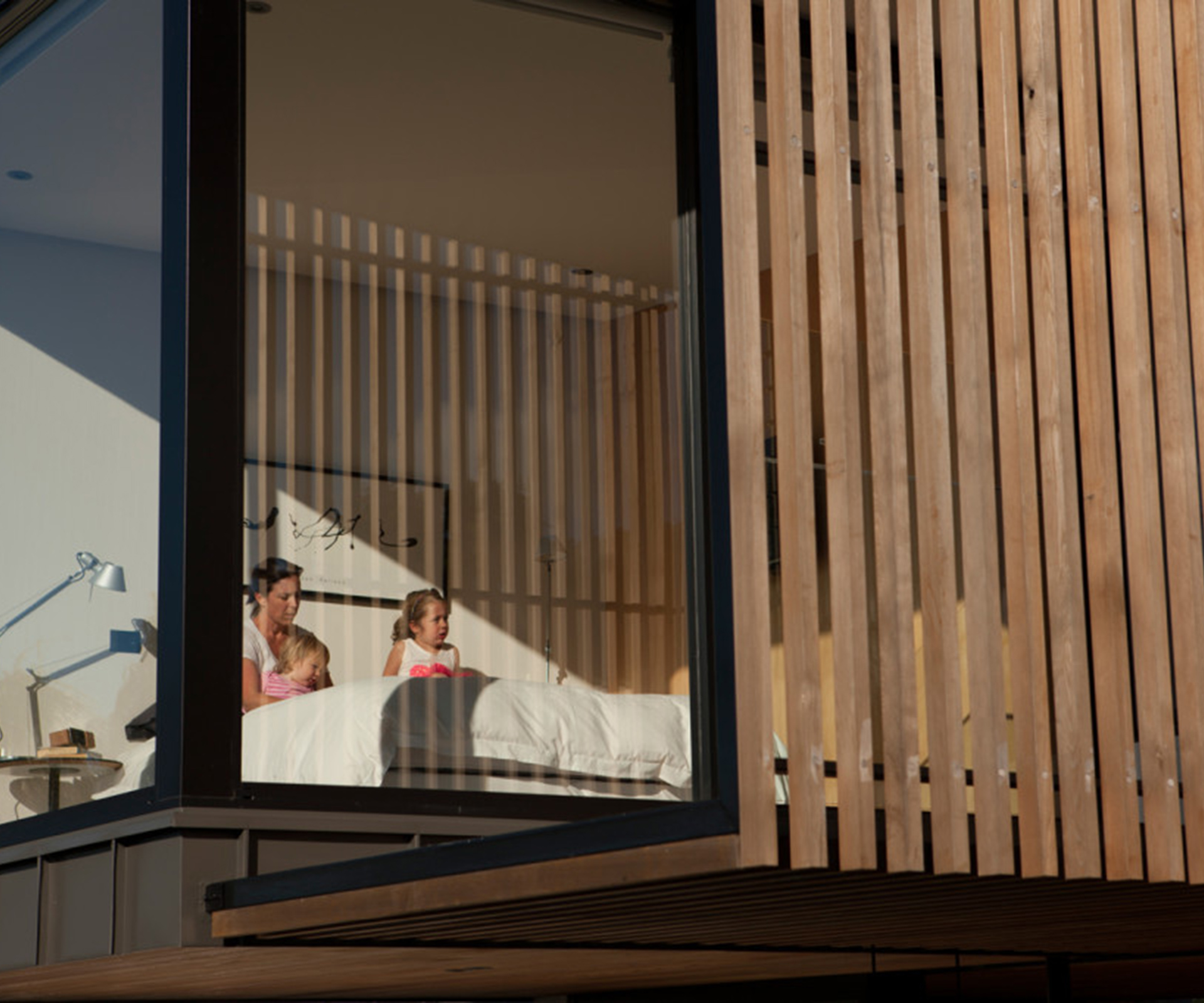
At the rear of the house, there’s a small, bookcase-lined room where the family watches television, as the owners were determined not to have the TV in the living room. Upstairs is simple: three bedrooms, two bathrooms, nothing particularly large or grandiose. The main bedroom is small, though it has massive expanses of glass and a harbour view. When they were building the place, people often commented on it being small. “It’s just going to have a bed in it,” one of the owners would reply.
One of the biggest successes of the home is the intelligent use of materials. And this is where it gets interesting. “We’ve put money into the things we touch,” says one of the owners of their selection process. “It was about tactility, as this is what leaves a lasting memory.”
You see that downstairs with the tiles, which are hand-made, and upstairs in quality bathroom fittings – in a canny move, they were bought at a bathroom sale. In other parts of the house, materials are pragmatic, with a lot of ply. “When I started working as an architect, one of the things I was disappointed with was that you relied on paint,” says Nich. “I’m more attracted to materials that are self-finishing.”
One of the other things they did without was the customary level of detail in the drawings – it was an impossibility in terms of time, distance and budget.
“I love that line that you should be able to fit the drawings for a house on six sheets,” says Nich. “Now it’s more like 40.” The owners were fortunate that their builder, Rob Anderson of Contour Construction, was able to easily step in if there were any gaps. The end result shows how obsessed he was with details: every sheet of ply is perfectly finished and positioned. The result is a beautifully crafted home. “It has warmth and mood,” says one of the owners. “It’s not a big house. It’s not out of scale.”
Photograph by: Simon Devitt. Words by: Simon Farrell-Green.
