With its simple geometry and sloping ceilings that mirror the land, this 124-square-metre cedar home is a sculptural masterpiece
[jwp-video n=”1″]
How this home was designed to work with Wellington’s ferocious winds
What’s a couple to do when they find themselves in an empty nest? If you’re Barbara Fill and Nick Dryden, you sell the family home before moving three doors down and demolishing a worker’s cottage, one of four built from Dutch kitsets by the blokes who went on to start Lockwood Group.
The Wellington couple had a defined design sensibility: they wanted a home with a strong contextual link to the hilly, sloping section, that worked with, rather than against, the weather conditions, and which accommodated their art collection.
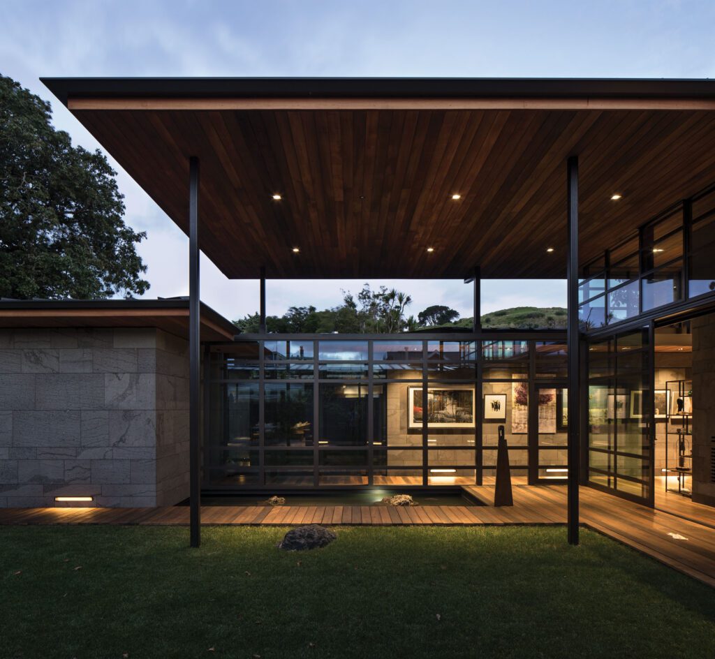
The house is organised around two key elements: the spaces created by two recessed decks and a long hall flanked with bookcases and recessed storage. Tucked into eaves on the northern and eastern sides of the house, the decks come into play when dealing with those pesky Wellington northerlies. Just off the kitchen, the deck is so sheltered that the sliding kitchen doors can be left open in all weather. Off the living room, meanwhile, a second alcove is sheltered from the south-easterlies and enjoys late afternoon sun.
Their previous home was 60 stairs up from the road and on several levels, dominated by dark native timber. “This house is a reaction to that,” says Lovell. “They wanted something simple, accessible and low maintenance so that they could pursue new interests.”
Q&A with Tim Lovell of Lo’CA Architects
How can good design minimise the impact of Wellington’s notorious winds?
Shelter is the key. The idea is that there will always be a covered outdoor space to escape to. In a storm, the indoor spaces are designed to feel connected to the surrounding landscape.
Sliding doors are good for sites with high winds since they don’t slam, and the amount of opening can be finely controlled. Hunkering bedrooms into more sheltered, well-insulated, quiet areas ensures a peaceful sleep even in a strong storm.
What was your best design decision with this house?
The asymmetric angled roof and ceiling. It’s simple, sculptural and playful and follows the angle of the hill on which it’s sited.
How does good design complement rather than distract from the spectacular view?
A space is there to facilitate a connection with the surrounding landscape. We have the luxury in New Zealand of having the problem of how to manage often jaw-droppingly spectacular views.
[gallery_link num_photos=”5″ media=”https://homemagazine.nz/wp-content/uploads/2017/08/WellingtonSmallHome3.jpg” link=”/inside-homes/home-features/compact-wellington-home-gets-back-to-basics” title=”Read the full story here”]


