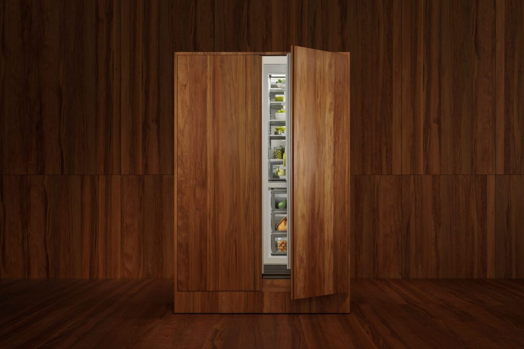
It begins with dust: fine, dry, and strangely weighty. Packed and labelled with numeric codes, PeterFell’s coloured oxides read like elements — ready to be combined with concrete and set in permanence.
Among the 80 or so colours in the range, it is black that is most favoured. It’s in driveways and floors, plinths and walls, all over New Zealand. A colour that articulates form with stunning simplicity — matte, shadowy, and understated — it seems to enhance the tactility of concrete, underscoring its permanence.
PeterFell is the New Zealand supplier of Bayferrox Black Oxide, for which it recently received a Declare label — a small sticker that signals a big shift. And the label was not only for the Black Oxide. The entire PeterFell range of coloured oxides is now Declare-labelled.
Developed by the International Living Future Institute, Declare is akin to a nutrition label for building products; ingredients are listed, supply chains are traceable. It’s a way of understanding not just what a material looks like or how it performs but what it’s made of.
Adding further weight to its sustainability credentials, PeterFell’s Black Oxide is also supported by an Environmental Product Declaration (EPD) — a globally recognised, independently verified document that details the pigment’s environmental footprint across its entire life cycle, from raw material extraction to delivery. Certified to ISO 14025 and EN 15804, and verified by the Institut Bauen und Umwelt e.V. (IBU) in Germany, the EPD gives architects and specifiers robust data to support greener building practices, including Green Star, LEED, and BREEAM certification requirements.
It’s a fitting move for a product that is integral, mixed through concrete before it’s poured, creating an inherently coloured material; colour that doesn’t fade with time. As the years pass, it ages, develops a patina, and slowly becomes more characterful.
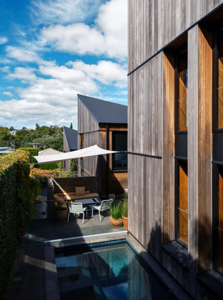
While PeterFell’s Black Oxide remains undeniably popular, there’s a slow but steady reckoning happening with colour in New Zealand. As a nation, we seem to be on a precipice — ready, and beginning, to embrace it more freely in our homes and public spaces.
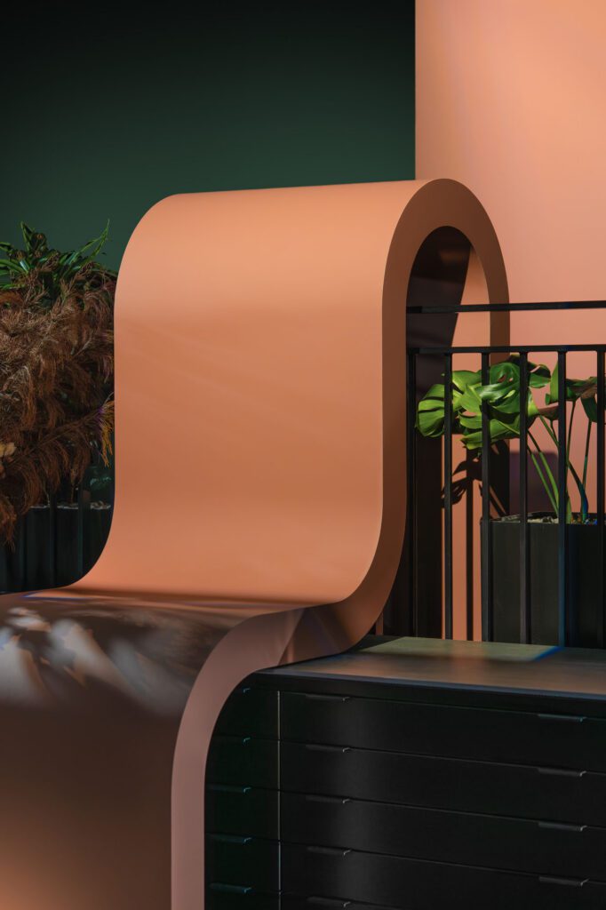
A few years ago, PeterFell expanded its range beyond the largely neutral offerings — stone, sandstone, neutral, and charcoal — and introduced a new series of colours using white cement: a cleaner, brighter base that allows pastel and gelato tones to come to life. They’re vivid, and introduce a clarity of tone. Boysenberry, Watermelon, Pistachio, Kiwifruit, and Plum are among the most vibrant, while, in the pastel range, Lavender, Blush, and Peach strike a softer chord. SuperWhite, in turn, offers a pristine vibrancy in its pure white tones.
In the context of the Declare labelling of its products, PeterFell coloured concrete takes on a new ethos, grounded in transparency and ethical production.