This sculptural home by the sea, Sumner Salute by RTA Studio, was named the 2024 Readers’ Choice Home of the Year.
Beneath skyward-pitching angles, two pavilions appear as if they were once one but have since been cleaved down the middle and separated; their roofs askance as if to let the Pacific blasts skip across them. The home puts on quite a show in Sumner, the coastal enclave 20 minutes’ drive from central Ōtautahi Christchurch.
It’s a design that revels in a response to the skinny wedge of a site at the knuckle end of Sumner beach promenade. A pebble’s throw from the Clock Tower, hard up against a playground and Scarborough Hill, the dwelling makes an architectural statement: a sophisticated bleached-blonde bach contrasting with the European-like formality of the promenade.

The location’s complexities explain the site’s strange geometry. Many decades after the surveyor had to slice it off at an odd angle, its irregularities presented an opportunity for an architect to create an equally irregular response.
“It was great,” says Rich Naish of RTA Studio. “I find that the more constraints there are with a project, somehow the more interesting it is. Constraints require an immediate decision on what you can and can’t do. If you have a flat, greenfield site with no views, and nothing to nudge you in any direction, it’s like a blank canvas; you get stage fright.”
According to the Home of the Year awards jury, RTA has achieved “an absolute beauty. As far as creative solutions to site restrictions go … this one is borderline miraculous.”
The home is designed for a couple who share a love for architecture and had met Naish socially about 15 years ago; they contacted him when this site became available. “The clients are fun, adventurous, and wanted something that was not necessarily an expected solution,” says Naish.
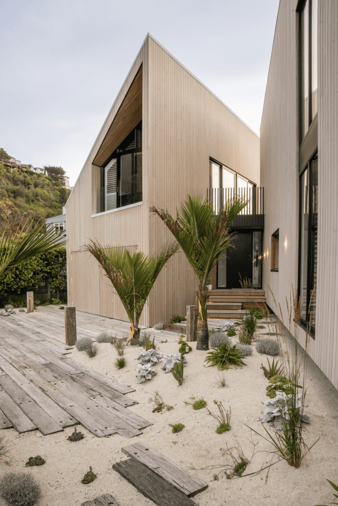
With its two flaring boundaries, the site’s triangular shape made it impossible to accommodate a house with a conventional form. However, the brief didn’t divert from the customary: its owners required a place to live and to sleep. They also needed space for their significant art collection — one is an artist — and they enjoy entertaining. A pool would be quite nice, too, they thought.
Naish’s thought process immediately went to dividing living and sleeping into two pavilions.
“We took a gable form, split it down the middle, and splayed it,” he says.
This created a casual forecourt arrangement, with the front door clearly positioned between the two forms. The next logical move was to go up, to provide both space and the sea views that are not accessible at ground level.
While the site’s geometry drove the split, the slightly jagged roof forms speak to the Christchurch vernacular and immediate landscape.
“Being up against the rugged rocks, it feels like this is one of the few parts of Christchurch [that is] a bit rugged, not flat,” says Naish. “I couldn’t help thinking about architects like Sir Miles Warren and Peter Beaven, but I couldn’t contain that analysis to just the urban architecture. It was also the landscape and the Port Hills, where they break down and fall apart towards the water’s edge.”
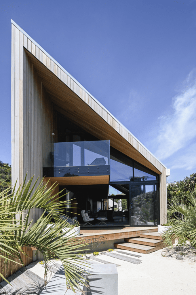
Beneath those roof forms, the programme contains the kitchen and living area at ground level, with a mezzanine inserted above. This elevated lineal space projects forwards onto a balcony at the seaside-and-sunsets end, while at the other end the view captures the hills. Directly below is the guest bedroom, which is accessed off the entry lobby. From the mezzanine, the owners’ bedroom pavilion is accessed off an external balcony; an informal connection that’s almost like a secret passageway.
The roof peaks create as much drama inside as at the street — compressed where pitches form triangles and attic-like spaces render reduced volumes.
The mezzanine offers an element of tension, sculptural light, sea views, and internal vantage points.
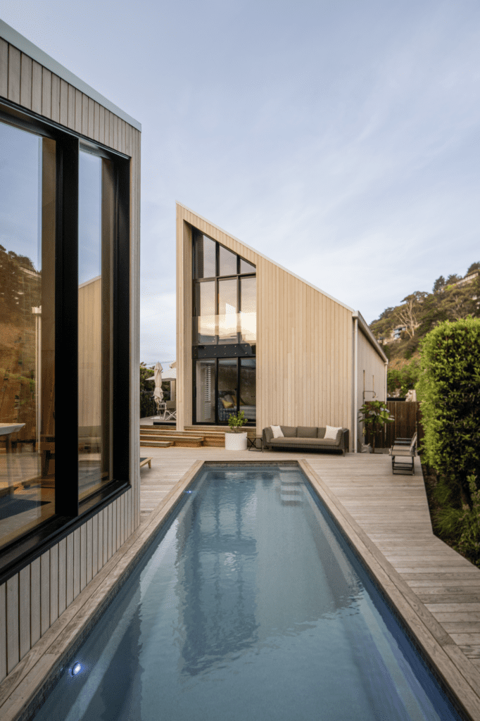
By contrast, the courtyard is a little pocket of sheltered space. It is key to the design programme and, in conjunction with the living area and the swimming pool, creates a generosity of space. It’s the latter that forms a punctuation point in the architectural statement, Naish explains.
“The pool occupies that difficult thin end of the wedge and puts a full stop, if you like, to the property.”
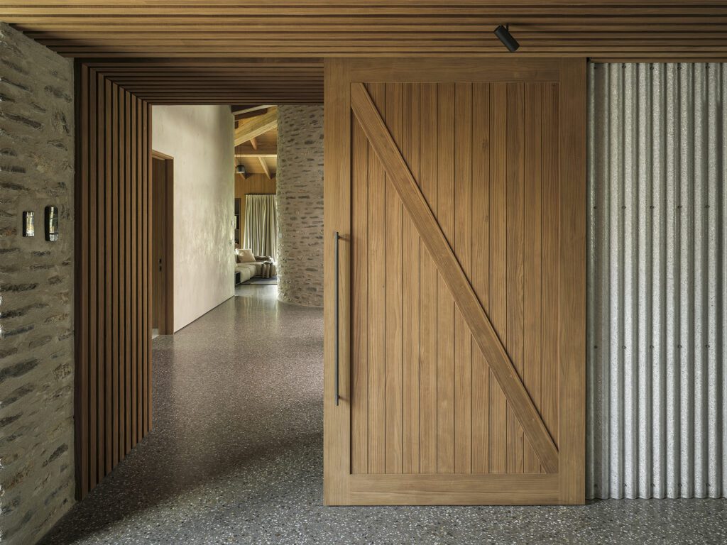
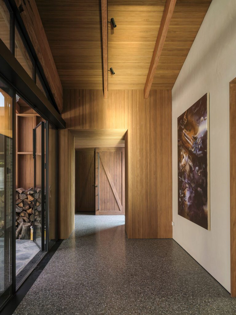
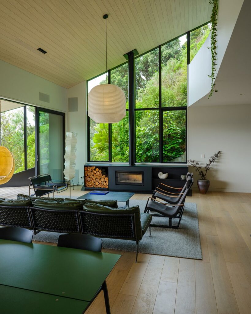
The home’s interior palette serves as a crisp, but informal, backdrop to the owners’ art. Band-sawn pine, reminiscent of fence palings, has been whitewashed and lines the interior. Underfoot is band-sawn American white oak flooring. In stark contrast, the underside of the mezzanine and entry lobby is black-stained pine. Outside, Abodo cladding has been given a UV-reactive stain that will impart a bleached effect to the timber in time.
Old railway sleepers at the home’s entrance read like a pier or jetty, which is not such a whimsical reference when Naish explains that, in light of the sea-level rising and storm surges, it was a requirement that the building be significantly above the existing ground.
“It gave us a nice opportunity for a suspended timber floor, rather than a concrete slab,” he says — a measure that supports the studio’s sustainability agenda and aim to reduce the carbon footprint of its projects by 100 per cent by 2040.
“We know that this house is at least half the embodied carbon of a typical New Zealand house,” says Naish of the low-carbon, highly insulated, low-energy building — and perhaps that’s the underscore to the full stop defining the success of this contemporary home by the beach.

