Fearon Hay has designed two elegant cabins that redefine what we’ve come to expect from a back-to-basics encampment
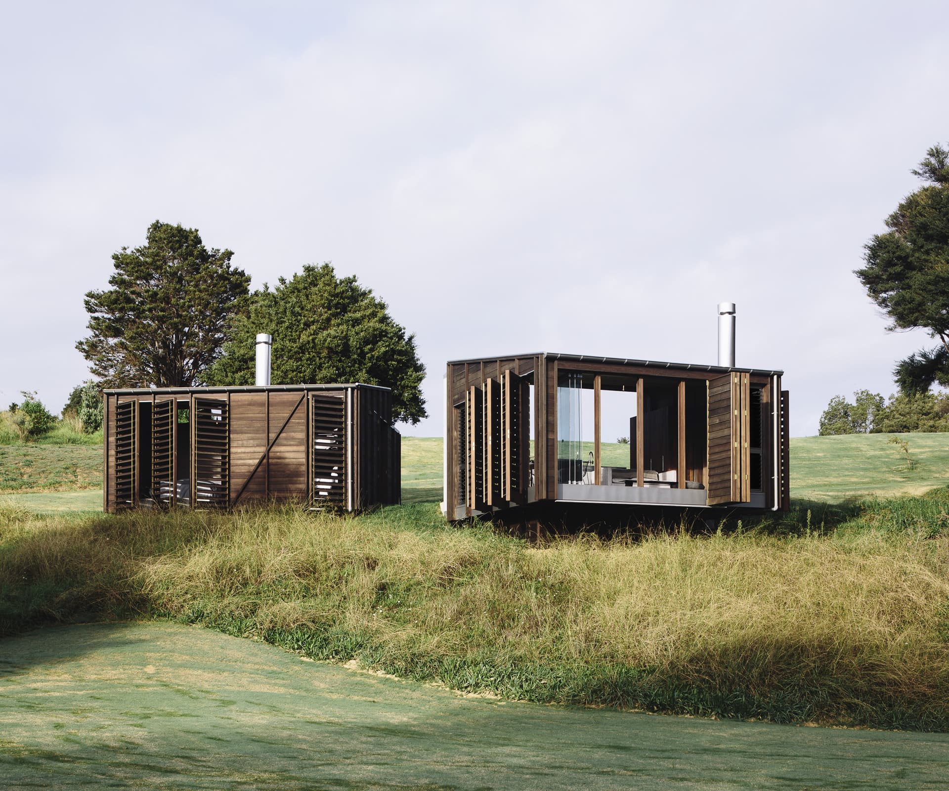
A few years ago, a couple with young children approached Fearon Hay with their thoughts about building on rural land they’d purchased on the Tawharanui Peninsula. Located on an inlet, big, rolling grassy hills trickle down to the water’s edge.
The estuary is not your quintessential ocean-front view for a holiday home and the owners’ approach to building on the large site veered from convention. Early discussions with Fearon Hay were about a loose occupation of the land and how it could eventually be used in a few different ways. The couple was interested in how the long-term occupation of the site might develop from an initial, informal dwelling. There was time to consider a more substantial and permanent set-up, but only if they felt it was what they wanted or needed.
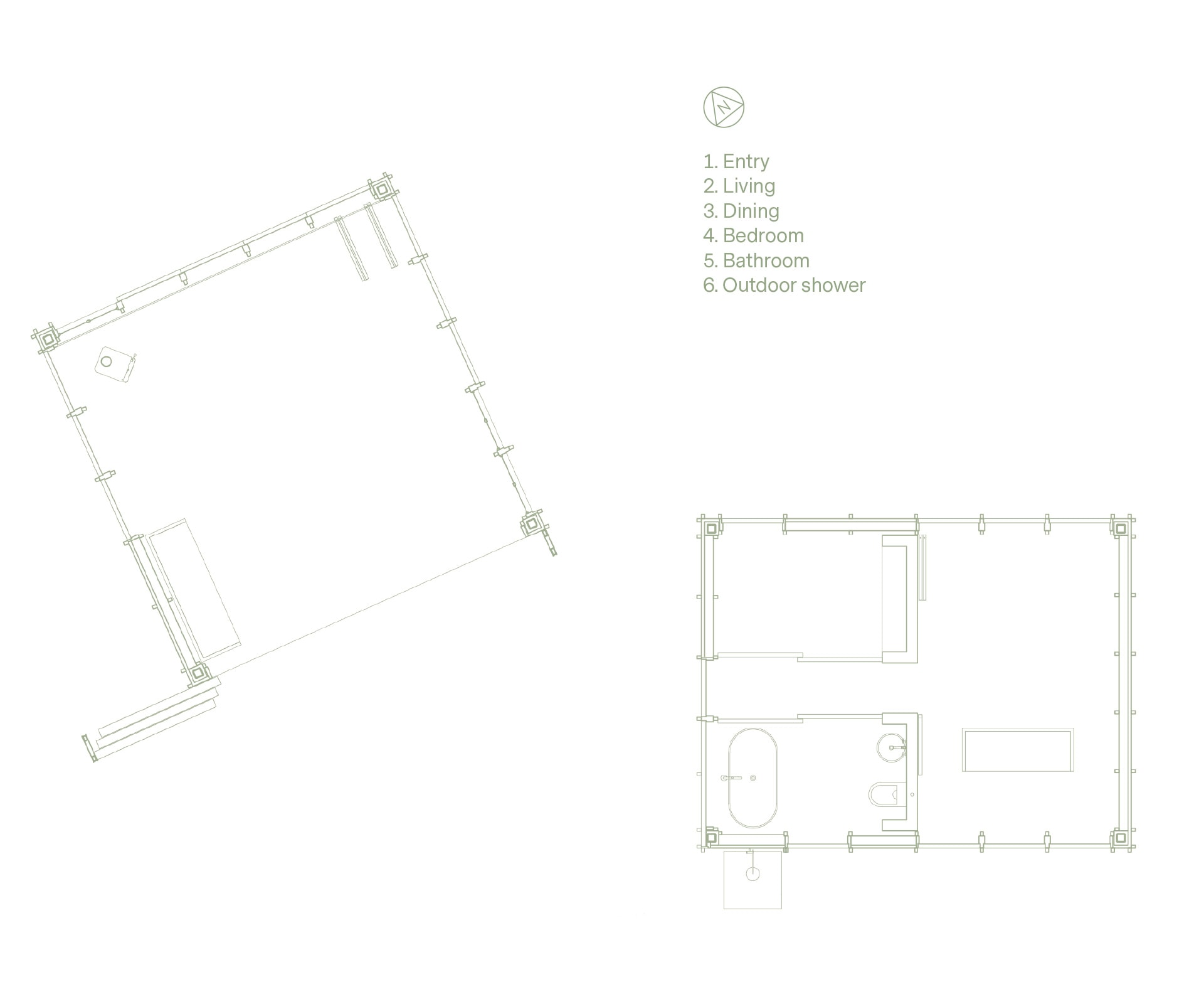
Talk arose around a scattered inhabitation of the landscape – a couple of cabins, an encampment. As you do when you camp, it all comes back to the essentials – there would be one cabin for living, one for sleeping. The cabins are about 35 square metres each, are offset on the site and project towards the water. A loose interpretation of a courtyard between them creates entry points where they touch the land. Where they hover on the site, the cabins sit on timber piles that are stepped back from the edges and painted black to recede from sight.
Designing to such a modest scale gave the architects the opportunity to craft their response and perfect the balance of scale. “Projects of this scale are really enjoyable as they enable you to have the level of detail and quality that we like to work with,” says Piers Kay, project lead and associate at Fearon Hay.
“A lot of our buildings have open edges that connect with the exterior and environment. This project pushed the concept even further, since it wasn’t about developing a highly sealed, high-performing house. We were able to loosen up the enclosure lines and connect the owners closer to nature.”
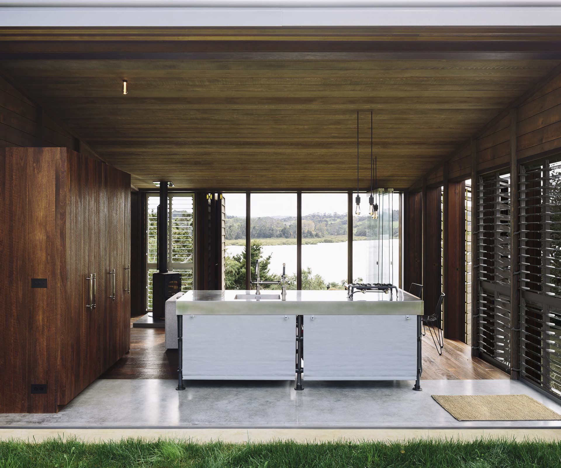
Without all the service-heavy, back-house components that go into making a conventional home function, attention could turn to making these simple structures feel relaxed, open and beautiful. With such a limited scale, the camping concept could be maintained in its purest sense throughout the design. Focus went into the building envelope and how it edits light, sun, view and privacy, while considering informality and openness.
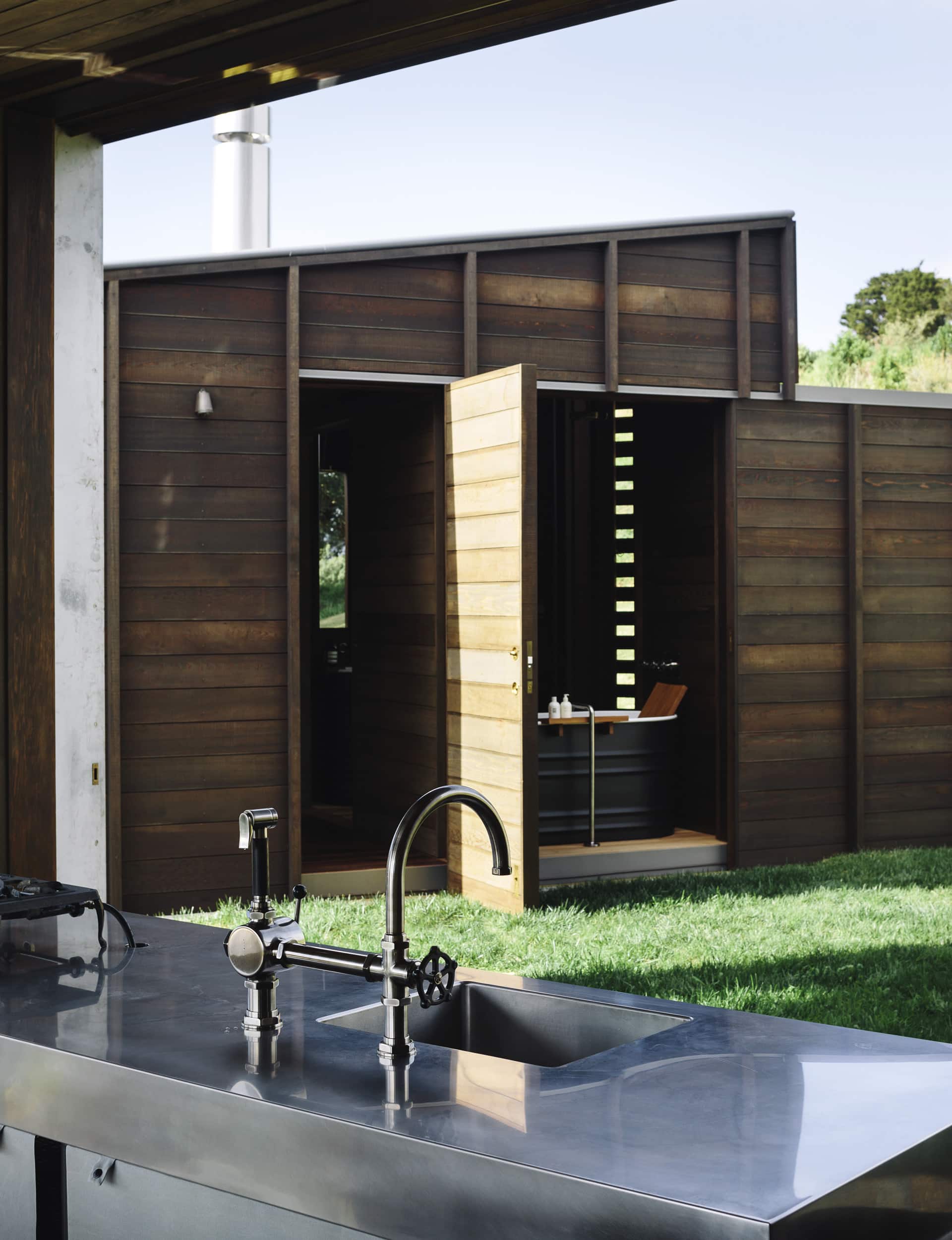
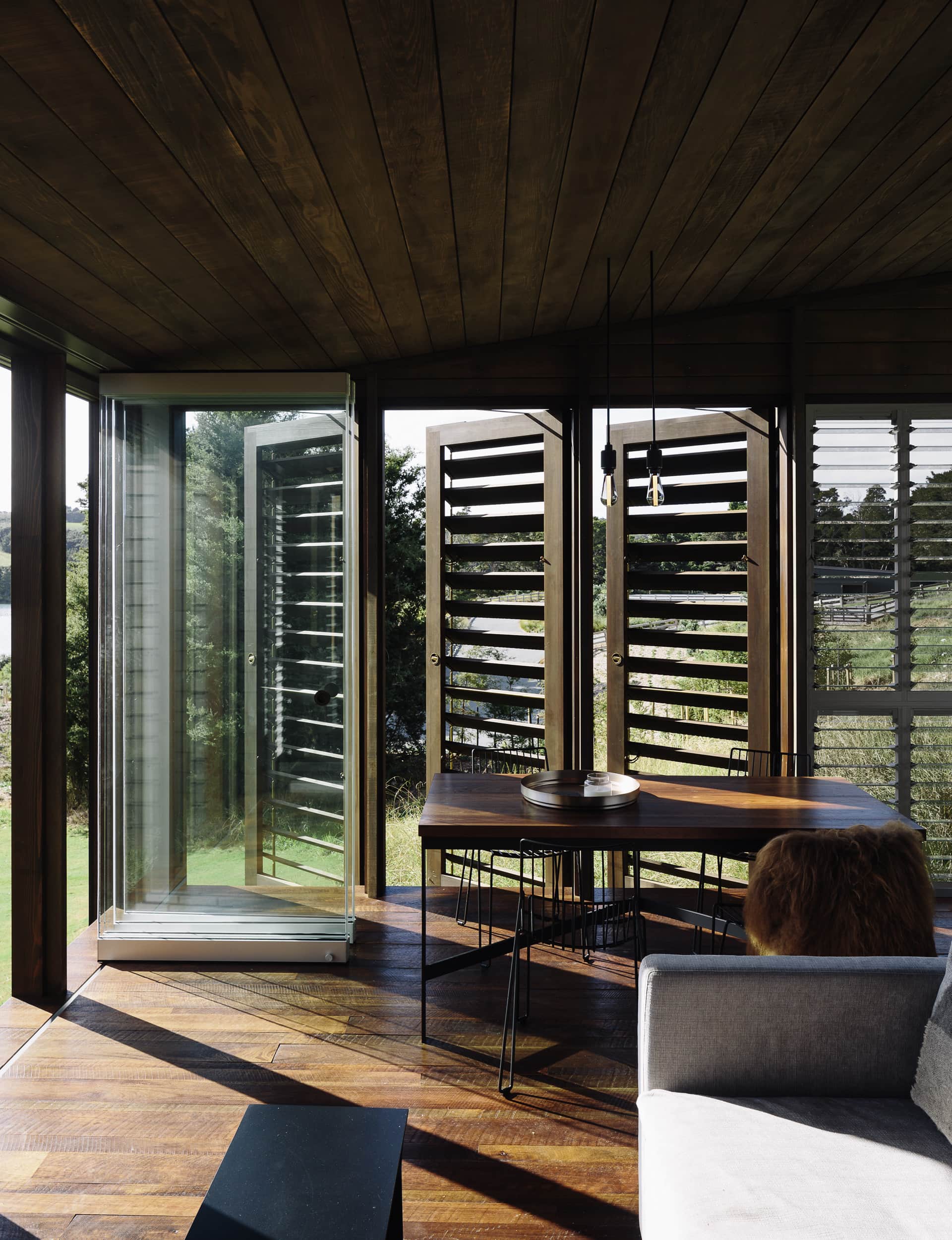
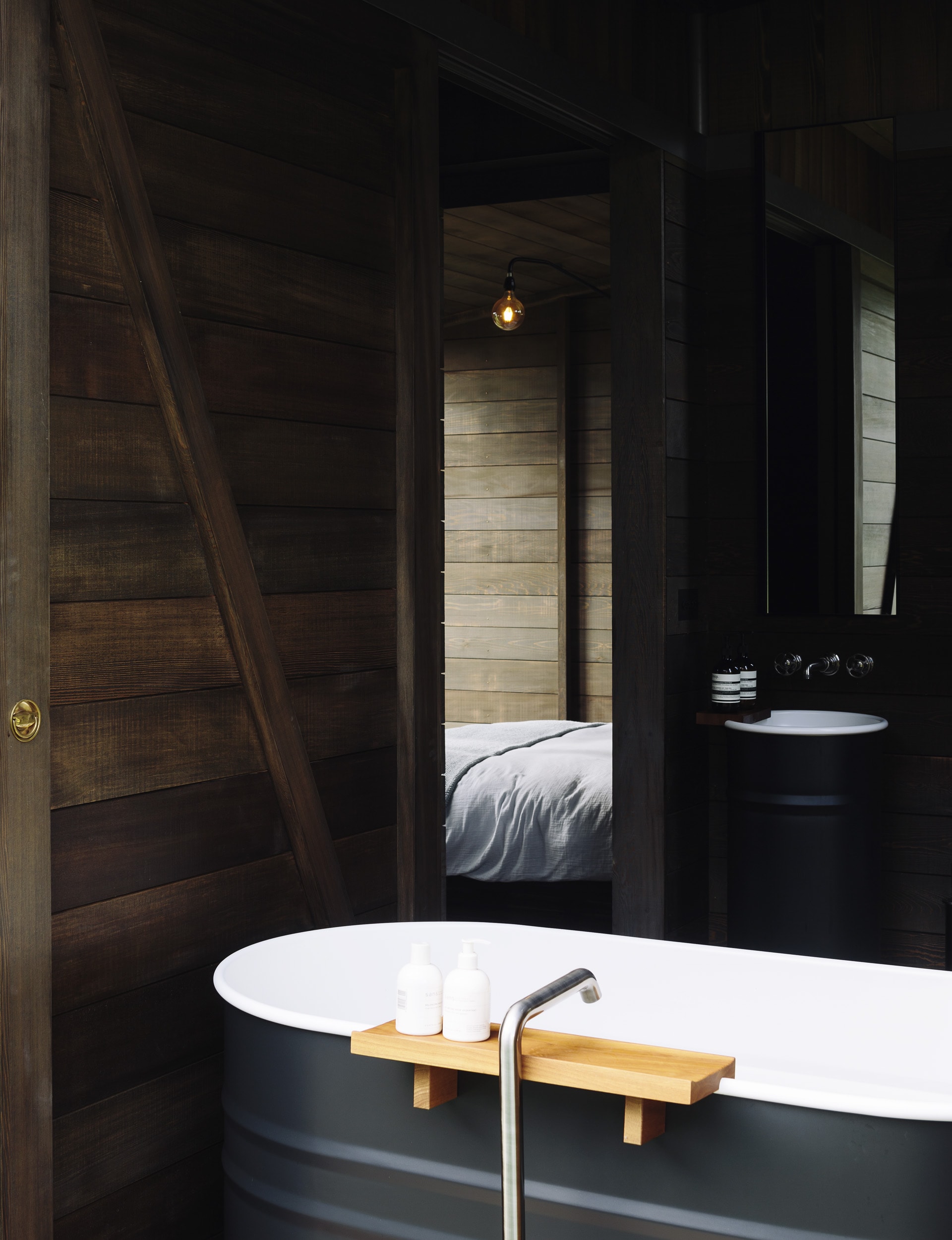
The living cabin is, in essence, one room – a place to cook, eat and relax. A fireplace takes up a corner. Cabinetry is placed loosely, sitting below the ceiling to get a sense of the room’s edges. A tall unit contains a fridge and pantry. The island references a school camping set-up – it sits on legs, with canvas drops to enclose storage. Instead of being a fixed element, the gas cooker sits informally on the work surface. The sleeping cabin is slightly longer in its proportions, to allow bedrooms to be placed next to each other, and still face the view. The bathroom is tucked in behind them.
The building’s edges are open, blurring the boundaries between internal and external spaces, and eliminating the need to build covered areas. It’s another camping reference but there’s nothing here to suggest the built structure crosses a line to become a cliche of camping. “You can only design to glean some of the aspects that people like about camping – openness, informality and connection to the outdoors,” says Kay. “We were not going to make it feel like a literal camping experience. But we are interested in what makes camping enjoyable. Developing the brief was definitely an enjoyable process.”
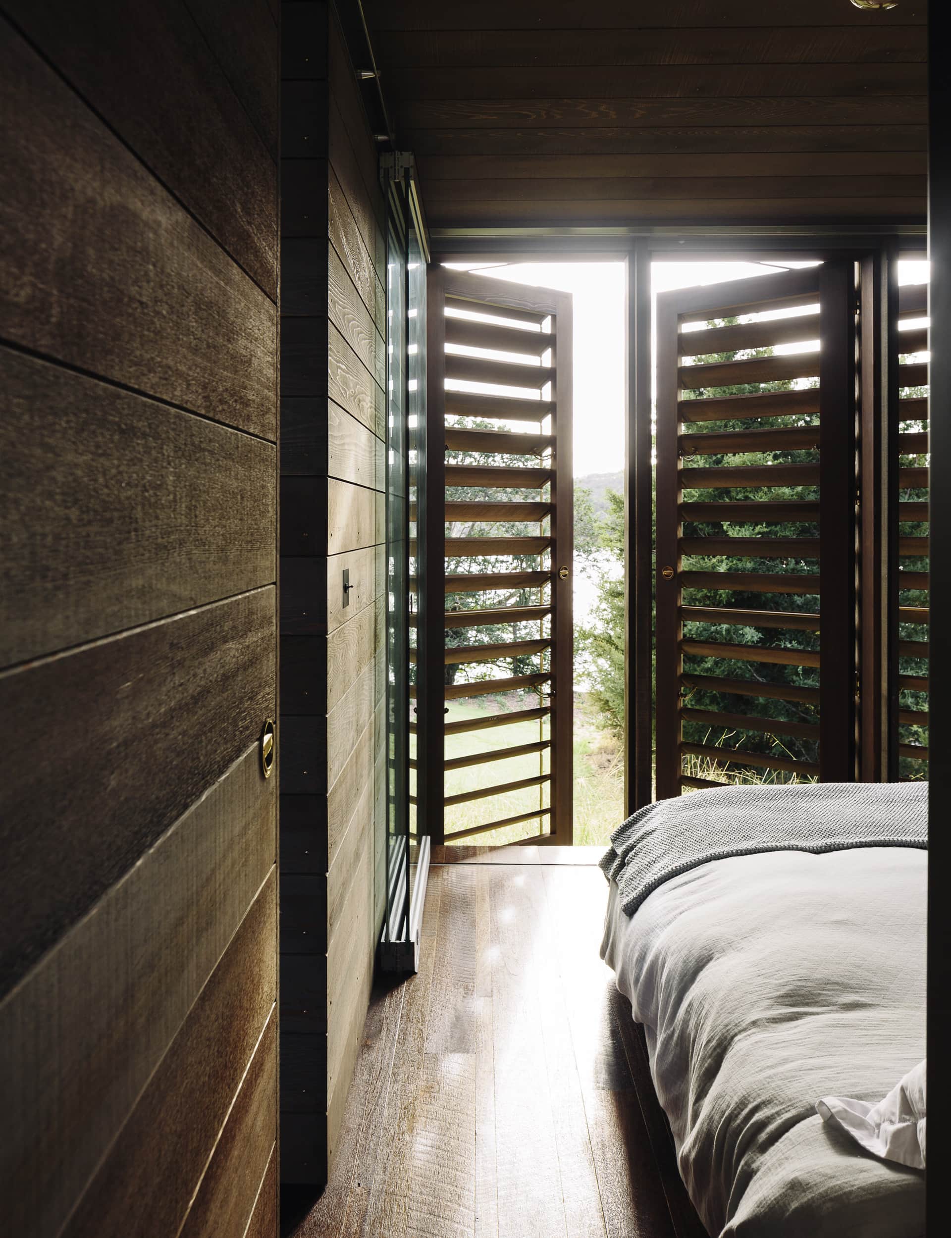
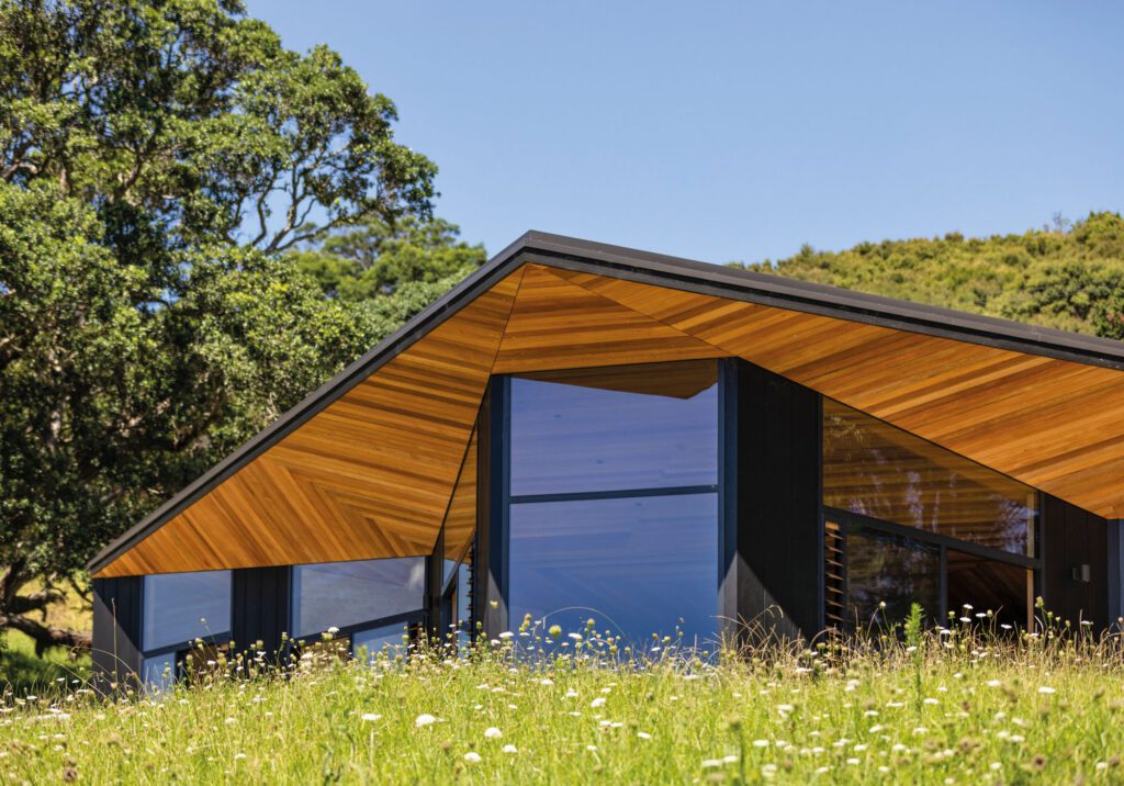
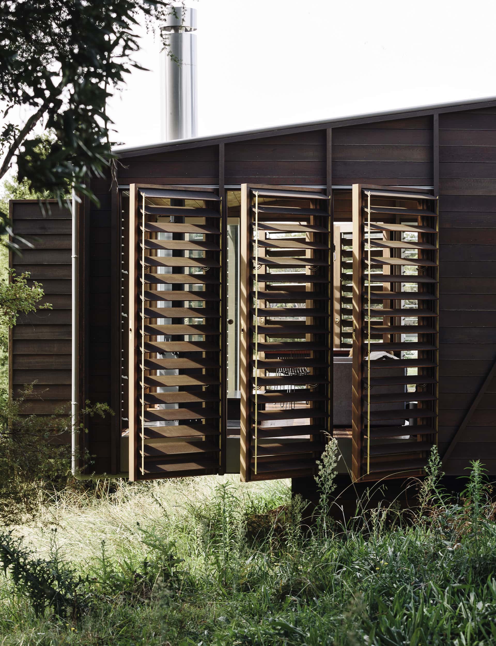
The exterior palette needed to be as natural as possible to help blend the structures into their environment. The exterior is wrapped in richly oiled cedar that will fade and age. The shutters are also cedar. The roof and metal work (including downpipes and guttering) are zinc, which will soften and mottle.
Cedar lining is combined with oak flooring for texture and warmth. The floor becomes concrete as the cabins touch the land. “Rather than having the floor change from outside, which is gravel and grass, to the interior surface at the enclosure line, we like the sense that the threshold has been brought in,” says Kay.
The enclosure line of the shuttered exterior took time to resolve, balancing openness through layering, yet still maintaining a sense of enclosure while the cabins are occupied and containment when vacant. There’s no ‘soap-on-a-rope’ at this ‘camp’, but the retreat is treasured for the hard work and extrapolated thinking that has gone into the charm it embodies. So much so that the owners have not yet put any more pegs in the ground.
This article was first published in HOME New Zealand. Follow HOME on Instagram, Facebook and sign up to the monthly email for more great architecture.
Words by: Jo Bates. Photography by: Simon Wilson.
