A sophisticated retreat by Architecture+ at Medlands Beach on Great Barrier Island rethinks conventional bach living. See why it won the Best Interior award, sponsored by Dulux, for Home of the Year 2019
[jwp-video n=”1″]
Home of the Year is brought to you in association with Altherm Window Systems
Not so long ago, Stuart Gardyne spent a night at the house he designed on Great Barrier Island, only to discover that the neighbours use the place as a thoroughfare to reach other homes. He got talking with them, and it quickly became apparent some are less than fond of their urbane, intellectual neighbour, with its hooded eyes and inward focus. They found it austere and closed. “It doesn’t have the cottagey charm,” says Gardyne, of Wellington-based Architecture +.
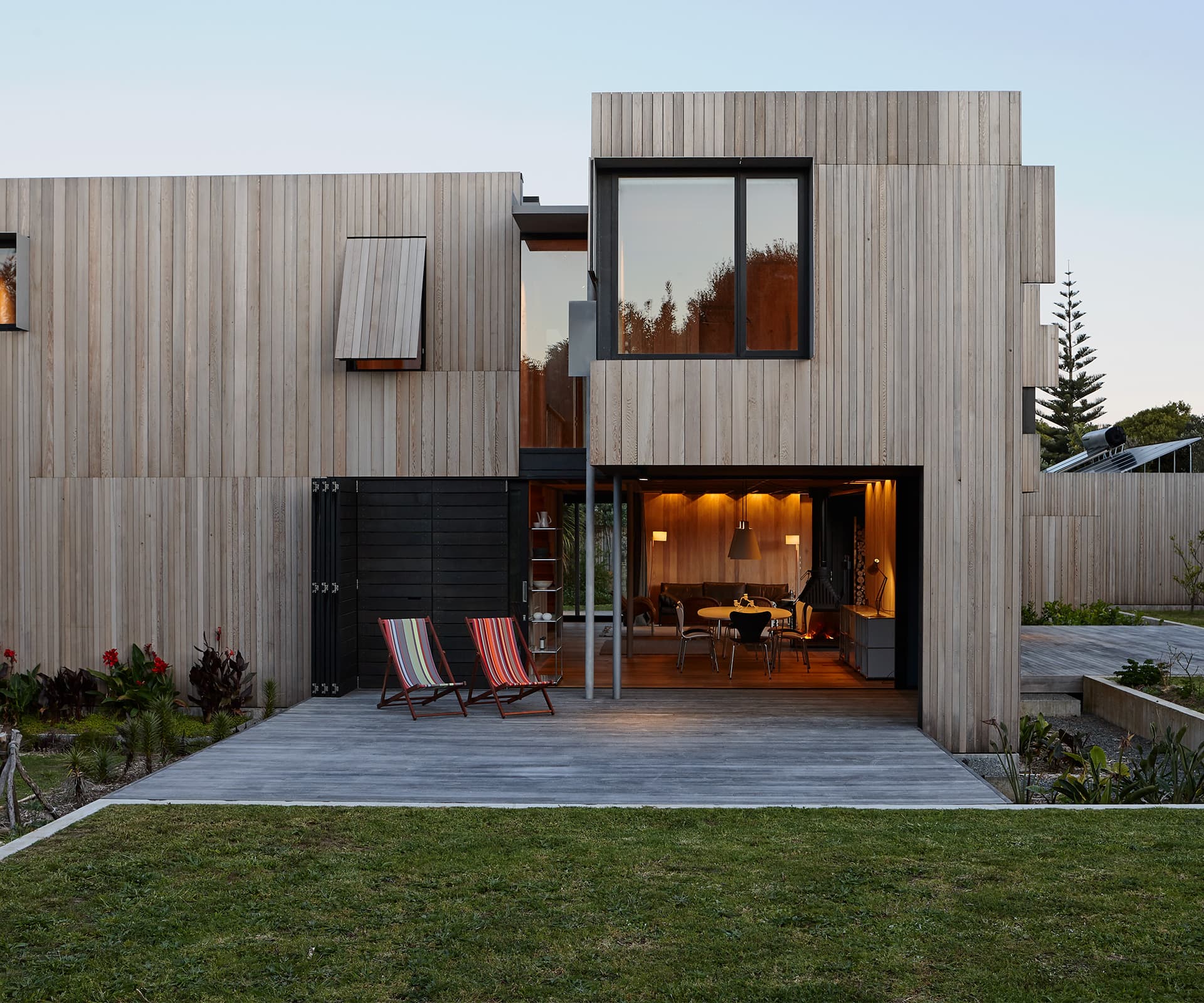
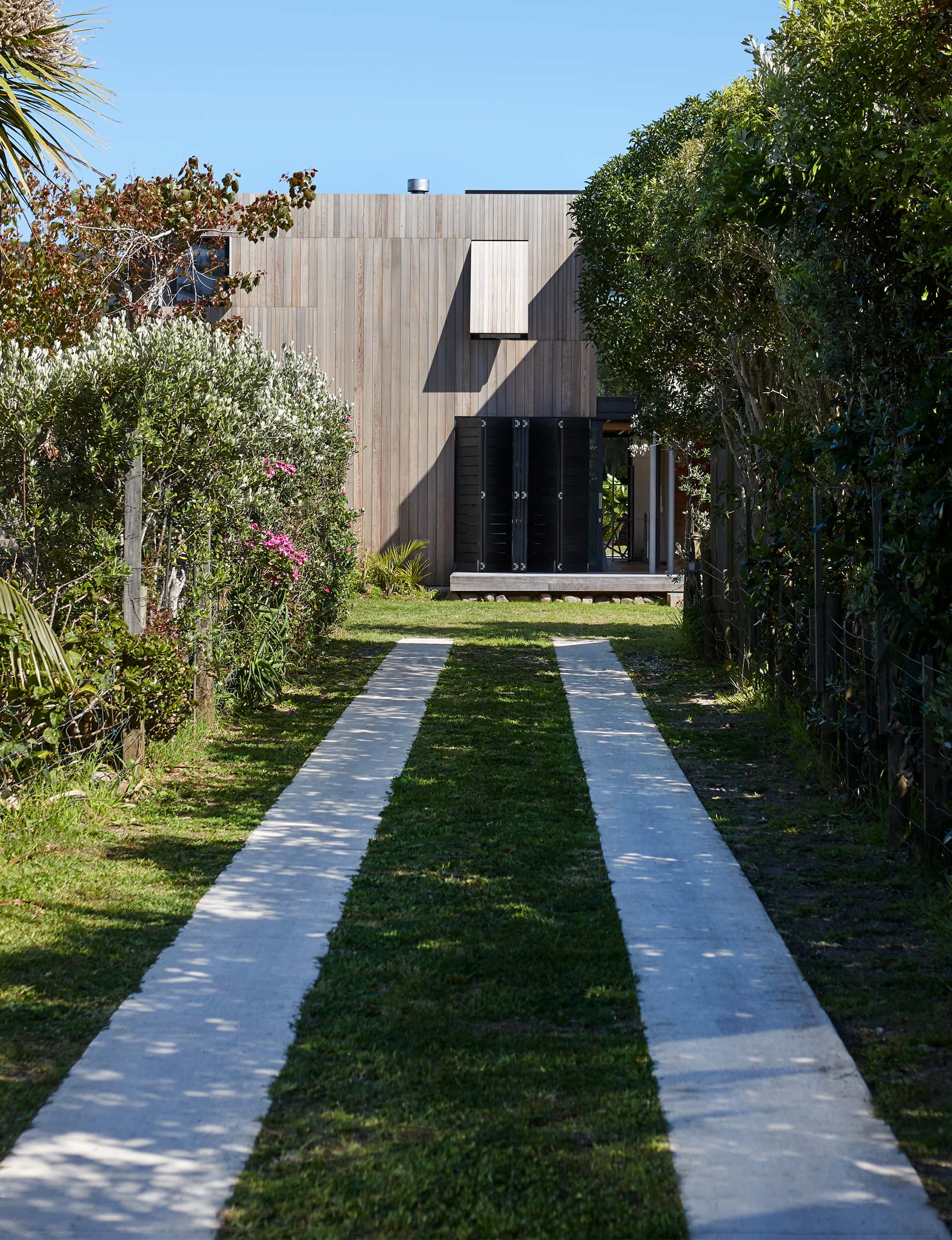
In fairness, the house isn’t closed, and it’s far from unwelcoming, though it does have an attractively monolithic look that might be perceived as imposing. Set on a garden block down a long driveway, the grassy approach is deliberately informal. There isn’t a front door: a stroll across the lawn takes you to a deck and in through a sliding glass door, from where you look straight through the house and out the other side.
There is a sort of calm resolve to the house, which was designed for a New Zealand couple while they were based in Beijing, and their four children. Rather than austerity or closure, there’s a sense of retreat and respite woven into the very skin of the house – early on, the owners expressed a desire for a courtyard house, not a beach house.
It’s something of an intriguing brief for a coastal home – so often we expect them (and more so on Great Barrier Island) to be glorified tents, with openness and views from every room. “It was about having a house that’s more inward-focussed than outward,” says Gardyne. “That doesn’t imply disengagement with the landscape, but there’s an intimate engagement with the site.”
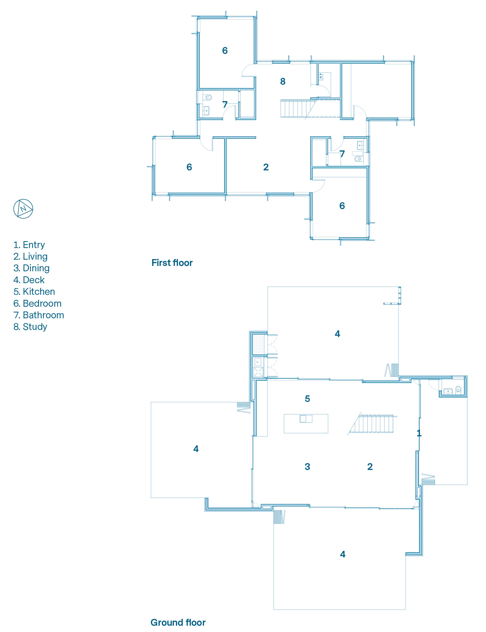
Ironically, the courtyard approach was ditched early on in the design process, although the idea of retreat and respite stayed. Planning regulations limited the footprint of the house to 15 per cent of the site, which meant either building something very small, or something over two storeys. Gardyne’s response was to design a two-storey home set within a ‘pinwheel’ of four courtyards, each with its own covered outdoor space created by the bedrooms above.
It’s a house of geometry and clever screening, where precise lines and volumes align to create a dynamic series of spaces with different aspects and uses – mornings on the eastern deck; afternoons facing north; cocktails on the western deck; and late-summer evenings on the northern deck. “The ground floor connects with different spaces depending on the weather, the time of day and number of people within a quite simple arrangement,” says Gardyne. “That simplicity allows a lot of flexibility with how it’s used.”
No matter where the wind blows and rain falls, there’s always shelter in the lee of the house. Downstairs doors can be covered with sliding black cedar screens, and some upstairs windows have top-hung timber screens over them. Downstairs, tall, narrow solid-timber shutters sit in front of mosquito screens, allowing you to open and close the house in carefully calibrated ways, depending on the vagaries of the elements. “Often it’s beautiful and warm and humid, but you’re still affected by rain,” says Gardyne.
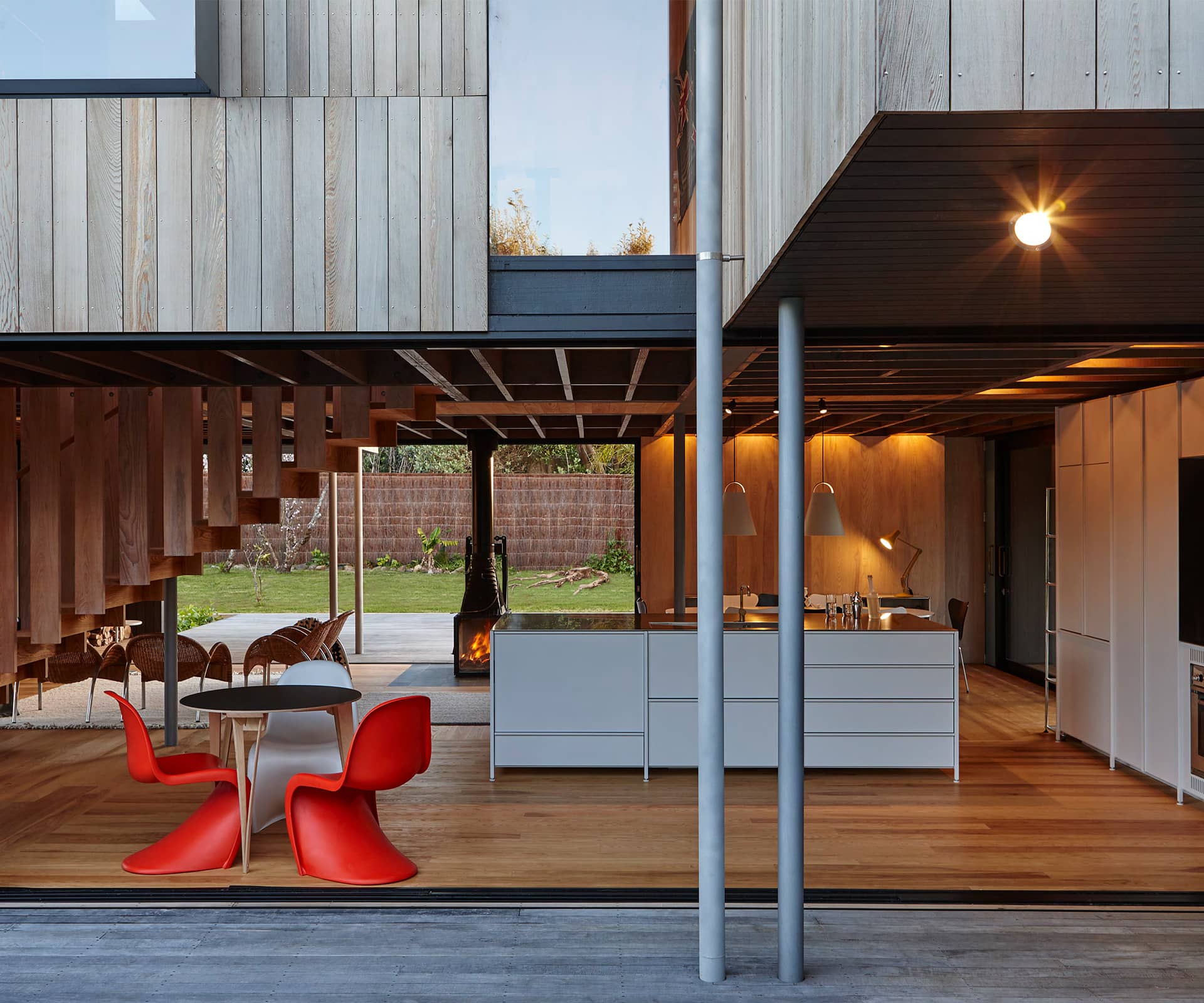
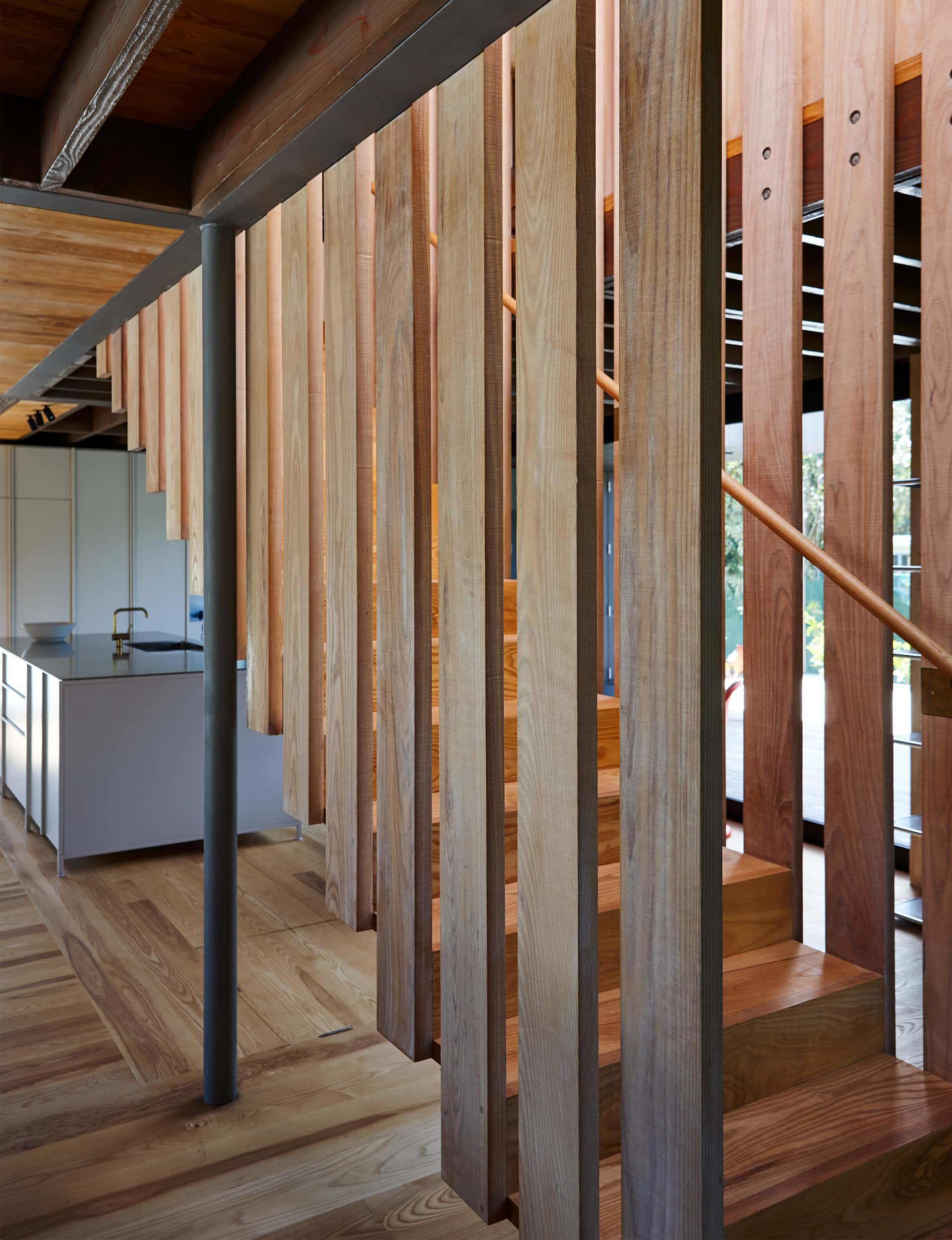
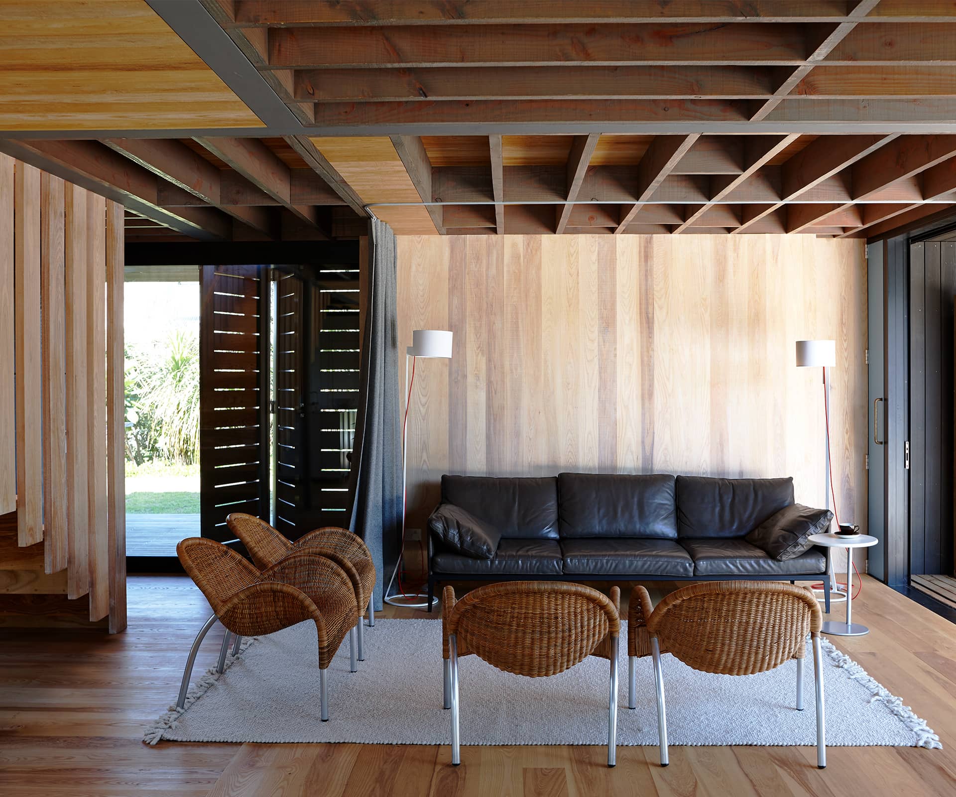
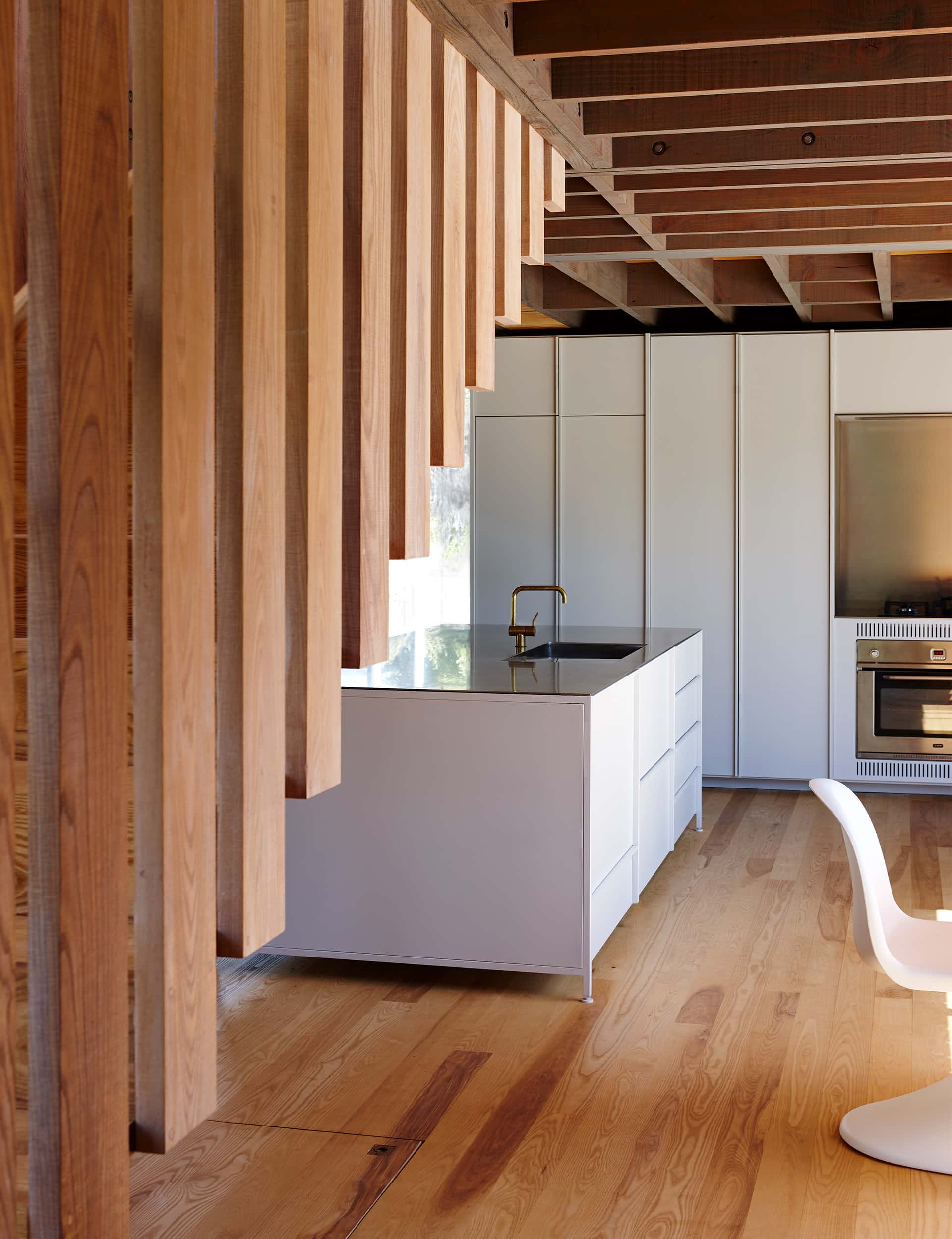
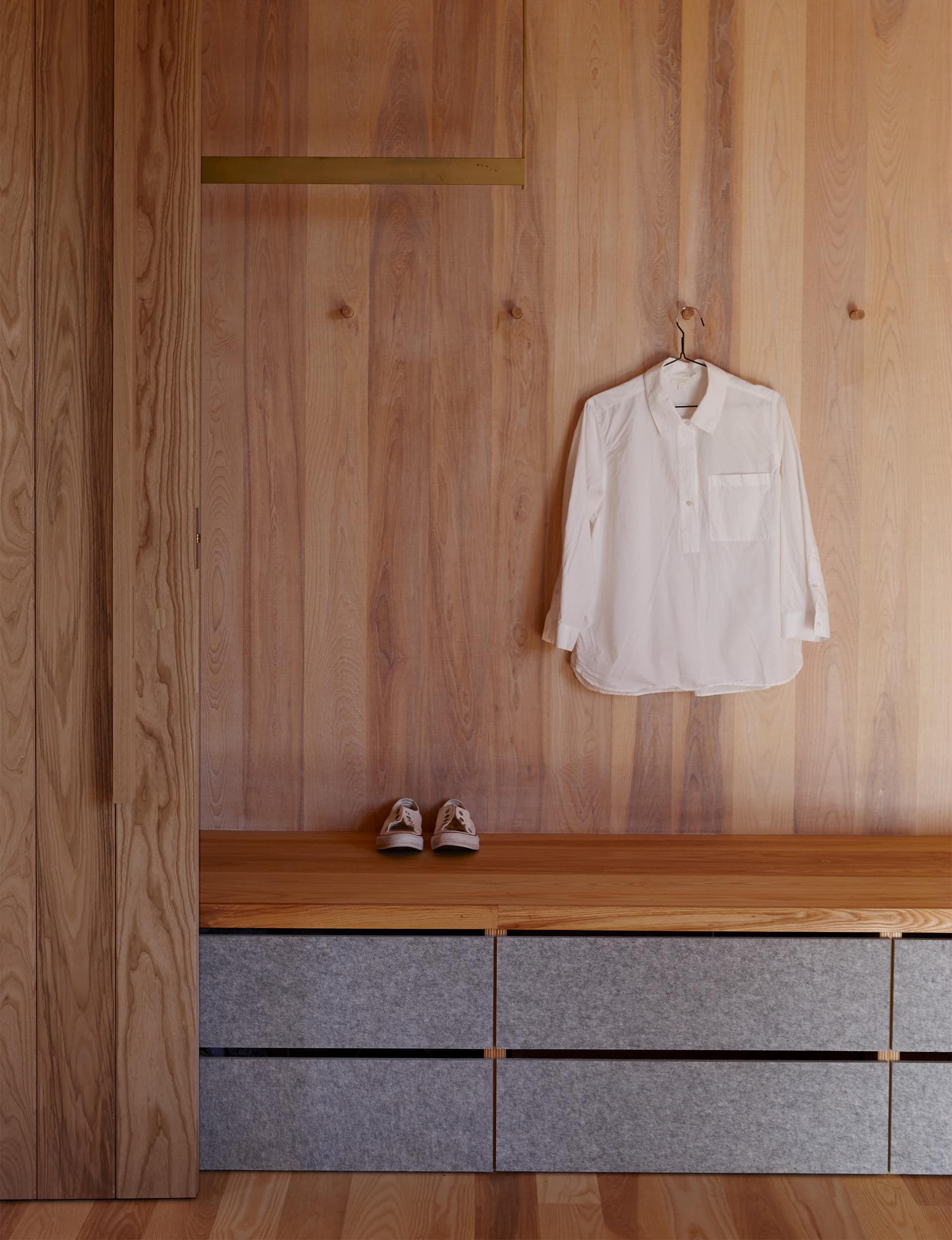
There’s a loose informality to the rooms, rather than an overly programmed approach, an impression emphasised by the use of a single timber – American white ash – across the walls, floor and ceiling. Different uses are delineated only by the changing board size and their orientation; even the ‘KXN’ kitchen by Auckland-based designers IMO feels less like cabinetry and more like furniture.
[quote title=”The materials aren’t seeking your attention – they’re a backdrop to the furniture and activity… ” green=”true” text=”The house is a background for life.” marks=”true”]
A curtain draws around the living area to create an extra sleeping place, and instead of cabinetry and fixed fittings, the owners’ lovely collection of classic, contemporary design pieces have been deployed around the house, which allows them to change arrangements at a moment’s notice. “You can overdo the details,” says Gardyne, “have too many shapes and forms, and then anything out of place feels wrong.”
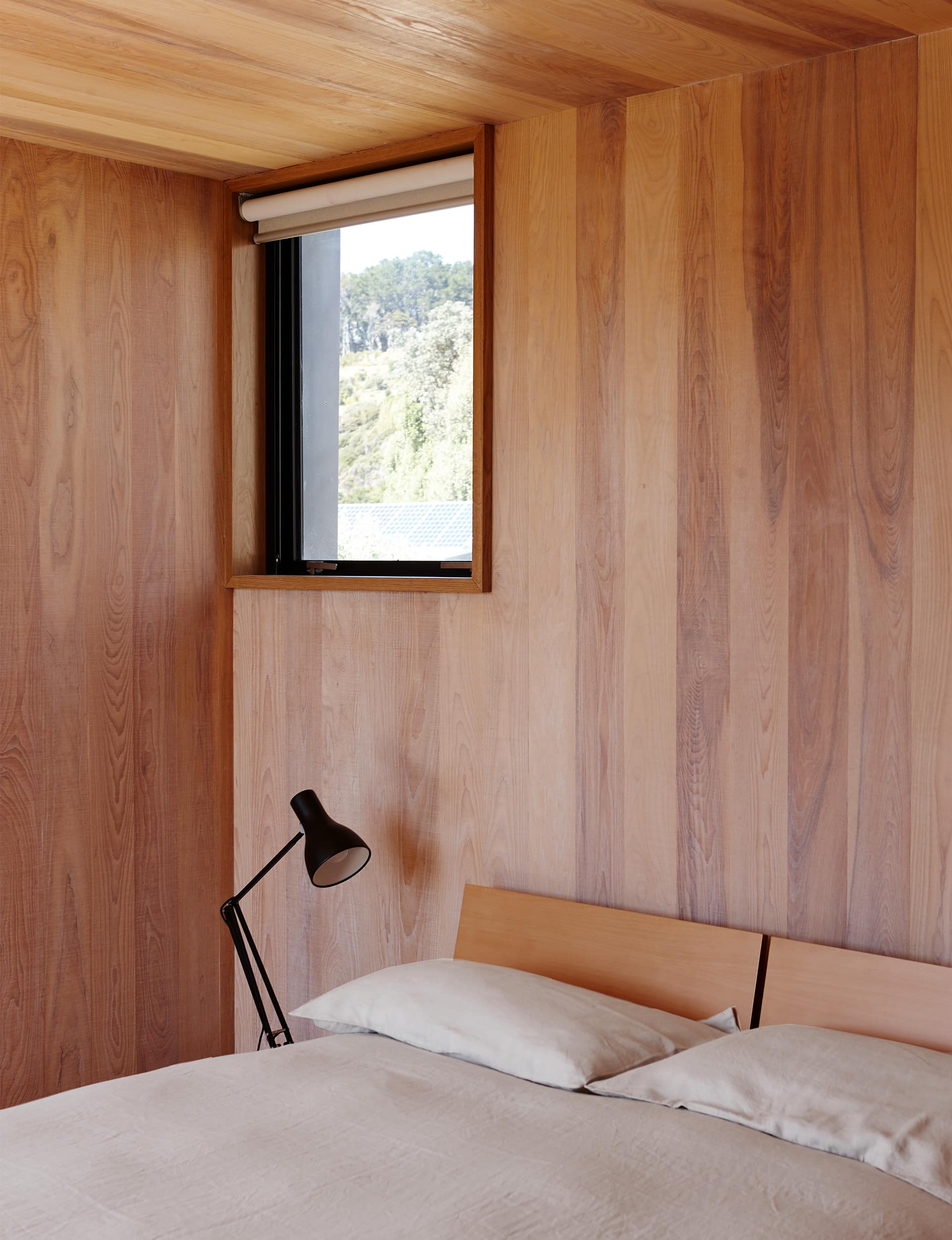
Upstairs, the same thinking applies. Gardyne noticed that the owners didn’t have what you might call a ‘master’ bedroom in their previous home. Instead, over time, they had occupied a series of similar-sized rooms in different ways. There are four bedrooms of the same size, each extending over the space below to create sheltered outdoor areas. They’re spare, even Spartan, and each has a brass clothes hanger, built-in drawers and a shelf for two suitcases since most people arrive on the island by plane.
There are two identical bathrooms. “I liked that,” says Gardyne, “and it was a big part of this design – it could be all the family in residence, or it could just be the owners or the children with friends. We didn’t want bedrooms for any particular members of the family – whoever is there will choose a room that suits.”
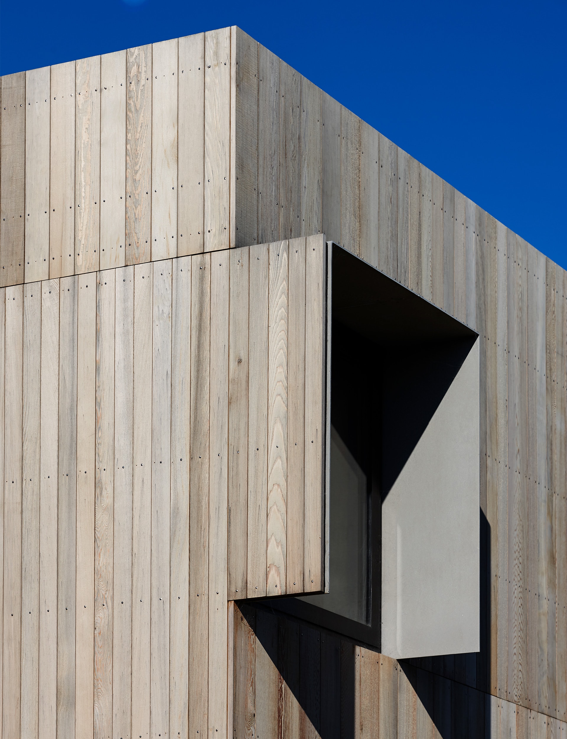
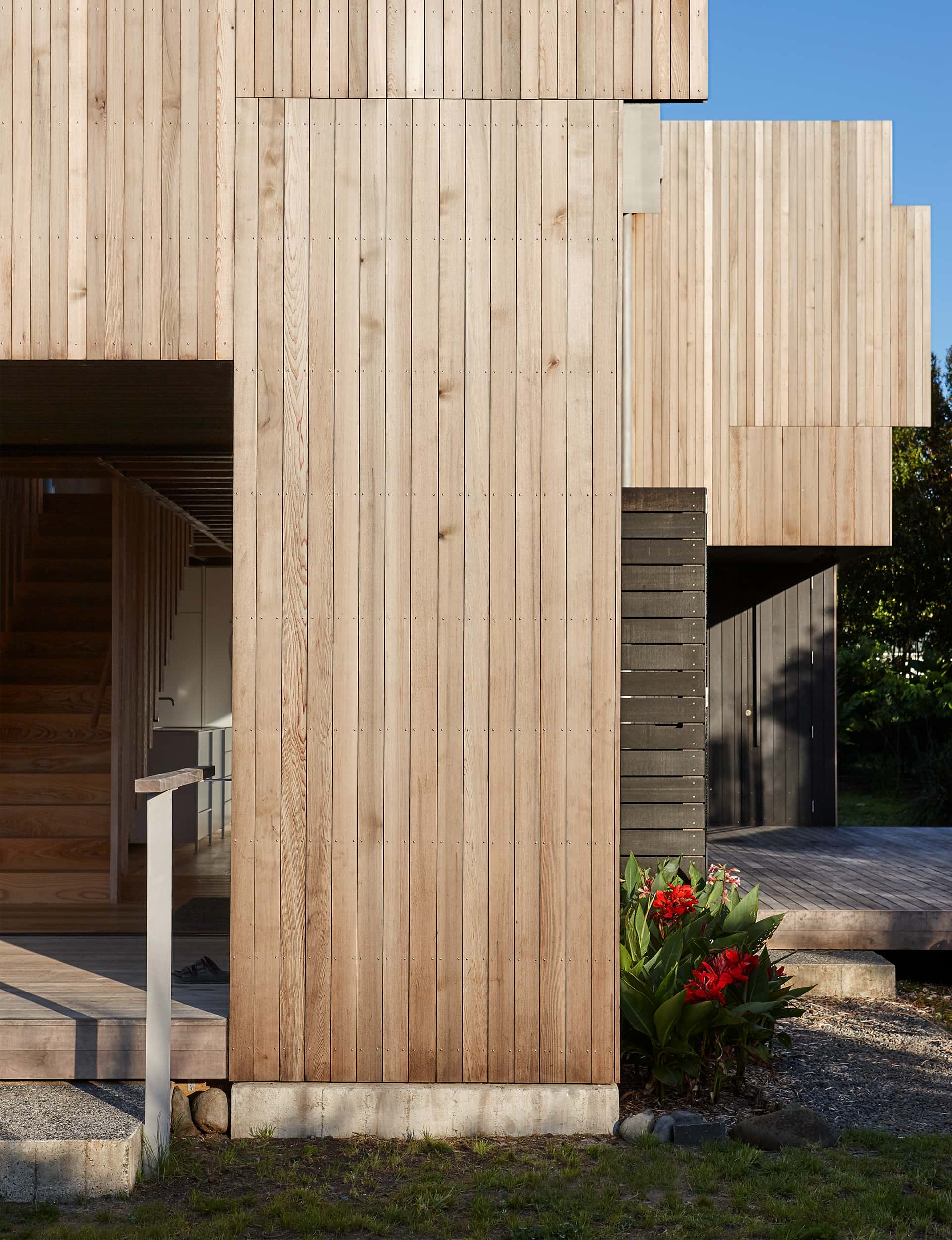
Clever geometry extends to the exterior, where a cedar rainscreen is fitted over a waterproof plywood box, hiding unsightly flashings. Here, too, cedar boards change size and direction, sometimes extending beyond the building footprint. It was a direct response to a recent job where boards were programmed to fit perfectly across each elevation and around windows, only the builders hadn’t gone through with this plan. “We thought we’d just work out where they should start from and let them work their way across – a bit like ceramic tiles in a bathroom.”
[gallery_link num_photos=”22″ media=”https://www.homemagazine.nz/wp-content/uploads/2019/04/PinwheelHouseGreatBarrier_architecture_13.jpg” link=”/real-homes/home-of-the-year/great-barrier-bach-architect-stuart-gardyne” title=”See more of this home here”]
It’s a house the neighbourhood will no doubt get used to; mainly thanks to its politeness. It’s not intended to be an object and it’s not a piece of sculpture, says Gardyne. “The materials aren’t seeking your attention – they’re a backdrop to the furniture and activity and what you’re doing in the space. The house is a background for life.”
Words by: Simon Farrell-Green. Photography by: Jackie Meiring
[related_articles post1=”94246″ post2=”93721″]
