Craig Wilson resolves a steep, narrow site with prefabrication technology and a little humour
‘Don’t pack a sad’. The artist’s message on fluted plastic board in the kitchen is pointed, droll. Indeed, retaining a sense of equilibrium was advantageous in this project. Owners Craig and Kristin Wilson built a home after seven years of living – strike that – existing in the worst house on a not-so-favoured street.
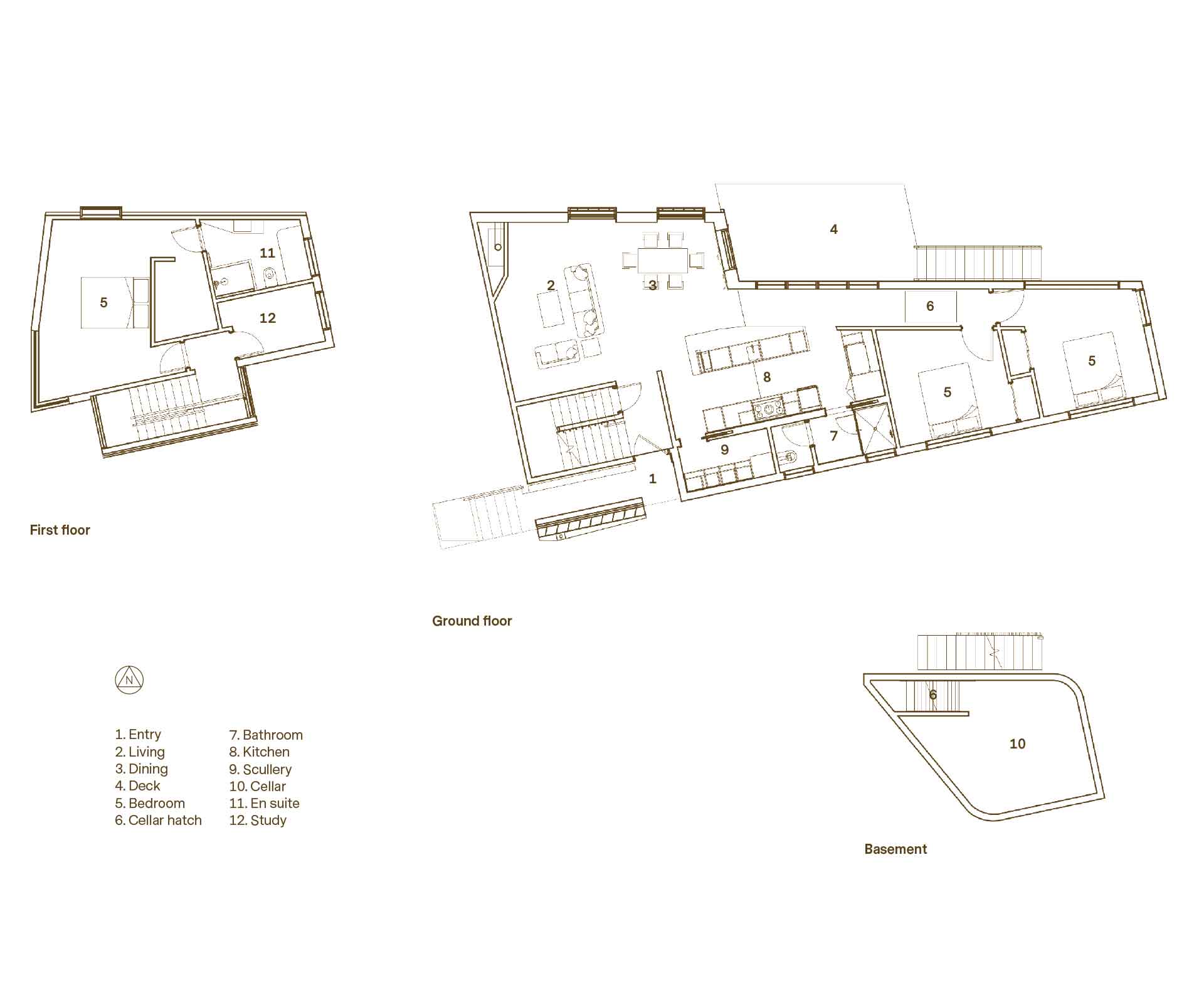
It was “interesting times”, says Craig, an associate director at TOA Architects, who knows the stats like the back of his hand. The section: 585 square metres, but only 13.5 square metres wide. “The rear 25 percent fell under the drip line of a massive pōhutukawa that we love.” Previous house: 47 square metres – four power points, five lights. Current home: 156 square metres (not counting the wine cellar) uses 43 panels of cross laminated timber (CLT) for the floors, walls and ceiling. The smallest panel, 1500 x 300mm, is beside the hatch to the wine cellar; the largest panel is 14.4 x 2.3 metres and spans the length of the southern wall.
But it’s not the numbers that tell the tale. It’s the stories. An aerial photograph of Grey Lynn, Auckland, taken in 1940 shows villas at the top of the road, then bare fields that lead down the hill as far as the speedway. “The land wasn’t built on until the 50s due it being steep and adjacent to a small quarry,” says Craig. Yet build they did, on a section that fell into a gully and also had a cross slope. They perched the tiny uninsulated cottage next to the street to avoid the contours from hell. Neighbours – left, right and centre – were as close as propriety would allow.
[quote title=”From concept sketches where members of daft punk…” green=”true” text=”strutted in helmets on the deck and in the garden, to this.” marks=”true”]
It went on the market in 2009 and the Wilsons saw their opportunity. “We offered as much as we could afford and were prepared to live in the house while we built up capital.” They held onto their dream on winter mornings while they clung to the covers, frost on their breath and ceiling panels threatening to crash down on their heads.
When Craig began working on the concept designs with his friend Nicholas Dalton, director of TOA, they researched the history of the land and honed in on the name of the road – Tuarangi. Turns out, it’s Māori for ‘outer space’. They were off. “It gave us a narrative; the interplay between sharp, technical forms and the natural landscape,” says Craig.
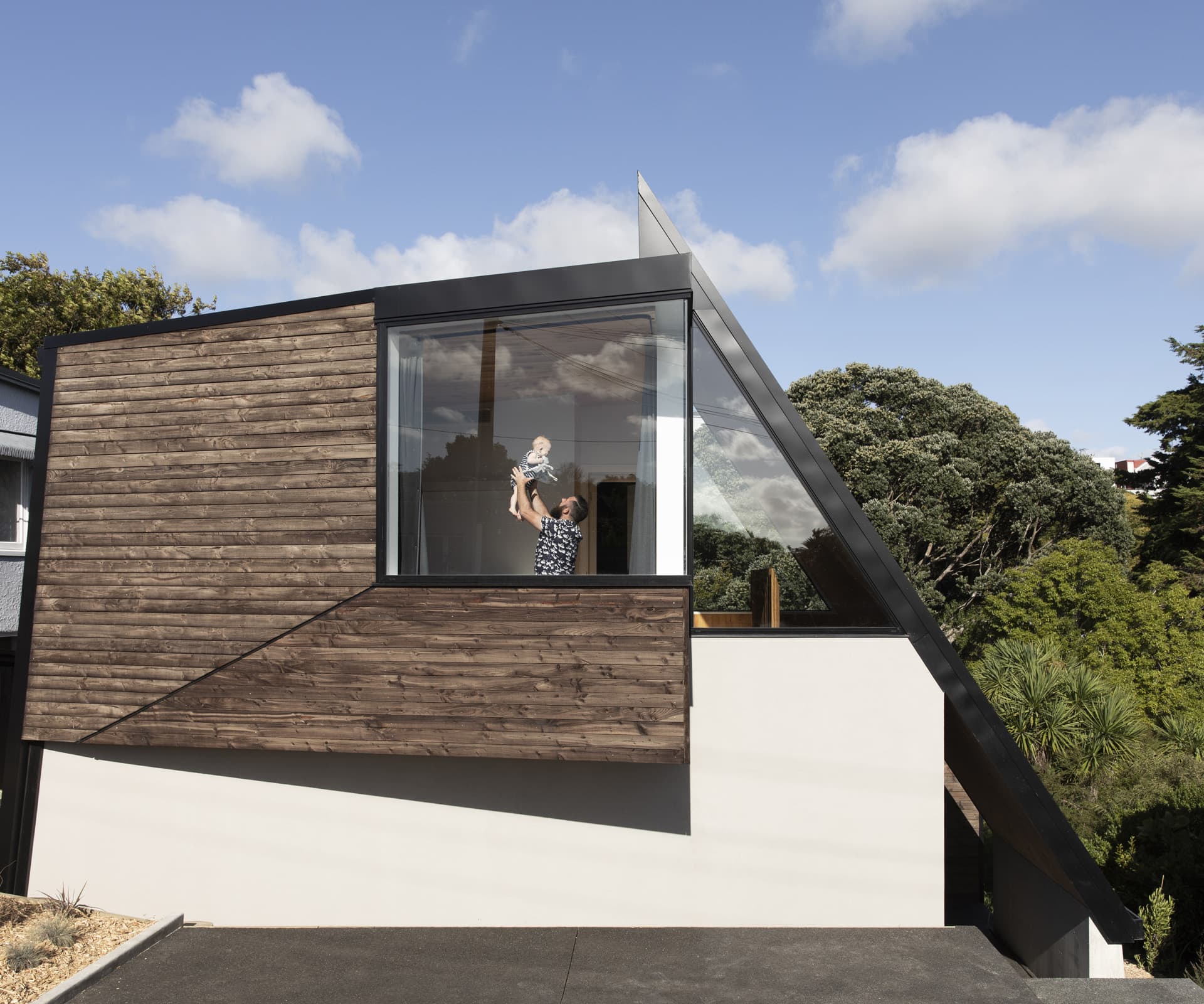
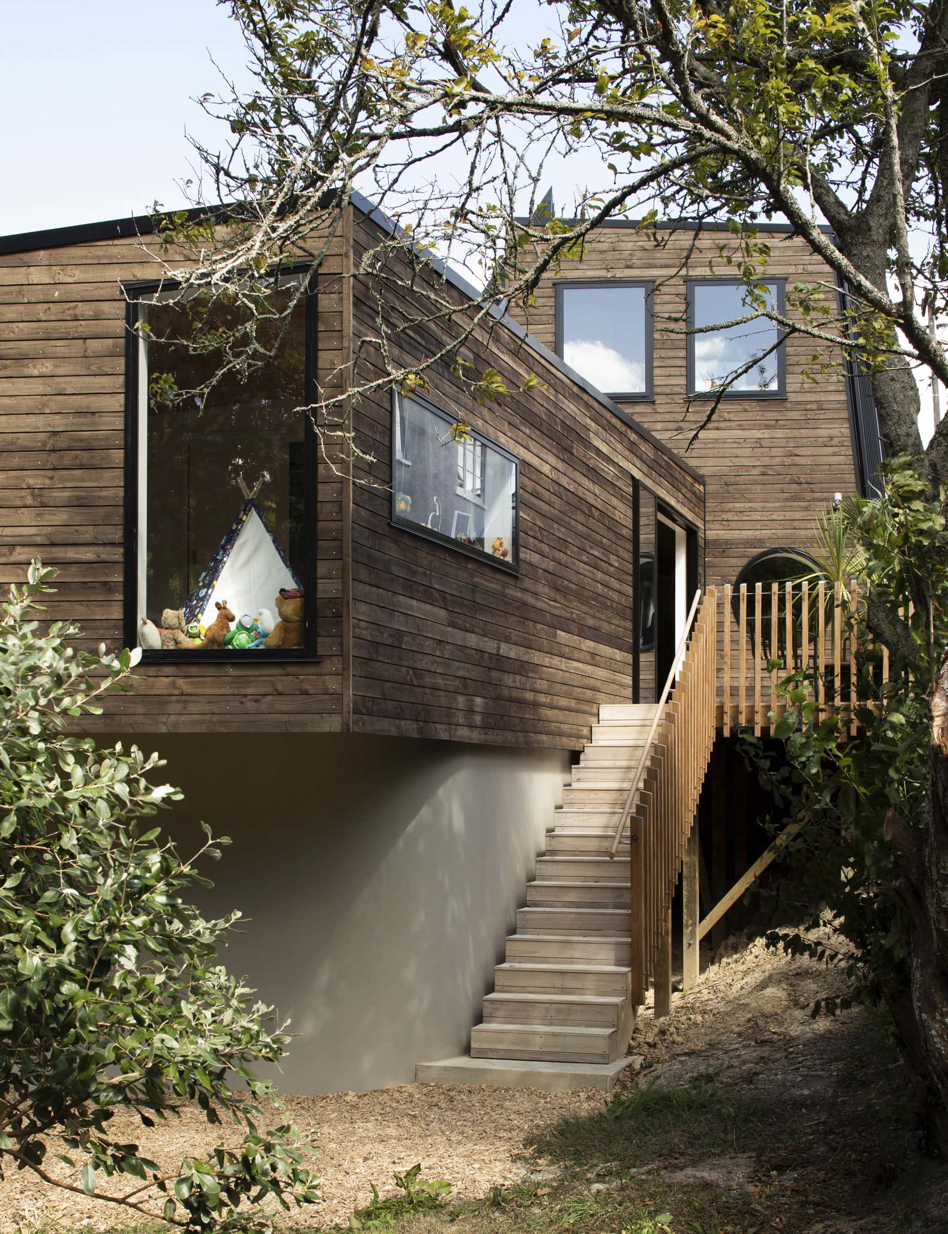
Having shivered through one too many grim winters, Craig took further inspiration – Prometheus, the Greek god who stole fire from Mount Olympus, and Mahuika, a Māori deity who held the secret to making fire. From concept sketches where members of Daft Punk strutted in helmets on the deck and in the garden, to this: a futuristic whare. Street-side, it’s parked like an angular spaceship, a shark-tail entry slicing into the sky. To the rear, the tapered form cantilevers above the ground.
The entry journey channels beneath a steeply angled roof to the front door. It plays with the Frank Lloyd Wright concept of compression and release. Playing with ideas is what architects do, especially in the design of their own home and Craig, a member of Prefab NZ, couldn’t wait to test-drive some new technologies. Kristin, who was pregnant at the time and busy practising law, gave him free rein.
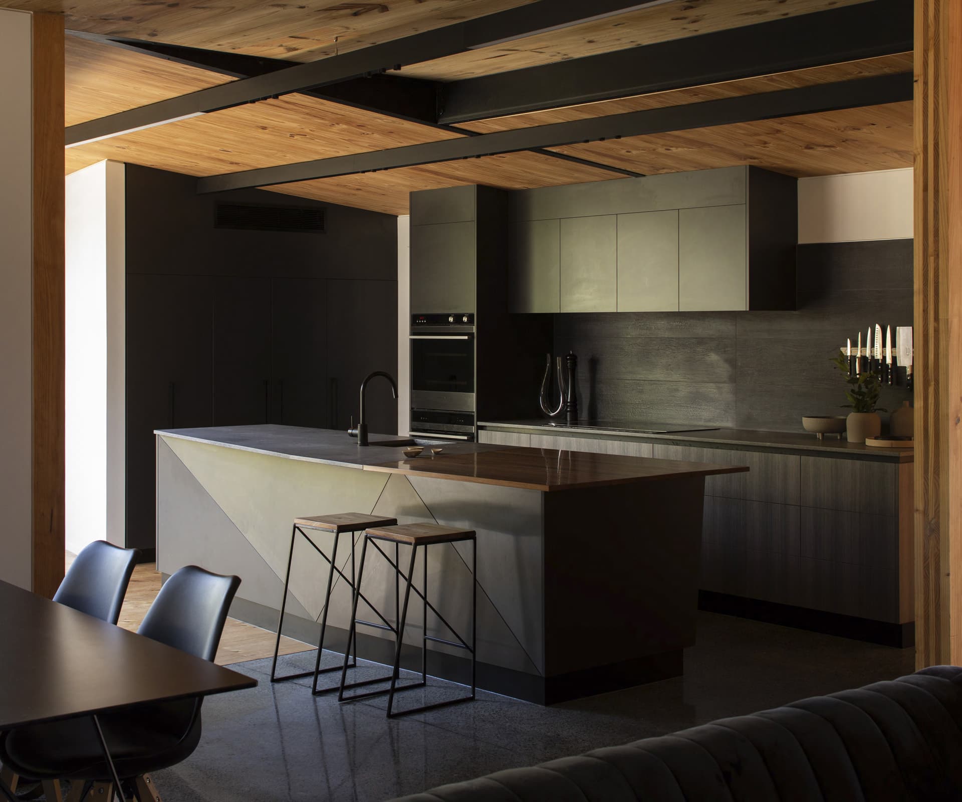
CLT was a material he wanted to explore. “It’s honest because it’s the structure and interior finish. A standard frame wall needs all sorts of things done to it from different trades, so it also speeds up construction.”
Once the concrete foundations were poured and the wine cellar safely encased in the basement, the crane came. CLT panels were lifted into place and the superstructure was erected in 10 days.
[quote title=”At TOA, we always start with an abstract concept or narrative” green=”true” text=”derived from whenua or tangata” marks=”true”]
Something else that pushed the boundaries: the rough-sawn Douglas fir cladding with a coating of iron vitriol instead of stain. “The chemical reacts with tannins in the timber to create a protective layer. It has been used in Scandinavia for hundreds of years,” says Craig. A steel roof with a tray profile is a cost-effective feature that waterfalls down to clad parts of the home.
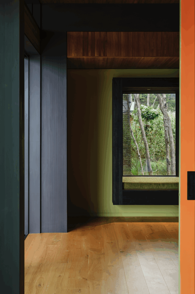
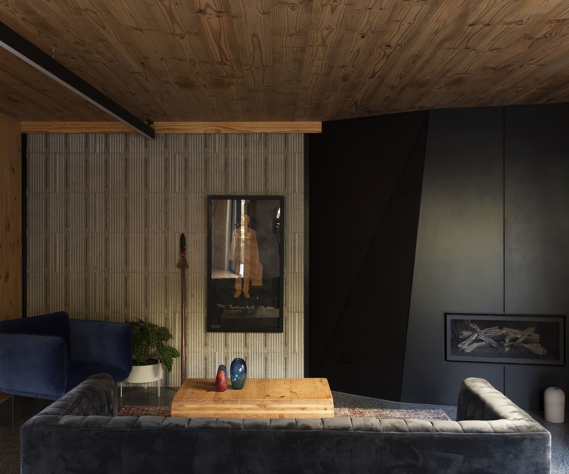
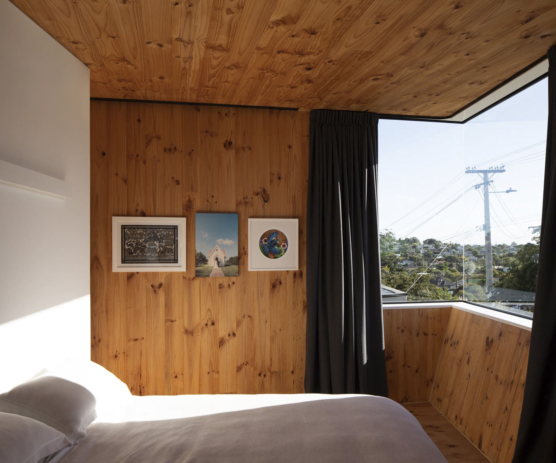
Inside, the honeycomb tones are a warming counterpoint to the strength of the steel. There are other elemental parts to the design, too. A concrete-block wall shows the bubbled patterning of its polystyrene formwork. Fractured forms on the hearth and island bench, bathrooms wrapped in dark stone tiles, and angular geometry to the ceilings are a subtle homage to the fire gods. In the main bedroom on the upper level, there are only two 90-degree angles to be found. Walls slope this way and that and the door to the en suite appears to be on a slant.
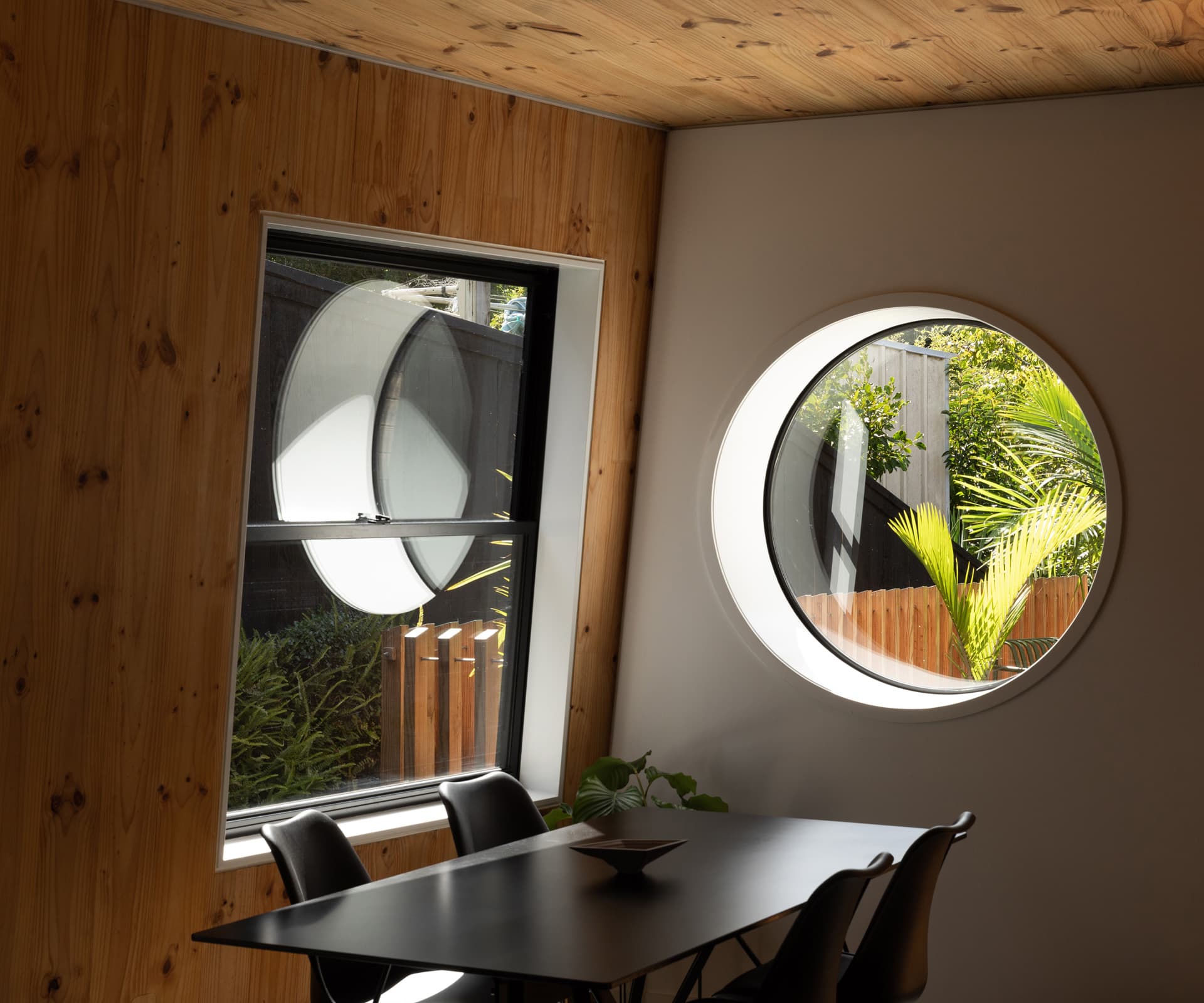
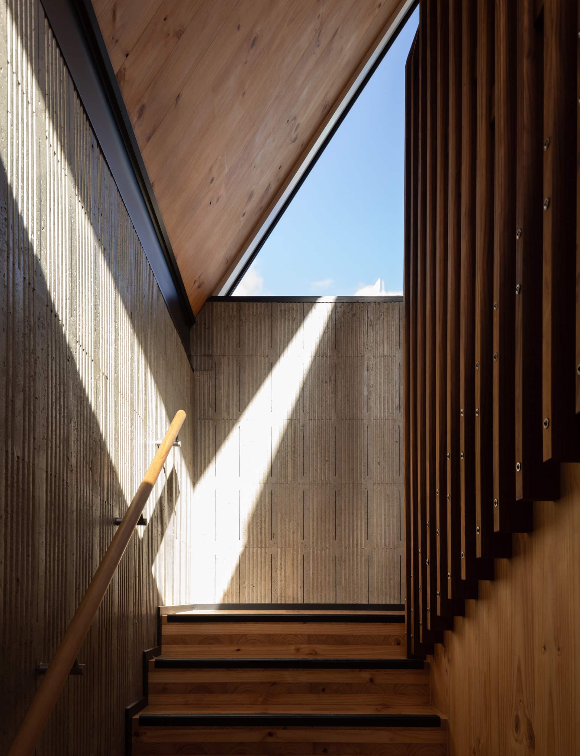
Windows, placed for privacy, are like portals – a horizontal frame of the faraway Waitākere Ranges, a vertical outline to the specimen pōhutukawa in the back garden, a porthole aperture to the deck. Walking up the stairs to the main bedroom always gives Craig reason to pause. Through the sharp, triangular glazing he can see to the street where urbanites are on the move – cars, bicycles and Lime scooters zoom by.
[gallery_link num_photos=”15″ media=”http://www.homestolove.co.nz/wp-content/uploads/2019/06/HE0619_H_Tuarangi-House_DST-TUARANGIROAD0219-6591.jpg” link=”/real-homes/home-tours/home-wasnt-afraid-to-push-boundaries-with-extreme-angles” title=”See more of this home here”]
Looking up, he sees the weather rolling in and, at night, the stars. In late 2018, when the couple moved in, those stars aligned to deliver a searing summer that stretched on and on. With a young baby in tow, and a penchant for entertaining, the south-west facing deck and adjoining kitchen were well used as the conversation and wine flowed. Craig was none too happy about the potential for red-wine stains on the 1000-year-old swamp-rimu benchtop. “It gave me conniptions,” he says. “I’d run around with coasters.” But if one day, in the party spirit, the worst should happen, he need only remind himself of that on-the-nail message on the wall.
Words by: Claire McCall. Photography by: David Straight.
[related_articles post1=”94774″ post2=”83547″]

