Inspired by worker’s cottages in the surrounding area, Tobin Smith creates a compact home with a strikingly simple aesthetic
[jwp-video n=”1″]
A bold urban cottage on a quake-damaged Christchurch site
So many open homes, so many sketches. The idea of designing a house before you buy the land is something of anathema in New Zealand: every house is site specific, right? But in Christchurch, Tobin Smith had been noodling around for years with the idea of a modern cottage, based on the small, charming 19th-century designs in the side streets beside Bealey Avenue, just east of the city’s CBD.
“They were quite charming and were close to people’s work,” he says. “And I kept wondering why we weren’t building houses like this for professional couples now. So we thought we’d make a modern interpretation.”
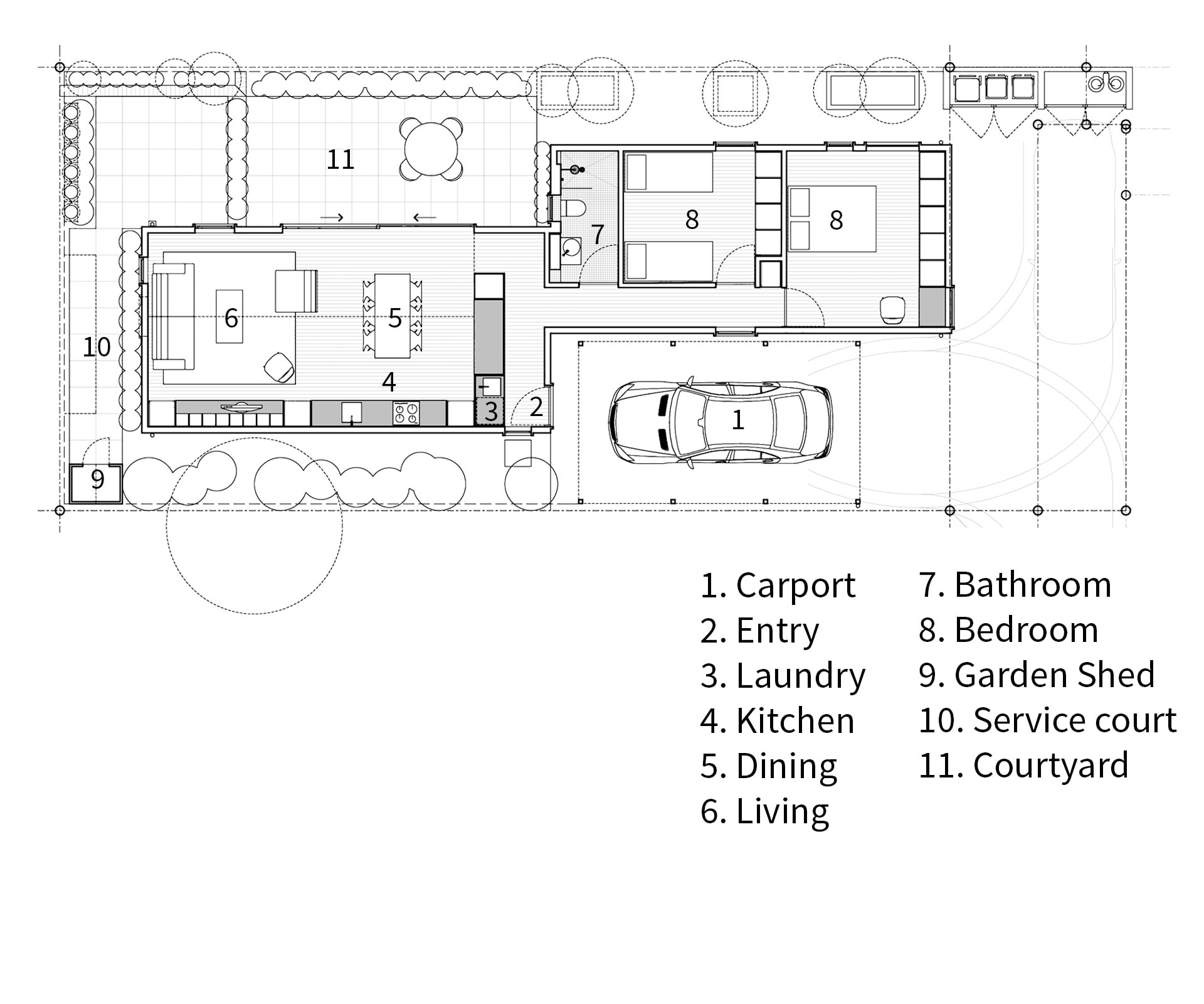
Smith began to design a hypothetical cottage on sites dotted around the area, gradually evolving the idea from the classic pitched-roof cottage – a square with a hall up the middle and bedrooms off the spine – into something more refracted and offset, with living areas in one pitched-roof gable and bedrooms and bathrooms in another. The shapes were simple: rectangles with gable roofs, sliding past each other. “We just wanted a little house,” says the designer. “We didn’t want a big footprint.”
But none of those sites came off and Smith’s schemes never quite came together. He and his wife Hayley missed out on auctions or were rebuffed by owners not interested in selling – until a tiny back section down a long dog-leg driveway across the road from where they were renting came on the market.
At 297 square metres, with classic suburban height-to-boundary rules, it was never going to hold a big house. It had previously been home to a 1990s townhouse, the only one of four to be significantly damaged during the 2011 earthquakes, and demolished.
Smith – who, with partner Blair Paterson at CoLab Architecture, has built a number of projects on earthquake-damaged land around central Christchurch – immediately saw how he could adapt his doodlings into a workable design.
“It ticked the boxes in terms of size and it was quite cheap,” he says. “And although it wasn’t the proportions we had been playing with, we could start evolving this idea into something else.” In essence, Smith’s design splits the classic cottage in two, then slides one gable almost all the way past the other: living areas on the northwest corner, bedrooms to the southeast, an entry in the middle.
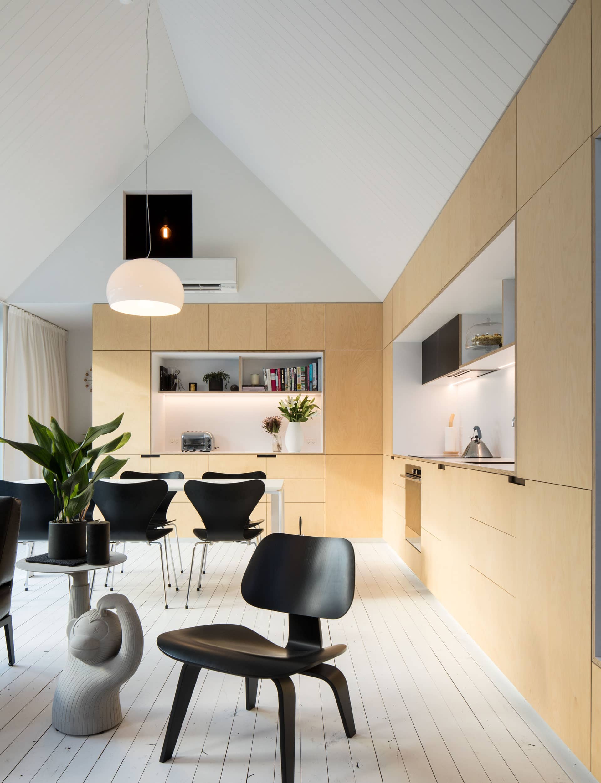
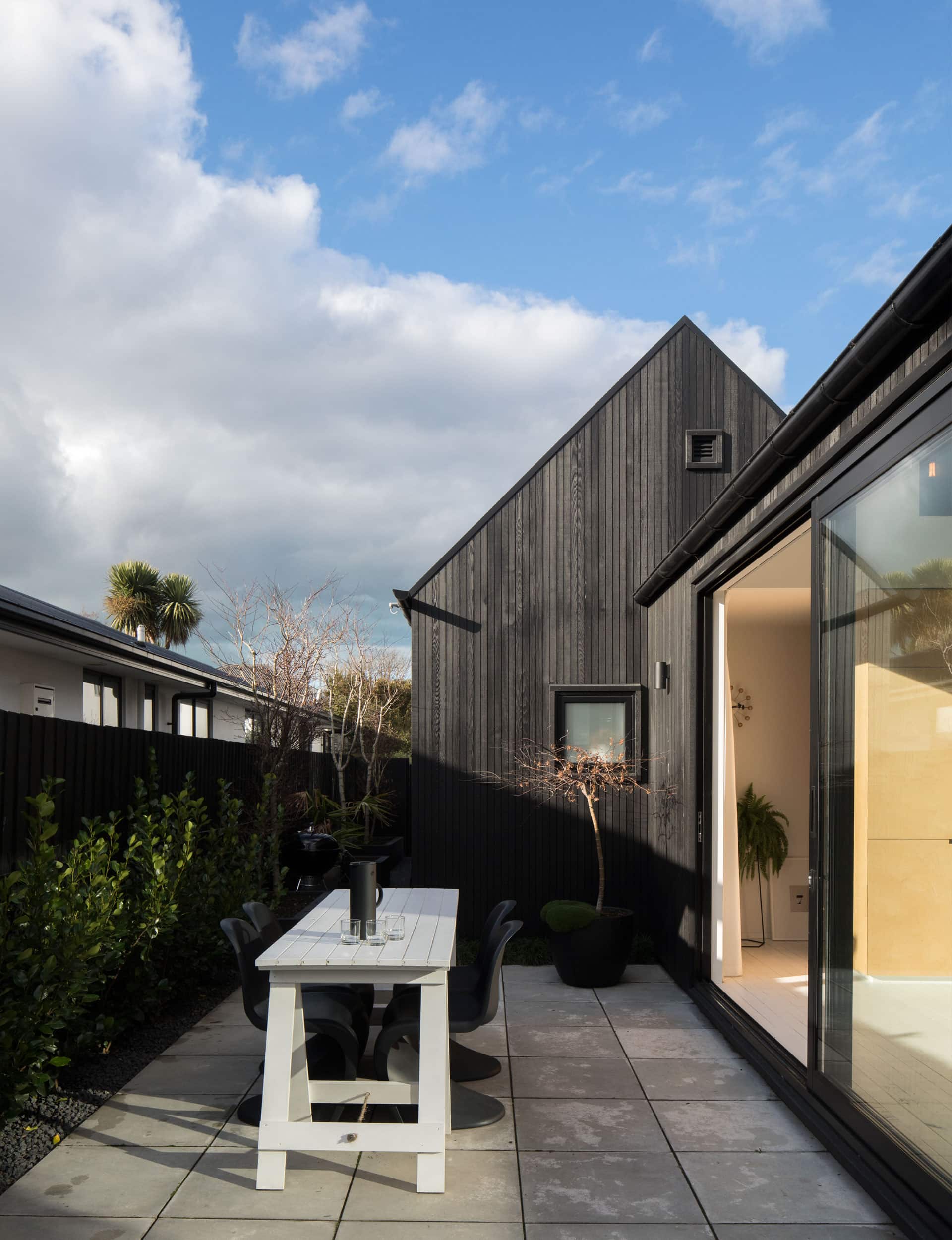
The result is stripped back, simple and highly rational, but the details make it: black-stained cedar shiplap cladding with no eaves, so the little gable is almost abstracted, the gutters extending out past the end of the walls. Inside, the floors are recycled rimu, painted white and loosely fitted, the walls are white, and birch-ply cabinetry with elegant mitred edges runs to the ceiling.
[quote title=”The result is stripped back,” green=”true” text=”simple and highly rational” marks=”true”]
In the living area, Tobin designed the ceiling plane so it meets the top of the cabinetry – a clever deceit on a different angle to the true gable, and one that further abstracts the shape of the house. “We wanted to really strip back the detail,” he says. “Bringing the scale back from a square plan made those shapes far more elegant.”
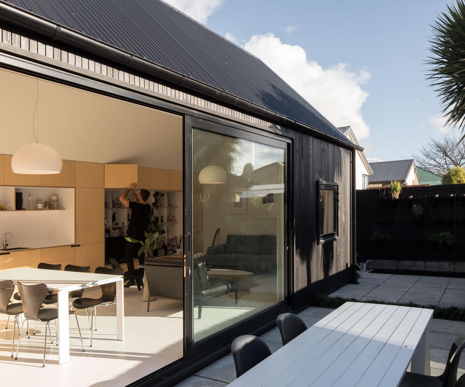
A low-ceilinged hallway leads past two bedrooms and a bathroom, and then hooks around a wall of cabinetry and into the living area: it’s not large, but it has a high stud and gable roof through to a small courtyard. The kitchen wraps around one corner, then turns into a storage unit down one side.
A wall of full-length, birch-ply wardrobes is repeated in the bedrooms. “We put a lot of focus into the living space,” says Smith. “One thing the old cottages had was a three-metre stud, so we wanted to put our energy and budget into that.”
The house was initially built just for Hayley and Tobin, who now have Oliver; born in June. Tobin’s studio isn’t far away, which means he can pop home for lunch… just as a worker might have done a century ago.
Words by: Simon Farrell-Green. Photography by: Patrick Reynolds.
[related_articles post1=”71501″ post2=”71446″]


