On a central Wellington street, architect John Mills weaves old and new into a rhythmic tapestry of texture and colour, in which the landscape becomes internal and the strange subtly familiar.
Originally built in the early 1960s, a somewhat dilapidated industrial building lost in central Wellington’s Te Aro basin had immediate appeal to architect John Mills and his clients, whose vision for their home was bold and unwavering.
Down the road is a brewery and a drop-in centre; scattered in-between are a number of boutique hotels and apartment buildings. A few hundred metres away the hub of Wellington’s eateries and bars gives life to the area.
The mixed nature of the built environment lends itself to development — a process rapidly unfolding. Running east to west between two major arterial routes, Frederick Street is part of the one-way system connecting the capital’s gridded cityscape.
While arguably an unlikely choice for a central city pad for a couple used to suburban living, the transformation of this former plastic fabrication factory is at once honest and cryptic, homely and industrial. It takes its cues from the surrounds — current and predicted — and makes light of the fact that it may be built out.
John Mills had known Nicola and her husband John for years, having designed the renovation of their family home 20 years earlier. A series of frank conversations about what they wanted to achieve ensued. The brief was simple: to create an inner-city home that would negate the need for the winding and often long coastal commute living in Eastbourne had necessitated. They wanted privacy, an urban outlook, and a sense of interior luxury and comfort; a building that masked the domestic life within.
However, this building was one suited only to a bold vision and there was much to look past. The post-war construction methodology meant significant seismic strengthening was required along with asbestos removal, a new roof, and replacement of the wiring and plumbing that was no longer fit for purpose.
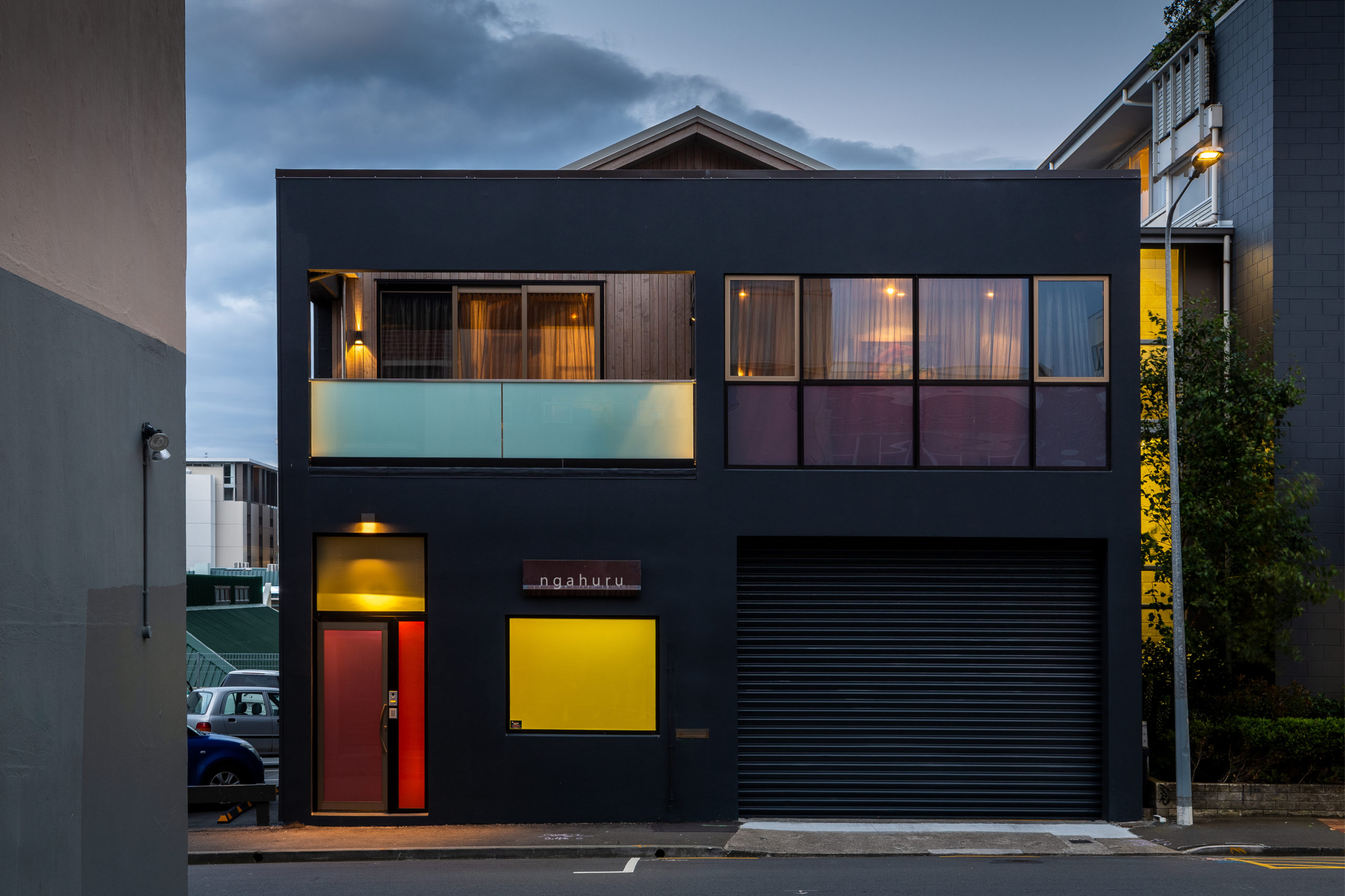
John Mills saw the opportunity immediately and set about creating a beautifully eclectic space that offers more than meets the eye. From the street, it is unclear what the intention of the building is, except perhaps for the larch on the second level that offers a hint at domesticity.
Coloured glass punctuates the otherwise black facade on the lower level, illuminating the entrance and offering an almost ethereal quality to the entry foyer. Here, the larch of the exterior traverses the divide between public and private and follows the stair to the upper level alongside an original block wall and a raw-steel rail, providing a link between the strange beauty of the multi-coloured light below and the daylight above.
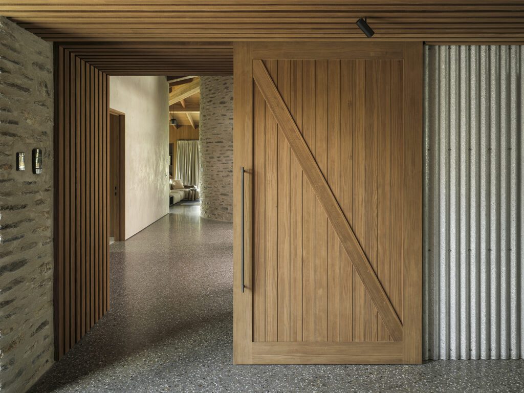
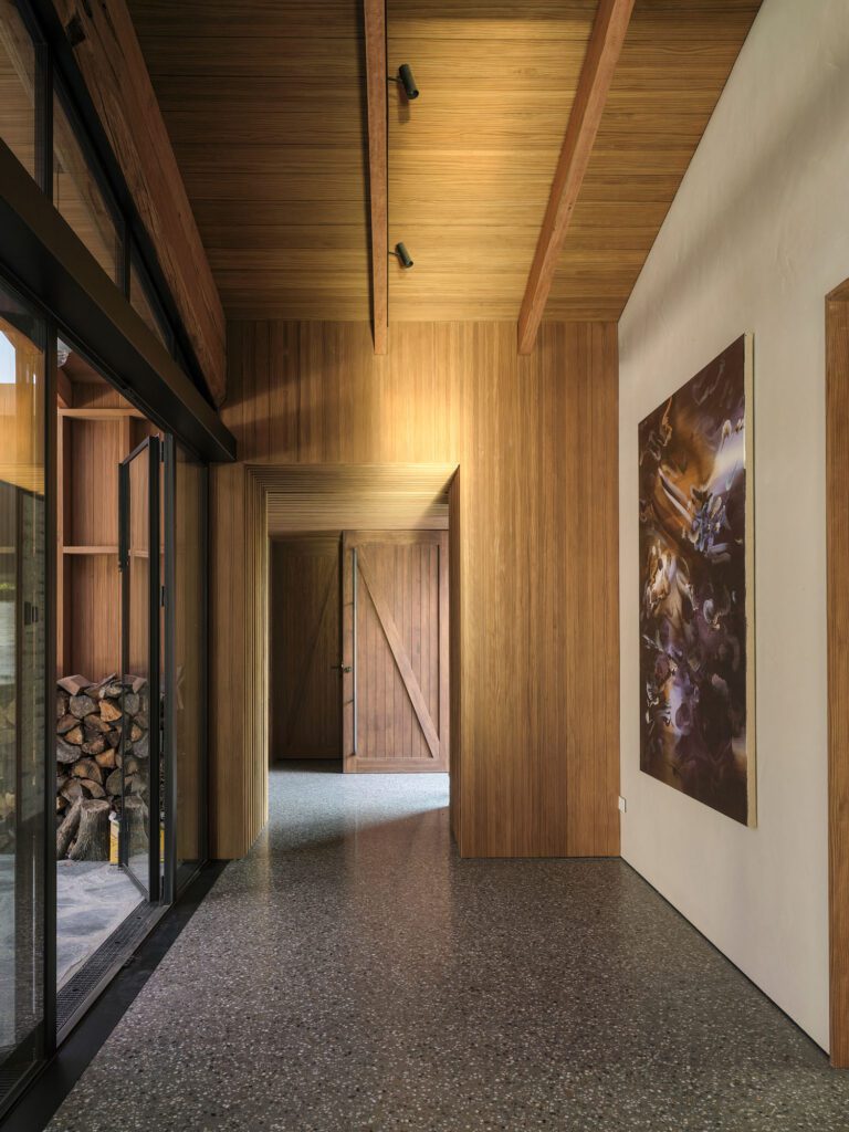
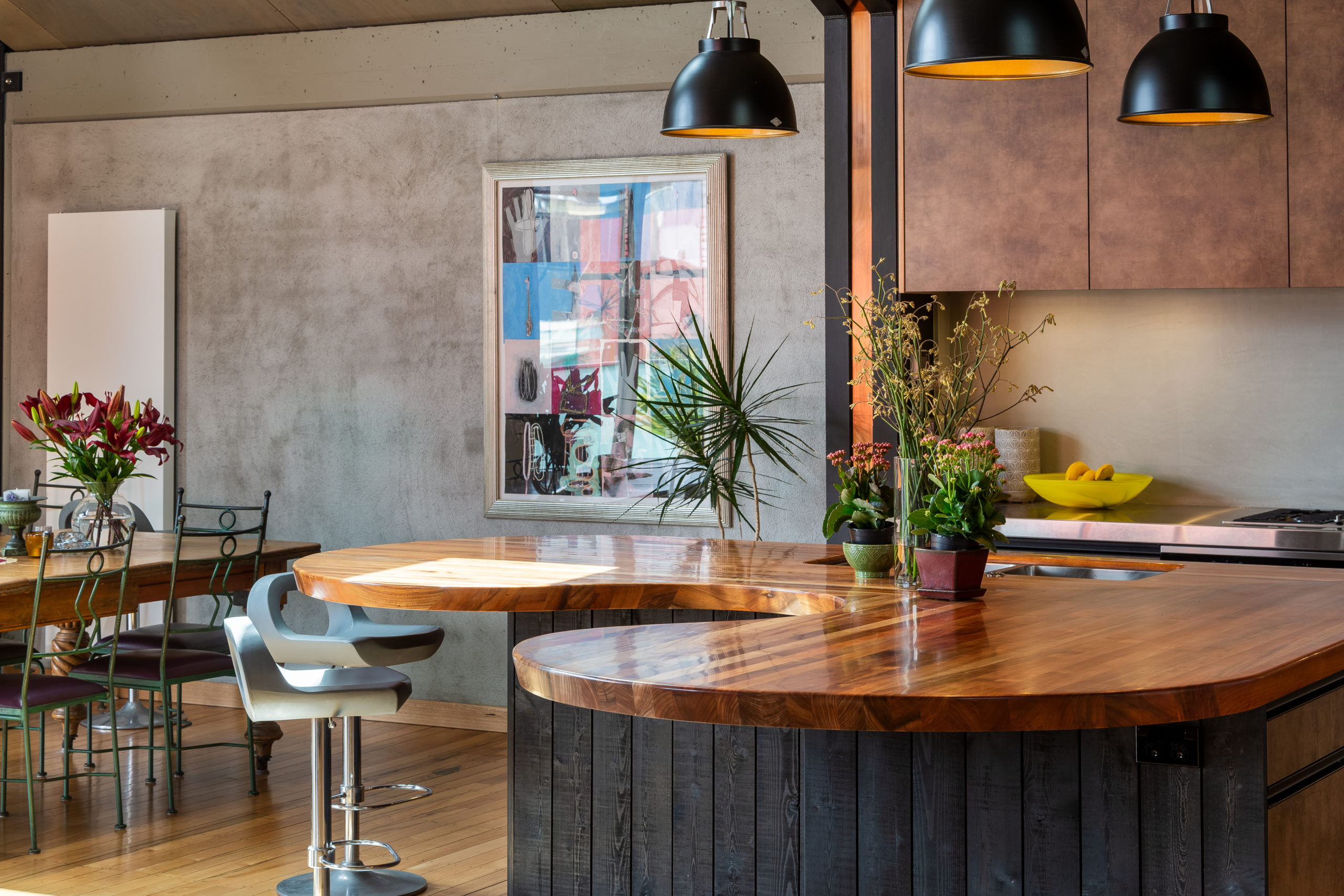
The original tawa floors are retained and combined with a tapestry of textures in the voluminous living space on the upper level. Plastered block walls converge with black-steel portals, aged brass, copper, and burnt-orange Plytech.
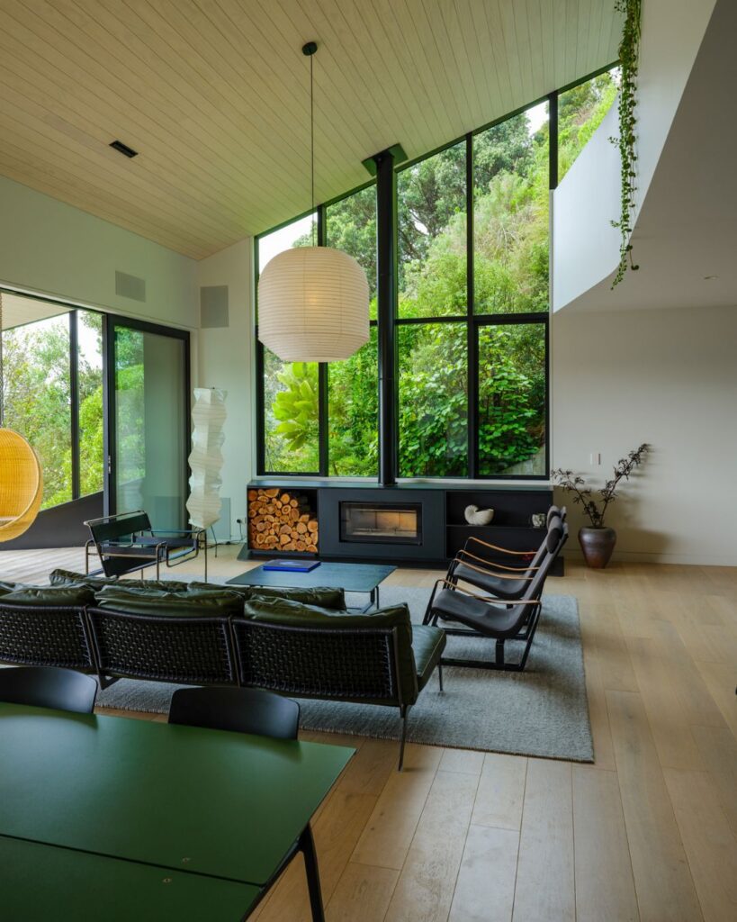
It’s what’s above eye level that offers the defining character, though, and is the factor that allows this unassuming space certainty. In this part of the city, zoning allows for boundary-to-boundary developments at significant height. To mitigate the effect of that, John punctured the gabled roof at every opportunity with banks of skylights.
Structural ply panels stained in different tones meet clerestory windows, creating a pattern of hues; a landscape not unlike aerial views of pastoral land.
“As you lose the views out the windows the ceiling becomes part of your view and your landscape and part of your environment,” John explains. “The skylights give a blast of light and sky views that punctuate the ply. Moonlight spills through them, too.”
High gloss kitchen cabinetry was turned inside out to achieve a more matte finish in brass tones, while the curvature of the laminated totara benchtop creates a fluidity of movement akin to the way people naturally move about a space.
“It’s intentionally anti-trend. I always love to overdo rather than underdo — that Oscar Wilde comment comes to mind: fashion is a form of ugliness so intolerable we have to alter it every six months. This was a space that needed to endure.”
It’s a dynamic home, enlivened by light, art, and colour; the perfect urban whare for a couple whose bold vision allowed John to weave the familiar with the strange, the old with the new, and the internal and external backwards and forwards, in turn dissolving the delineation between each.

