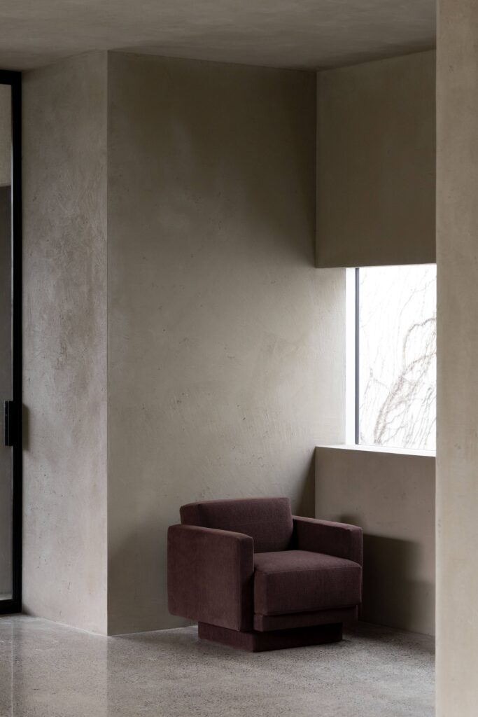
The colour of Milan, in Dulux colour specialist Davina Harper’s opinion, is burgundy. “We saw burgundy being used widely as an accent colour, along with berry reds and mulberry tones.”
Of course, it wasn’t just one colour that piqued Davina’s interest, it was the wider themes that emanated; a marked move away from minimalism and an embrace of bold, very personalised combinations — a tailoring of spaces to add playfulness and character.
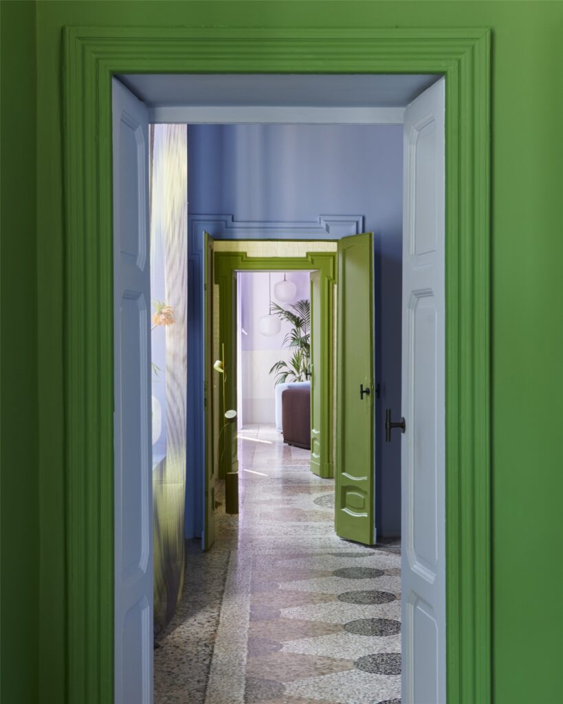
“What really stood out was the unexpected colour pairings. Green and lilac, for example, is an unusual pairing — Muuto was a great example of this.” The brand presented a Scandinavian perspective on a Milanese apartment entitled ‘The Artful Home’; six rooms exploring spatial identities where art, architecture, design, and nature converge to create a distinctive universe of colour, light, material, and tactility — an invitation to experience the way colour affects body and mind individually.
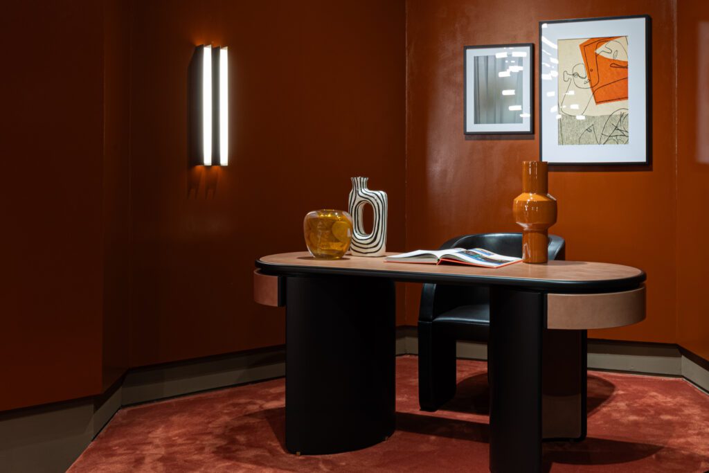
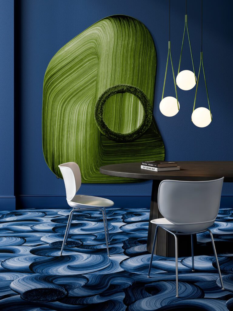
“We saw a lot of green, as well as greens and blues paired together. Burgundy with soft blue was another pairing that felt fresh and different.” Baxter presented ‘The Clay House,’ described by the brand as: “It’s an architecture of raw earth. With a Mediterranean flavor. A caravanserai, a place of hospitality and encounter in a desolate and distant imaginary.” Here, burgundy met blue, orange, and creamy neutral accents in an immersive spatial experience.
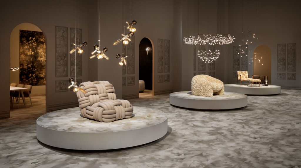
In contrast, Moooi presented a warm palette of pared-back neutrals underpinned by beautiful pattern and texture. “Pale greys and neutrals were interesting, and quite different to the bold, dark palette they presented last year — an embrace of soft, protective colours. Neutrals in general this year were still quite warm with lots of buttery, soft tans, and warm browns. However, we also saw soft greys coming through, which is probably a reflection of the global economic uncertainty we’ve been experiencing.”
The annual Dulux Colour Forecast will be released in late August; an in-depth consideration of these global trends and the colours we’ll be seeing in the local design landscape in the year ahead.
