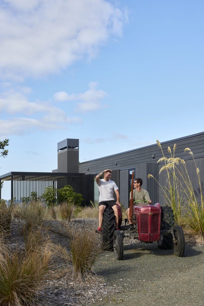
On a vertiginous site above Onetangi beach on Waiheke Island, Lance and Nicola Herbst create their most layered home yet
[jwp-video n=”1″]
A stunning clifftop home on Waiheke wins Best Interior at Home of the Year
The night Andrew Glenn and Jonathan Rutherfurd Best moved into their house above Onetangi beach, the Easter moon came up at dusk, square in the middle of the picture window that runs the length of their living room. “Right there,” says Rutherfurd Best, pointing at the confluence of two slopes that focus the eye down and out over the spectacular view of Onetangi, the hills of Waiheke and the peaks of the Coromandel Peninsula in the distance. “It was almost a religious moment. I thought, ‘Oh God, Jesus is coming.’ I really did.”
Glenn and Rutherfurd Best decided to move back to New Zealand in 2010, after decades in Hong Kong and London. Not long after their return, they spent three days on the island and bought the land on which their house now stands. Precipitously steep, down a long driveway just up from Onetangi beach, it had an incredible view and the developer had cut into the land to retain it, creating an obvious building platform.
“You could immediately feel the house when you stood there,” says Lance Herbst, who visited the site a few days before the couple made an offer.
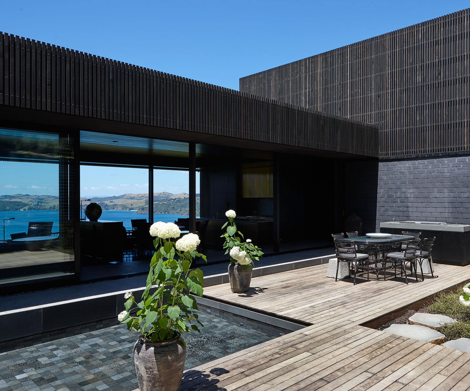
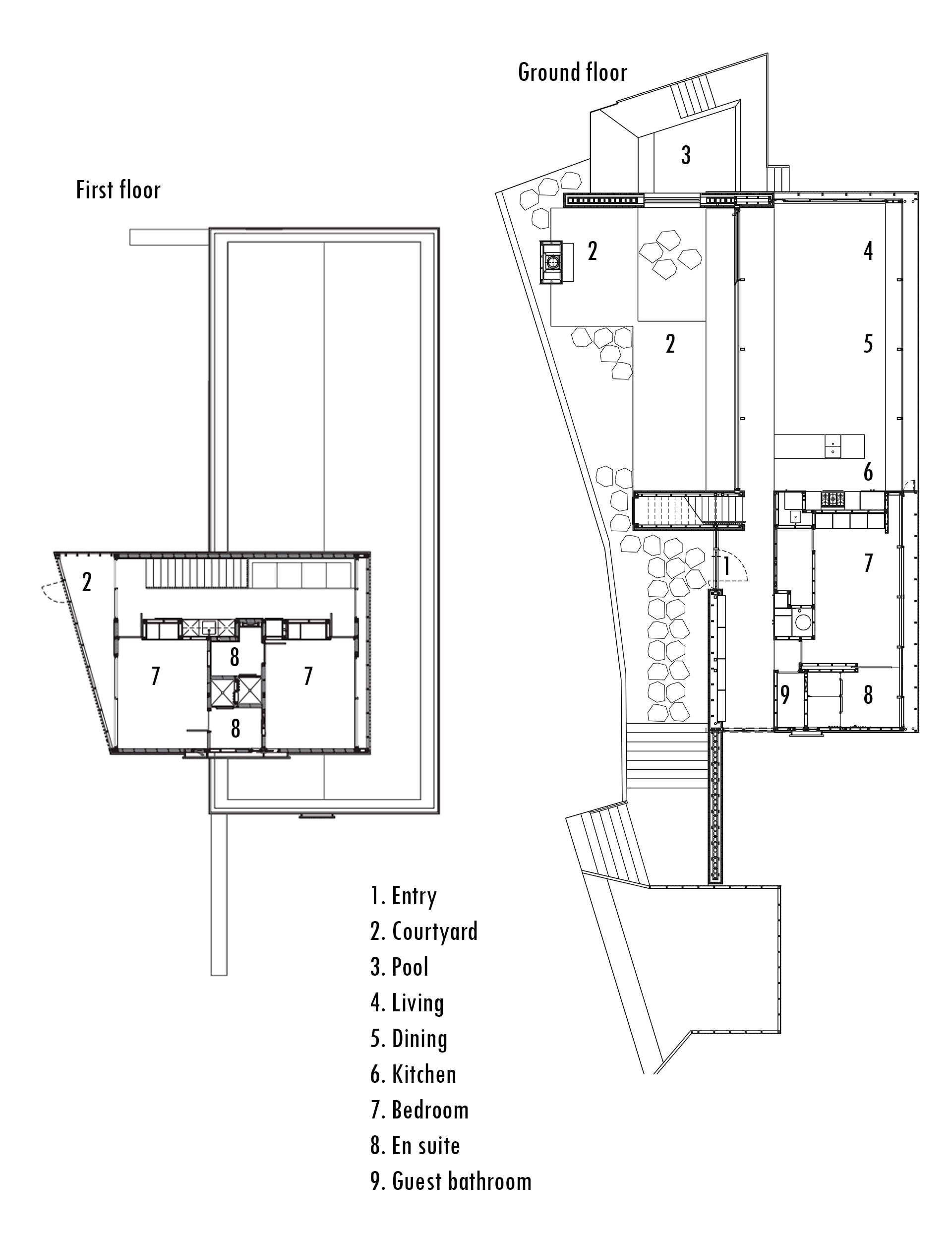
“The big idea was not to build on the land they’d already cut,” says Herbst. Instead, he proposed to use the flat area for a sheltered courtyard, and cantilever a horizontal pavilion out into the air. In effect, the design created a one-bedroom apartment, strung out along the width of the site, looking down and out at the view.
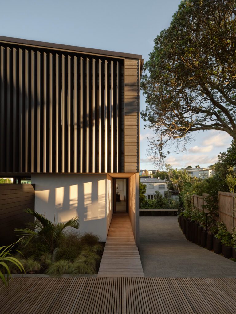
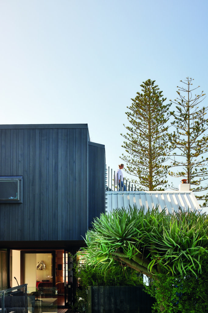
A long gallery-like catwalk runs the length of the house, connecting the living area and courtyard, and runs past the entry to the main bedroom and the couple’s study. Here, the home is wrapped in a timber rain screen that Herbst describes as a ‘veil’. Upstairs, a perpendicular box connects back to the hill, with two guest bedrooms and bathrooms.
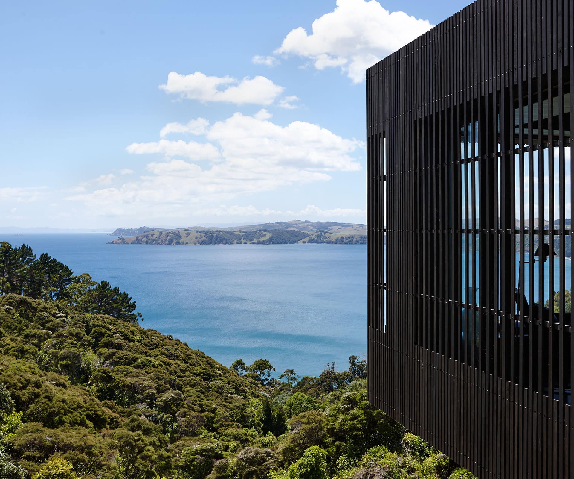
It’s a house of high drama. You arrive down a long driveway to find a couple of boxes sitting on top of each other, clad in a black-stained timber screen. You then descend gabion stairs to a dark, cave-like entrance where the front door opens into a shadowy hallway. Then – and only then – do you come around the corner into a long living area, dominated by the picture window with a widescreen view. “You know you’re in serious view territory, but you can’t see it,” says Herbst. “It’s very deliberately going into the dark and slotting the view.”
There is no front deck: “If you put a balcony out the front all you’re going to do is look at a balustrade for the rest of your life,” says Herbst.
Glenn and Rutherfurd Best loved the proposed design, but in the interim they’d bought a small restaurant on the island and set about expanding it to The Oyster Inn, with charming accommodation and a restaurant designed by Katie Lockhart. Faced with launching a new hotel and building a house, they chose the hotel, and parked their residential project for a few years, allowing it to percolate.
Herbst Architects has a distinct voice that manifests itself in the use of different types of timber, exposed structure and lightness. A lot of time is spent thinking about the proportions of wood, the way it casts light and how it’s joined and finished. The architects also play around with ideas of ‘unpacking’ – being able to see the tectonics of the house and its construction.
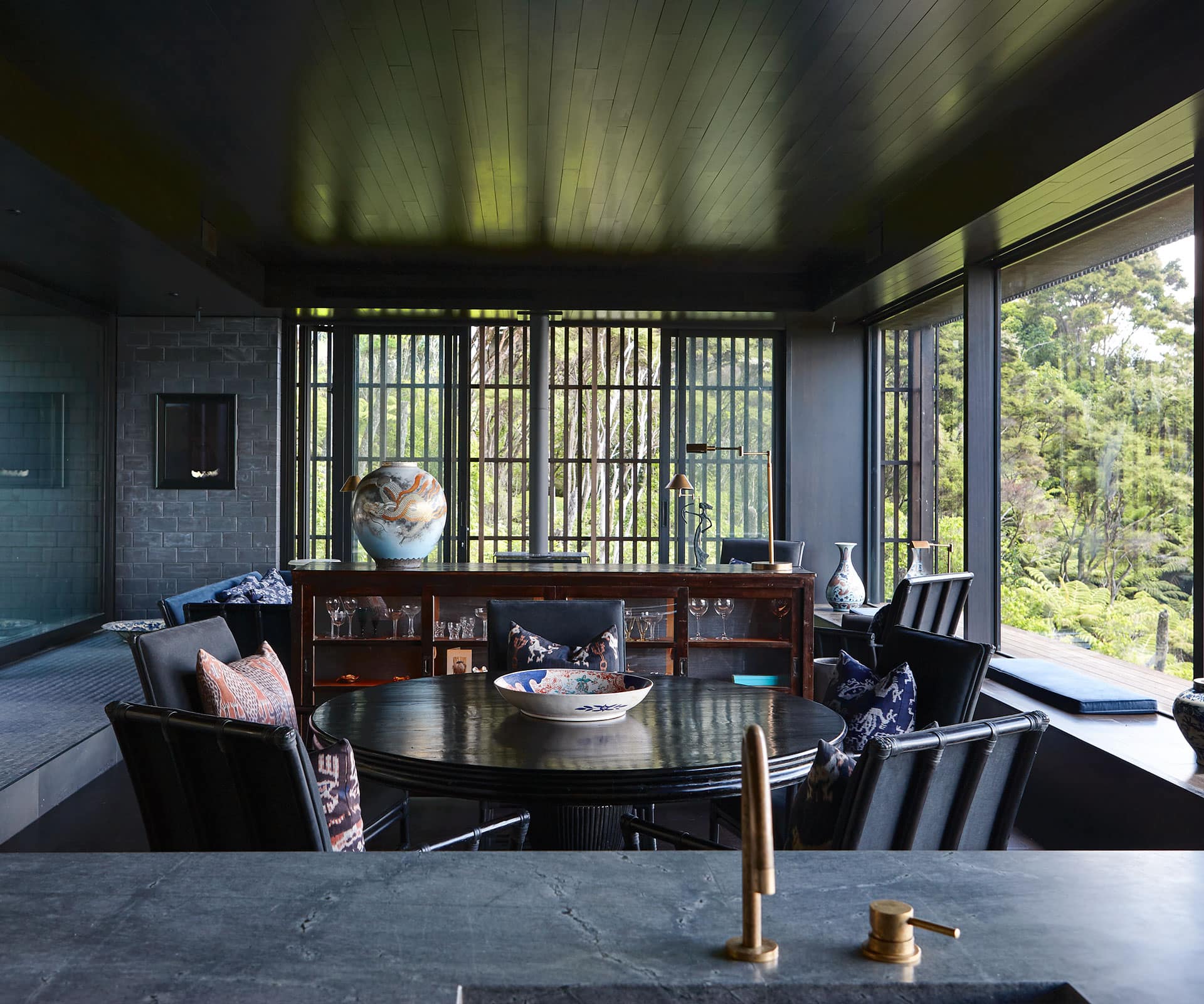
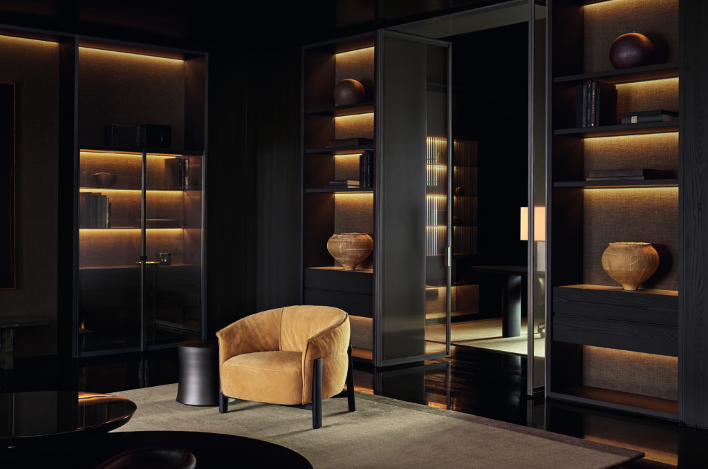
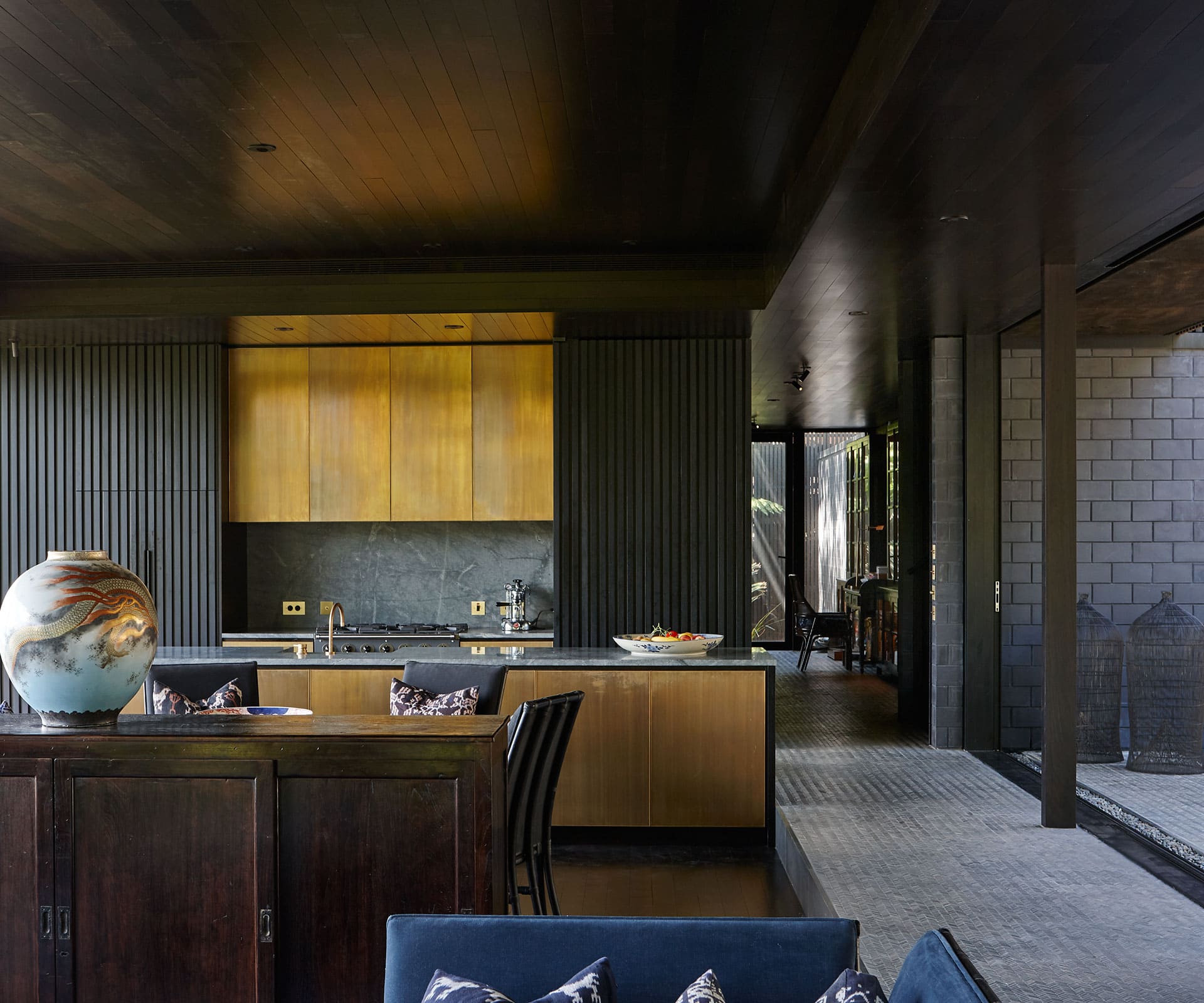
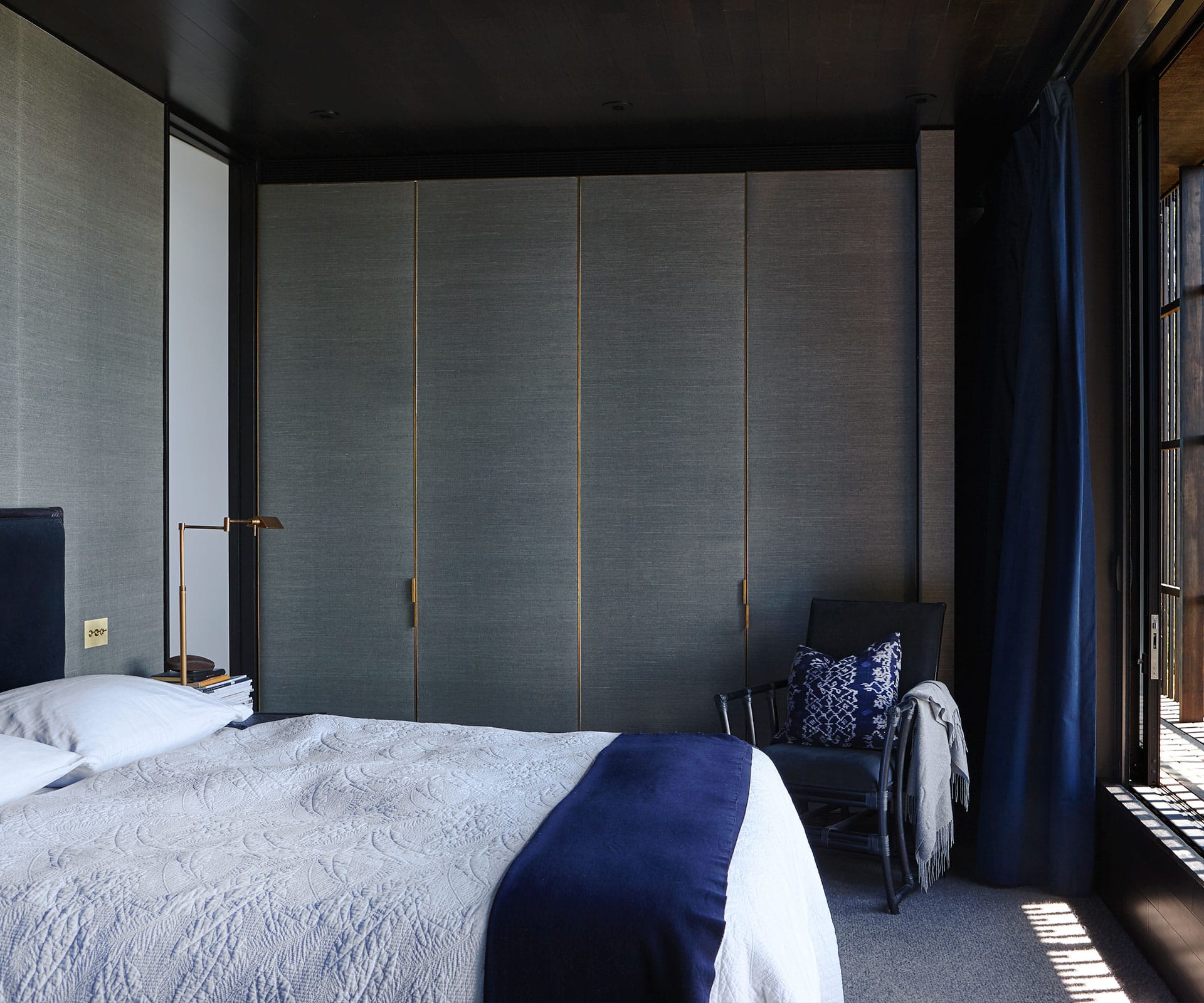
Glenn and Rutherfurd Best loved the Herbsts’ thinking, but decided they wanted something a little different. While the architectural moves didn’t change, the material palette did. Glenn grew up in Hong Kong and the couple spend a lot of time in South East Asia – the influences are obvious here. Floors and ceiling are lined with Japanese black-stained teak and black timber battens wrap the kitchen and hall.
Where the Herbsts might typically specify crazy paving, a catwalk – which articulates the concrete retaining wall off which the house hangs – is lined with tiny grey marble pencil tiles, laid in a herringbone pattern. Underfoot the walkway feels like an elegant sisal mat. The couple found the tiles in a design store in Canggu, Bali, and sourced them directly from the manufacturer.
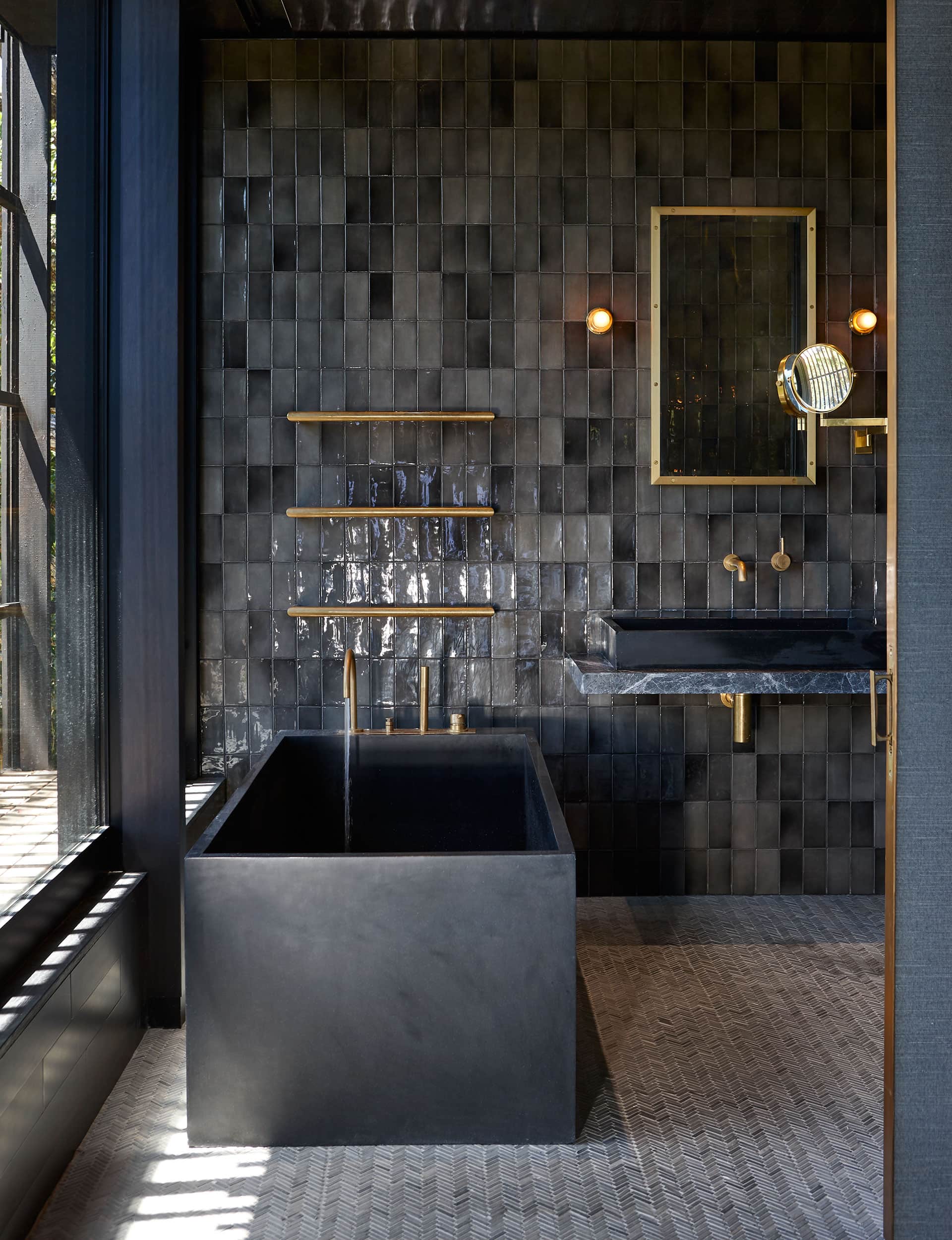
Each time they made a design discovery, they’d ring the architects and ask them what they thought. “I’m sure we drove them mad,” laughs Glenn. Over time, a new language emerged – one that’s glamorous, earthy and soft. “It has been useful for us,” says Herbst. “Left to our own devices, we’re much more humble with our materials. It was an opportunity to lever into this world of luxury.”
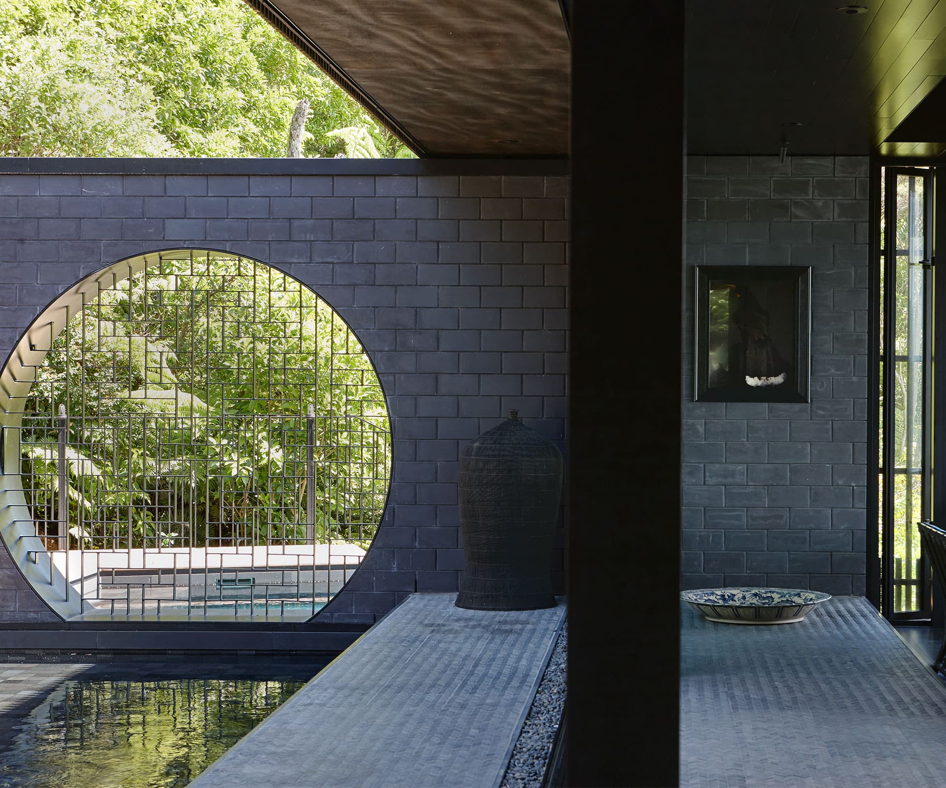
Early on, the Herbsts started playing around with a spectacular ‘moon window’ set into a grey brick wall that divides the courtyard and pool. On one level, it’s practical, avoiding the need for a pool fence. On another, it’s a deft nod to the heritage and taste of the owners. “We’ve seen this type of house in Asia,” says Rutherfurd Best. “It will get worn and battered as it gets older. And that doesn’t matter.”
Words by: Simon Farrell-Green. Photography by: Jackie Meiring.
[related_articles post1=”77800″ post2=”77776″]

