They say opposites attract. It’s case in point in this Waiheke house where grandiose cathedral meets cosy boat shed, with a hint of nostalgia
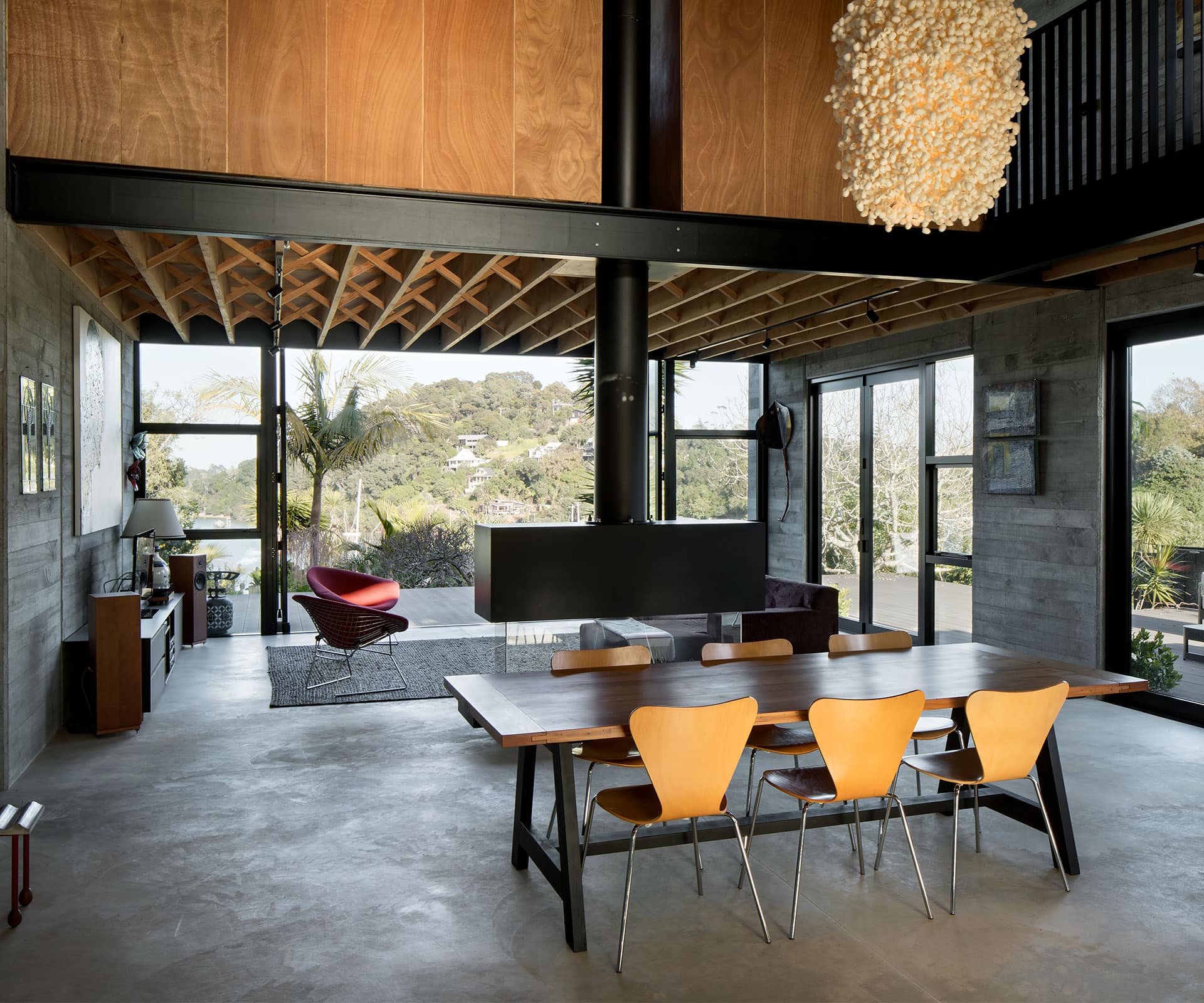
This Waiheke house was designed to be part boatshed, part cathedral
On a hill above Waiheke Island’s Anzac Bay is a house that seems to recline on its elbows, wriggle down into the sand a little, and tip its face to the sun.
It feels good inside. Welcoming, lofty, warm. “A celebratory space,” as local architect Vaughn McQuarrie puts it. The brief was offbeat.
“What we wanted was a combination of a cathedral and a boatshed,” says Wendie Hall, who lives here part-time with her partner Lois Simpson. The pair has owned the section for more than a decade and built this house to replace an old bach and assorted outbuildings. Nostalgia for that place also informed the wish list.
“We wanted it to feel like a bach,” says Hall, “to retain the essence of feeling really relaxed.”
To catch the sun, McQuarrie shuffled the footprint of the house east, freeing up the north-west for outdoor living. He threw up the bones of a classic boatshed, glazed each end, and hoisted the whole to a grand height: 6.5 metres at the peak of the vaulted ceiling.
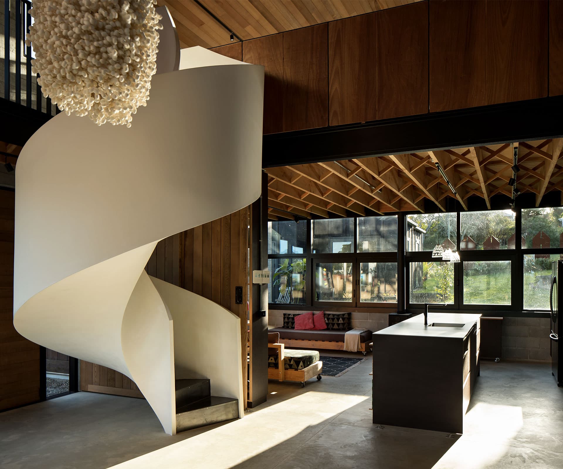
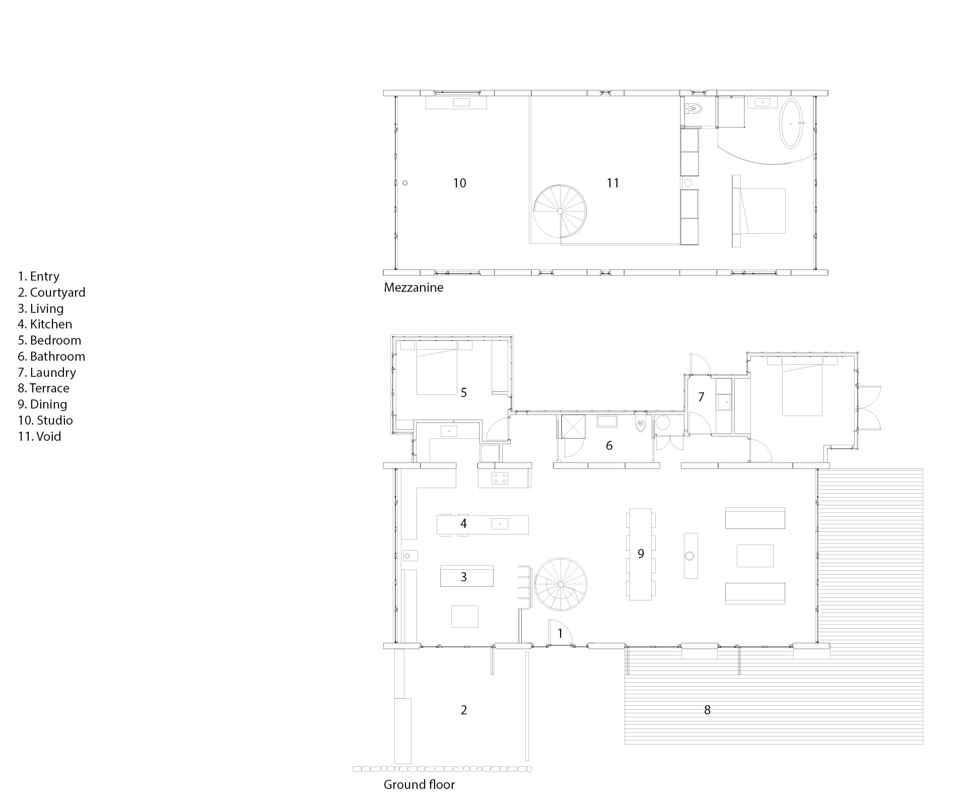
The main living area is a single rectangular room. Two mezzanines are connected by a walkway and reached via a twisting, sculptural staircase. Its plastered curve lands directly in front of the main door.
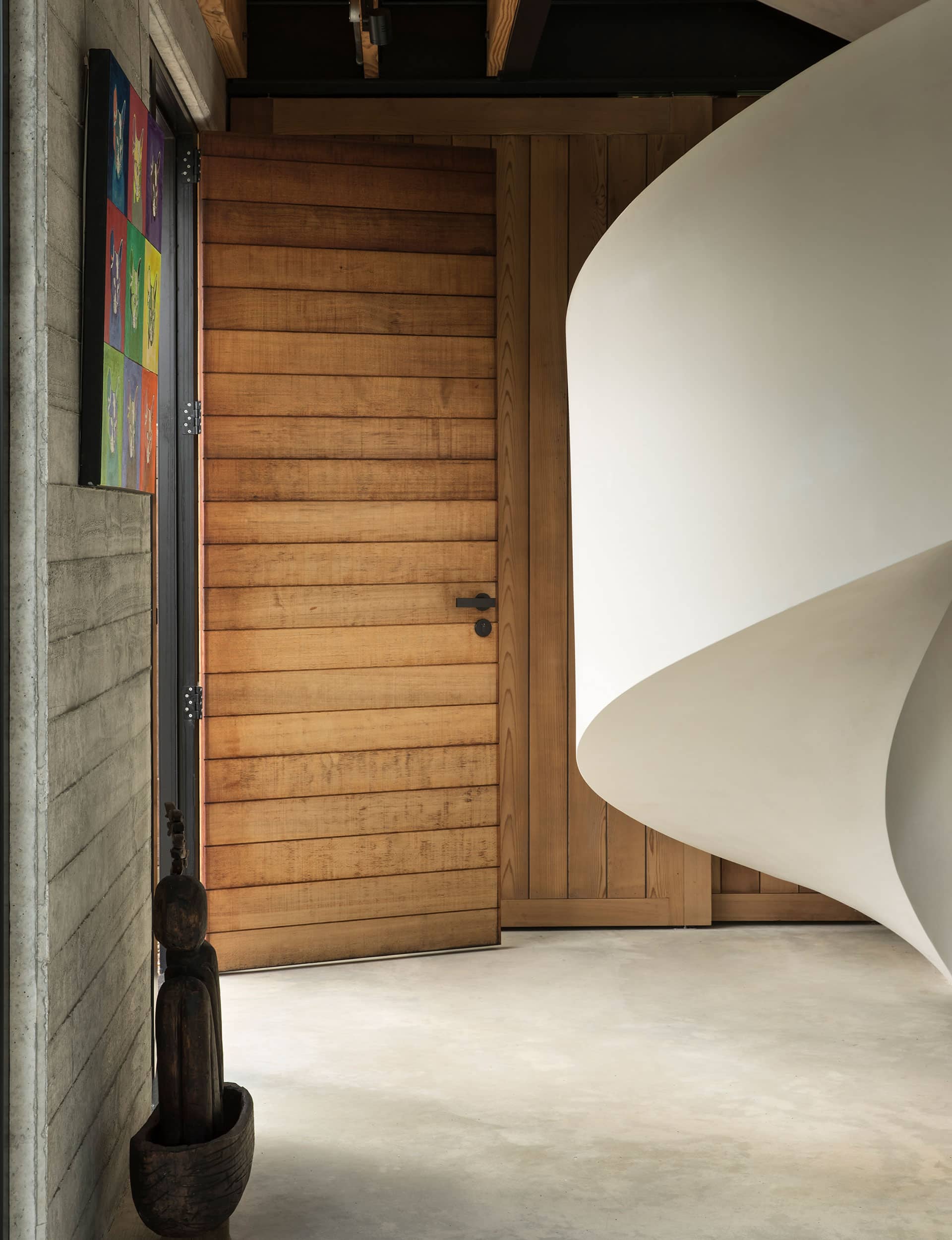
“You do get hit by it, visually. I like playing with compression and expansion,” says McQuarrie, who went further, capping the entrance with the walkway, and flanking it with storage hidden behind huge old cellar doors (these can be pulled across to divide the room). On entry, the enclosure holds you tight for a moment or two. Then – whoa – you step inside and into space.
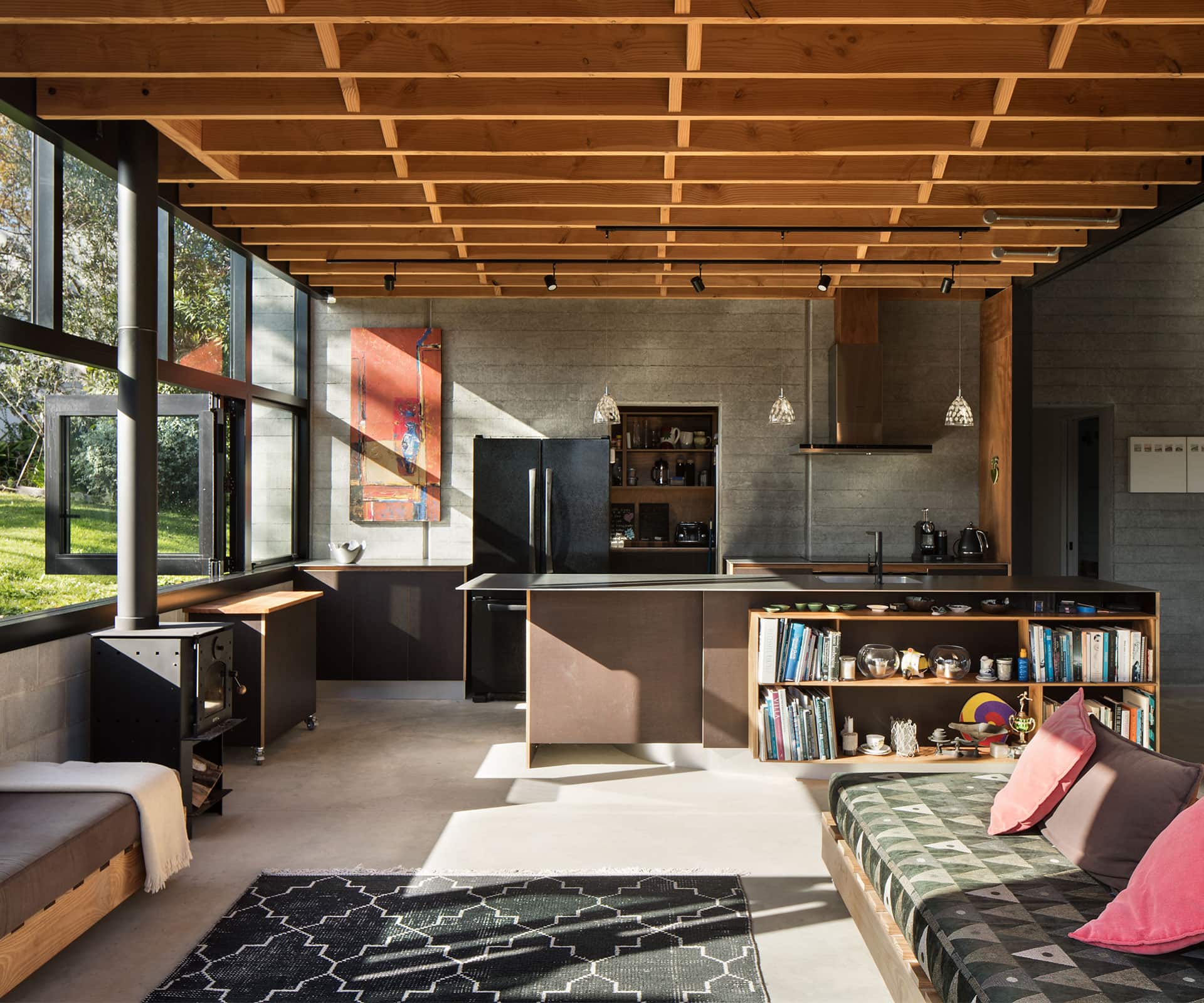
Light does wonderful things here. The mezzanine ceilings are crisscrossed with herringbone struts that work with the aluminium window framing to cast a jungle gym of shadows. To McQuarrie’s profound satisfaction, there’s very little paint or gloss to glare at you: the concrete floor is unpolished but chemically sealed to harden its surface. The kitchen is made largely of a matte material called Trans-Tex, more often used on truck decks. The staircase has a standard wallboard plaster that would usually be painted but is left as is, protected by a transparent layer of beeswax-based cream. Light sinks into the toned-down, scruffed-up walls – Litecrete panels poured into band-sawn timber form work to pick out the grain.
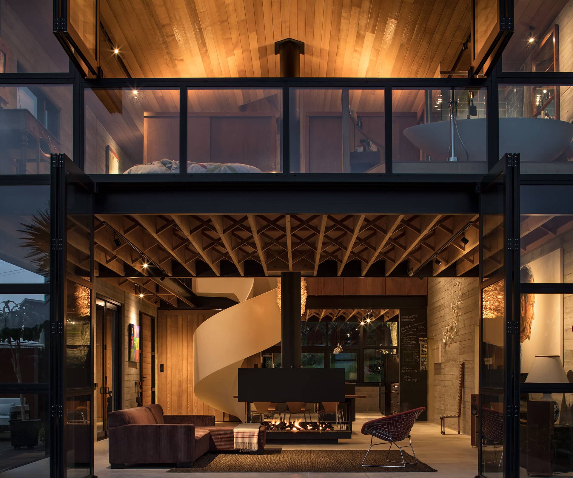
“It’s the variation you get within a material that I like,” says McQuarrie. “We’ve let the materials speak for themselves.” By keeping dimensions consistent and just-so, McQuarrie has tied the design together. The width of the board imprints on the walls is the same as the cedar on the front door, ceiling, and sliding cellar doors. Each plane is organised so that no boards had to be split. “It’s honest,” says McQuarrie. “Simple.”
A barrel-sized, irregular-shaped light made of hundreds of white orbs hangs in the centre of the room. “Any guesses?” asks Hall. Um. Gum-tree caterpillar cocoons? Close. Try silkworms. Their long-vacated dwellings form the shade, which was hand-crafted in Thailand by Ango.
There’s texture everywhere, an element the clients and architect are both passionate about. The street end of the house is dug into the ground so that even the lawn becomes a feature. Lifted to eye height, it takes on a feathery quality and makes the interior feel pleasantly Hobbiton-esque. McQuarrie likes the contrast with the seaward face, a clean sweep of water and bush.
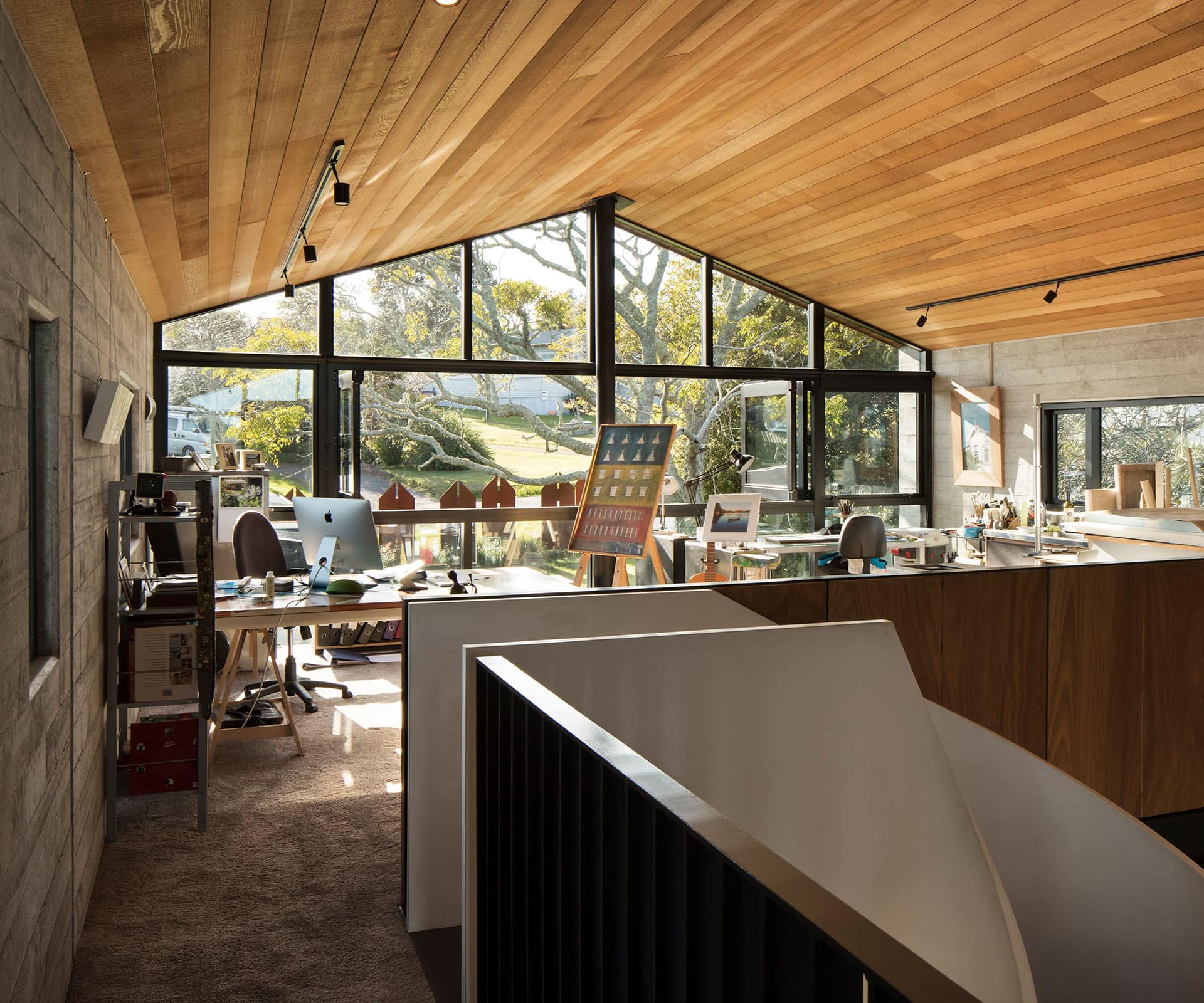
Hobbits again: according to Simpson, this is a house best experienced in bare feet. Thick carpet, warmed concrete, the steel of the stairs. Pad upstairs, turn right and you reach a sunny, shared workspace. Left and there’s the sea. You’re headed to the main bedroom but for a moment, the narrow walkway feels like a gravel path leading to the beach.
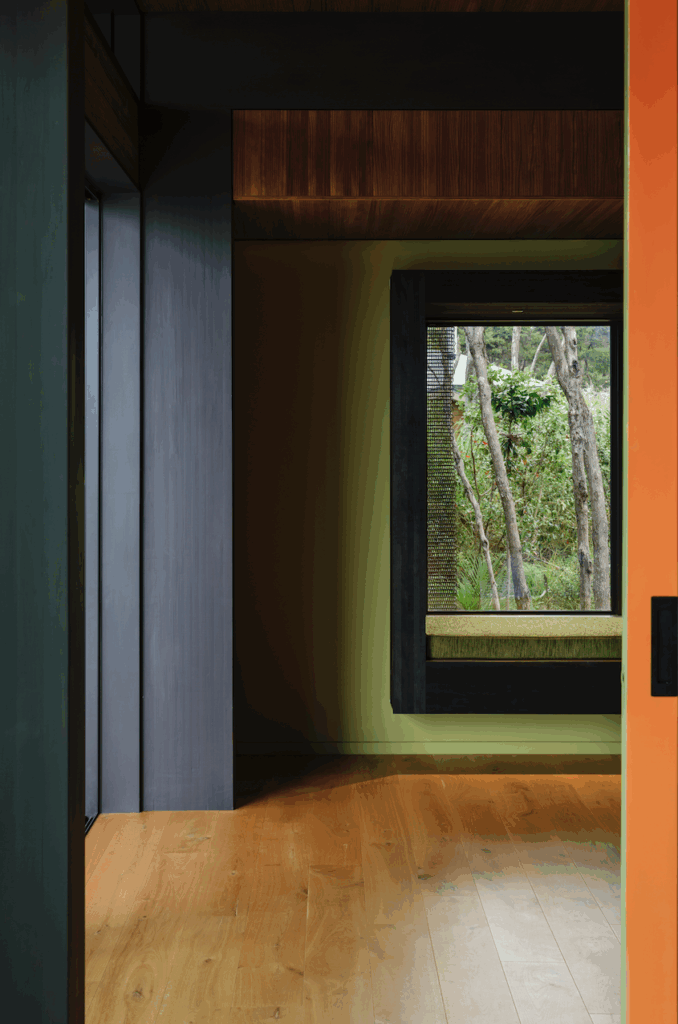
The couple revel in waking up to the vista the bedroom affords, with its wall of windows opening up to bay views. The space is partially screened from the bathroom by a low panel of gaboon ply. Matai warms up the area, where a raised platform holds a teardrop-shaped bath.
[gallery_link num_photos=”10″ media=”https://www.homemagazine.nz/wp-content/uploads/2018/10/vaughnmcquarrie-oct9.jpg” link=”/real-homes/home-tours/spiral-staircase-was-the-perfect-addition” title=”See more of the home here”]
Another bathroom and two bedrooms are tucked in downstairs, in a guest wing accessed off the main living space. Hall and Simpson call it the “lean-to” and, on the odd occasion that it’s empty, they shut the door and ignore it.
Somehow, the main space feels like a church. It achieves a deep sense of peace, a certain reverent quality of light and air. McQuarrie points out that the grunty black flue of the gas fire – used as a space divider more than heating – forms a subtle cross with the floor of the main bedroom above. “I thought that would be a nice composition.”
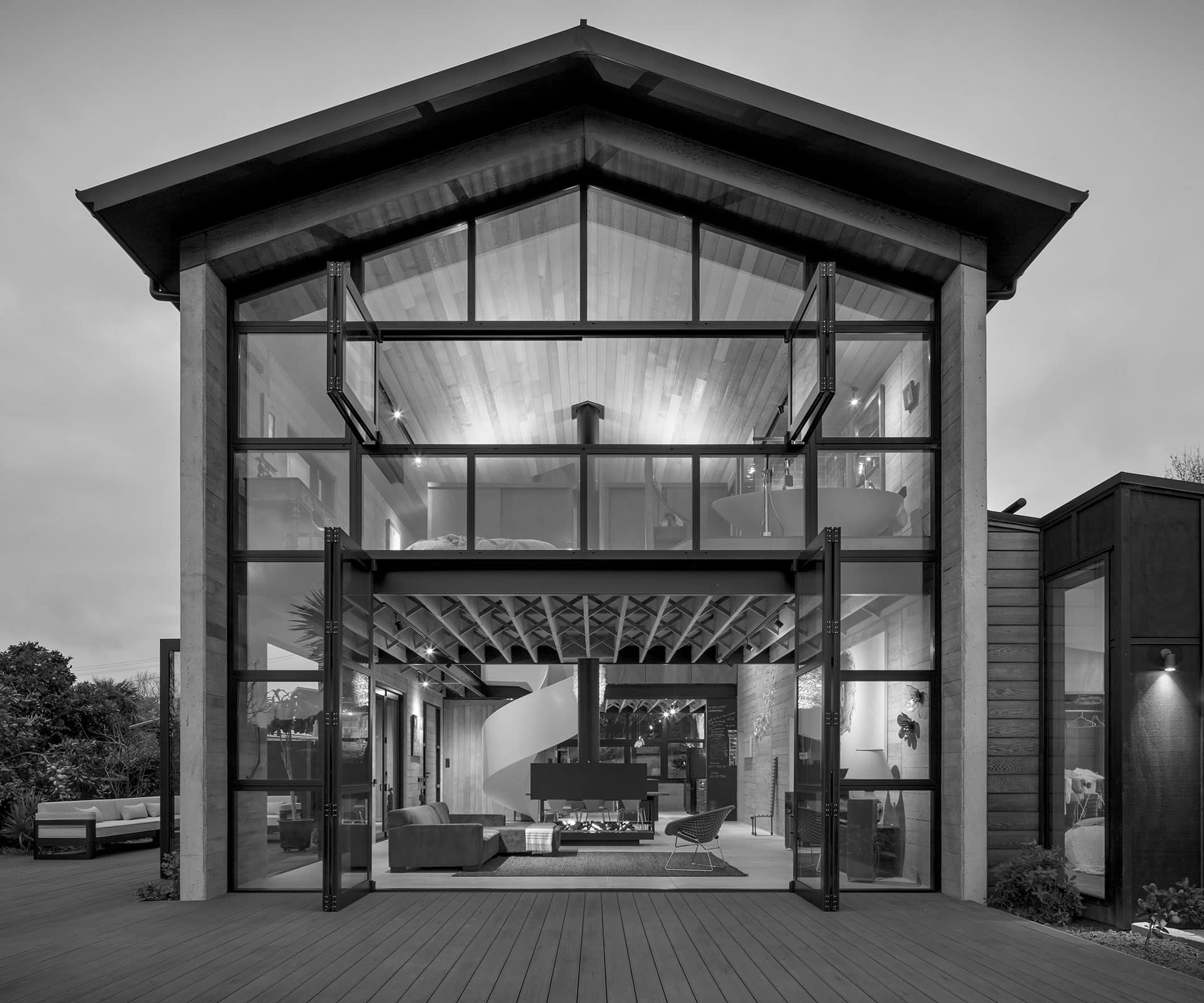
A high, narrow window is another nod to the cathedral idea. And, recently, a wedding. An 81-year-old couple, one of whom has been the gardener here for years, married in this space, then sat down for lunch with two dozen guests. Hall: “Isn’t that awesome?”
Words By: Catherine Woulfe. Photography by: Simon Devitt.
[related_articles post1=”83600″ post2=”83616″]
