Once highly contested, this challenging house above Matiatia has softened into the Waiheke Island landscape, without losing its edge
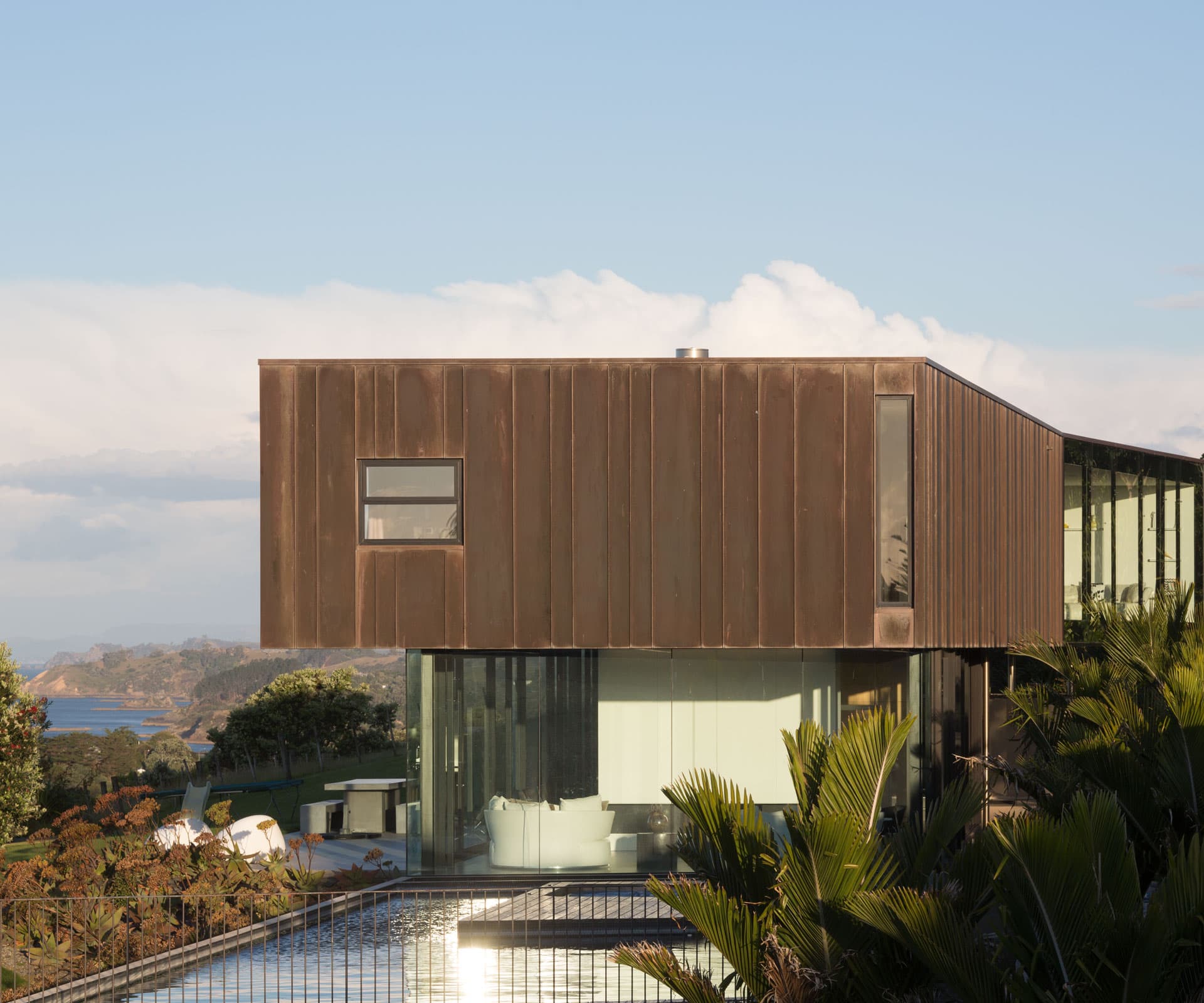
A controversial copper-clad Waiheke home has softened with age
Ten years ago, when this Waiheke house designed by Dominic Glamuzina was completed, a local man running for local council called it a “crime against humanity” on his campaign flyer. Waiheke residents can be critical of any new architecture on the island, betraying a tension between social progressivism and local conservatism. But few new buildings draw as much attention as those that sit on the hills over Matiatia, the bay where visitors get their first welcoming glimpse of the island and where locals come and go, some daily, on their way to and from the mainland.
On the ferry over to visit the house, I ask Glamuzina whether he was aware of the public nature of the houses viewable from the ferry and if he anticipated the criticism. “You have no way of not being aware,” he says. “I was coming here at least once a week while it was being built and it was pretty intense. But I got used to that awareness of doing something public. The fact that people love or hate it is great. I would sit at the back of the boat and occasionally talk to people about it, but I was never worried about whether they hated it.”
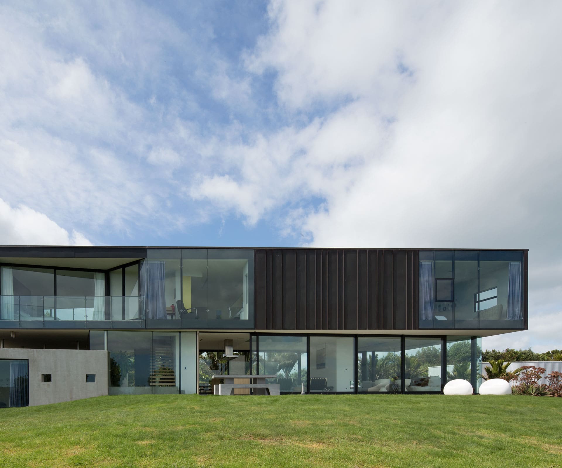
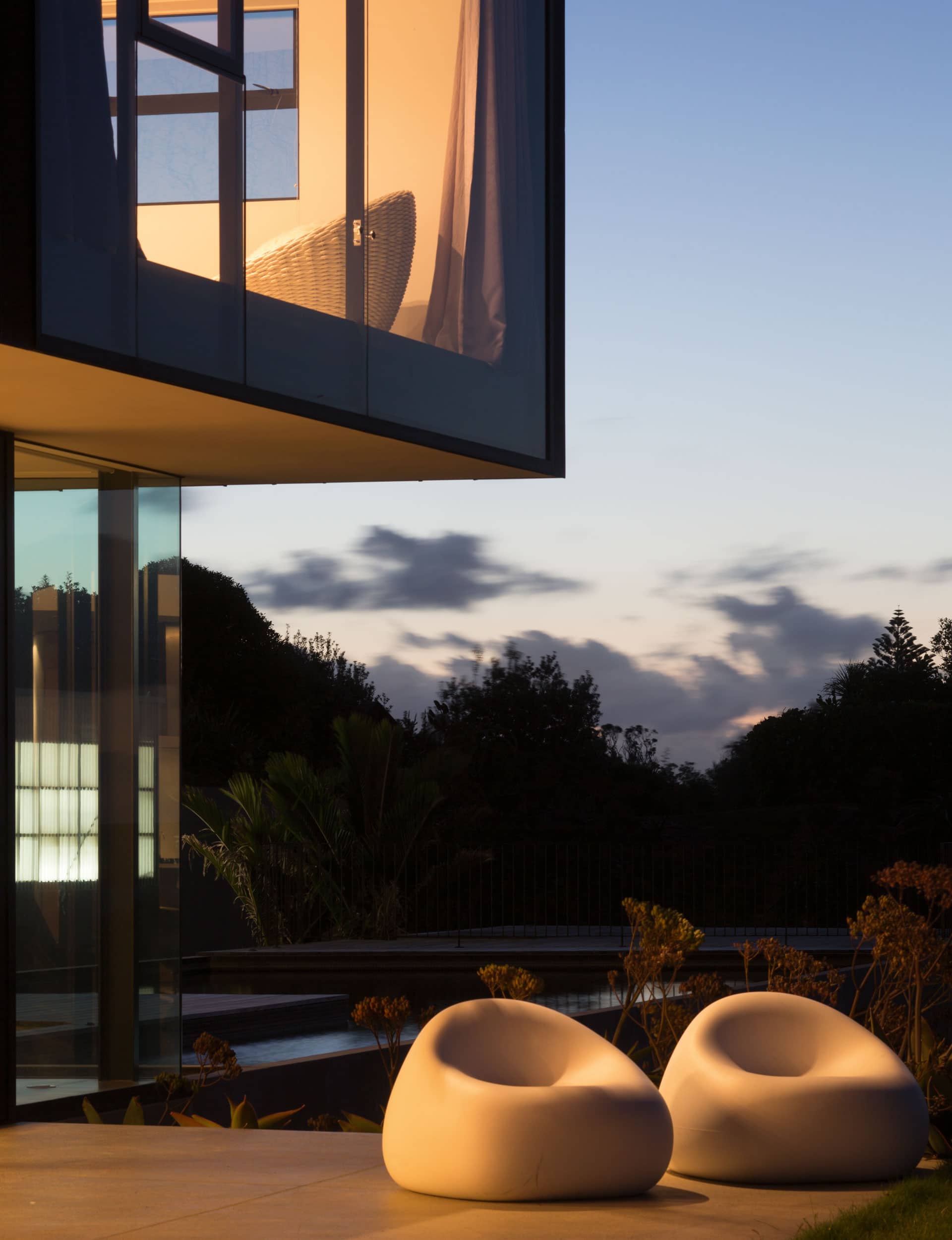
The house sits high on the crest of a large rural site, facing east towards Coromandel, north towards Rangitoto Island, and slightly west to downtown Auckland. Arriving by ferry, it’s seen to your right as you approach the terminal. From a distance it looks like a familiar modernist stack of boxes – glass on the bottom, some undefinable metal on top. Now that the house has settled into the landscape, it’s hard to imagine it raising anyone’s blood pressure. But, 10 years ago, the copper-cladding was bright and glistening and some residents saw it as ostentatious.
The owner, who grew up on a farm that once occupied the bay now populated with cars, buildings, boats and buses, says there were rumours they had paid off the council to get permission to build high on the ridge. All of which seems ridiculous since a decade has patinaed the copper to a deep, reddish brown, and shrubs and trees have grown to partially obscure the house.
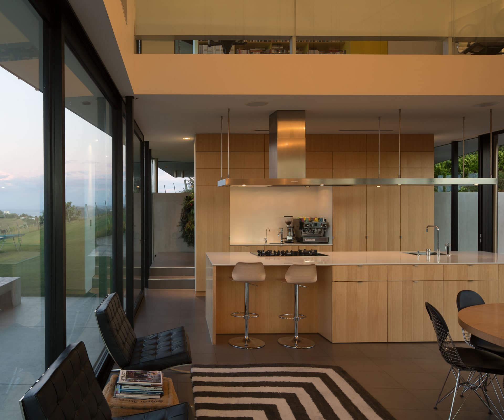
With a brief centred around what should be seen (the wharf and boats below, with Auckland and Coromandel in the distance) and what shouldn’t (the parking lot below and neighbours to the east), Glamuzina made two decisions that dictated what the house would become. Rather than placing the house on the hill, they would cut into and shape the land around the house; and instead of shaping the house around a tight geographic formula, they would shift and bend it to articulate different views at different distances, offering different light and levels of exposure.
By cutting into the hill, the house both sinks into the land and sits atop it, with its ground level providing a light-filled, glass-lined living space that hovers above the bay, as well as heavy concrete rooms that are dug into the hill like a bunker at each wing. “The base element is about generating a new condition on the landscape, so we cut a massive chunk out of the site up the back, lowering it down and then building it back up,” says Glamuzina. “As soon as you cut into the ground it really means something. It changes the relationship between the land and the building.”
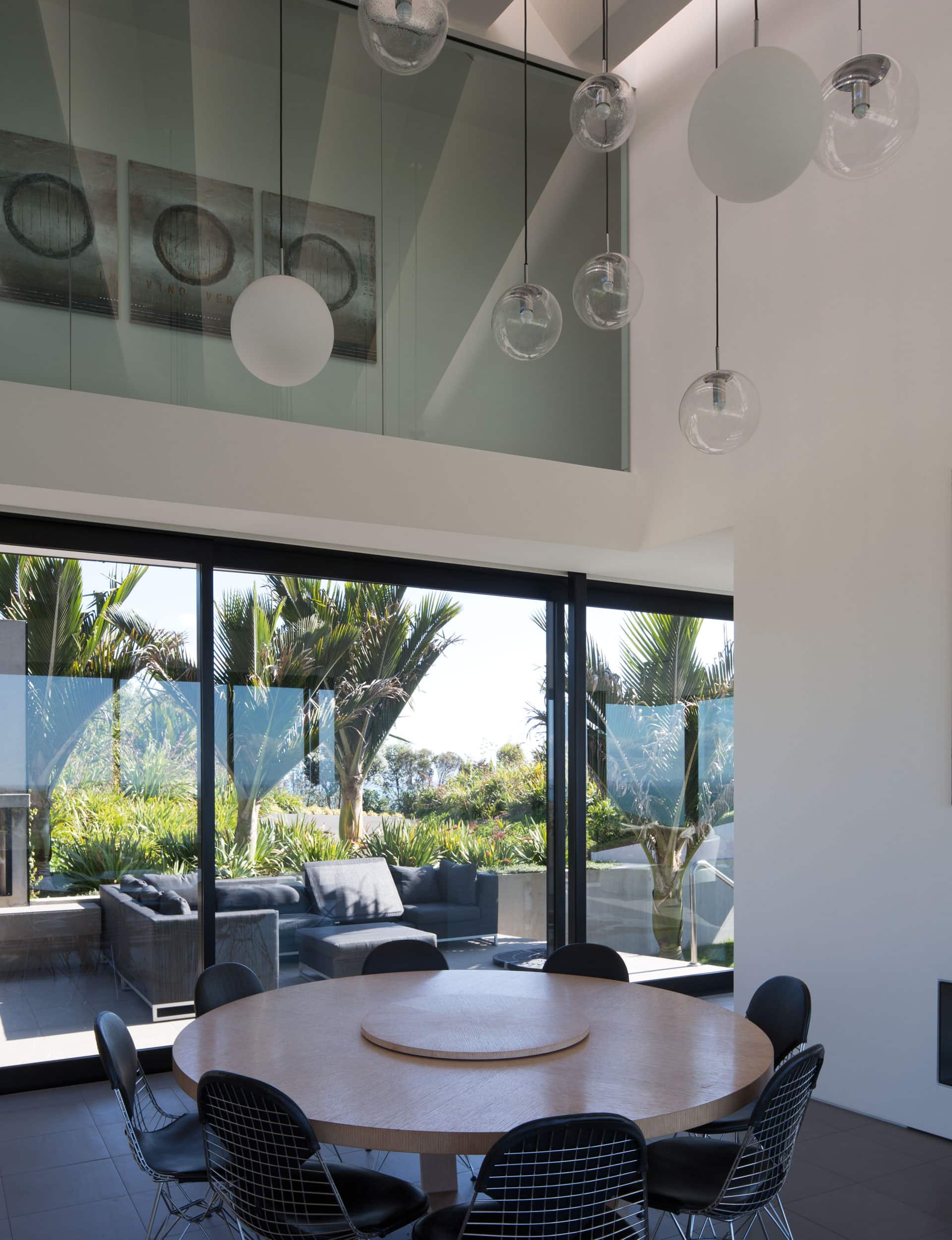
While the ground floor is complicated by its relationship to the land, the top floor is complicated by its relationship to the view. “It was about not only how you could open it up, but how you could close it down,” says Glamuzina. “It was about finding opportunities not to give them the completeness of the view but different proximities of views.”
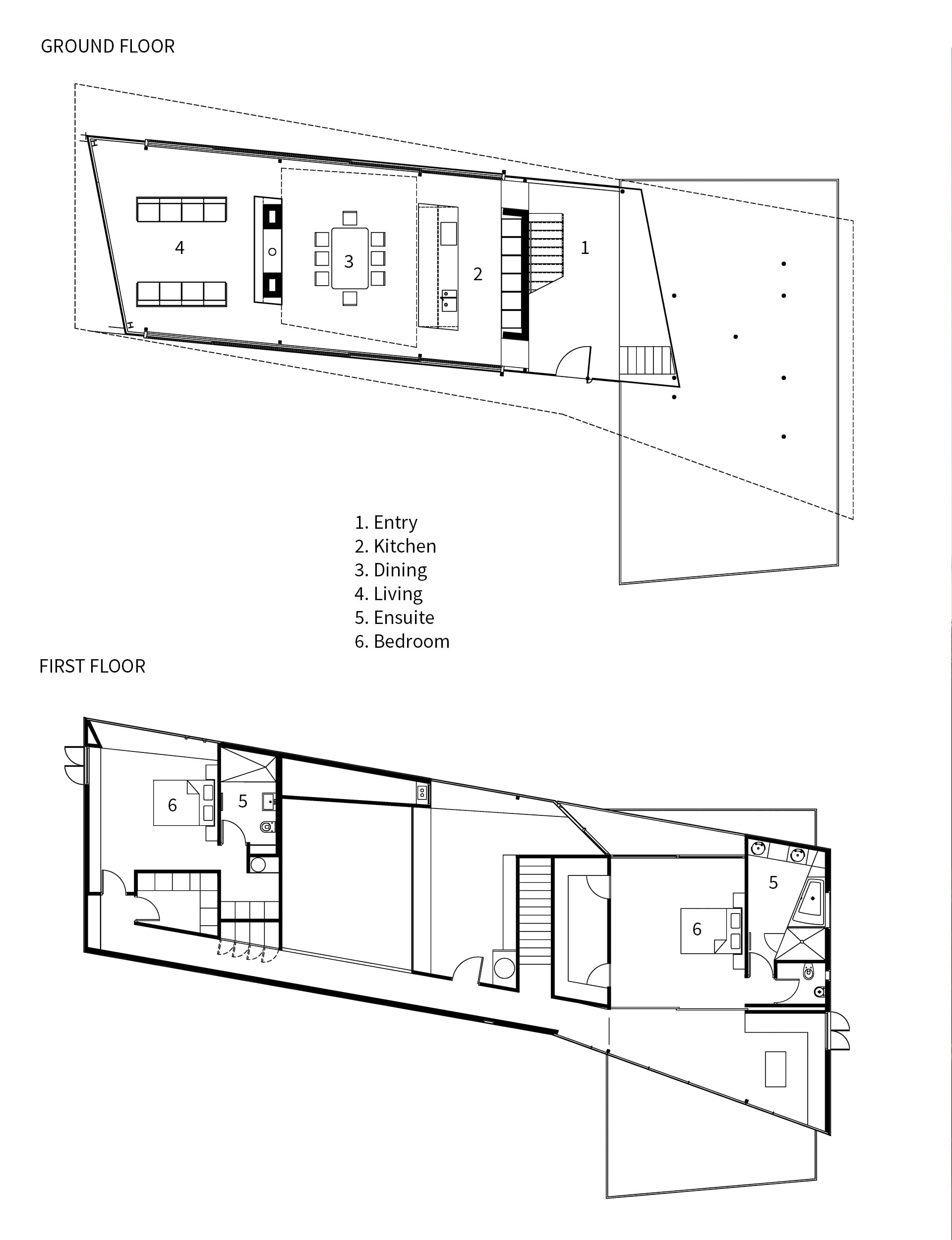
To design a long, north-facing house that could take advantages of its panoramic potential, Glamuzina took the shape of the ground floor and slightly twisted it for the upper floor. Or, as he says, “squeezing it like an accordion”. View the house from a distance, or mindlessly move within it, and you can miss its angular complexity. The copper-clad structure cantilevers in every single direction – there’s a triangular balcony, wedges of space are cut-out and utilised to give the rooms the illusion of being conventionally rectangular. “With angular geometry, it’s one of those things that once you start to generate, there’s no turning back.”
Glamuzina describes it as a “puzzle” of a house, designed with a sense of looseness and improvisation rather than an overriding pattern or formula. Rather than being hemmed in by a rigorous order, he opted for contingency, allowing a little irregularity to find its way in. “Sometimes a bit of randomness can be way more interesting. It fucks with the modernism, the perfection of it.”
Which is not to say that the house isn’t impeccable. It is. The house was built by Glamuzina’s brother Kevin, who lives on the island and talks proudly of the detail required to build a house designed with so many irregular angles. “There was no tolerance,” says Kevin. “Everything had to be a millimeter tolerance or nothing went together.”
[gallery_link num_photos=”13″ media=”https://www.homemagazine.nz/wp-content/uploads/2017/11/Matiatia10.jpg” link=”/real-homes/home-tours/modern-waiheke-home-glamuzina-architects” title=”See more of this home here”]
The house represents a turning point in the way the Glamuzina brothers work. Kevin says it’s the most complex house he’ll probably ever build. Dominic says his second project out of architecture school has informed his work ever since. “A lot of what I did here has ended up in other pieces,” says Dominic. “It’s a lot to do with the idiosyncrasies I found interesting. There’s got to be a problem somewhere. “
“What was the problem here?” I ask. “Trying to find a way to connect the building to the land.”
Words by: Henry Oliver. Photography by: Patrick Reynolds.
[related_articles post1=”76265″ post2=”76440″]


