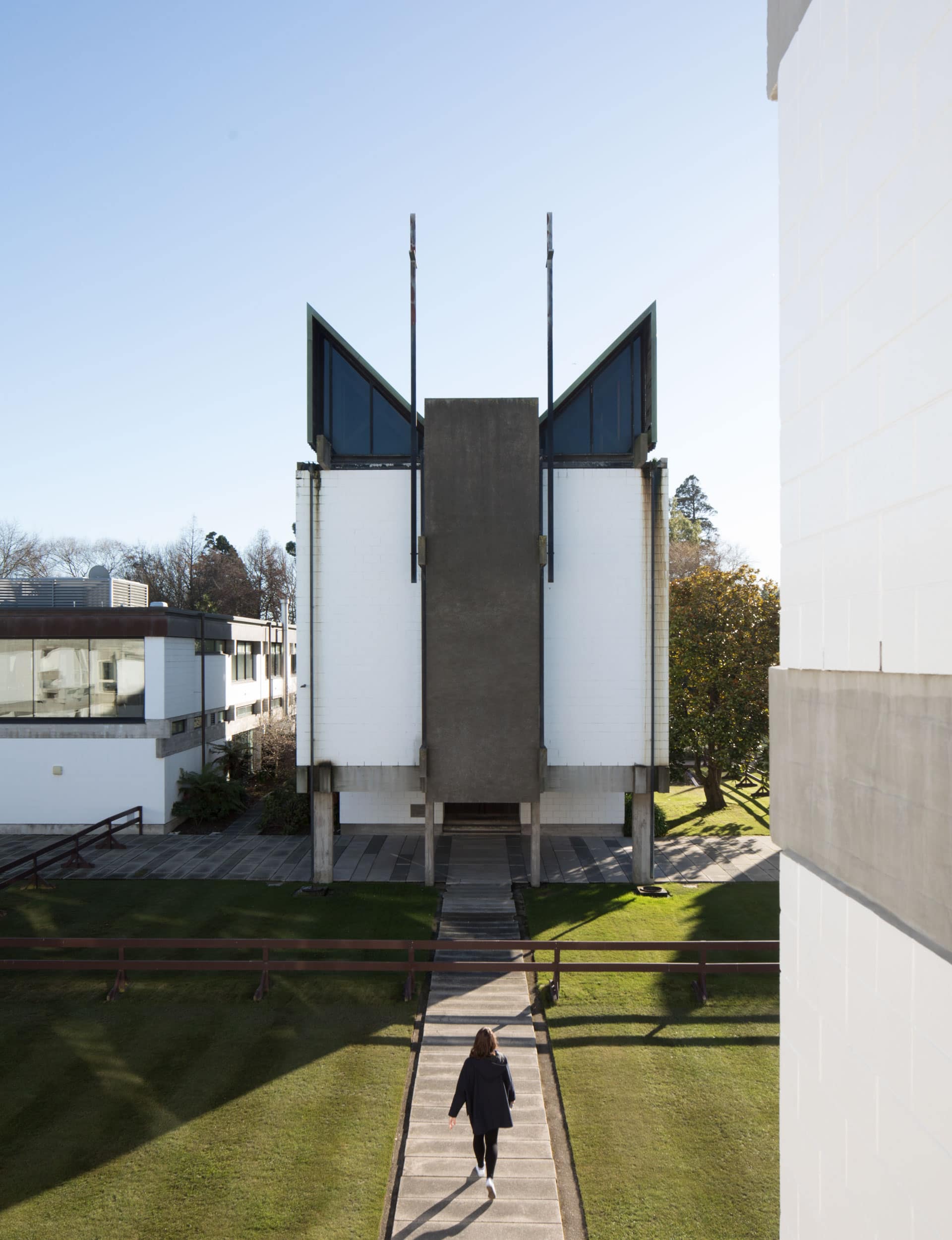
Part Oxbridge quad, part high modernism, Warren and Mahoney’s College House opened 50 years ago. Not long after, a young Malcolm Walker was so inspired by the building that he ditched science for architecture – half a century on, the building is as powerful as ever
Warren and Mahoney’s College House is still as powerful as ever
College house: ‘a residence for 120 gentlemen’. That was the total brief to the architect. And that’s what was built. Beautifully. (Finding 120 gentlemen in the mid 60s wasn’t quite so simple.) Designed by Sir Miles Warren, College House is a collection of buildings forming one of our great mid-20th century architectural works. Sitting in an elbow of the Avon and looking fresh after 50 years of hard labour and earthquakes, these buildings are magical. Raw, clear and, as is the nature of excellent things, simple in concept. But so right.
College House changed my life. It converted me from a wide-eyed provincial youth set for a career in chemistry and astrophysics to an architect. I was a resident for two years and ‘C H’ showed me how architecture works; how an understanding of behaviour, construction, materials and humanity can be assembled to deliver more than the sum of its parts.
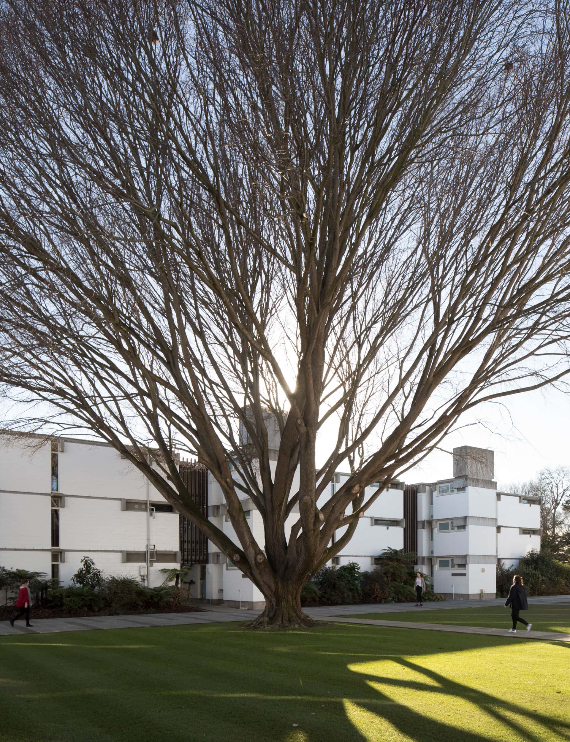
The essence of College House is not the beautiful (but impossible) chapel or the rectitudinal (but wonderful) dining hall. It is, as it should be, the residential blocks, known as houses, and how they relate to these other buildings. There are eight ‘houses’ arranged to the side of a formal quadrangle. Very English, very Christchurch, very Anglican.
Each house is three storeys, each storey has five rooms, a sink and bathroom. Each has 15 inhabitants. The central floor has a double room that serves as a social space for the house. The organising of five rooms to a floor functions much as a social grouping for a flat. No long, anonymous corridors here. Circulation between floors is by external stairways, which reinforce the separation of the floors to each other, and the houses from each other. The use of discrete buildings and exterior circulation is a potent one. To enclose the circulation would be architectural suicide.
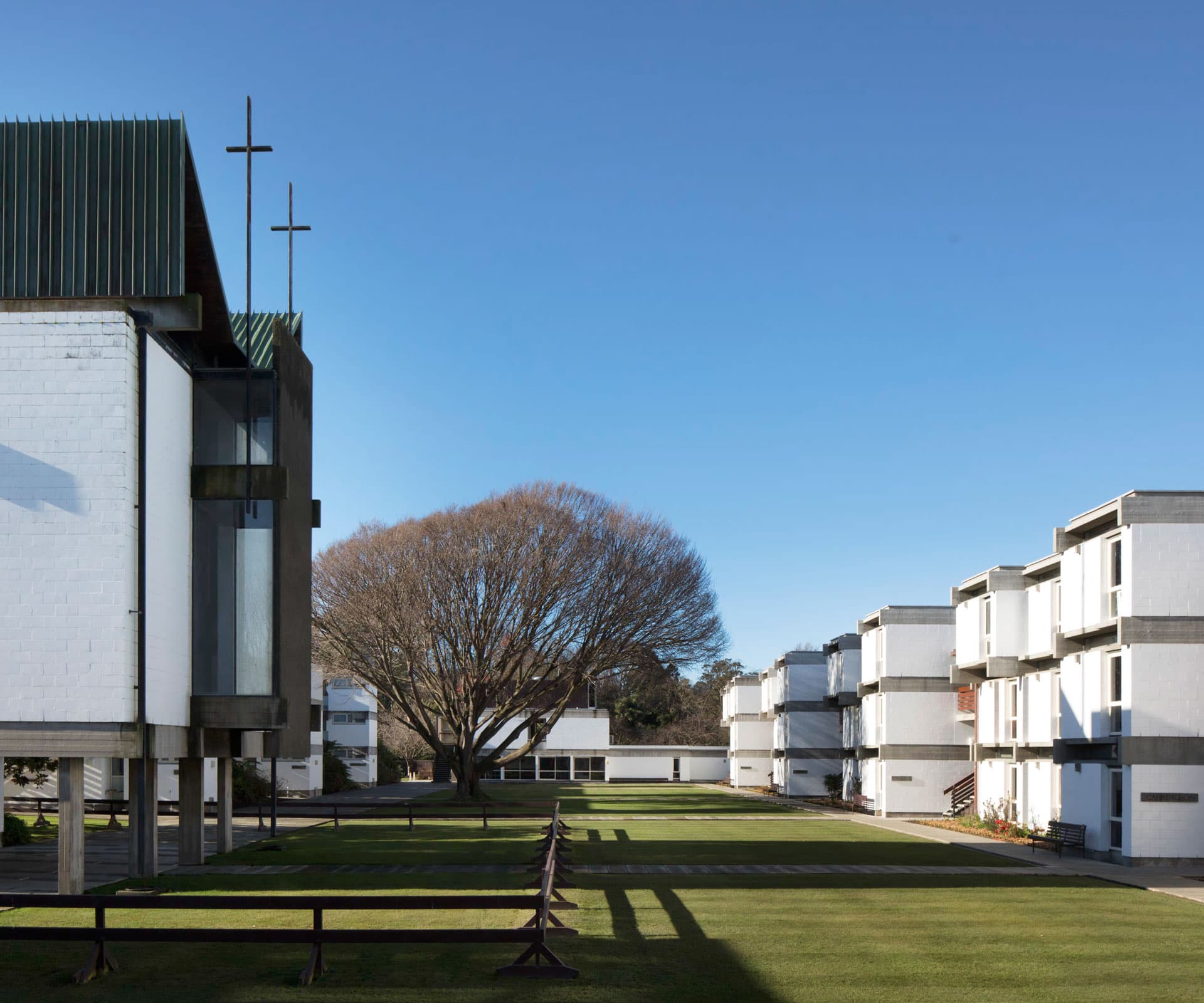
Miles knew the order of things. At the top of the quadrangle is the main entry, lounge and dining room, at the bottom sit the recreation rooms, with the library above. The chapel is off to the side – perfect! The style is Brutalist but the environment created is anything but. The rooms are comfortable, sunny, social – and everything is generous – windows, door thickness, storage. And what better material than concrete and hardwood for students?
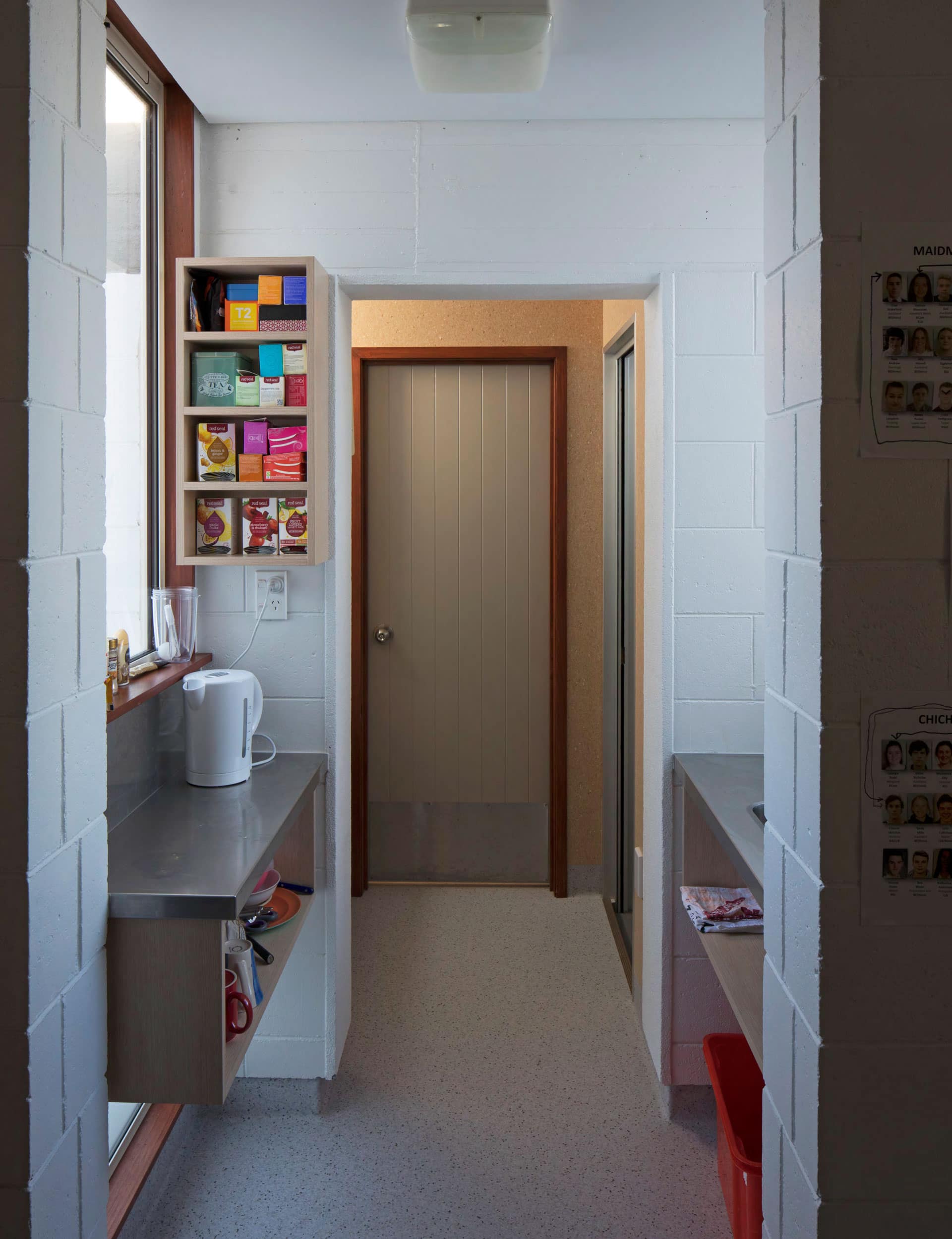
The structure is eminently climbable, the roofs will support a car, or fleeing groups of waterbombers. Rooms will accommodate cheering winter fires (not recommended) with surprisingly little damage. Doors survive being rehinged from their bases, wiring can be easily rerouted for remote switching by one’s neighbour. Windows weren’t too easy to break – but I did have a brick arrive through mine with a note advising me that my window was broken. But, mainly, the rooms were quiet and defensible; we did have work to do.
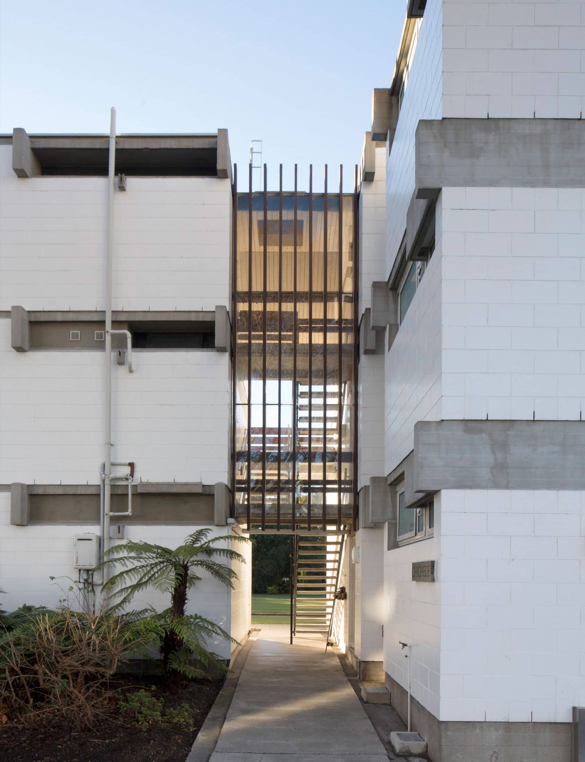
The quadrangle, overlooked by the houses, was perfect for croquet and competitive drinking – usually together. It was the setting for waging battles and for informal gatherings of plotting or theorising students. I won’t mention the pyrotechnics that took place, lest my eyes mist up with wistfulness, except to mention nearly a month’s board spent on a fireworks assembly lit from one wick. Brilliant – it ranged far and wide, wonderfully spectacular, sporadic and dangerous. And the teapot of blasting powder was memorable… another good reason for concrete buildings.
The place hummed with visiting speakers in the lounge – including Sir Miles, who gave talks on architecture. Good on him.
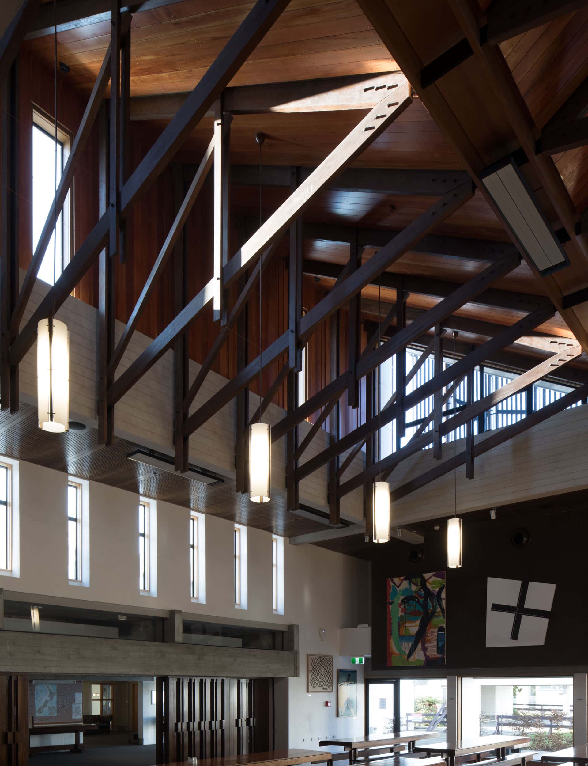
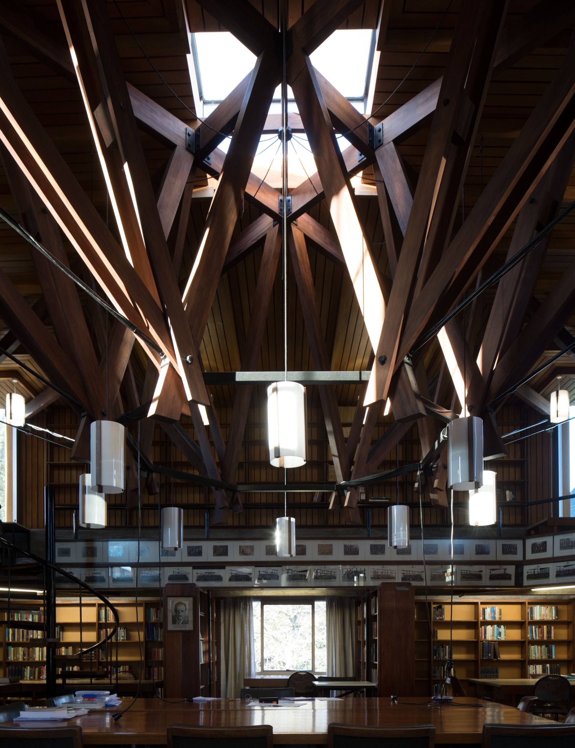
The chapel is extraordinary. From the conceit of glazing the stair risers (again a reference to outside circulation) to the mad truss work of the ceiling – more studied than the altar. It’s a strong and intimate building and a special accent to the whole of the place.
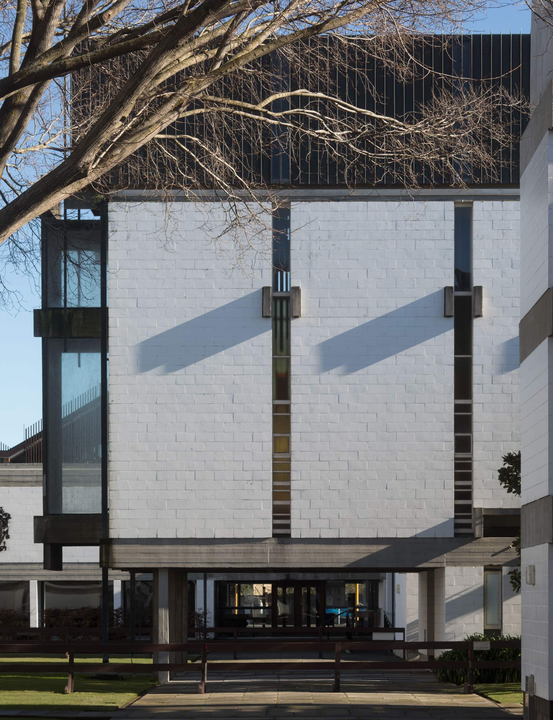
The dining hall is somewhat theatrical – its design put ceremony into dining. The servery is screened off from the dining space, which has a low-raised dias at its head and is furnished by refectory benches and tables (that organising thing again). And there’s more madly wonderful truss work. The hall has been rebuilt and enlarged since the earthquakes. All power to the board, it has been carefully considered and modelled to maintain the consistency of the original building. This place is too strong to be meddled with – some earlier unsympathetic alterations are testament to this.
The thing is, Miles got the essentials right – and then he made it interesting. These buildings are robust and socially planned – enduring relationships are formed – and it’s impossible to not be part of the place.
To design somewhere to eat and sleep is easy, but to make a place to belong to – that’s architecture. The social order flows from floor to house to quadrangle to dining hall, and structures the way one inhabits the place. College House is a place of order, but not of rules.
At one end-of-year formal dinner it was decided that when, as Anglicans do, the Queen was toasted, we’d drink then throw our glasses over our shoulders. “Gentlemen – the Queen!” Then the sound of 120 glasses breaking. I wouldn’t suggest we do that for Sir Miles. Just drink deeply, thank him and put the glass back for someone else to use. College House is bloody brilliant. Here’s to its next 50 years.
In July, College House was awarded Category 1 status by Heritage New Zealand Pouhere Taonga.
Words by: Malcolm Walker. Photography by: Patrick Reynolds.
[related_articles post1=”50812″ post2=”71578″]
