These two Wellington couples decided to pool their resources and build two homes on a site where most would struggle to fit one
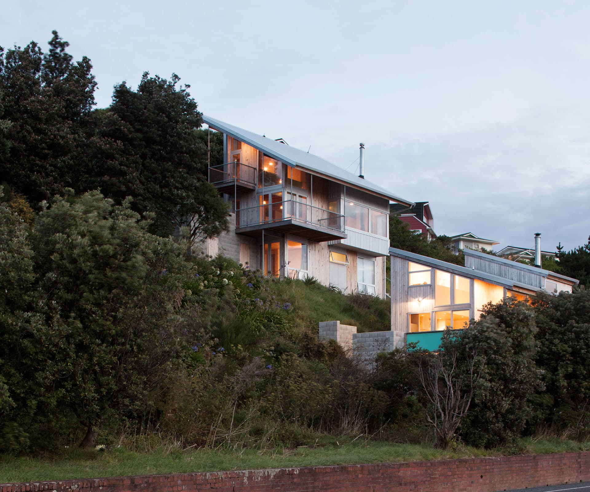
How two Wellington couples built a house each on a difficult sloping site
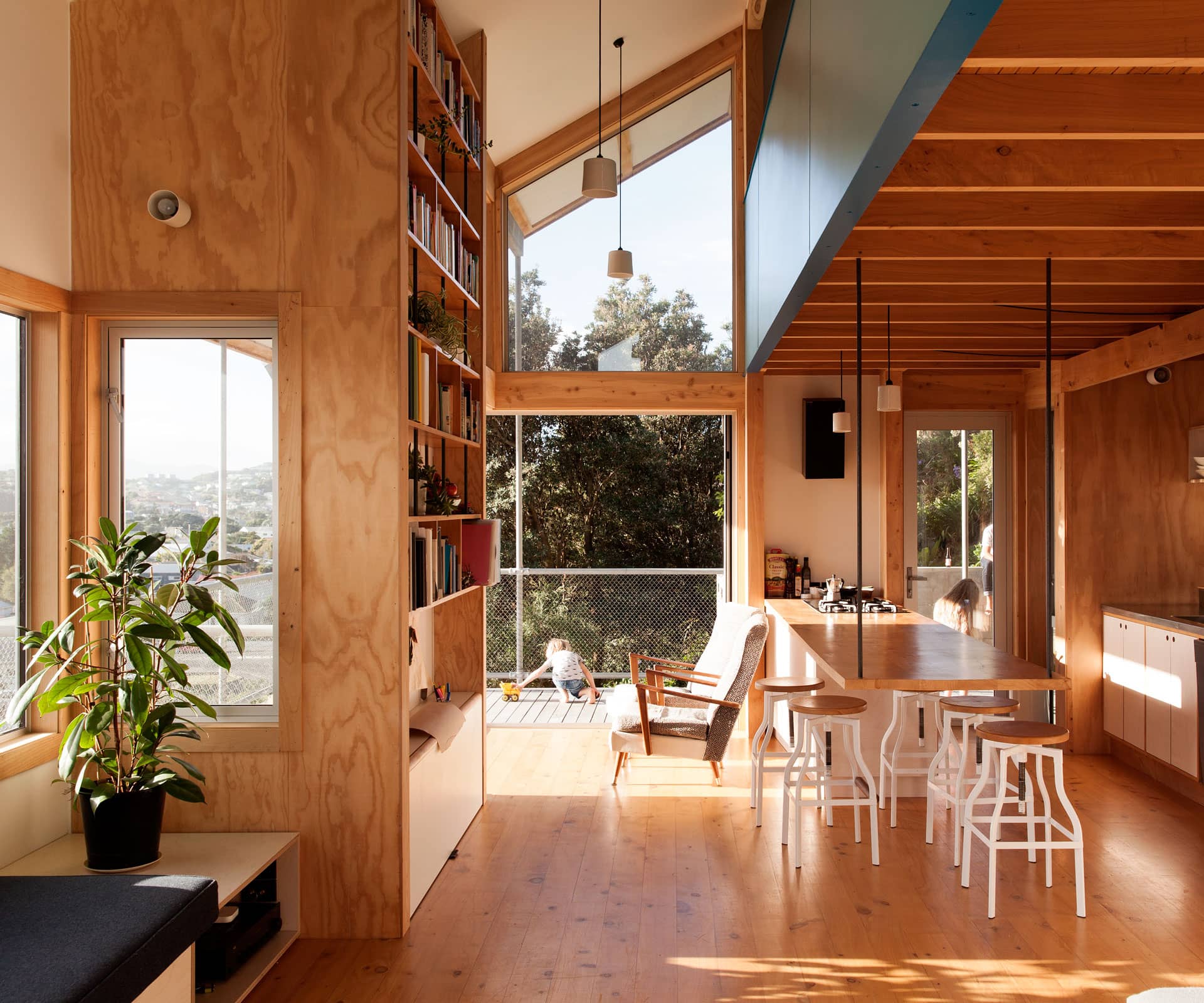
“This is 95 square metres and three stories,” says Tim Gittos, gesturing at the view out over Wellington. “That’s north, west is out there and east is there. And you get to look out at the hills and view. On a clear day, you can see the South Island.”
Gittos and partner Caro Robertson – who run Space Craft Architects – returned to Wellington in January 2013 after time in Whangarei and Whanganui, where with friends they’d built a house known as ‘Dogbox’ (a finalist in Home of the Year 2013) . Shocked at the cost of renting a tiny two-bedroom flat to house themselves and their son – and with another baby on the way (Robertson has now been pregnant through two builds) – they figured there had to be another way.
Around the same time, their old friends Mat Lee and partner Charlotte Key had also begun to despair at the cost of old, rotting wooden houses in Wellington, and the prohibitive cost of renting. Eventually, the two couples realised they could pool their resources and build two homes on one site.
They found their opportunity on a section in Miramar near the airport: a smaller than an average suburban plot, and so steep as to be impractical. In the early 2000s it had been subdivided off the back of a house as part of a development that never came to anything.
There was very little interest in the site and so it was also very cheap. In other words: it was perfect. “The idea was always to find marginal land,” says Lee, an architectural designer at Melling Architects. “Land that no one else wanted and that we could invest some time and thought into, and squeeze something out of.”
They were helped in this regard by the planning rules of the Wellington City Council. Rather than meet minimum site requirements, they had to meet certain performance standards around sunlight and access to the outdoors and parking.
So in July 2013, they bought the 406-square-metre scrubby hillside and set about establishing how to get not one but two houses on it. “We looked at heaps of different massings,” says Robertson. “A party wall or a courtyard – everything was up for grabs. Tim was keen on a split up the hill, just to show it was possible. But in the end we realised we’d have to go for a clear division, or financing was just going to become a complete headache.”
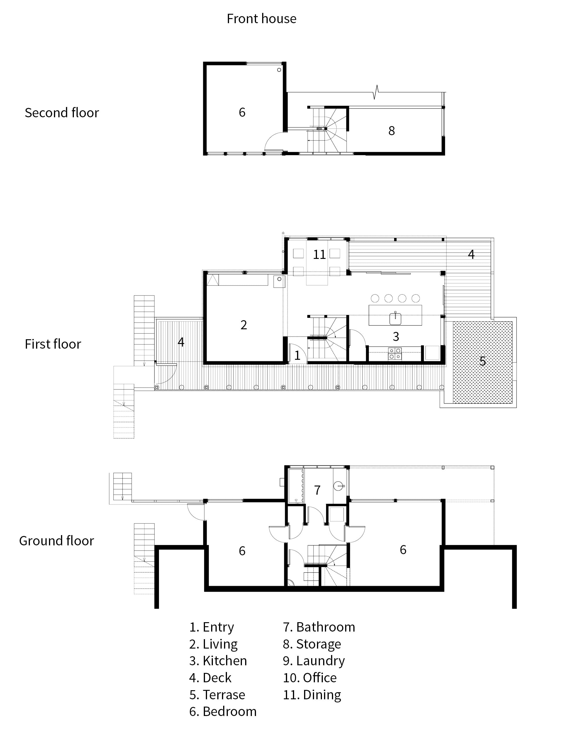
Eventually, they split the site halfway down and ran a steep set of concrete stairs up the side to service the front doors of both houses: one house at the top, one closer to the bottom but still above the road. “Now that it’s built, I’m looking at this and thinking we could have got another house on here,” muses Robertson. “But the thing is, we did struggle to get two through the council process.”
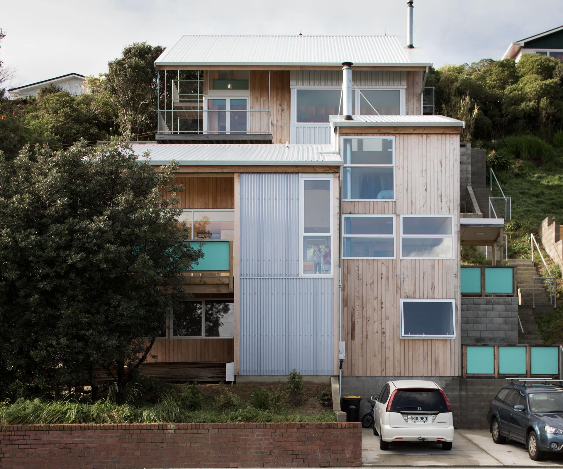
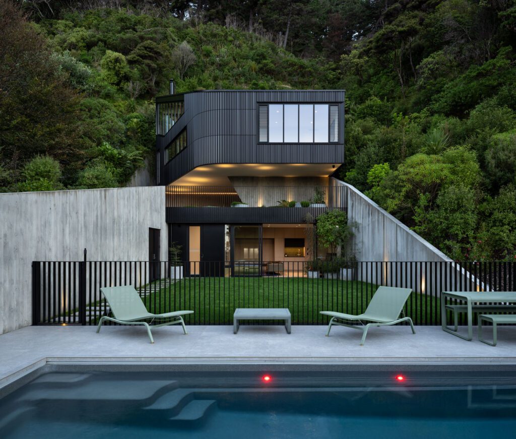
The houses share a similar palette – unpainted macrocarpa shiplap cladding, anodised aluminium joinery, exposed concrete block and grey steel corrugate, materials in part derived from their time working with Melling Morse Architects. Because of the topography, the houses are tall, running lengthwise across the section with monopitch roofs: long and narrow buildings spread over three levels with the living area on the middle level and kitchens on the northwest corner running out to courtyards and decks, extending the footprints of these small houses to make the best use of the site.
They also share a simple, stripped-back aesthetic that comes from tight budgets and doing as much of the work themselves as possible – Gittos built the foundations on his house, while Key – an industrial designer and jeweller – built the cabinetry and much of the furniture from inexpensive second-grade plywood.
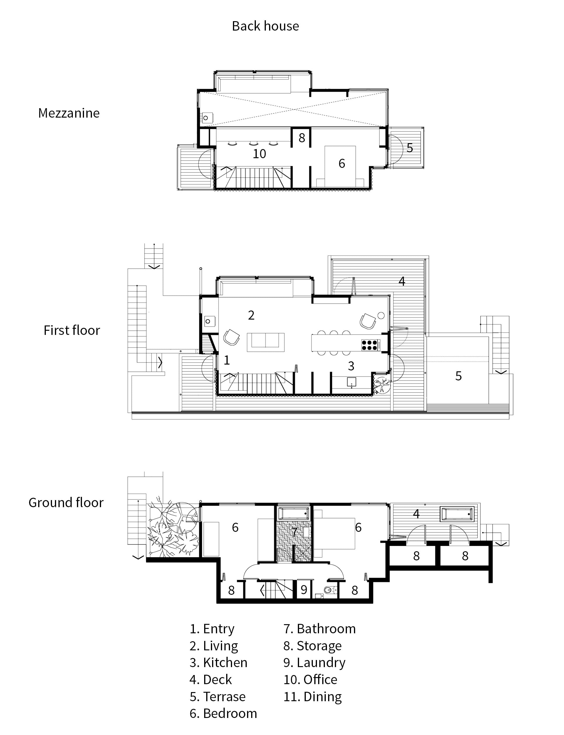
Internally, the houses are quite different. At the top of the slope, Gittos and Robertson built a house under one roof plane, which follows the slope of the hill. “We took the approach that we’d keep the envelope quite simple; have one roof plane and park everything underneath,” says Gittos, who worked on the house when he could, laying the foundations and doing a lot of finishing work.
There are two bedrooms and a bathroom at ground level, an open-plan living area at middle level and a mezzanine on the top level with a third bedroom and studio for Gittos and Robertson.
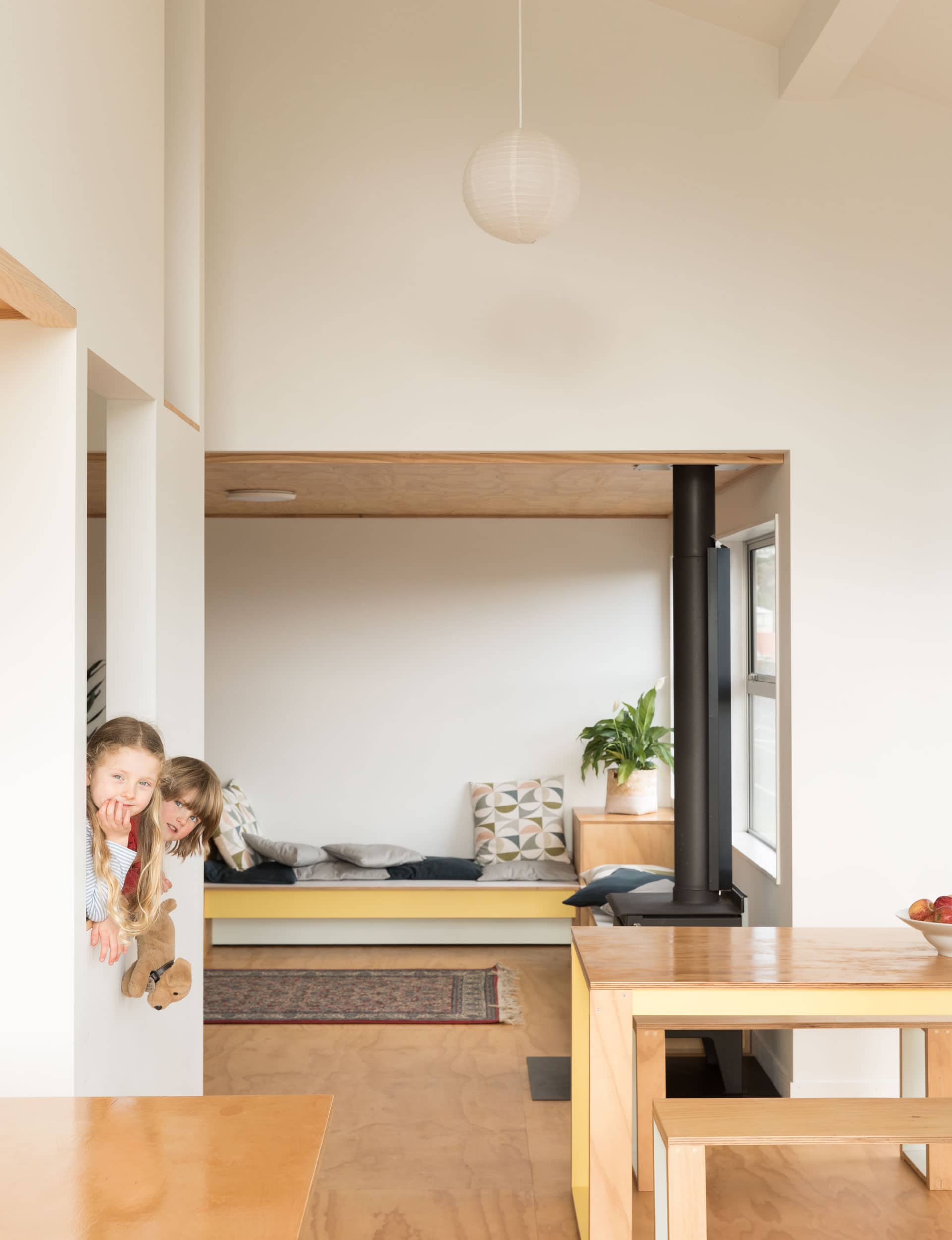
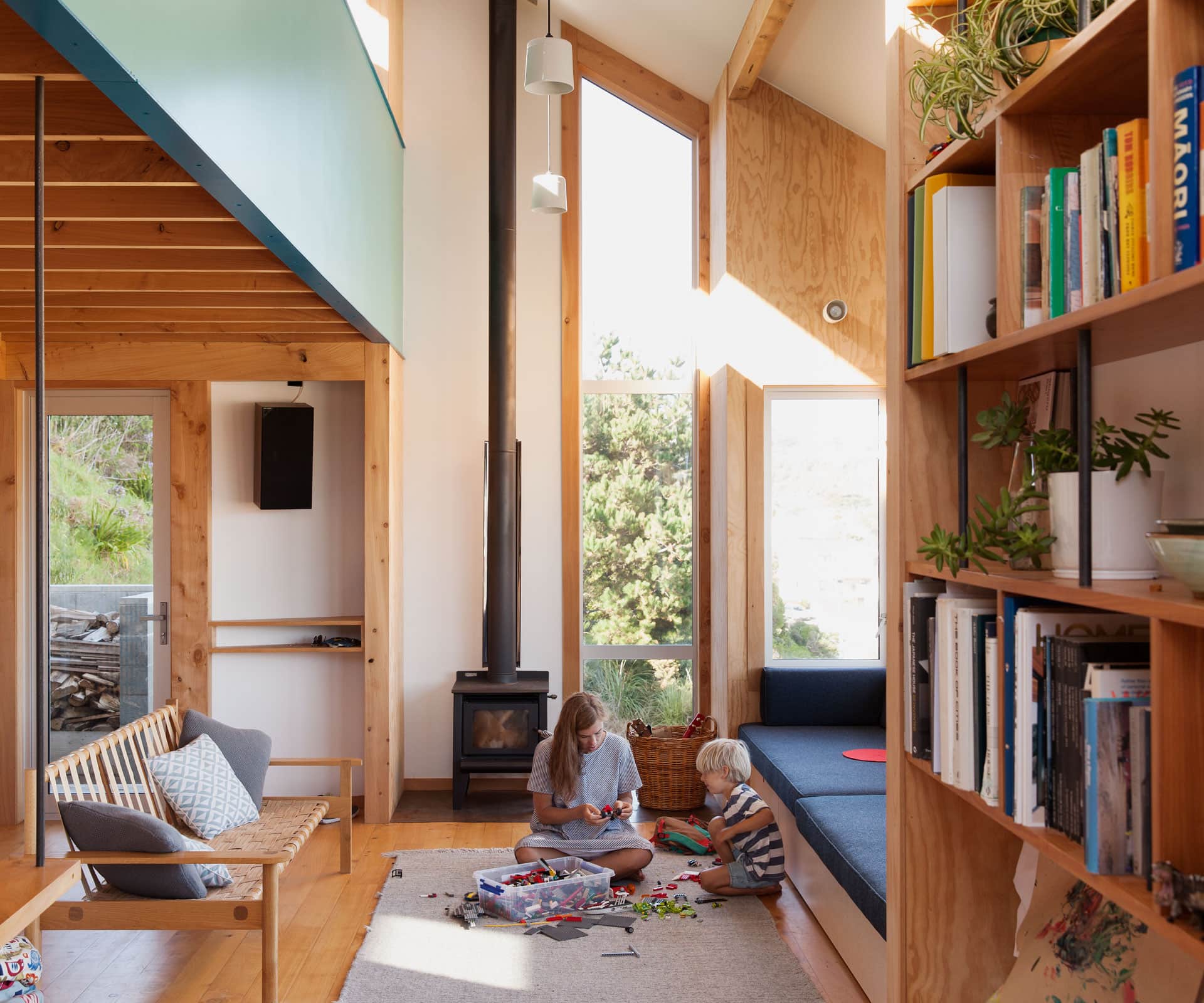
The entrance leads straight into a long, open-plan living area. There’s a built-in daybed in front of huge windows, which take in spectacular Wellington views, and an elegant steel screen that supports the stairs. The key is that everything does double duty: the bench in the open kitchen is hung from the rafters by steel poles and doubles as a dining table. Big daybeds conceal storage, as well as act as spare beds for guests. A panel in the 3.6-metre high bookshelves folds down to become a bench for their two kids to play on.
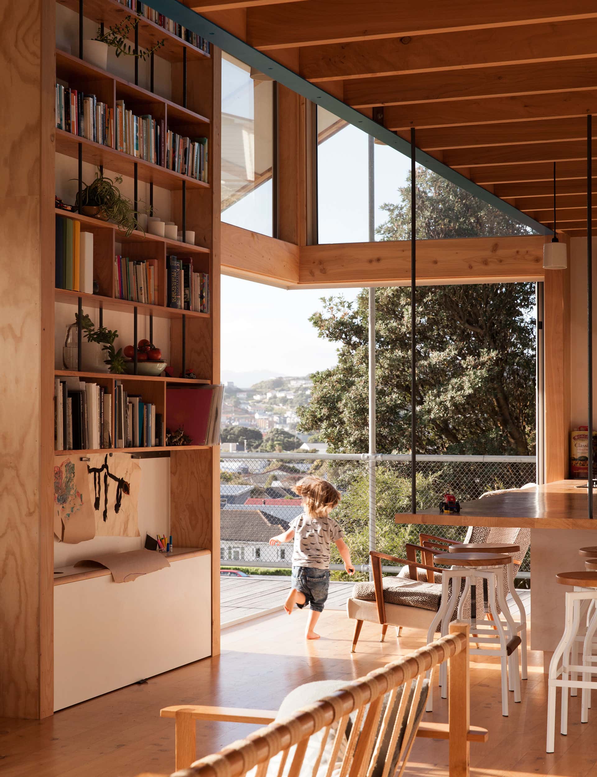
There’s a gutsy, wood-and-steel aesthetic at play here that’s simple, straightforward and hard-working. While the footprint is small, the volume is tall, with spaces borrowing views from each other. “There’s so much space in houses that’s used only intermittently, and only when other space isn’t being used,” says Gittos. “It’s so rare that a house is completely full or being used.”
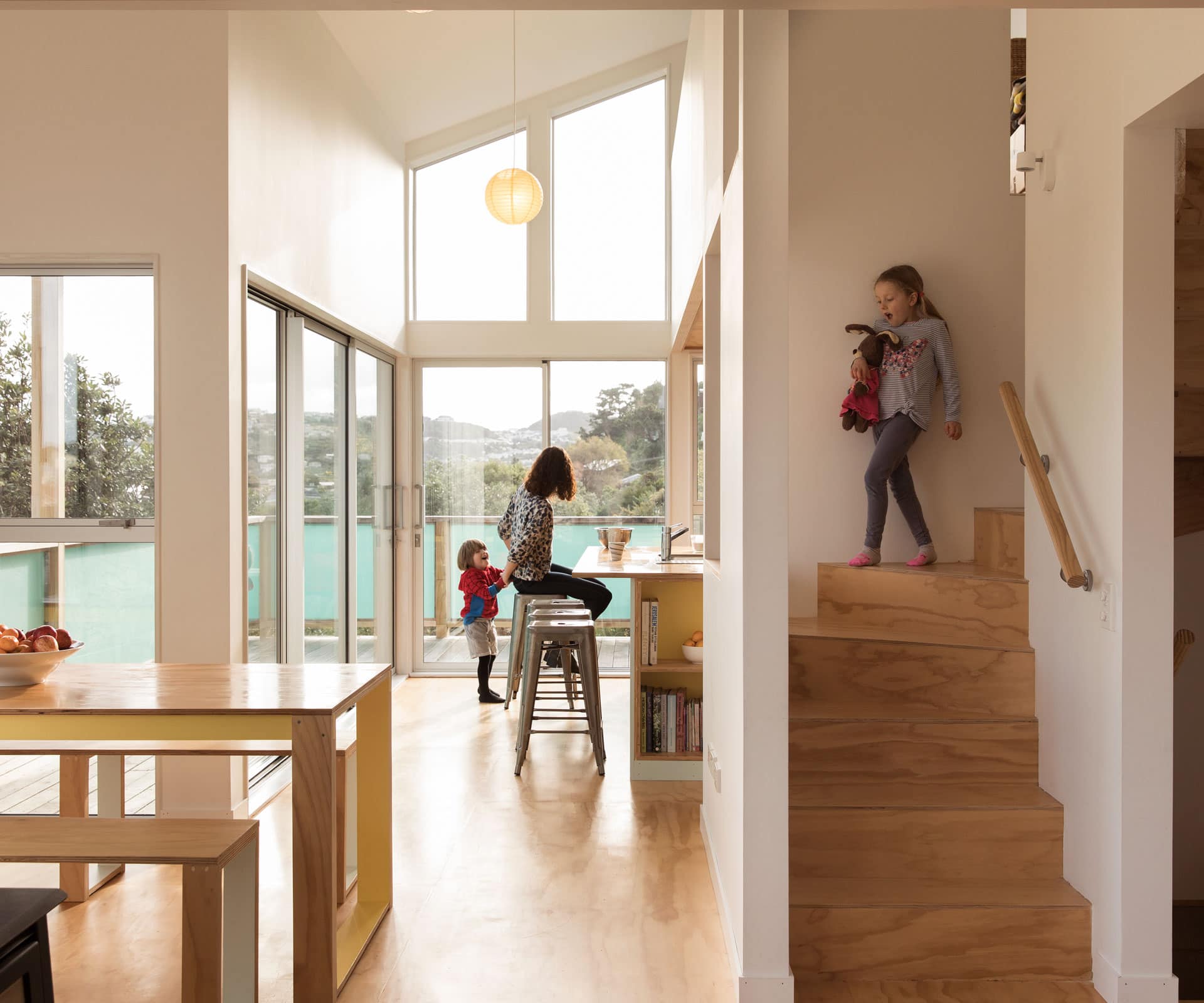
Down the hill, the planning is similar: living area in the middle and bedrooms below. But the approach is more fractured in the most elegant of ways. “Apparently, there’s this thing called broken planning,” laughs Lee. “We just tried to dislocate the zones a bit.” This approach is clear in the stairway, which juts out into the middle of the house to create two sides – a box and a tower, effectively, sitting on top of the bedrooms, which are dug down into the hill.
In the box, there’s a kitchen with a slip of a storage space above; in the tower, there’s a snug of a living area with a low ceiling, with Lee and Key’s bedroom above. In between, the dining nook juts out. “The interlocking nature of the volumes was really interesting to us,” says Lee. “We’ve tried to keep it simple and also test ourselves a bit.”
[gallery_link num_photos=”19″ media=”https://www.homemagazine.nz/wp-content/uploads/2017/08/Wellington12.jpg” link=”/real-homes/home-tours/building-on-subdivided-section-wellington” title=”See more of this home here”]
Being closer to the road and more visible might mean they don’t have to climb 65 steps to reach their front door, but it also came with challenges. Though there’s still a lot of glass, Lee made the sills higher to obstruct the view from the street, and specified fibre-cement panels in the deck balustrade for privacy; he also used twin-walled corrugated polycarbonate, which brings in light and stays warm, but obscures visibility.
Having a warm, dry home is one thing, but there are other benefits to how the couples have resolved housing their families on an awkward suburban site. They often cook together or for each other, and mind each other’s children. “The four kids hang out heaps,” says Key. “They’ll play down here and then go up there – it adds to the whole thing. They work together.”
Words by: Simon Farrell-Green. Photography by: David Straight.
[related_articles post1=”71493″ post2=”71446″]
