After sitting empty for three decades, a precipitous site above Wellington is revived by David Melling’s clever idea to build two homes that mirror the land
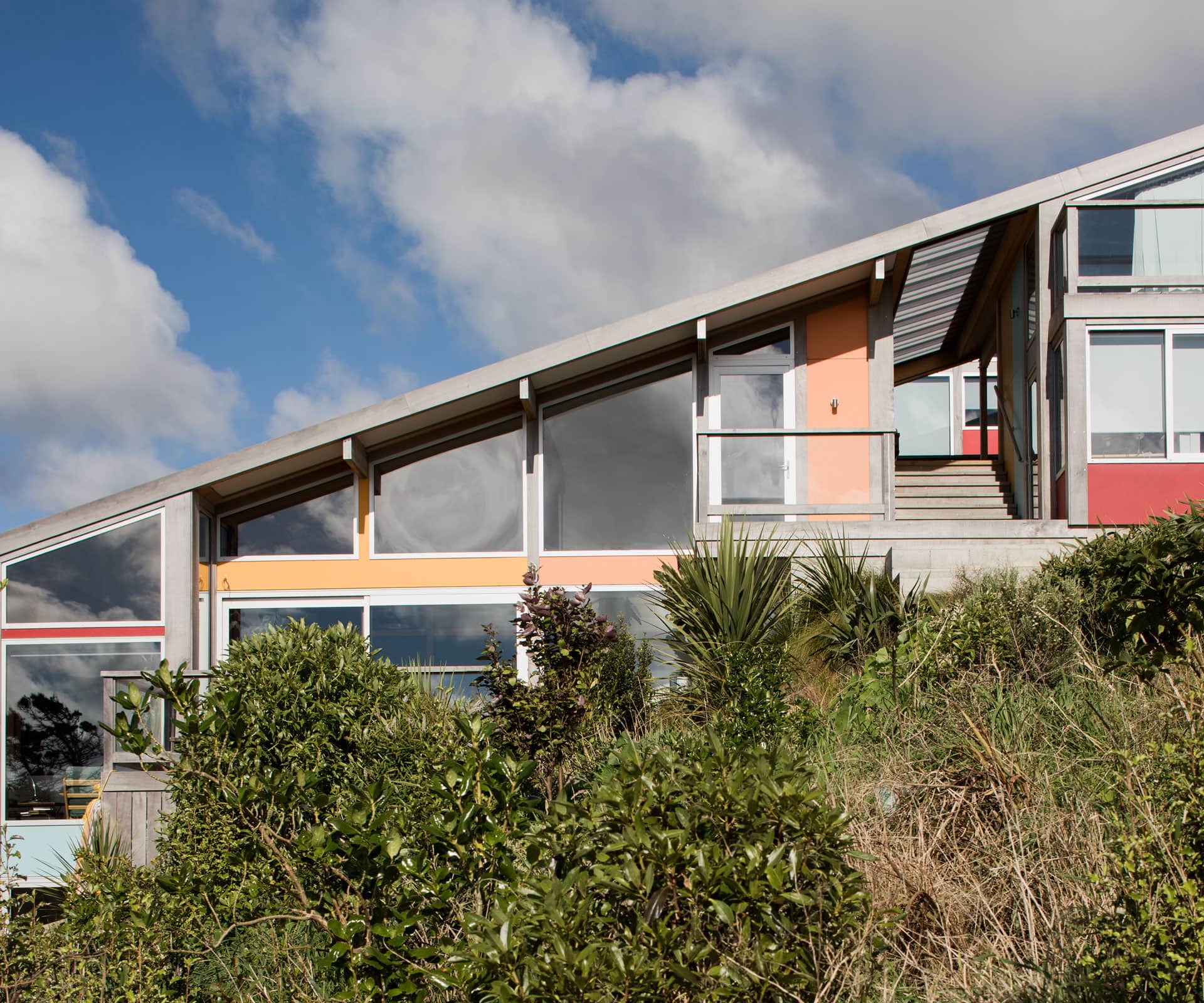
A pair of Wellington homes mirror the slope of their impossibly steep site
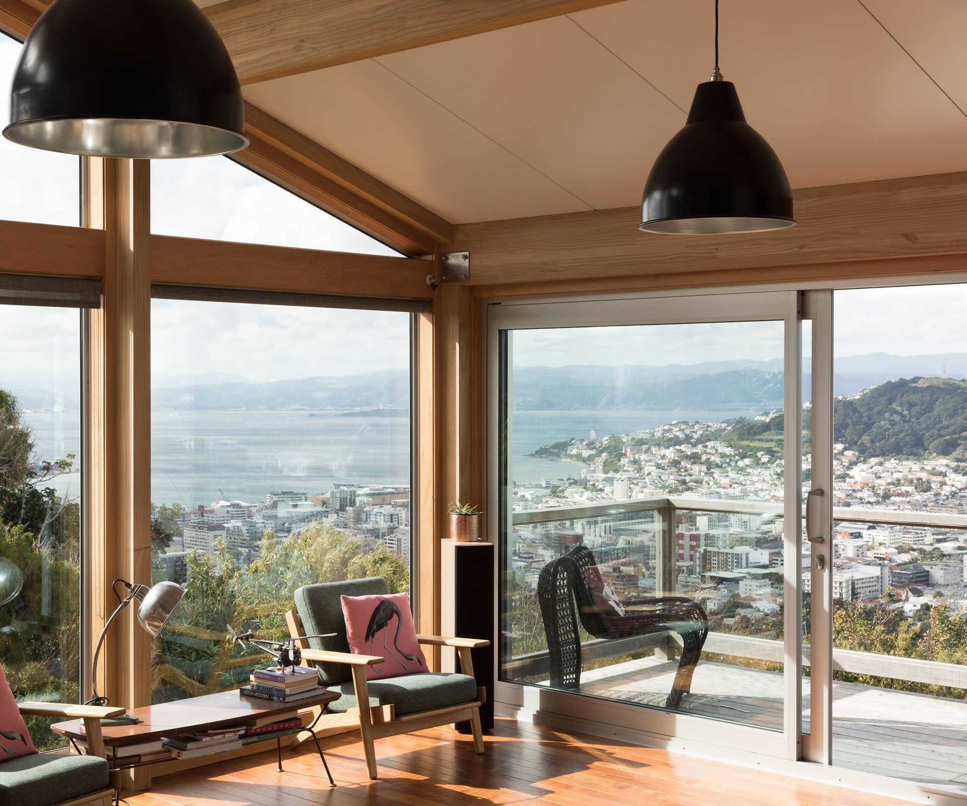
You’re 10 minutes’ drive from Wellington’s CBD, less if the traffic is kind. But high on the Brooklyn hills, with New Zealand’s capital spread beneath – the view extends from Pencarrow Heads out to the Hutt Valley and across to the western hill suburbs – the only sounds come from the native birds.
Building one house on this 885-square-metre section, neighboured by a walking track and tumbling down bush-covered hills, would be tricky enough. To build two is even harder.
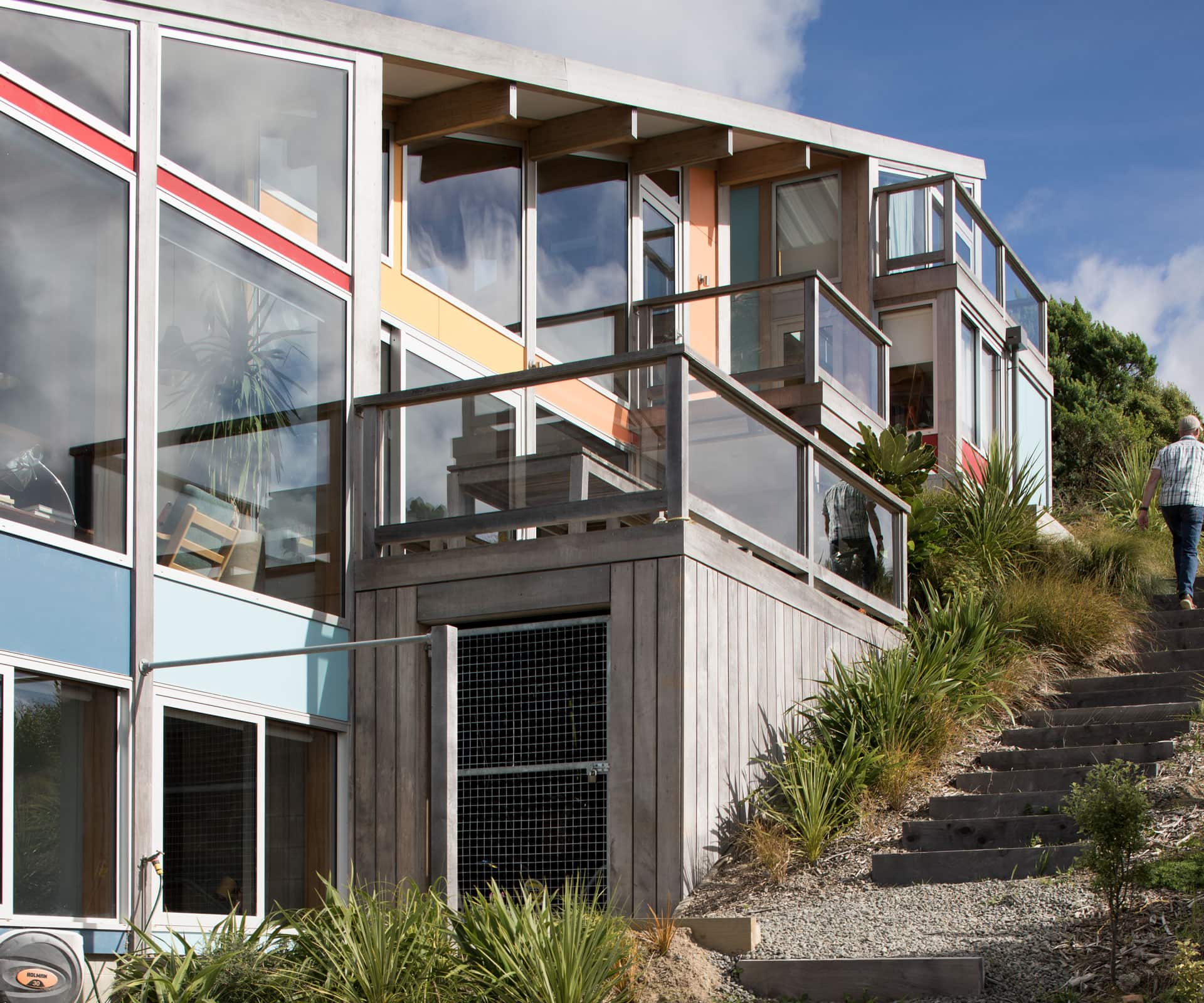
The site had sat empty for three decades after a small wooden cottage burned down in the 1980s – even in Wellington, prospective owners were put off by the 25-degree slope. Until David Melling’s clients, who lived nearby, fell in love with the view, seeking more room for their family and a self-contained rental property that could eventually double as extra family accommodation.
The architect’s first move – and the reason the combination of the two works so well on a reasonably sized suburban site – was to split the site lengthwise, giving each house street frontage. This meant placing one house in front of the other along the northern boundary. Both houses have off-street parking at the front of the site, so there’s no need for a driveway or path past one house to get to the other.
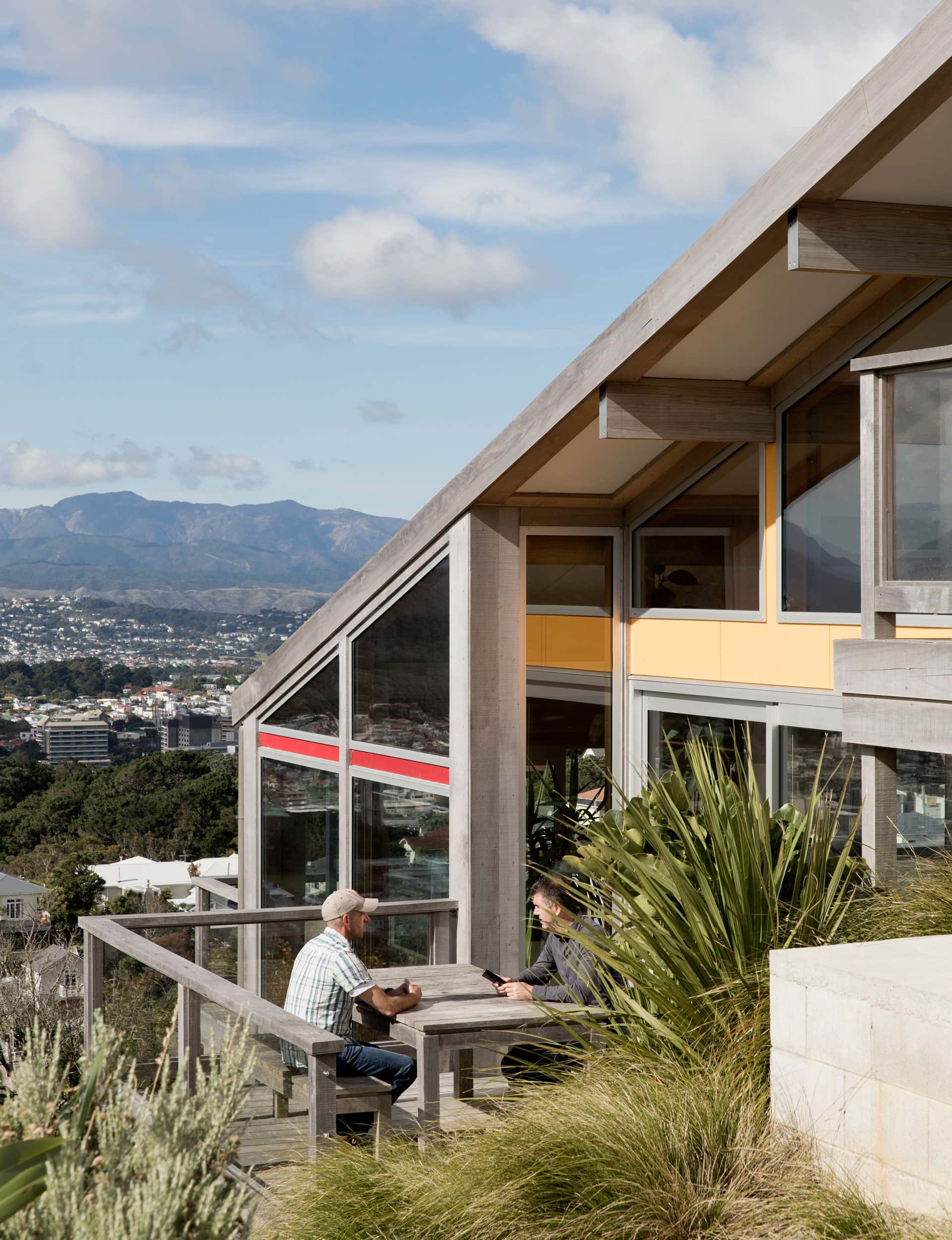
Once he’d done that, Melling designed the two houses as facsimiles of each other, with enough space between them – and few windows on the southern sides – so that neither the owners nor the tenants ever need to see each other. His vision was for both dwellings to reflect the typography of the site. That includes a 17-degree slope for both roofs, which approximate the gradient and visually form a ‘cap’ with the hillside. “This means both forms are subtle and fit naturally within their surroundings,” says Melling.
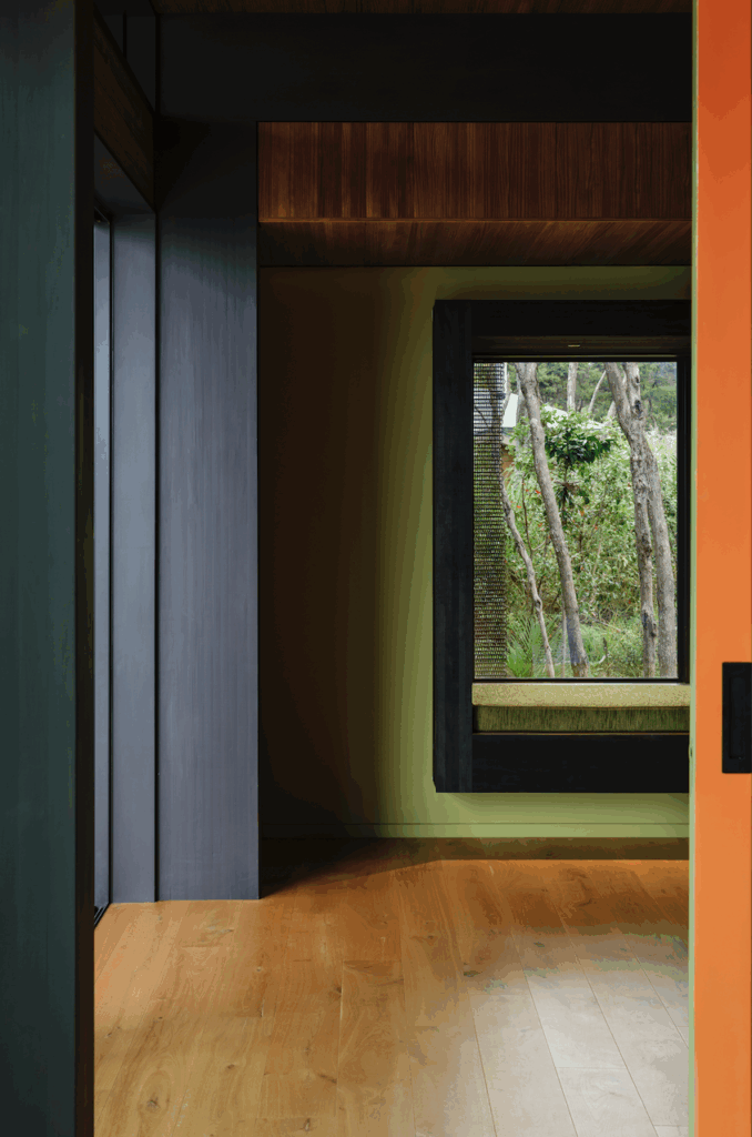
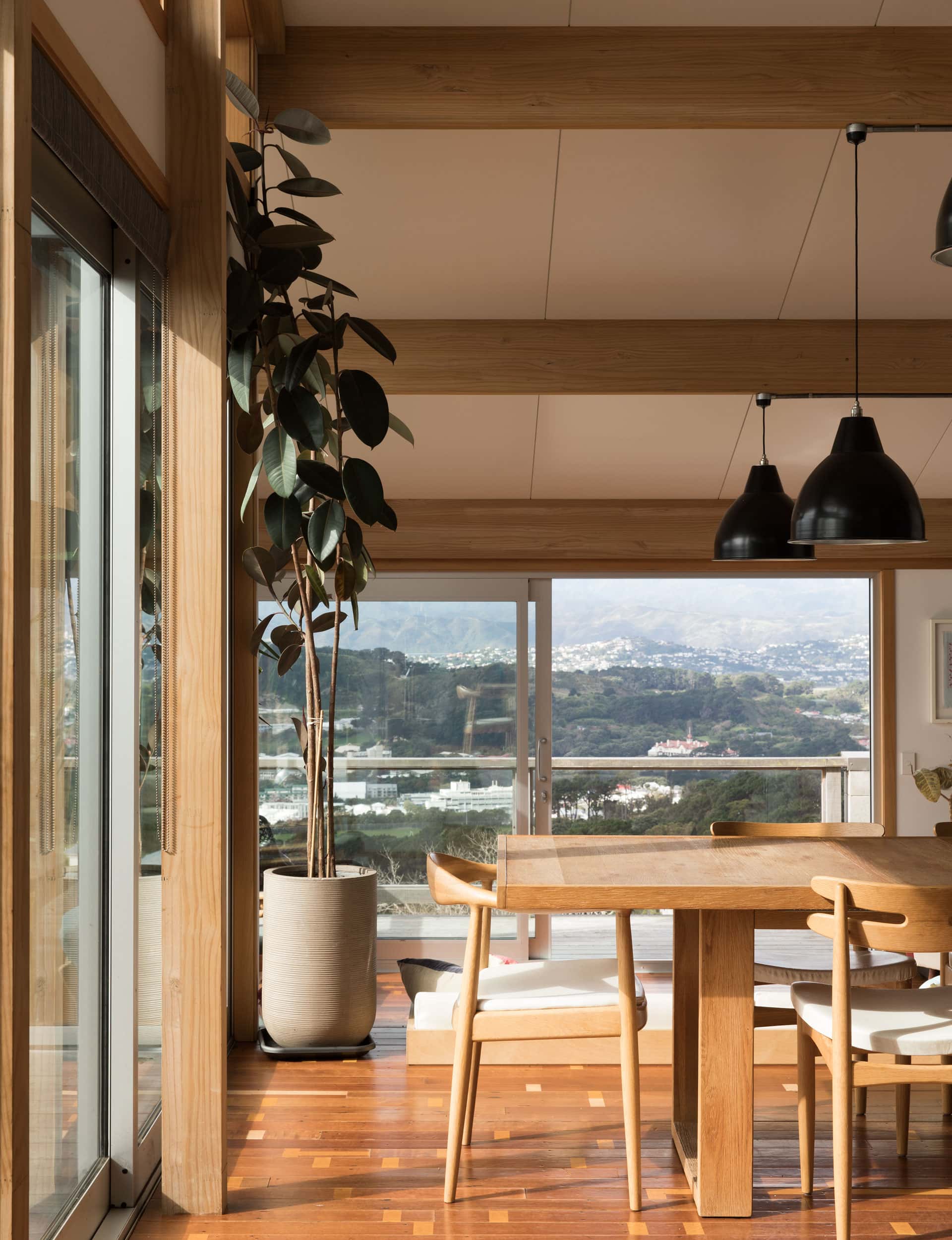
There’s a strong, pragmatic feel to the houses, with glulam posts and beams visible in the structure. Walls and roofs are made from panels normally used for commercial cool stores, something Melling has been experimenting with for a while. As well as coming to site ready-made, which saves cost, there’s a crisp, tough feel to them, softened by macrocarpa trim inside and ‘transoms’ painted in bright, primary colours on the outside.
“The use of freezer panels was a key part of the design,” says Melling. “They provide an effective continuous insulating blanket and a smooth pre-finished internal surface, which allowed us to expose rather than cover up the structure of the houses.”
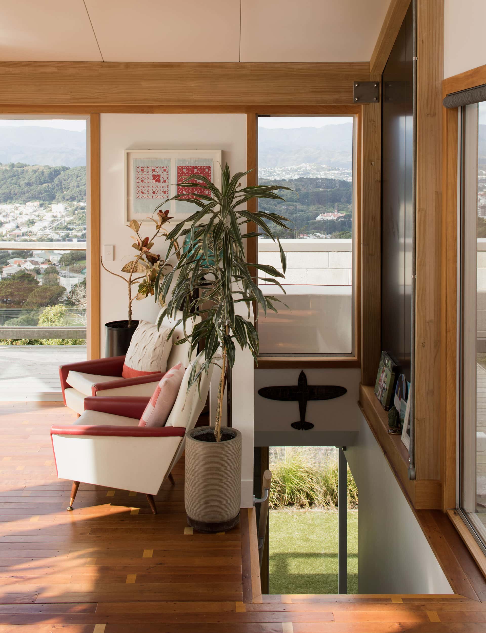
The floors throughout are recycled tawa from Eastbourne’s Wellesley College gymnasium, laid with the original gym markings intact. “The flooring guy was instructed to lay it as randomly as possibly, which adds to the industrial effect.”
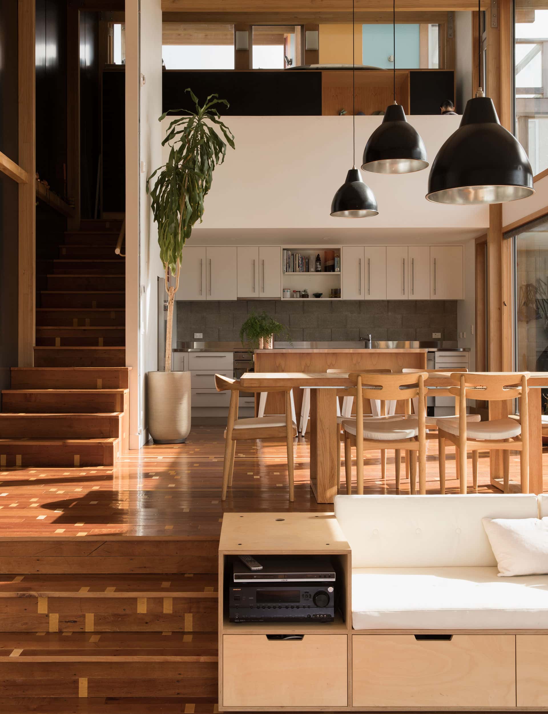
As you enter from the street, the main family home is to the left of the site. It’s slightly larger than the rental – which has three levels to the main home’s five. Under an unbroken roof plane, there’s a sleepout in the top corner, an open breezeway entry and then living areas below. The kitchen sits under a mezzanine, while the living area is recessed, following the slope of the site down three steps. (With a high ceiling and big windows, and a mezzanine space tucked in under the roof, the sleepout is currently used as an office but will one day provide spillover accommodation for family.)
“Having multiple floor levels under a single sloped roof allows for varying and interesting volumes as you move down and through the space,” says Melling. “It also allows for an easy connection between the entry mezzanine level and the dining and living spaces.”
The owners were keen on an unbroken line of sight from the entrance down through the living and dining areas. With the solid sloping roof facing east and the north side extensively glazed, the views are controlled as you move through the building, with the best vistas from the living space.
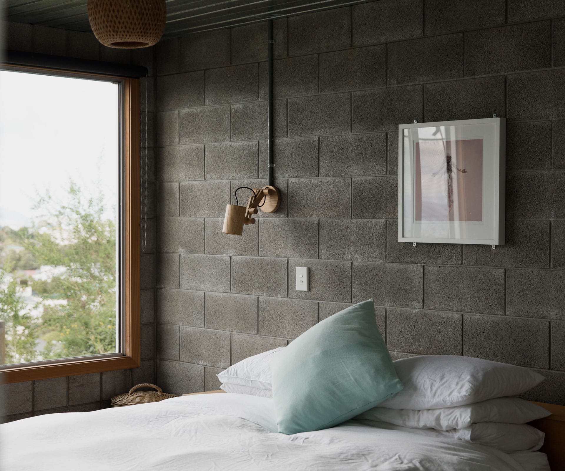
Down a few more steps, at the bottom of the house, is what the family affectionately calls ‘the bunker’ – a concrete-block structure with a green roof and lit by skylights. It includes three bedrooms and two bathrooms, along with a TV room which runs out to a sheltered expanse of lawn. By tucking the bedrooms and utility functions into the hillside, Melling was able to reduce the visual impact of the building on the site.
Having such simple, compact forms also means both the architect and owners were able to have some fun with materials and colours, particularly on the ‘active’ northern side of each home. “Both structures were designed with busy families in mind, but neither takes itself too seriously,” says Melling. “These houses will evolve as the owners and their needs do.”
Words by: Sharon Stephenson. Photography by: David Straight.
[related_articles post1=”71480″ post2=”71432″]
