The home of Pete Bossley and his partner Miriam van Wezel has evolved over 18 years, with outdoor areas being amended to accommodate best use, light and views. Bossley talks us through his manoeuvres
Project
Outdoor spaces at an architect’s own home
Architect
Pete Bossley
Location
Cox’s Bay, Auckland
Tell us about the house and its outdoor areas.
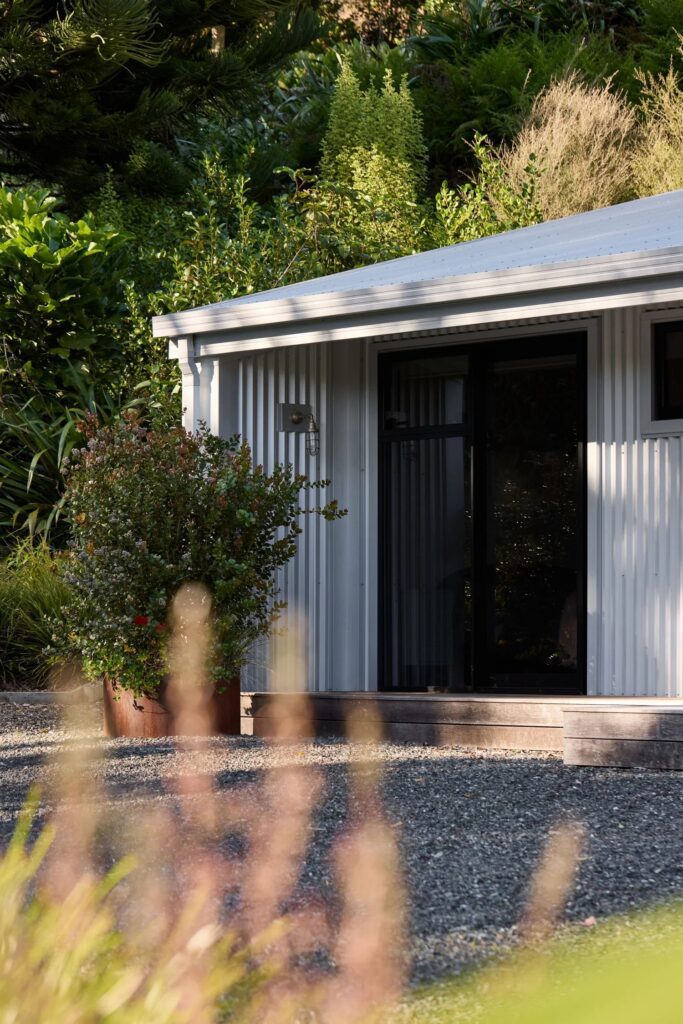
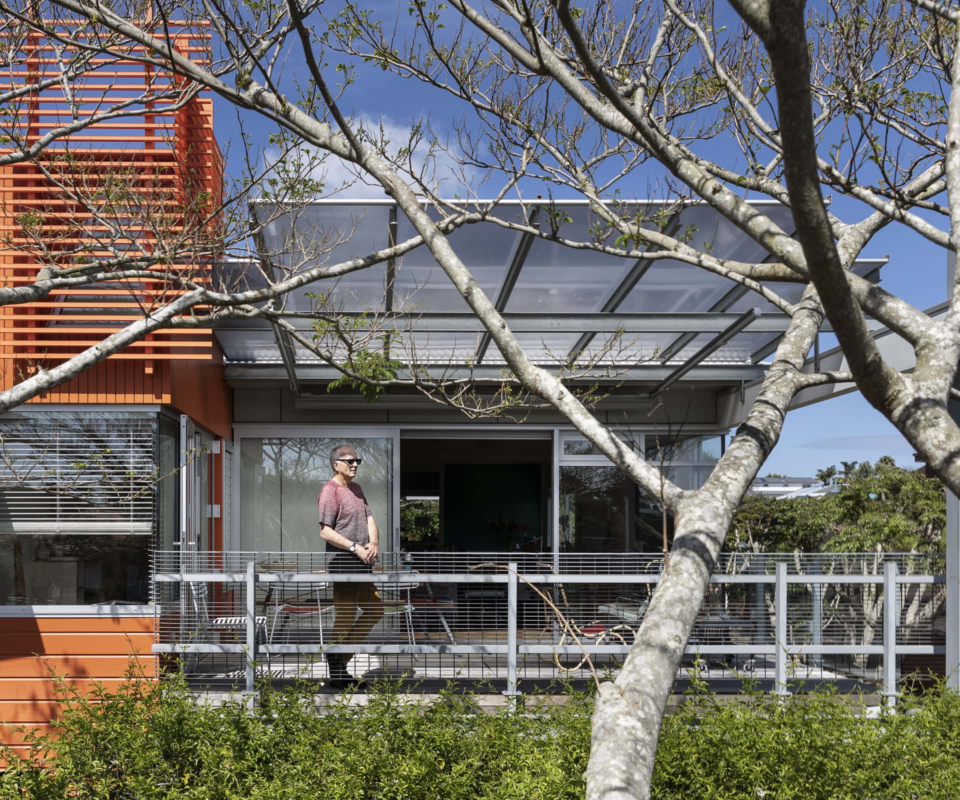
It was originally a very simple 1930s bungalow, which has been through a couple of iterations. The biggest change was designed by Mal Bartleet about 25 years ago. Mal gave the house really good bones. We have been in it for 18 years and have subjected it to three major iterations and many more minor ones. It has been great being able to change a house around us, modifying it after much considered thought based on the experience of having lived here. I suspect if we had done it all at once at the beginning we would have designed something quite different.
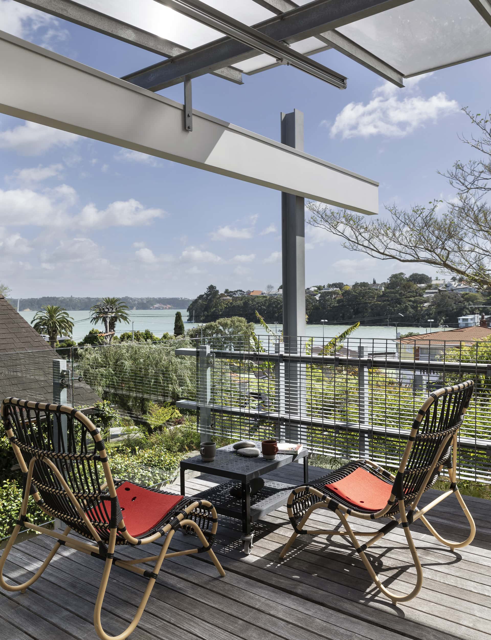
The house is oriented really well for the views and sun. There’s an outdoor area to the north-east and north-west orientations, so we get all day sun with areas to be outside. The north-east deck faces lovely views over the West End Tennis Club toward Cox’s Bay, with one of my favourite collections of buildings – the Chelsea Sugar Works – visible in pink across the Waitematā on the North Shore.
What does the deck replace and when was it completed?
When we bought the house, a deck formed the roof over the garage. One of the first major changes we wrought upon the house was to dig out the basement level and insert a new bedroom, laundry, workshop and convert the garage into Mir’s art studio, which is now a lovely space. However, the metal roofing under the timber decking rusted out so we needed to replace it with a membrane, which we did in 2018 as part of a larger alteration.
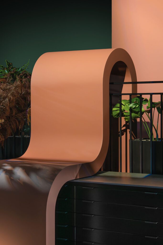
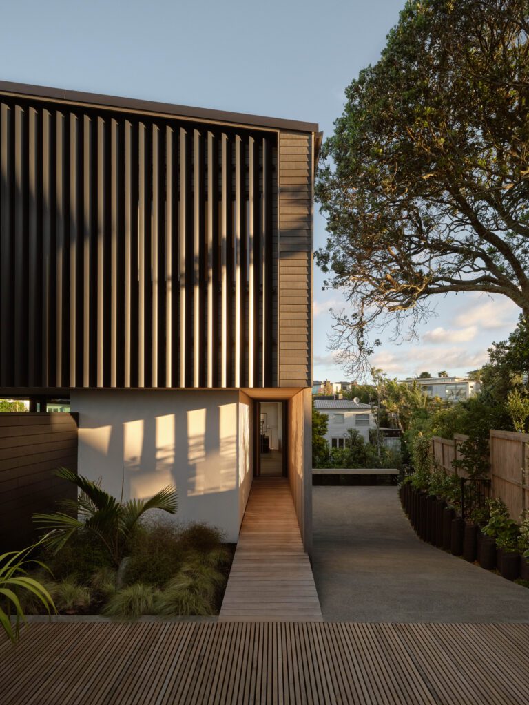
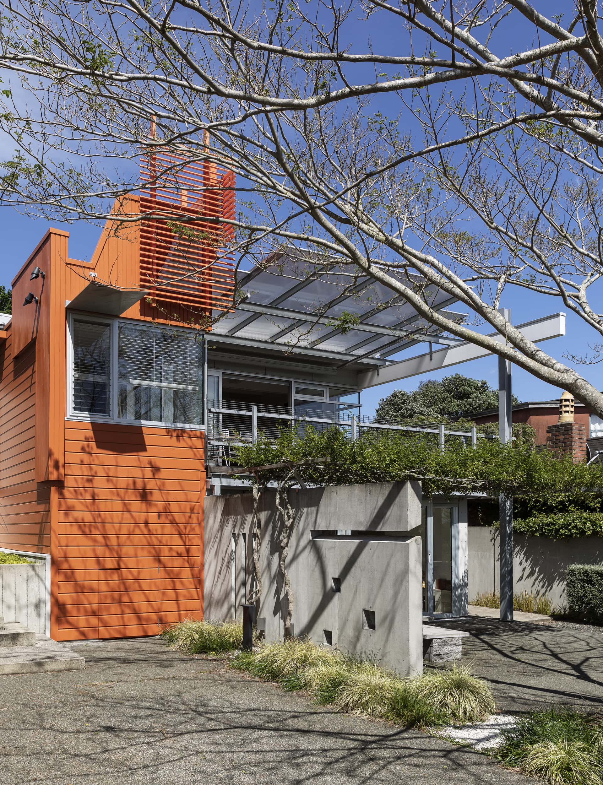
This involved extending the adjacent space upward to create a lightbox-tower, which is the orange structure that you see when approaching the house up the driveway. It has previously suggested a tower form, but it didn’t feel high enough so we extended it vertically as an uplifting roof to bring light in. We then pushed it further with the orange aluminium screen, which reaches up to the maximum height.
What were your objectives when designing the deck?
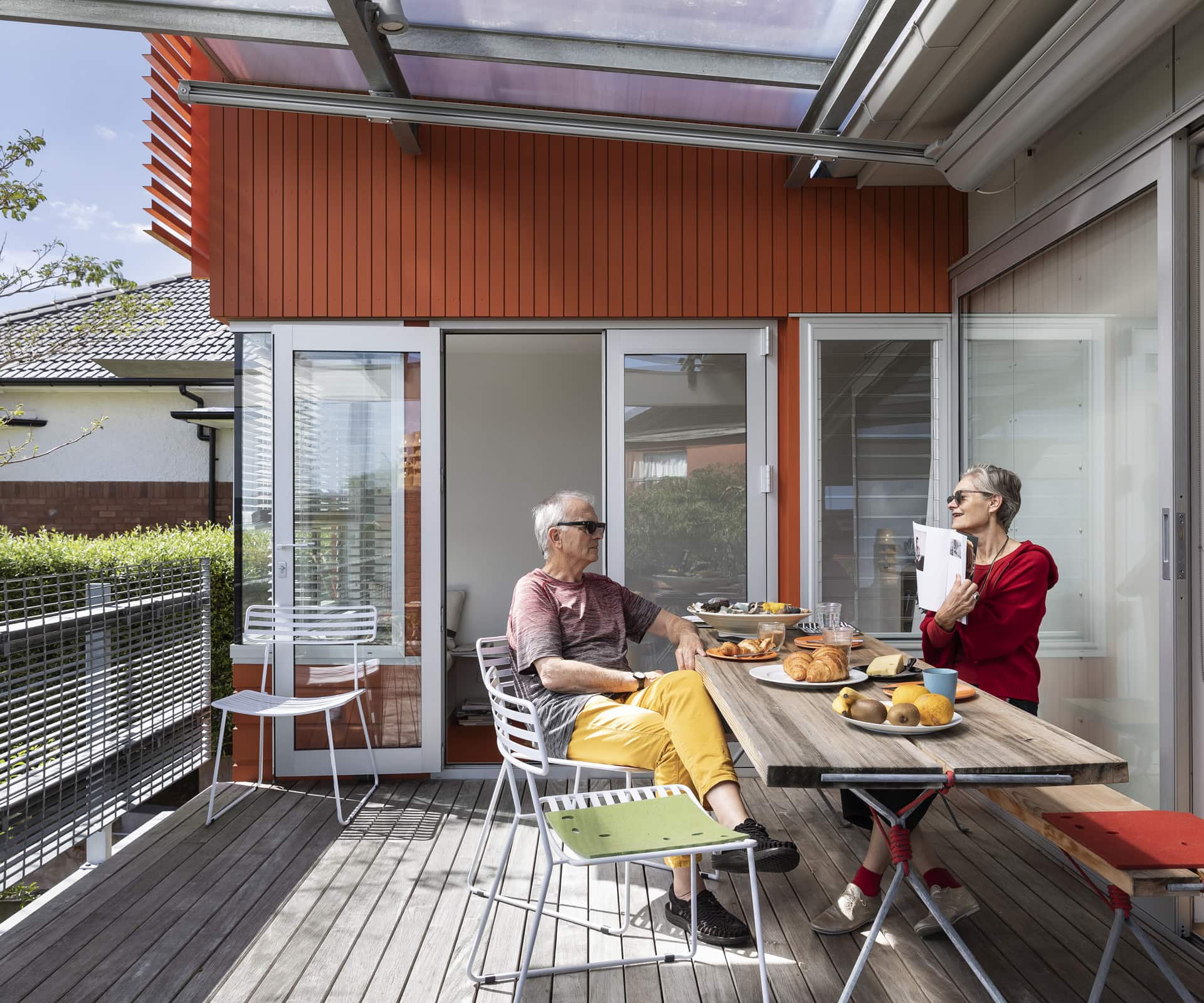
As part of this iteration, we also added the Danpalon canopy on steel beams over the deck to make it more useful in soft rainy conditions, and to soften the light. There is a roll-out Varioscreen blind below the canopy which we can extend to soften the light even further. We wanted the deck to be used in inclement conditions, either when it’s otherwise too hot, or raining. It also means we can leave the sliding doors open without fear of rain entering the house.
Talk us through spatial arrangements and how the decks relate to the home.
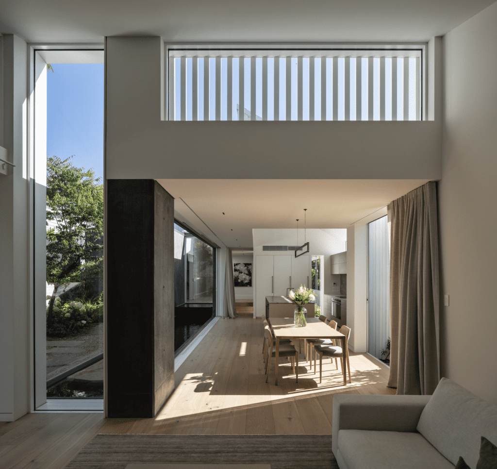
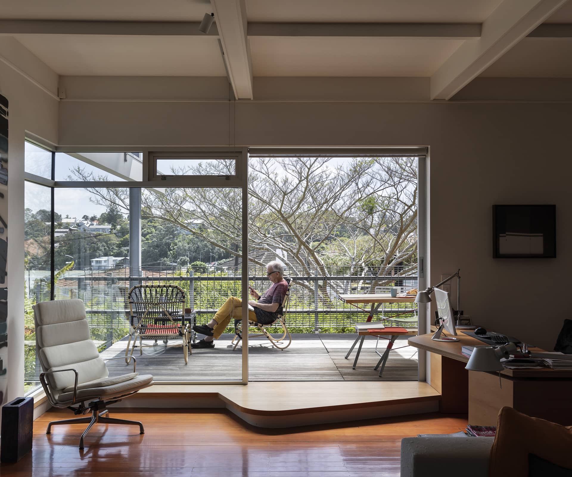
The north-east deck is one floor above ground level. It extends the main living area towards Cox’s Bay and the harbour, and provides an additional outdoor space. It opens off a space which was an office and is now used for reading and yoga.
The north-west deck [not shown in these photographs] opens off a conservatory created by extending a previous corridor by 600mm. This made an incredible difference to the usefulness of the space, which is now a sitting area bathed in afternoon sunlight. We added the same kind of canopy over this deck, with the beams threaded among the branches of a well-established jacaranda tree. This area is closer to ground level, with a small lawn and fishpond.
What is the main deck used for and how does it connect with the sea view?
The north-east deck extends the living area towards the sea and view, and contains a sitting space and an eight-seater dining table, with a bench seat and some steel chairs from Simon James. The ‘Kampenwand’ table and bench by Nils Holger Moormann from Katalog have an ingenious structure of a timber top and galvanised steel legs tensioned together with red rope. If the rope breaks, the table collapses!
What materials have you used and why?
The decking is actually what was there when we bought the house and is still in good condition – it’s better to re-use materials than throw them away unnecessarily. The boards were built in four panels which were removed while we replaced the roofing below, then returned to their original position. There are two types of balustrade. On the north face the glass balustrade is supported on exposed steel stanchions, whereas the east balustrade is galvanised steel mesh flooring intended for use in factories, bolted vertically onto steel stanchions.
This balustrade cantilevers beyond the corner to expand the aesthetic, which has generated many of the design decisions around the house, whereby planes of material ‘float’ in space.
The canopy is a light steel structure with Danpalon. We first used this polycarbonate roofing material on the NZ Maritime Museum in Auckland, and like its soft translucency. However, we found it does transmit too much light to sit comfortably in direct sunlight, so we recently added the Varioscreen motorised awning from LaHood Commercial, which rolls out under the Danpalon and provides an extra layer of softening.
This article was first published in HOME New Zealand. Follow HOME on Instagram, Facebook and sign up to the monthly email for more great architecture.
Photography by: Sam Hartnett.
[related_articles post1=”109076″ post2=”85787″]

