Architect Dom Glamuzina learnt about working with family when he updated an apartment in the glamorous 1960s building, ‘The Pines’, for his father
Q&A with Dominic Glamuzina of Glamuzina Architects
How many square metres is the apartment and how does it function within the footprint?
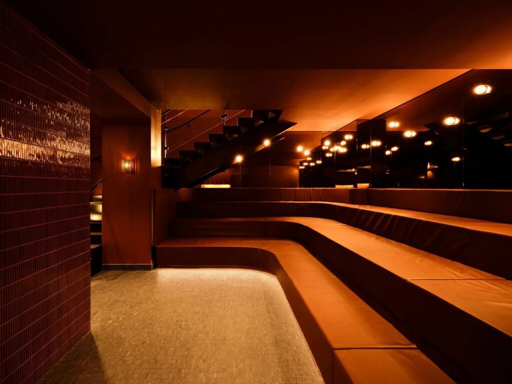
It’s essentially a 130-square-metre one-bedroom apartment with a study, which would be an outlier in the current Auckland apartment market. The original plan was broken down into discreet spaces that were punctuated by large columns and cranked at the edges as building blocks turn the corner. We stripped the place back to bare concrete, opened the kitchen to the dining room, and reconfigured the bathrooms. The plan maintains the serial nature of the spaces but negotiates the realignment of the kitchen to the living spaces.
[gallery_link num_photos=”9″ media=”https://www.homemagazine.nz/wp-content/uploads/2018/10/oct-glamuzina5.jpg” link=”homes/glamourous-apartment-pastel-colour-scheme” title=”Read the full story”]
What did you like about the original design?
The vanity in the middle of the carpeted wardrobe was interesting; overbearing use of cream and beige, not so much. The slot windows in the bathroom with opaque patterned glass provided a soft light that informed how we dealt with materials in the space – a contrast to open vistas in the living room.
Was there a brief from your father or did he trust in your direction?
Doing work for family is a political endeavour, and not of the democratic kind. I have four siblings who would offer critique, and being the youngest in the family meant that I had to yell to be heard! Dad had recently sold his house and was downsizing, so a lot of furniture was sold. Apart from a few items, we started from scratch. There were things that were important to him – like the piano – but he otherwise trusted me to design the apartment.
What are your thoughts on Becket’s design of the building, an American designing for a New Zealand context in the 60s?
Becket’s ability to shift across styles, and being an outsider would have helped to alleviate the anxiety of designing a high rise on the hill. It’s interesting when you look at the original plan – the building’s outline looks like a castle, the turrets become bay windows for each apartment, with a small-scale space to look out to the vistas. The light brick softens the scale of the building, and the projecting concrete frames provide a domestic quality to the façade. The form of the building is roughly broken down into four joined forms, which curve subtly from the east to the north and create a variety of apartment plans.
