Here are five bathrooms that shun clinical clichés in favour of rich materials, and spaces worth luxuriating in. Each is suffused with natural light, including Fearon Hay’s semi-subterranean bathroom at Omaha Beach.
1. Ponsonby, Auckland by McKinney Windeatt
What was your brief and what made you want to foster the strong connection with the outdoors?
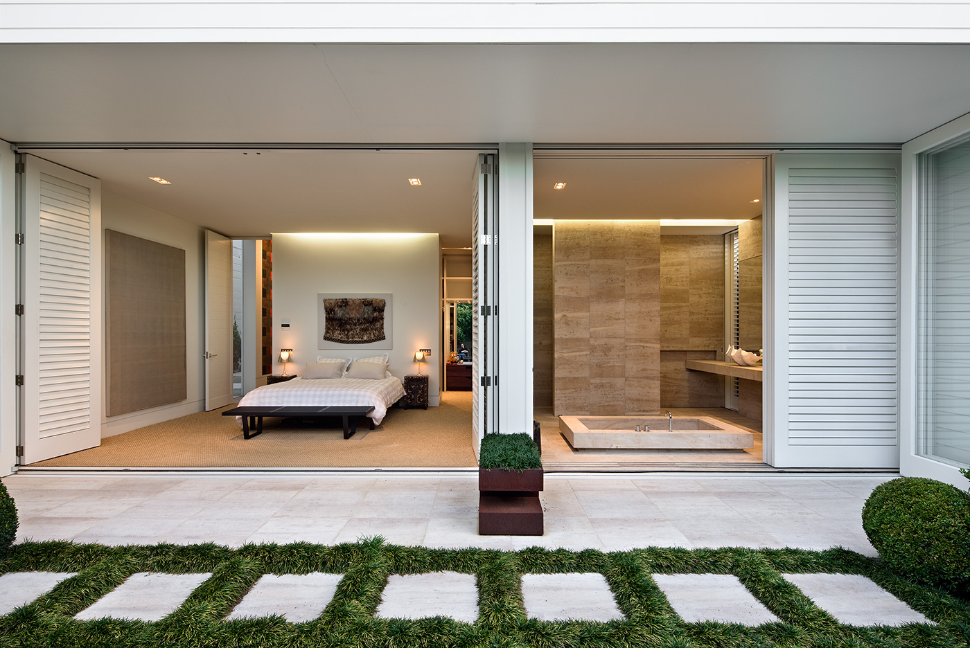
Jack McKinney, McKinney Windeatt Architects The clients asked for a “spectacular” bathroom and we interpreted this as a request for a bathing experience that had an additional dimension. This led to incorporating the garden into the room and treating the articulation of the space in a sculptural way.
The position of the bath makes you wonder why most bathrooms tend to push all the functional elements to the edges of a room. Did placing the bath in the centre make the design any more difficult?
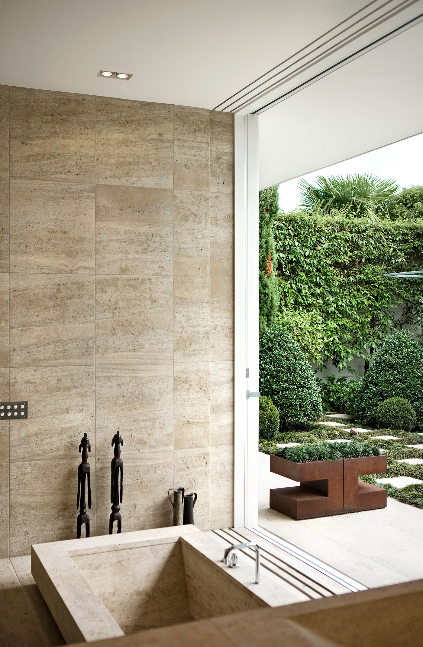
Jack McKinney Not more difficult, but you do need plenty of space to do this. We had to carefully consider the proportions and geometry of the bath: it needed to feel generous in the space but remain ergonomic. The inside dimensions of baths are actually quite tight, so the edge detail became a way of visually enlarging it while not creating a swimming pool instead of a bath.
How did you choose the materials?
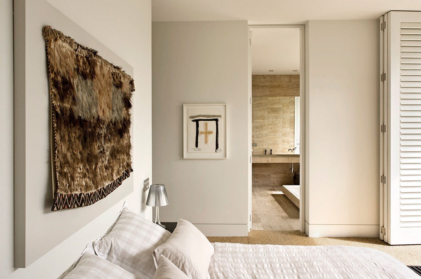
Jack McKinney There is an extremely limited material palette with the walls, with the cantilevered slab of the basins and the sunken bath all formed in the same stone. There are only two colours in the space, white and stone. This parity makes the space tranquil and seamless, and enhances the sculptural qualities of the architecture. The antiqued character of the stone feels enduring. The same materials are present in the garden, strongly linking the two areas.
Design details
Tiles Antiqued French limestone tiles from Designsource.
Basins Carved from blocks of antiqued French limestone.
Tapware Dornbracht from Metrix.
Photography by: Simon Devitt.
2. Omaha Beach by Fearon Hay Architects
What were the main constraints in this bathroom space, and how did you respond to them?
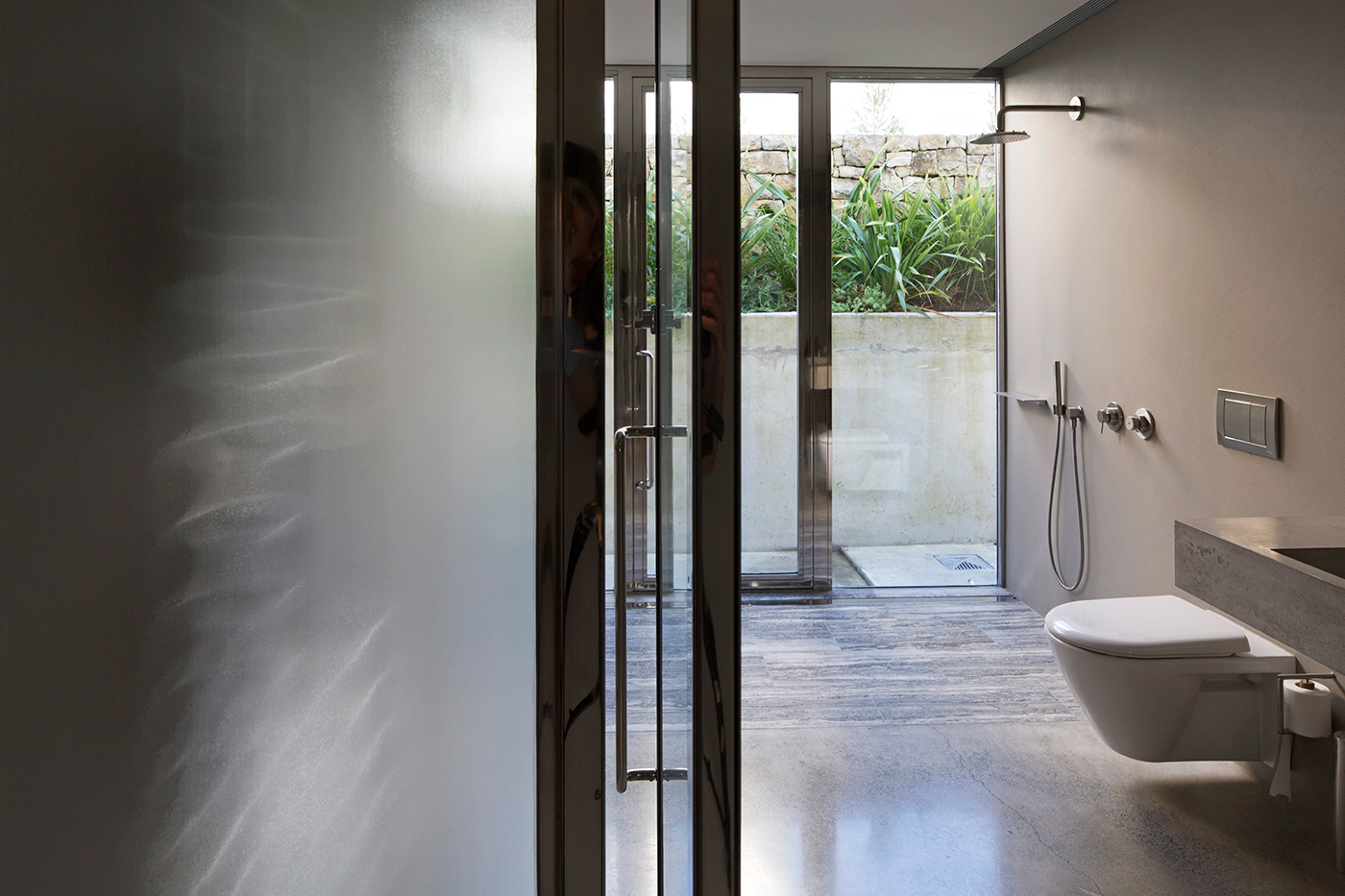
Tim Hay, Fearon Hay Architects The opportunity of a semi-subterranean space meant access was provided through an excavated courtyard. This allowed for a light and open space while still maintaining a sense of privacy.
Jeff Fearon, Fearon Hay Architects The idea was a utilitarian space, adjacent to the garage and laundry, with functionality that would deal with people coming to and from the beach.
How did you want the bathroom to feel?
Jeff Fearon The bathroom was intended to feel open, despite being below ground level. A sense of ease of use was also important for the space to work within its context.
How did you go about choosing the material palette?
Tim Hay The colour and material palette was a continuation of our design scheme for the rest of the house, and was chosen for its sense of subtle richness, such as the plasterwork and finishings.
The bathroom looks remarkably uncomplicated – but is there a lot of work behind that apparent simplicity?
Jeff Fearon It aims to appear simple and clean but with a high level of utility. With indoor and outdoor showers it can be easily accessed to and from the beach, for washing the dog and so on. The racks [out of shot] provide a means of storage for beach activities, heightening the functionality of this space while still maintaining a sense of simplicity.
Design details
Tapware from Boffi Studio Elemento.
Flooring The shower flooring is travertine, and elsewhere it is honed concrete slab.
Vanity Custom-made terrazzo.
Toilet Duravit ‘Stark 2’ by Philippe Stark for Duravit from Metrix.
Glass doors ‘W20 Milan Suite’ electro-polished stainless steel and ‘Satinlite’ toughened glass.
Walls ‘Cement Grey’ Stolit MP from STO.
Photography by: Simon Devitt.
3. Pt Chevalier, Auckland by Guy Tarrant Architect
Where in the house is this bathroom, and what were the spatial constraints on its design?
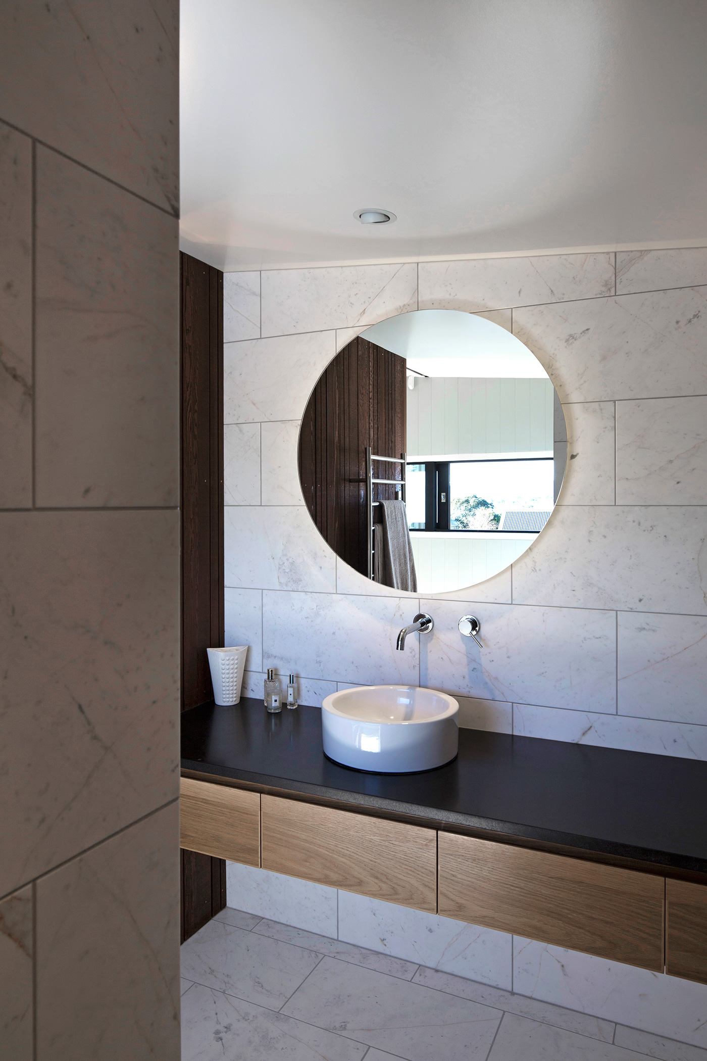
Guy Tarrant It’s an ensuite bathroom adjoining the upstairs master bedroom, with a sloping roof but with views to the water. Space constraints and a sloping ceiling meant it was important to maximise the sense of space.
How did you choose the material palette, and what made you choose the same tiles for the walls and floor?
Guy Tarrant The materials are an extension of the palette established in other parts of the house. Because it is a small space, a restrained palette of materials was selected to create a sense of calm. The marble tiles lend a restrained, classic luxury.
You’ve created a wall-mounted vanity unit. What led you to this decision?
Guy Tarrant The floating vanity is an elegant solution and also helps to enhance the sense of space.
What made you choose a basin mounted on the bench instead of a single unit?
Guy Tarrant The round basin is a contrast to the orthogonal nature of the house and has a purity and simplicity that I like.
Design details
Tiles Marble tiles from Artedomus.
Tapware ‘Cox’ wall-mounted mixer by Paini from Metrix.
Basin David Chipperfield for Ideal Standard from Robertson Industries.
Mirror Custom-made by Anytime Glass.
Benchtop Honed granite from Italian Stone.
Timber American oak vanity cabinetry fabricated by Form Design.
Heated towel rail from Metrix.
Photography by: Simon Devitt.
4. Te Henga, Auckland by Stevens Lawson
While many bathrooms are hidden away for privacy reasons, this one has a wonderfully direct relationship with the site. What made you decide to design it this way?
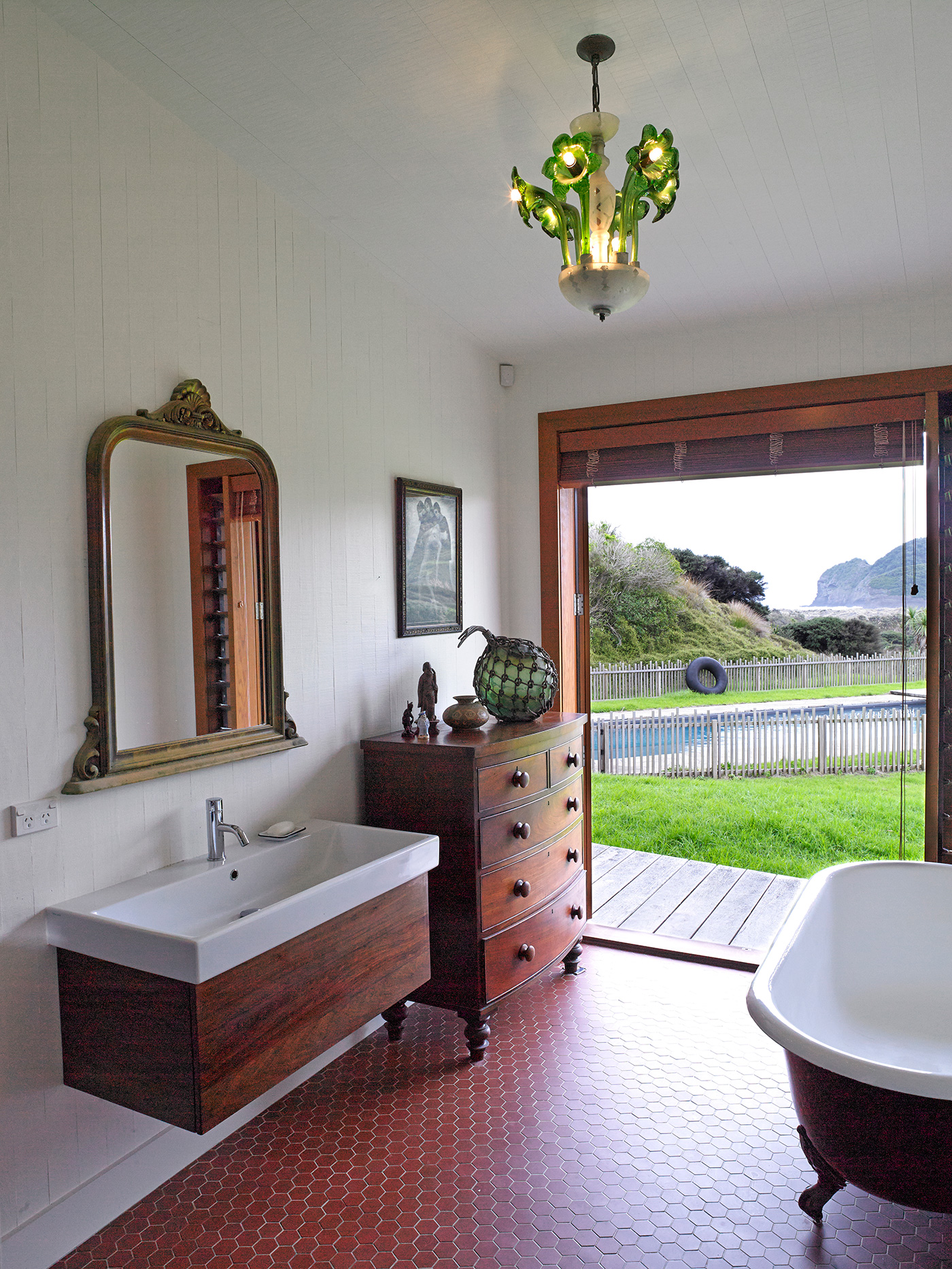
Nicholas Stevens, Stevens Lawson There are no neighbours and the horses don’t seem to mind, and there are always the timber Venetian blinds (so as to not scare the horses). Most importantly, the sublime luxury of lying in a bath with French doors open to the ocean was too good to pass up.
Most bathrooms are full of built-in cabinetry, but in this one you’ve allowed space for free-standing furniture, as well as a mirror and an artwork more like you’d find in a living area. What are the benefits of this approach?
Nicholas Stevens An eclectic bathroom is less clinical, has more personality and allows the owner more self-expression. It feels like a place to spend more time, not just pass through.
What are the key elements a good bathroom should have?
Nicholas Stevens I think a bathroom should be sensual and serene with beautiful fittings, materials and textures and, of course, exquisite light.
Design details
Tapware Dornbracht from Metrix.
Vanity ‘Vero’ by Duravit from Metrix.
Floor tiles French hexagonal tiles from Heritage Tiles.
Bath Resurfaced claw-foot bath.
Light Antique Venetian glass.
Photography by: Mark Smith.
5. Takapuna, Auckland by Mitchell & Stout Architects
This ensuite has a lake view. What made you decide to privilege it with one – bathrooms are often shoved out the back of a home – and how did you manage the vista?
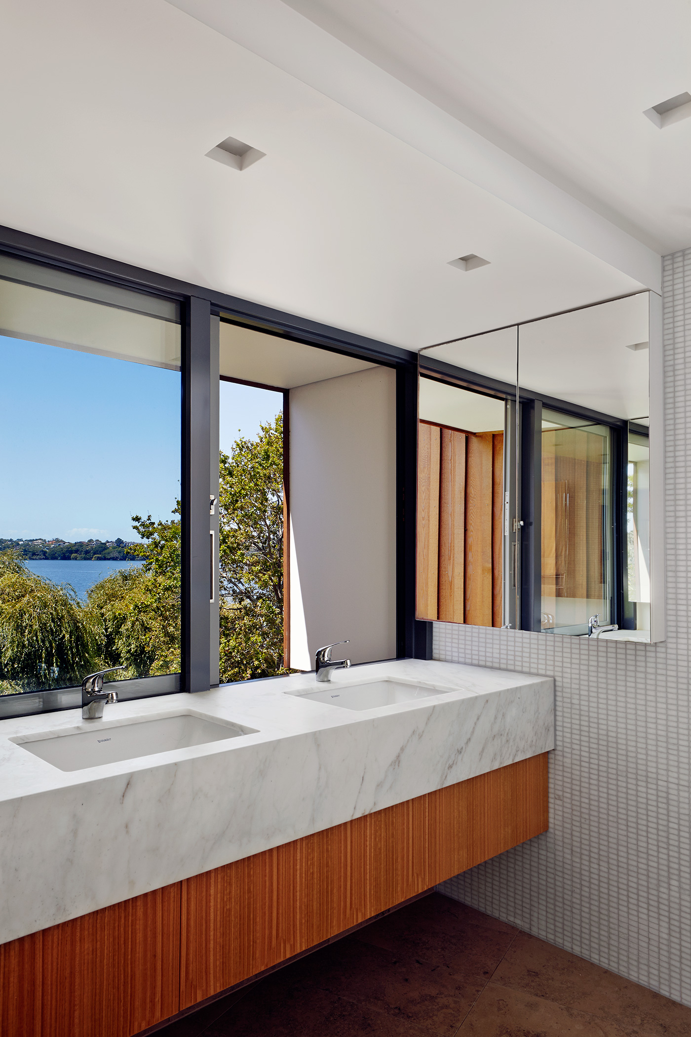
Julian Mitchell The view of the lake is so beguiling that it seemed churlish not to engage with it in as many rooms of the house as possible. Some rooms break out of the main form of the house to catch the view and this, along with the kitchen below, is one of those rooms.
How did you choose the material palette?
Julian Mitchell Our clients were keen on a fairly clean look and they liked Jura (a hard limestone) floor tiles. White marble and wall tiles were chosen for their durability and clean appearance, while the honey tones of the Jura and Tasmanian oak warm the space and tie it in with the exterior cedar cladding.
The vanity is lifted off the floor – what made you decide to take this design approach?
Julian Mitchell Lifting the vanity extends the floor area, which gives the room a more spacious feel.
Design details
Tapware ‘Promix’ by Methven.
Marble ‘Miele’ marble from Italian Stone.
Timber bench Tasmanian oak bestwood veneer.
Tiles ‘Jura’ floor tiles from Italian Stone and white wall tiles from Artedomus.
Lighting ‘Buzzi Buzzi Nefi’ downlight with satin white glass by Philippe Starck from ECC.
Photography by: Toaki Okano.
[related_articles post1=”66304″ post2=”579″]
