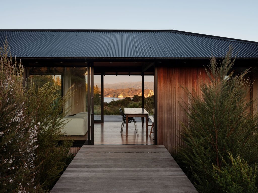
Drawing on modernist and Japanese influences, and recreating the distinctive tonal interplay of dappled light on a forest floor, the renovation of — and addition to — this Grey Lynn villa offers an enchanting take on spatial design, where beauty and accessibility effortlessly coexist.
It was an interesting brief: an existing lean-to addition was in good condition, and the ethos behind the clients’ vision matched that of design duo Eva Nash and Kate Rogan of Rogan Nash Architects, in that reuse where possible was paramount.
To that end, the lean-to structure remained relatively untouched, while the spaces beneath it were adapted. The lean-to itself became a transitional area between the original villa and a new addition to the rear, connected to each by curving walls.
The brief also called for accessibility, with one family member potentially requiring a wheelchair in the future, but this would not be the defining element; rather, it would be subtly incorporated into the overarching design language — one of intriguing div ersity that plays out in different but connected ways in each of the spaces.
The lean-to originally housed the kitchen, and that’s where it remains — along with a new concealed scullery/laundry and a bathroom. In the addition, a dining and living space was created. The three structures have different ceiling heights, but a level slate-tiled floor creates a cohesiveness and a sense of volume, especially in the lean-to, where the stud is lower.
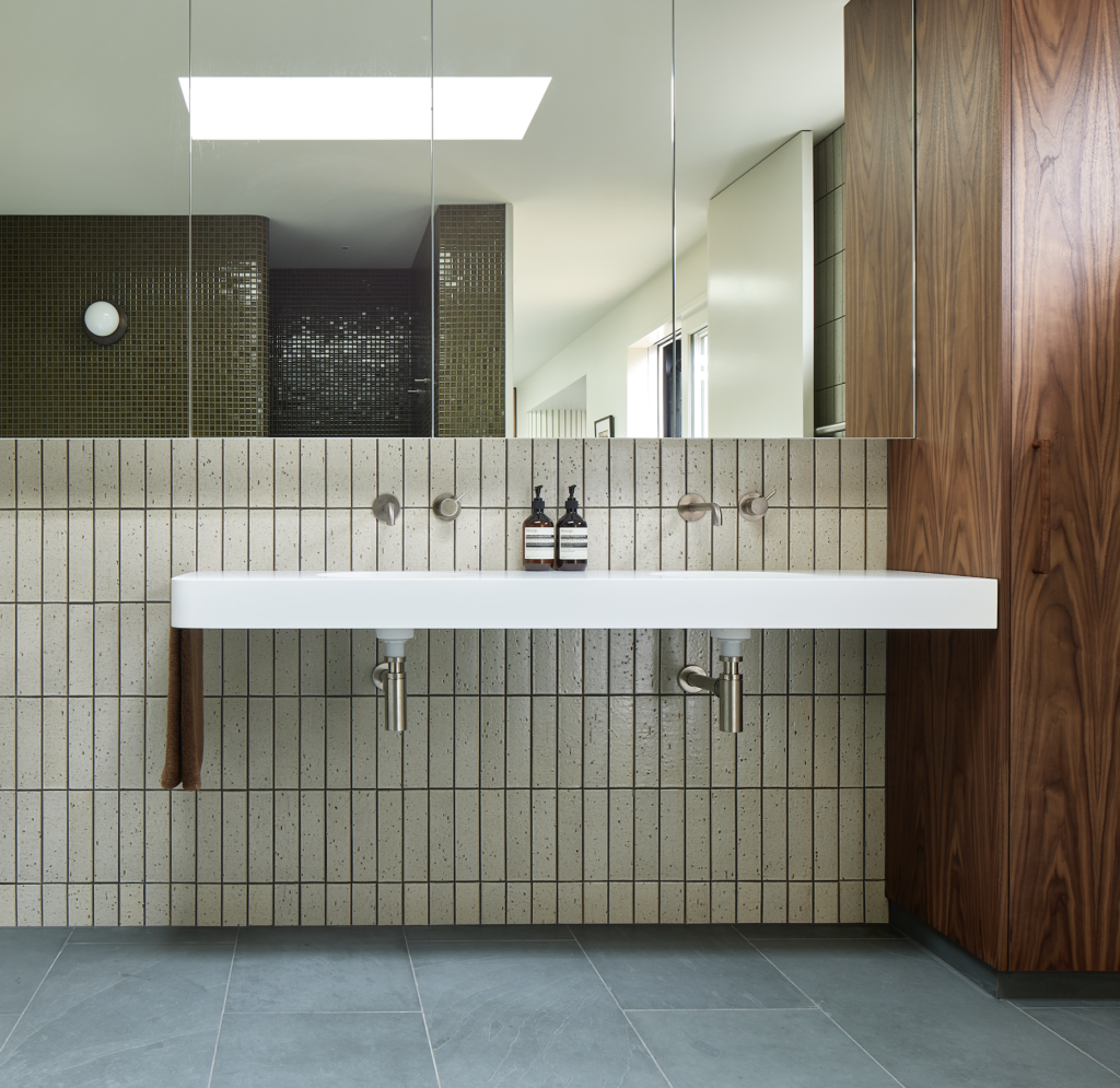
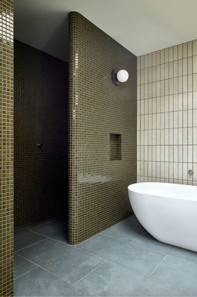
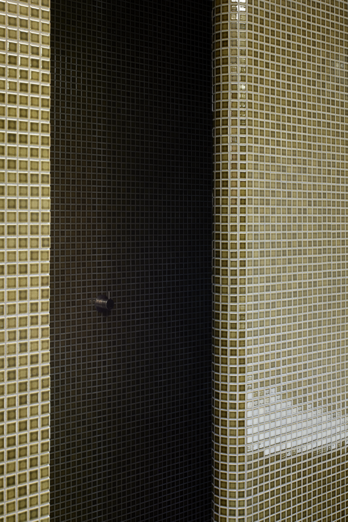
It is, arguably, the bathroom that is the hero of this renovation. Here, a shimmering full-height curved wall of green mosaic tiles with a halo-like glaze separates the shower from the rest of the space, while the slate tiles continue seamlessly underfoot. A curved free-standing bathtub sits against the green shower wall and another wall of white, flecked, vertical subway tiles. A floating vanity is bookended on one side by walnut veneer cabinetry — a feature that is continued in the kitchen — and on the other is curved in plan.
“It feels like a woodland dance. We felt like it had all these elements: with the green tiles, you have the sense of light coming in through the trees, while the white tile has irregular flecks through it reminiscent of natural patterns, then you have the dark walnut. It was about creating that sense of dappled light; it feels like a slightly enchanted space, with light filtering in and dancing around the walls,” Kate says.
“There’s a real beauty in the curves,” Eva says of the motif that is repeated throughout — from the curvature on a large scale of the black exterior cladding that encloses the addition to the organic curve of the kitchen wall and, on a smaller scale, the curved edges of the bathroom vanity and kitchen benchtop and island. It was an element that catered to the accessibility needs but one that also came to define the project as a whole. So, too, did the accessibility requirement for wheelchair access determine the flush shower entry and the floating bathroom vanity, but there’s an inherent beauty to these spaces that goes well beyond their function.
In the kitchen, the ebb and flow of the curves creates an intimate dialogue.
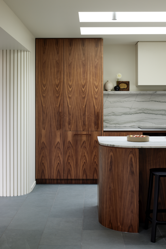
“The brief for the kitchen was not a large entertainers’ kitchen — although those carefree, relaxing times were not overlooked. The focus was more on creating calming moments for the family to enjoy,” says Eva.
Overhead, an existing skylight was mimicked to create a dual light source and reinforce the sense of dappled light coming from above. Walnut cabinetry meets an infinity stone benchtop and splashback that Kate describes as having the sense of “water moving through it” — a moment that echoes and connects to the woodland dance of the bathroom.
There are areas of strong colour and others where subtle hues come together quietly. The kitchen walls and ceiling are painted in Resene Ecru White, a light beige with a subtle hint of green. Outside, the new black cladding is a sharp juxtaposition to the horizontal weatherboards of the original villa. As Kate puts it: “That meeting of dark and light is like the stroke of a calligraphy brush across paper.”
This is a home cleverly designed to cater to differing needs, and one that wholeheartedly embraces the notion that architectural beauty can seamlessly coexist with accessibility.
Words: Clare Chapman
Images: Simon Wilson
Woodland Dance was named the 2023 Bathroom of the Year at the HOME Interior of the Year Awards.


