Rather a long time ago, the owner of this house on Auckland’s Takapuna Beach tried to buy the section from its elderly owner. She wouldn’t sell. Twenty years later, walking along the beach one morning, he saw the place up for sale and wasted no time in securing it.
You can understand his enthusiasm. It’s a long, narrow section at the very end of a narrow cul-de-sac that runs behind the beach. The sea is just there – a view unobstructed – yet because of a sloping front lawn, gawpers on the sand can’t look in. The section is well known by beach walkers: it was occupied by an 85-year-old, virtually derelict cottage, which was mostly rented by university students for about five decades from its Australia-based owner. Generations of families, meanwhile, have picnicked under the large pohutukawa on the beach front. An adorable 1930s changing shed borders the beach, and – unlike most security-conscious houses along this very public stretch of sand – there’s no front fence.
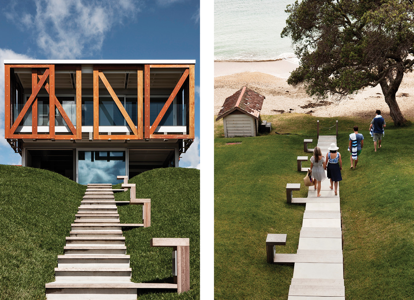
After demolishing the cottage, the owner also bought an adjacent section one house back from the beach to create a single, slightly odd zig-zag-shaped property. Now, with the help of Athfield Architects’ Zac Athfield (son of Ian, the firm’s founder) and Nick Strachan, the site sports three related buildings – a main house and two guest houses, all unified by a disciplined palette of materials, a sense of spatial ingenuity, and a scale that respects the modesty of the dwellings that originally lined this picturesque beach. It is a thoughtfully designed beach-side compound that effortlessly hosts the comings and goings of the extended family, which now comprises the owners, their six children, and 18 grandchildren.

The architects left the broad, steep and unfenced front lawn in place, siting the front of the new main house where the cottage had sat. From the beach, the new two-storey house seems tiny, dwarfed by its neighbours; a radical move in a suburb where maximising site coverage is something of an art form. “The idea was to turn that on its head,” says Zac. “The idea is that it has spaces to the boundary, not fences.”
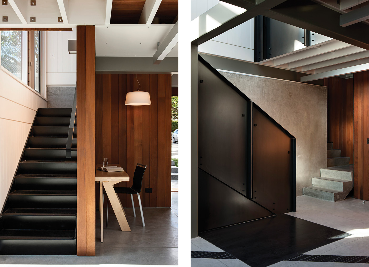
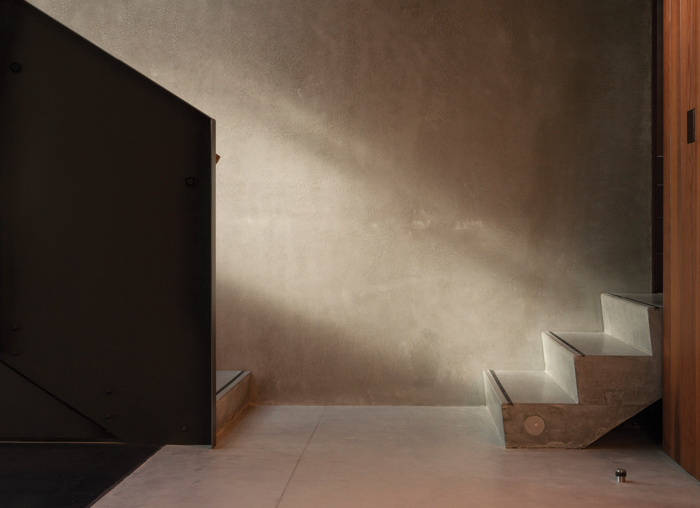
The rigorous open-plan living room in the main house expresses linearity and seriousness, playfully offset with the insertion of a timber sunroom and ‘Fifth Movement’, an artwork by typographer Catherine Griffiths, which features the letters A, E, I, and O in the home’s concrete floor with the U outside cast in rusting steel. The area is almost bunker-like; yet with soft, filtered light. Upstairs is a wide sort of gallery, flooded with light; the bedrooms are simple and shady thanks to exterior sliding screens. The owners expect to move into one of the smaller houses, leaving the main house for other members of the family. “It was a little bit like spec building,” says Zac. “We were aware that occupation was more of a generational thing.”
A second key move was to convince their client that, rather than building one guest house, he should build two – a guest house and what has come to be known as the gate house. These are vertically oriented, reaching up for views and light, which has the effect of allowing space around the buildings. In fact, there is so much space between buildings that it’s hard to work out whether they are one compound or a development of three. Approaching the house from the street and then down the driveway, the impression is almost of a strange, misplaced medieval village – there are concrete bases, solid timber doors and timber-clad upper floors – on top of which are spectacular roof decks; mainly because there was no room for proper roofs to fit within the height-to-boundary rules. This impression is heightened by the cladding of part of the gatehouse in brass, a surprisingly indulgent but highly effective move. “Like a jewel at the end of the street,” says Zac.
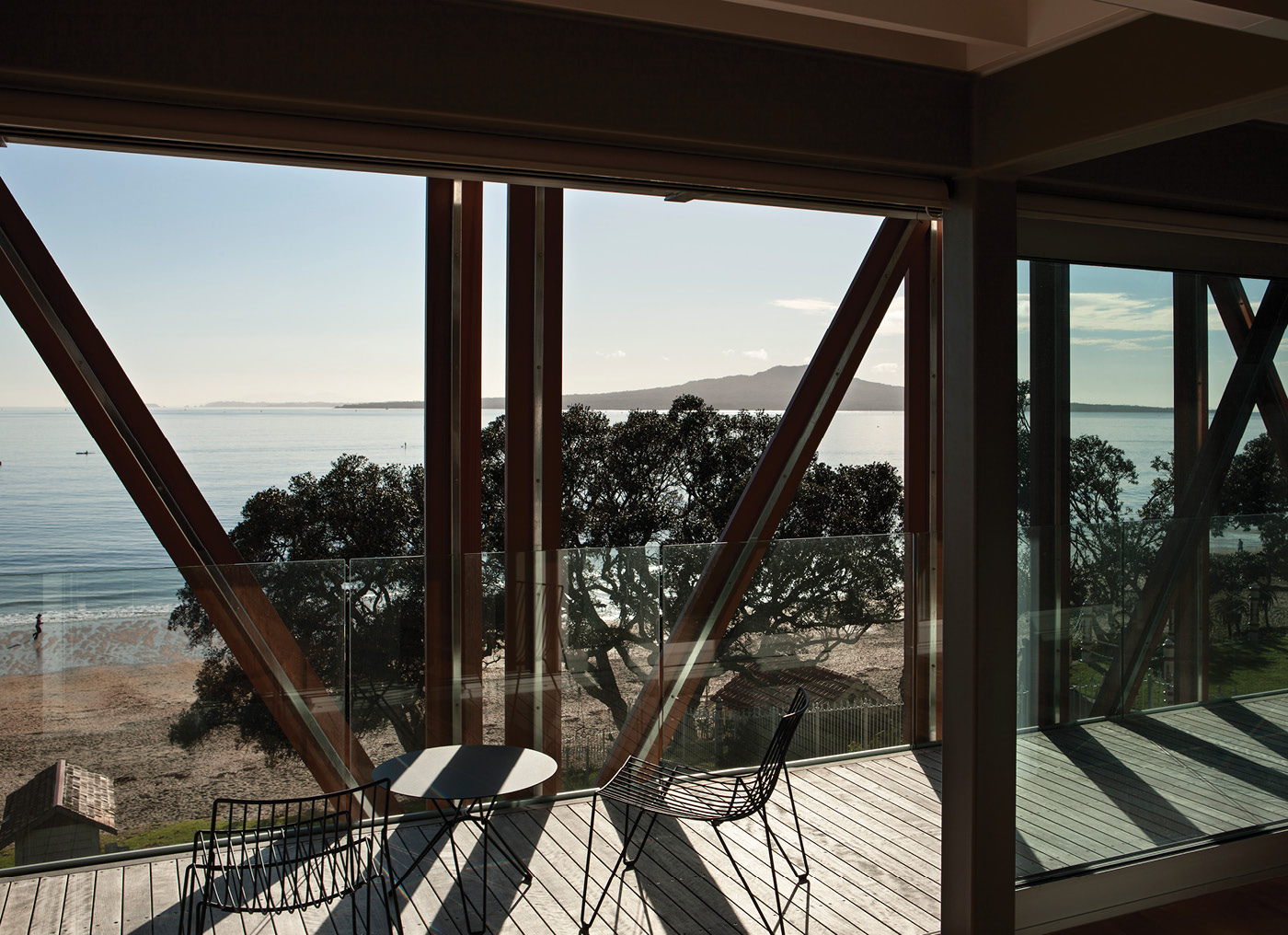
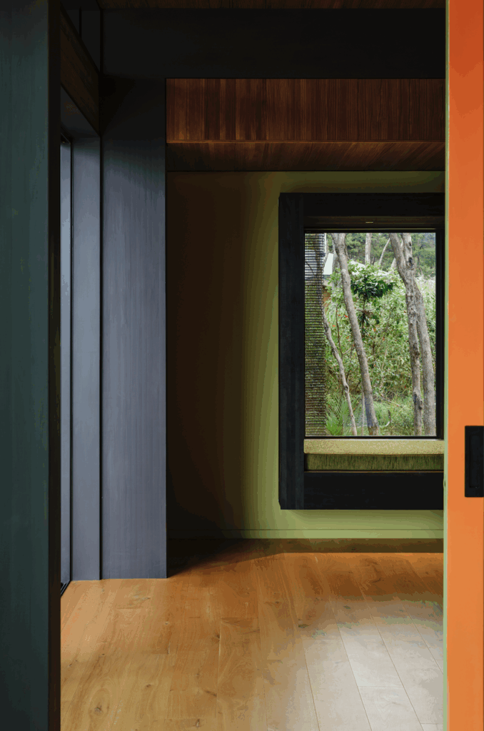
The three houses – which have a total of nine bedrooms between them – are different in aspect and feel. The main house is a play between solid and light, with that view constantly changing. The gate house is all glass and openings – there is a compact living room and a gloriously airy bedroom upstairs, as well as a single-car garage that can be converted into a bunk room. The guest house is dark and cave-like downstairs, and ship-like upstairs, with narrow corridors and efficient bedrooms clad in cedar tongue-and-groove. Beams have been left exposed to give the impression of greater ceiling height.
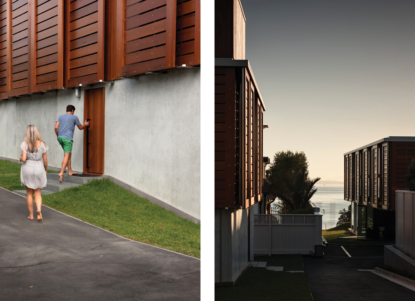
There is, though, a consistent sense of craft and honesty to the construction. All three dwellings share a rigorous, limited palette of materials – cedar tongue-and-groove panelling, sometimes painted white; cedar-clad timber boxes; folded metal stairways, concrete and glass. Kitchens in the ancillary houses are deliberately small, encouraging guests to wander down to the beach house for the main evening meal. The bedrooms are also modest; there is plenty of room for cars on the lawn and there is no swimming pool because the house sits above a very nice beach.

“We have a small footprint,” says its owner.
“That’s what we always wanted – what you expect a beach house to be.” –Simon Farrell-Green
Q&A with Zac Athfield
HOME The home could have been much bigger. All the neighbours are huge. Why the restraint?
Zac Athfield, Athfield Architects We weren’t thinking too much about restraint. We had an open-minded but caring client and felt like the challenges and opportunities were at the edges. Everyone loved the way the ancestor of the new beach-side house preserved an unobstructed lawn to the foreshore. It seemed generous and confident. As surrounding houses present sides as close as possible to other boundaries we didn’t want to marginalise the edges.
HOME How did you balance respecting the smaller scale of the original dwellings and providing everything we tend to expect nowadays?
Zac Athfield The small floor plates allowed maximum use of height, so space is not something you’re left wanting. Across three buildings there are plenty of bedrooms and living spaces; some open plan, others more contained, others borrow space from the landscape. They offer a surprising variety of conditions considering we didn’t change the formula too much on what is an essentially flat suburban site.
