2010: Stevens Lawson’s Wanaka geometry
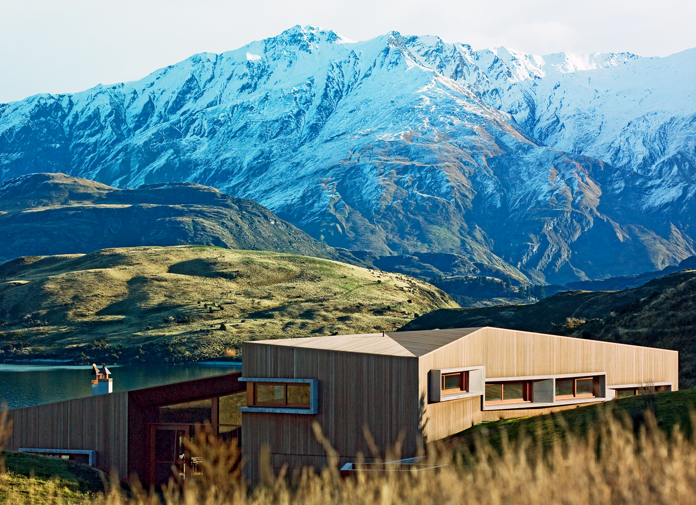
It started with a piece of paper, a square of white parchment standing in for golden contours beside a sparkling lake. Over time, the paper was tilted, folded and cut, a rough piece of origami that eventually became the model for the house you see here. Like an avant-garde garment created by an exacting tailor, the 2010 Home of the Year is a highly original piece of architecture that is also a beautiful fit with the incredible landscape around it.
At the beginning of the design process, as architects Nicholas Stevens and Gary Lawson bobbed about on a boat on Lake Wanaka and took in the site and its exquisite mountainous surrounds, “we were thinking, how do you build architecture in a landscape like this?” Nicholas says. “We felt a great responsibility to do something that measured up to the quality of the site and was respectful of the flawless natural environment.”
“It was intimidating and exciting at the same time,” Gary says.
They had reason to be confident they were up to the task. This is the duo’s third Home of the Year award and they had already worked with the owner of this home on two earlier projects, each more adventurous than its predecessor. The first was a house in the Auckland suburb of Ponsonby that was a Home of the Year finalist in 2001. A few years later they designed another Auckland dwelling that won a New Zealand Institute of Architects’ Supreme Award (and featured in our February/March 2006 issue).
By the time work began on this house, which the owner and his partner intend to eventually make their permanent residence, Gary says “an incredible amount of trust had been established”. Each time they have embarked on a new project with the owner, Nicholas says, “we’re always wanting to outdo the last [design] – you know he’s going to be open to quite a radical idea”.
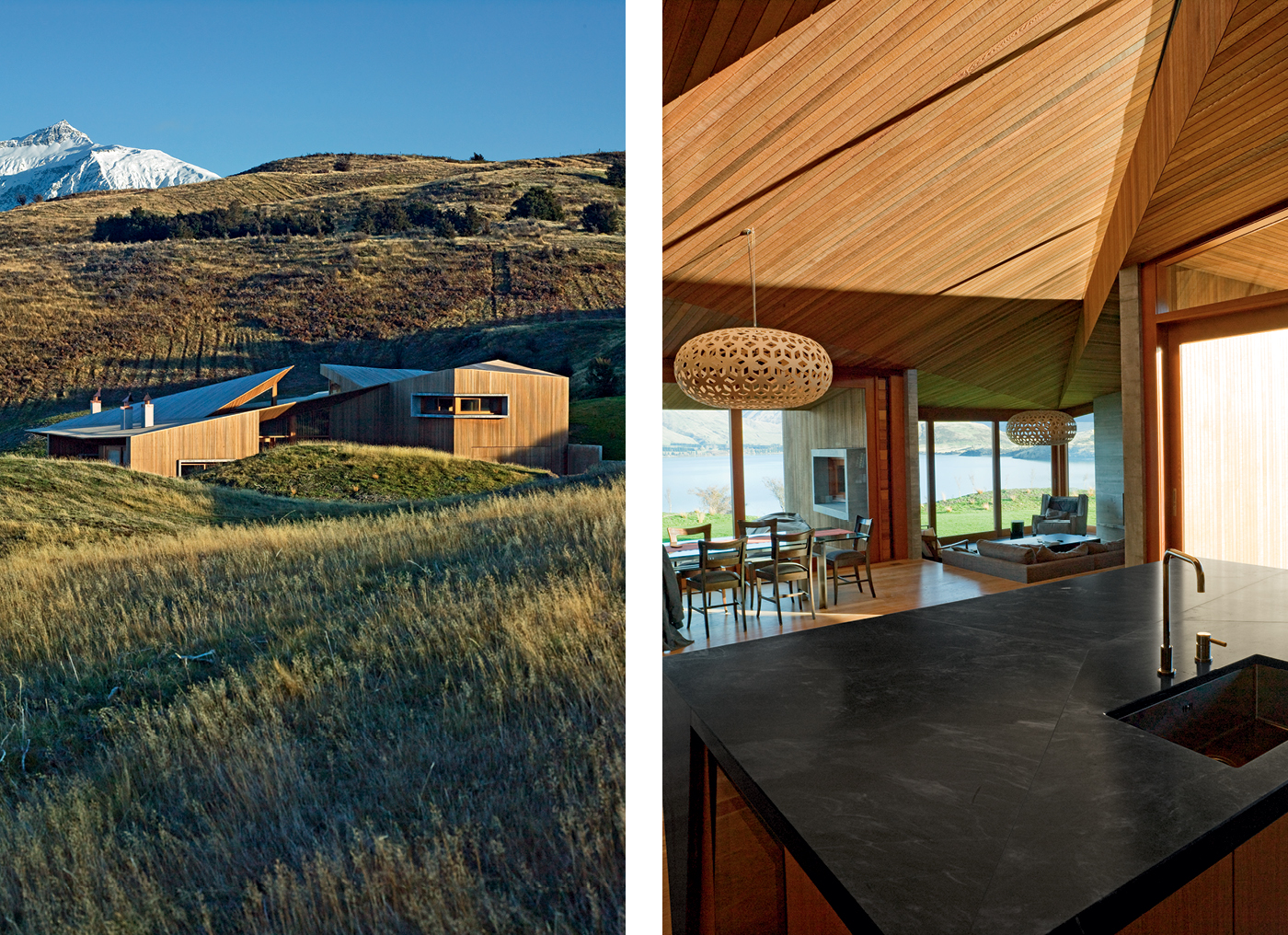
Thinking radically may be an exciting place to start, but the architects needed to tread carefully on this beautiful site. Earlier resource consents in the area had been bitterly fought by opponents who believed any development would irrevocably scar the landscape. The architects had no intention of blighting the vista, so the first step in the design of this home was to find an approach that would allow it to disappear into its surrounds. “Much of this house was about being invisible from a distance,” Nicholas says.
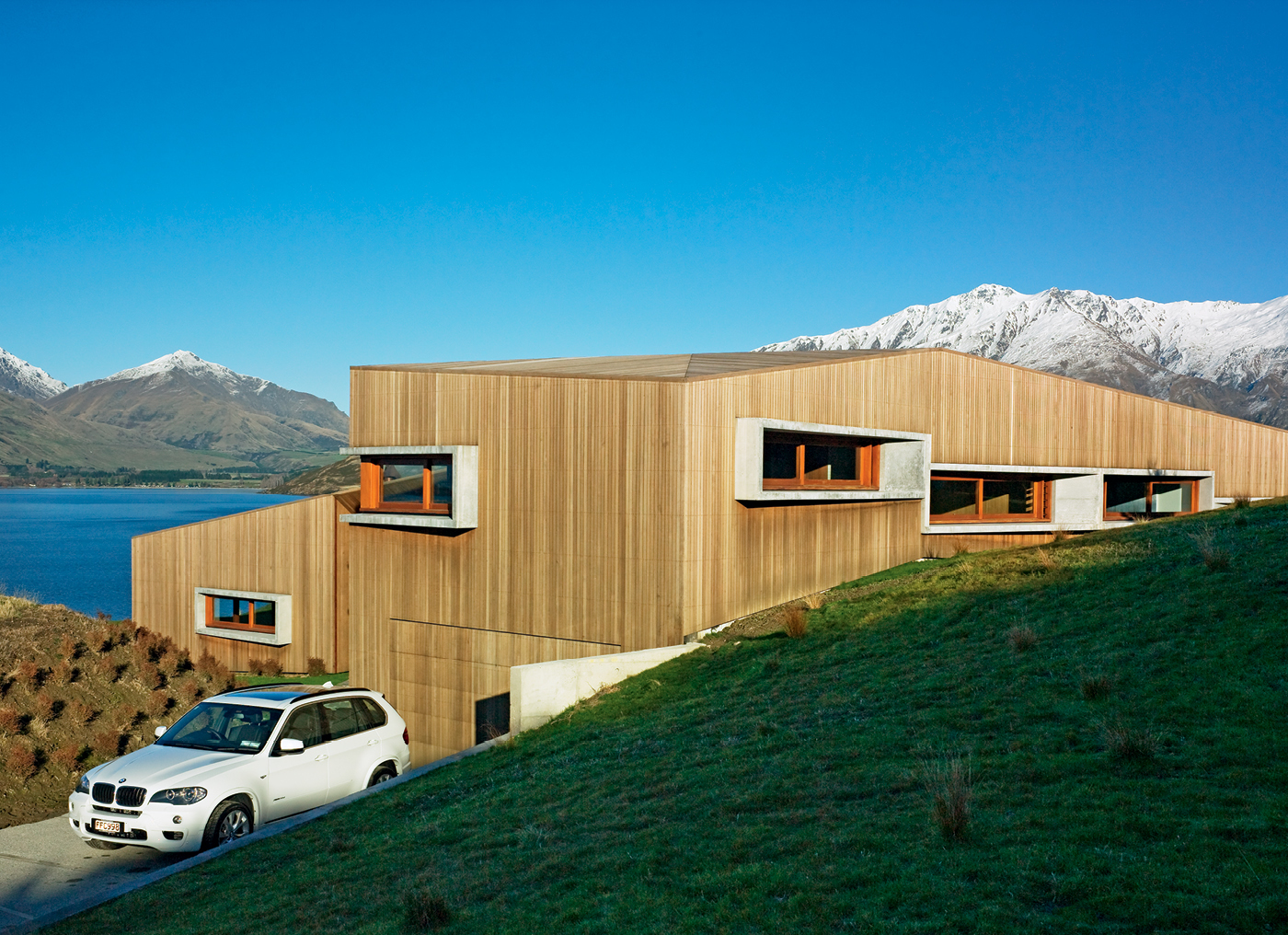
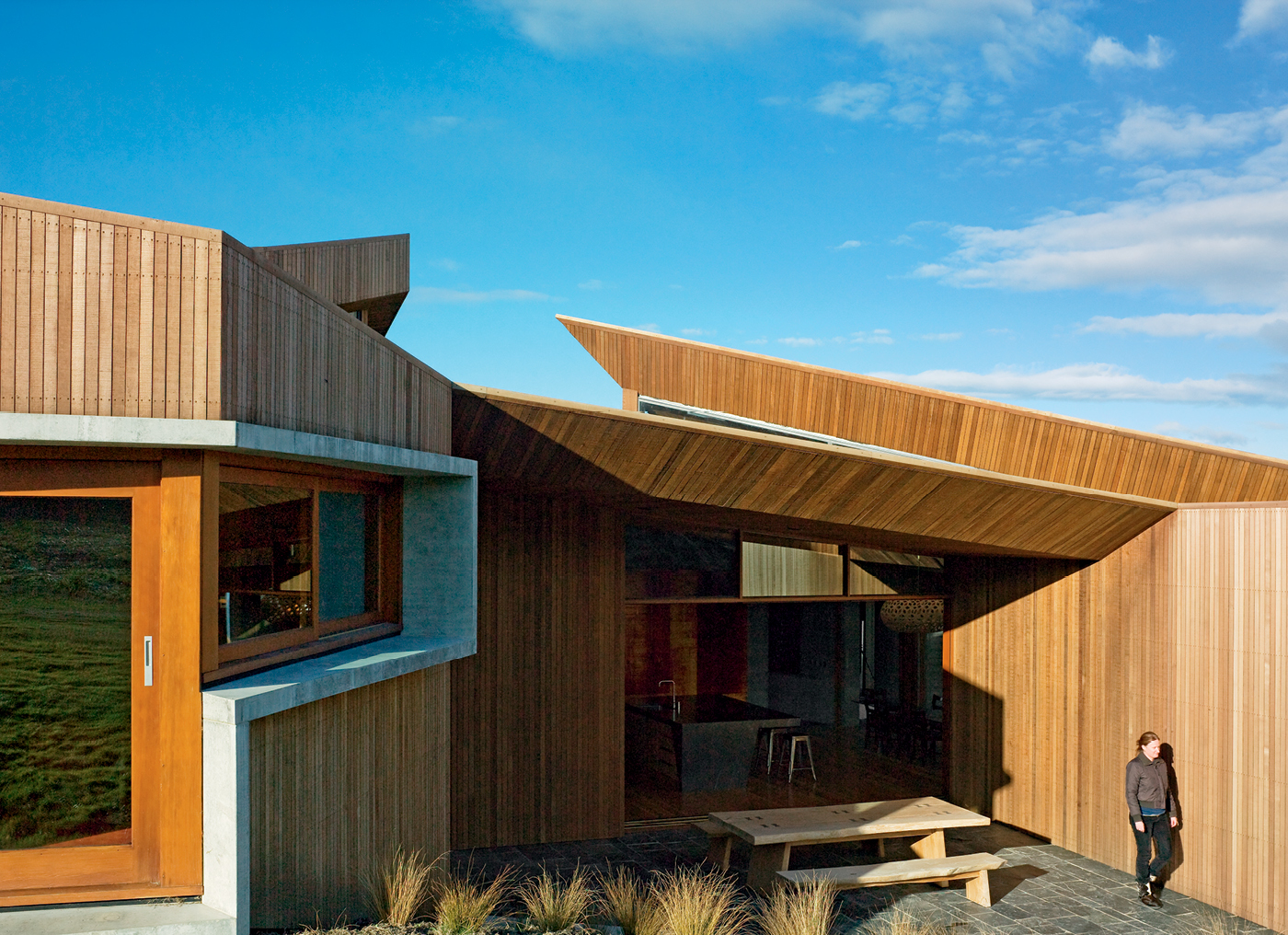
It blends in, but it certainly isn’t bland. The home’s cedar cladding mimics the colour of the tussock around it and, in a surprising and beautiful gesture, covers not only the walls, but the roof as well. (The roof is designed in removable sections to allow maintenance of the waterproof membrane below it if needed.) It is a structure that looks unusually delicate in such a tough landscape, but inside the house this softness gives way to robust, wonderfully crafted cave-like spaces that would feel secure in any storm.
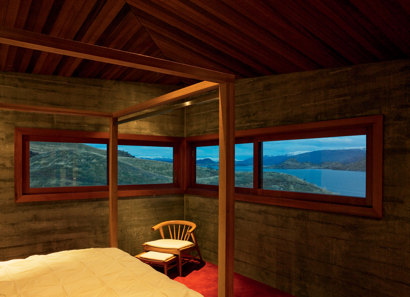
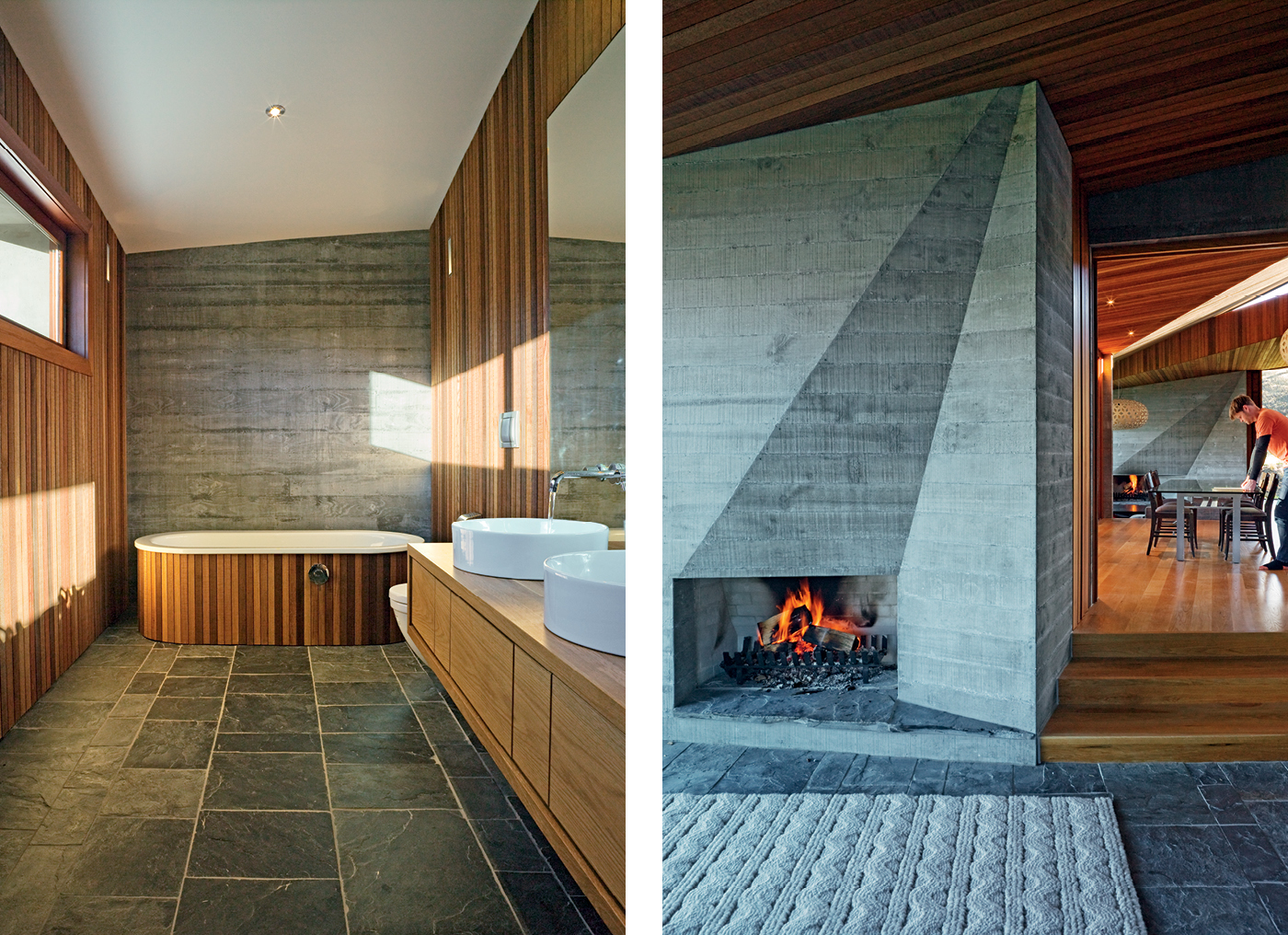
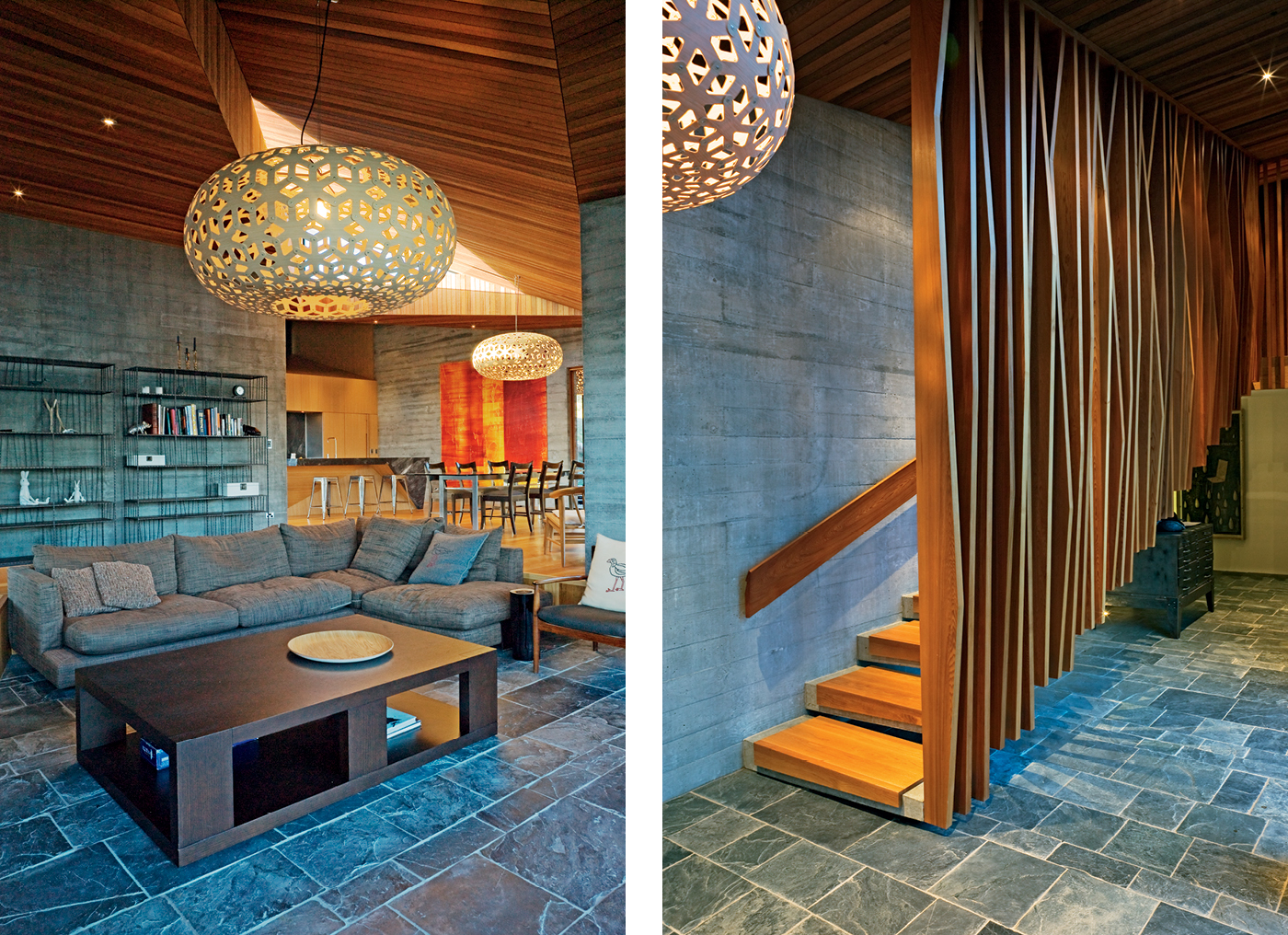
There are cast concrete walls, schist floors, and a folded timber ceiling hovering overhead, as if a cedar skin has been stretched over a concrete skeleton. This approach, Nicholas says, was engendered by “the way the tussock is laid over the rocks like a blanket or cloak”, or as Gary puts it, the appeal of “something delicate laid over something incredibly strong and robust”.
As well as stipulating that the building must blend in with the natural environment, local regulations required that it be constructed within a 25-metre by 25-metre square on its large site. Without this, it might have been possible to stretch the building along the site to allow every room a view of the lake. Instead, the mass of the 500-square-metre house had to be concentrated.
This is where the architects began experimenting with the aforementioned square of paper, an approximation of the allowable building area. “We began to cut away sections almost like a clothing pattern,” Nicholas says. They tilted the paper to form a roof plane that followed the slope of the land, cut away part of the side to shape the house around a knoll, trimmed an entrance to the east and a courtyard to the west, snipped and lifted the roof to allow sunlight into the building throughout the day, then folded parts of it down to create the walls.
Where their previous designs for Mark had been confined to rectangular urban sections bounded by fences and walls, the edges of this site dissolved into the landscape. “It seemed inappropriate to build something strict and orthogonal in an environment which has no boundaries,” Nicholas says. “We felt very strongly about the triangulated geometry of the mountainous landscape – it suggested a less conformist architectural language”.
The home’s intricate geometry not only makes it an object in the landscape over which light and shadow play intriguingly, but also serves to disguise its bulk. The way the site slopes southwards towards the lake allowed the architects to locate a two-storeyed section of the house against the hill with the garage on the ground floor and four bedrooms above.
Thus the house appears to hug the terrain as it slopes towards the lake, mirroring the angle of the distant mountain ranges at the lake’s western arm as it does so. (Concealed amongst all this are eco-friendly features such as on-site sewage treatment, a bio-diesel generator as a backup to the mains supply, rainwater collection, double-glazing, above-code insulation and solar-enabled water and power systems.)
Appropriately, the circulation patterns inside the house are organised along diagonal lines rather than right-angled regularity. The entrance, with its large doorway and handsome staircase, invites visitors in with a view across the dining area to the sunken living space, a diagonal procession culminating in the dramatically faceted concrete fireplace and the view, previously withheld, of the lake and the mountains to the south.
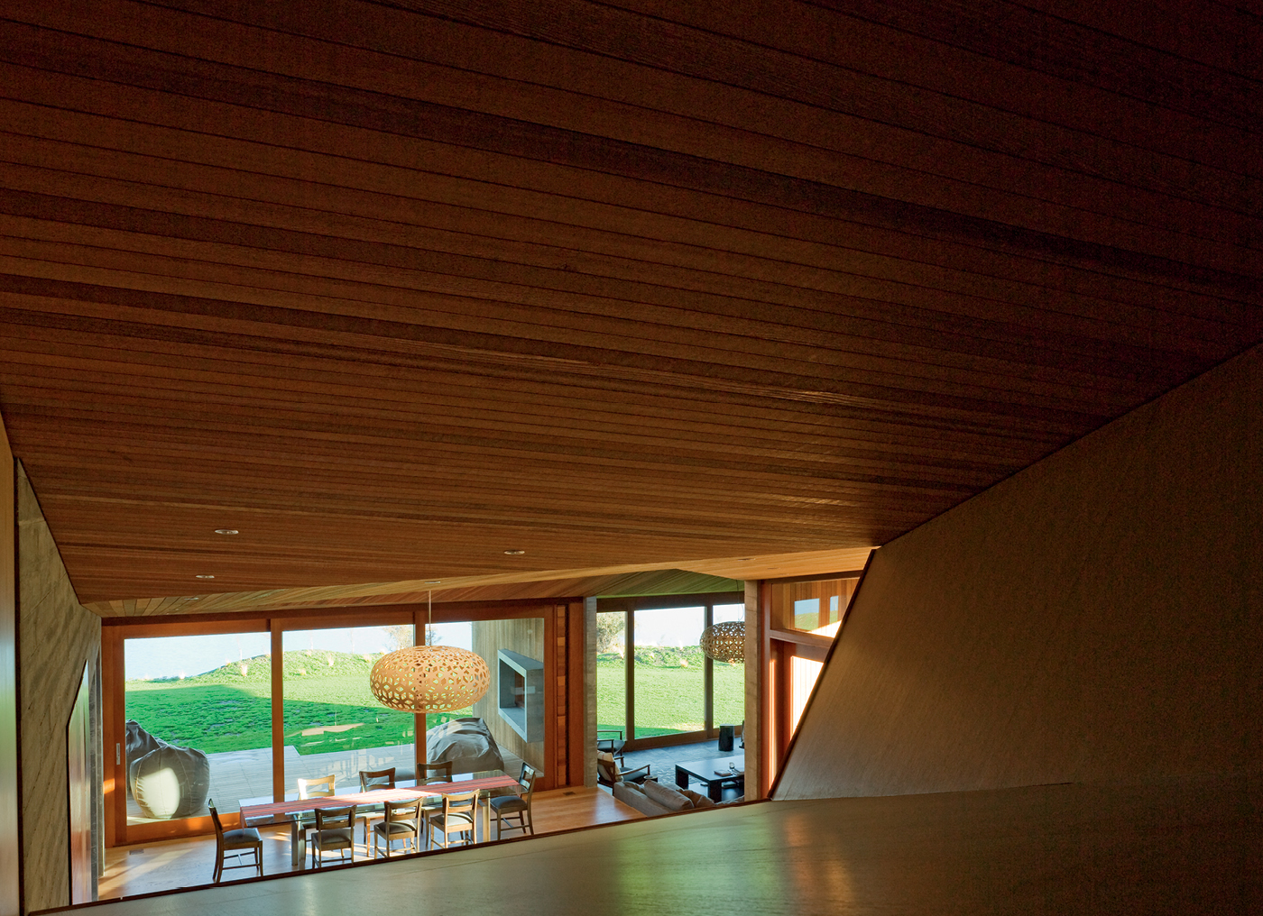
Looking back across the kitchen, a high wall of cabinetry gives way to an interior view shaft that allows people in the hallway upstairs to chat to those in the kitchen, a surprising and effective gesture that, by creating a vivid connection between the living and sleeping zones, makes the house feel more intimate.
“It makes the house a more sociable place, because you really do talk to people downstairs on the way past,” Nicholas says. (A potential downside is the shaft’s alarming propensity to transmit conversations conducted in one part of the house to another without any apparent decrease in audibility – those inclined to indulge in a bitch session are advised to do so outside.)
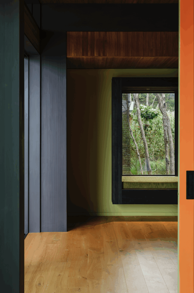
Tempting as they are, this is not a house that surrenders itself to the views, but carefully manages them. The rooms are not encased in huge sheets of glass, but have windows and doors that edit the vista in ways that foster deeper appreciation of the smaller moments that make up the breathtaking panorama outside.
This approach means the views here can never be taken for granted, that they must be actively appreciated by the occupants, whether it be by curling up on the couch in one of the living spaces, lounging on the sheltered south-facing verandah, or watching the stars dazzle overhead from the westerly courtyard at night. In this way, the house enhances the sense of engagement with the incredible scenes outside, but also provides a secure and singular place from which to appreciate them.
This is, perhaps, the most fitting of gestures: to design a home that reminds people of the beauty of the land around them without disturbing that land in the process.
Photography by: Mark Smith. Words By: Jeremy Hansen.
[related_articles post1=”2723″ post2=”1716″]
