Combining monumental heft with deft design moves, Daniel Marshall creates a surprising new family home
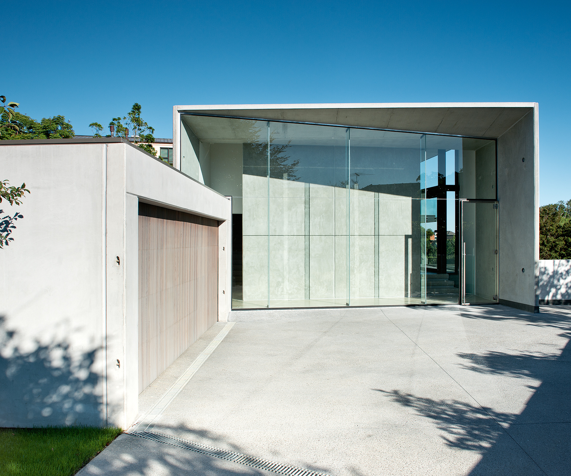
The gentle northern slopes of Auckland’s Remuera seldom see homes this mysterious. Here at the end of a quiet cul de sac, an enigmatic glass-and-concrete structure occupies a site where a plain 1960s brick-and-tile home once stood. Is it a commercial building? An art gallery?
An office for a boutique investment firm? It is a building that is simultaneously solid and transparent, inviting and intimidating. It is, as it turns out, a family home, ingeniously designed by architect Daniel Marshall (who had two homes in the finals of last year’s Home of the Year award) for a couple with two young children, a place that combines an elegant monumentality with just the kind of knockabout practicality growing kids need. Not that you would guess any of this from the street.
When the home’s owners first approached Daniel, they were considering a renovation of the existing property on the site. It soon became clear that the cost of doing so offered no real benefits: the old home was unremarkable as well as being awkwardly separated from its site, with its living spaces perched atop a basement garage. One of the main things Daniel appreciated about the site when he visited it for the first time in 2006 was its “vertical layering”.
At the ground level, with a wide lawn surrounded by trees lining a neighbouring right-of-way, the site has a sheltered, almost sub-tropical environment. One level up – the level of the new home’s entry – things get lighter with a view of the treetops. And on the third level, where the home’s main bedroom is now located, there’s a surprising view of the Hauraki Gulf, with Rangitoto and the North Shore’s volcanic cones rising out of the glittering harbour.
The challenge was incorporating these different experiences into a new home without making it feel fragmented. Would hanging out on the ground floor, for example, leave the owners pining for the view?
[gallery_link num_photos=”12″ media=”https://homemagazine.nz/wp-content/uploads/2016/04/HNZ0811Marshall_AR28695.jpg” link=”inside-homes/home-features/elegant-concrete-steel-home-daniel-marshall” title=”See more of this home”]
Daniel’s response was to carefully arrange the house over a number of split levels, a design that allows a full experience of the site and doesn’t leave the owners feeling like they’re always climbing stairs.
One of the major problems with the old place was the way the driveway dipped down the hill from the street to reach the garage, gobbling up a good portion of the site as it did so. Daniel’s response in the new house was to create an entry court and garage at street level, a gesture that also makes the home’s entry highly visible from the street. “I found the public aspect really interesting, and rather than covering all that up I wanted to engage with it,” he says.
And so he created what he describes as a contemporary interpretation of a veranda, an in-between space that blurs the boundary between public and private by allowing passersby to see a short way into the house, or at least as far as a large pre-cast concrete panel that sits just beyond a large wall of glass. The eventual aim is to treat this space as a type of gallery, so a work of sculpture or video art can be displayed there and seen from the street.
[quote title=”” green=”true” text=”Efficient stacking over three main levels leaves a large portion of the site clear for a swimming pool and a wide, flat lawn.” marks=”true”]
It is a large house – four bedrooms, and 400 square metres in size – but not a grandiose one, as its efficient stacking over three main levels (and more intermediate ones) means it was well under the council’s allowable site coverage, leaving a large portion of the site clear for a swimming pool and a wide, flat, sheltered lawn that the ground-floor living areas open onto.
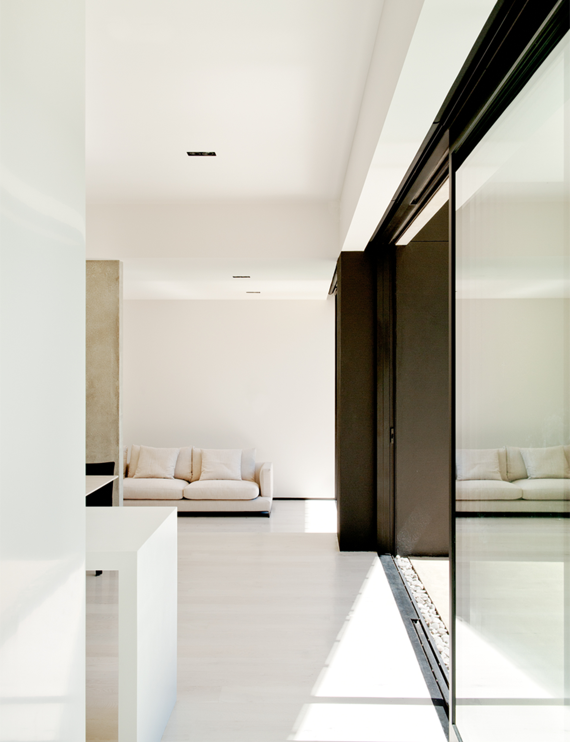
Down here in the family rooms – there is a split-level kitchen, dining and living space and a snug TV room that doubles as a study – the large pre-cast structural concrete panels are left exposed on the interior, in line with Daniel’s strategy of keeping the material palette stripped-back and simple, and with the happy side effect of giving the interiors a surprising lightness. “They reflect the light beautifully – there’s such a warm glow in the house,” Daniel says.
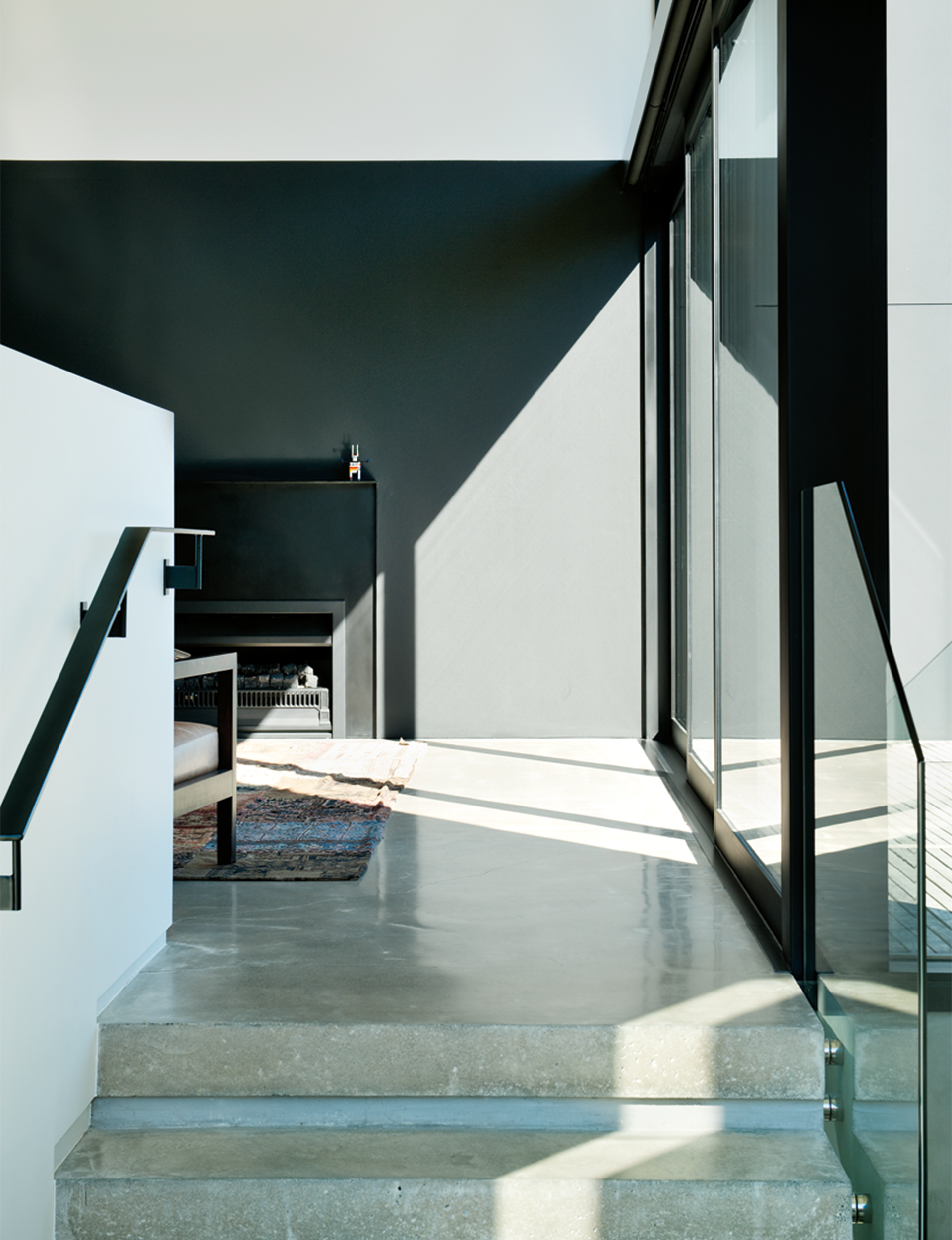
Upstairs, continuing to play on the formality suggested by the idea of the veranda, Daniel designed what can best be described as a reception room just two steps up from the main entry, with a fireplace, black cabinetry and ceilings that soar as high as 4.5 metres, a place for adults to retreat after a meal and leave the kids to it downstairs. As Daniel describes it, it’s a kick against the classic modernist approach of the single open-plan living space. “It’s a more tailored response than just saying, ‘Here’s a big space with a big kitchen island’”, he says.
The home’s rear wall follows the same straight line as that of the original home, but its geometry is enlivened by Daniel’s introduction of a secondary axis that roughly mirrors the diagonal line of the site’s eastern boundary. But it isn’t until you’re out on the front lawn looking back at the house that this strategy becomes clear, with the whole composition coalescing into a single, very impressive sculptural form.
From here, you can see how the children’s rooms have been cleverly sandwiched between the main bedroom and the living room below; how the pre-cast concrete panels appear to lean tectonically on one another for support; how the home’s black steel structural beams economically hold the home together. It is a structure of drama and clarity, heft and lightness, an elegant secret modestly hidden from the street.
Words by: Jeremy Hansen. Photography by: Emily Andrews.

