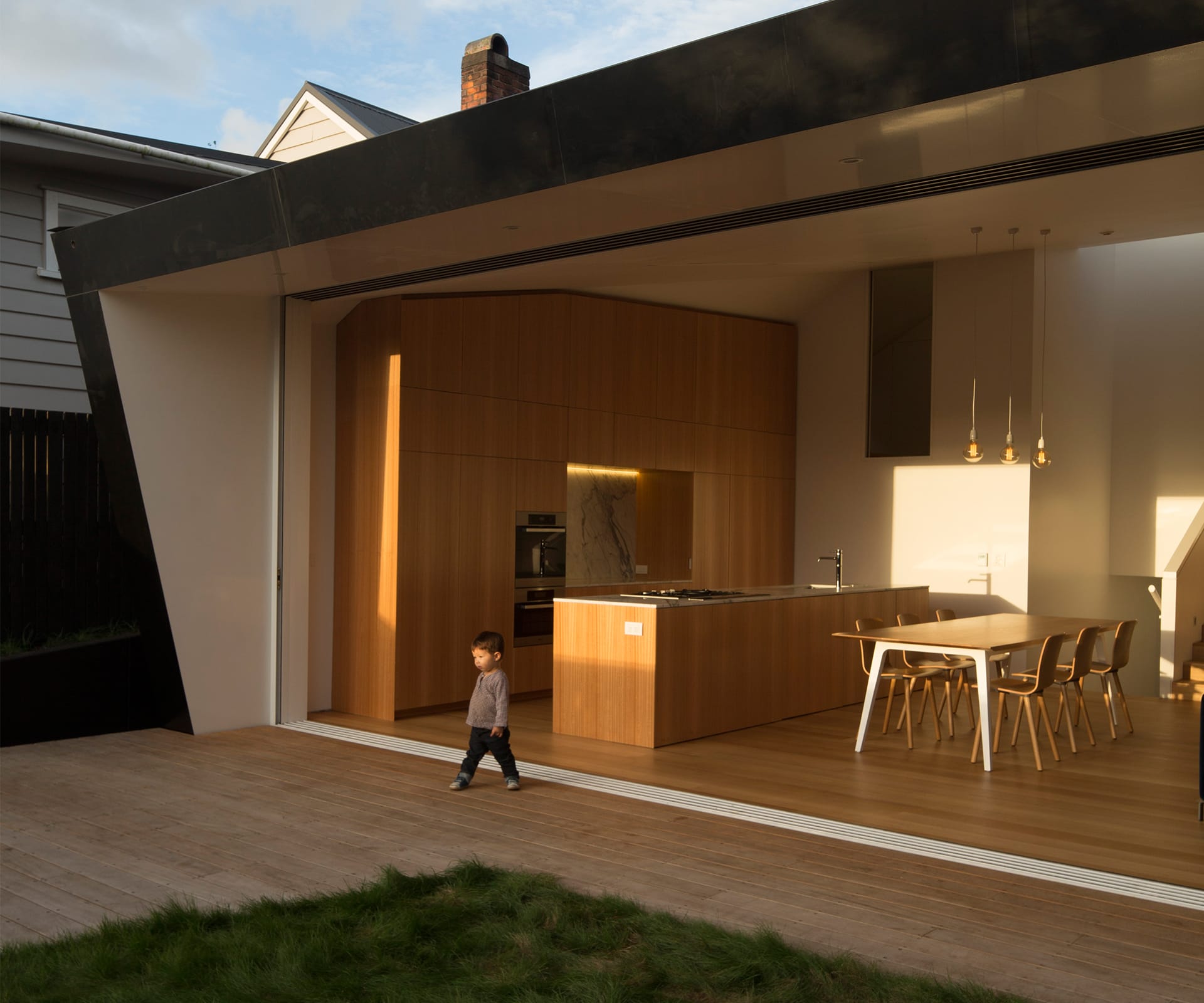
A finalist in the Home of the Year 2016, this Auckland home makes kitchen design look simple. Architect Anthony Hoete explains the project…
Architect:
Anthony Hoete, WHAT_architecture
Brief:
London-based architect Anthony Hoete designed this home for his friends, engineers Michael Pervan and Amy Oding.
Q&A with architect Anthony Hoete
A finalist in the Home of the Year 2016, this home has a carefully calculated asymmetry. How does the kitchen fit in with that?
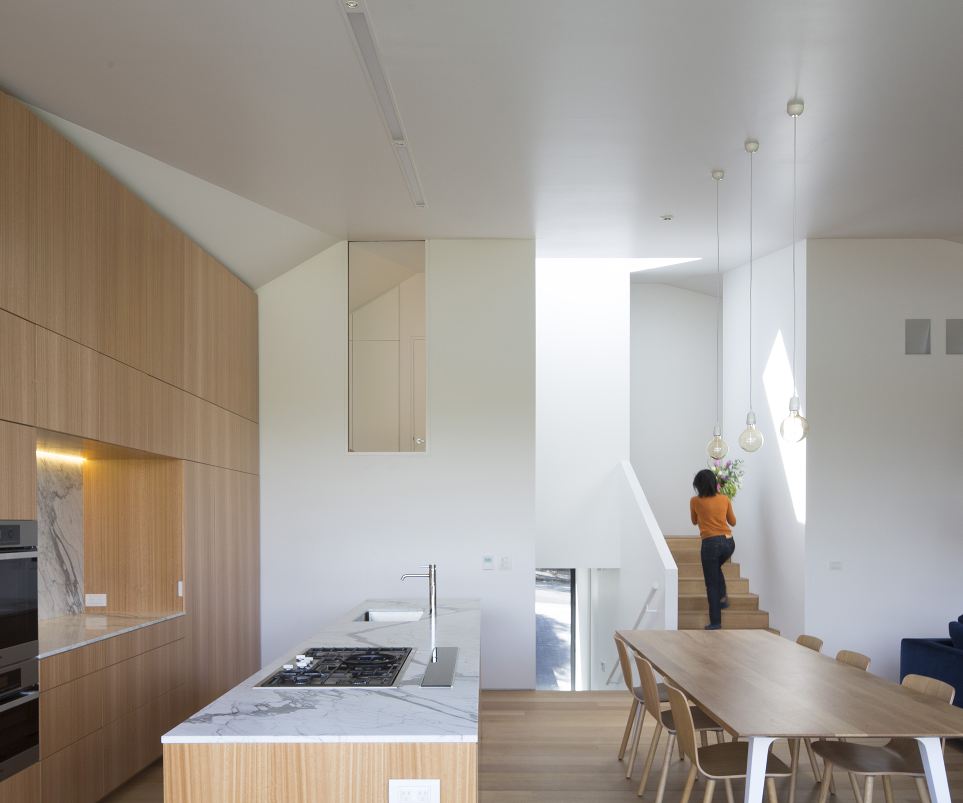
The ‘Villameter’ is an interpretation of the traditional villa to the street. Out the back, it is also a modern villa to the garden, with its non-façade wall of bi-folding doors. This extrusion between traditional and modern produced the geometry of the house.
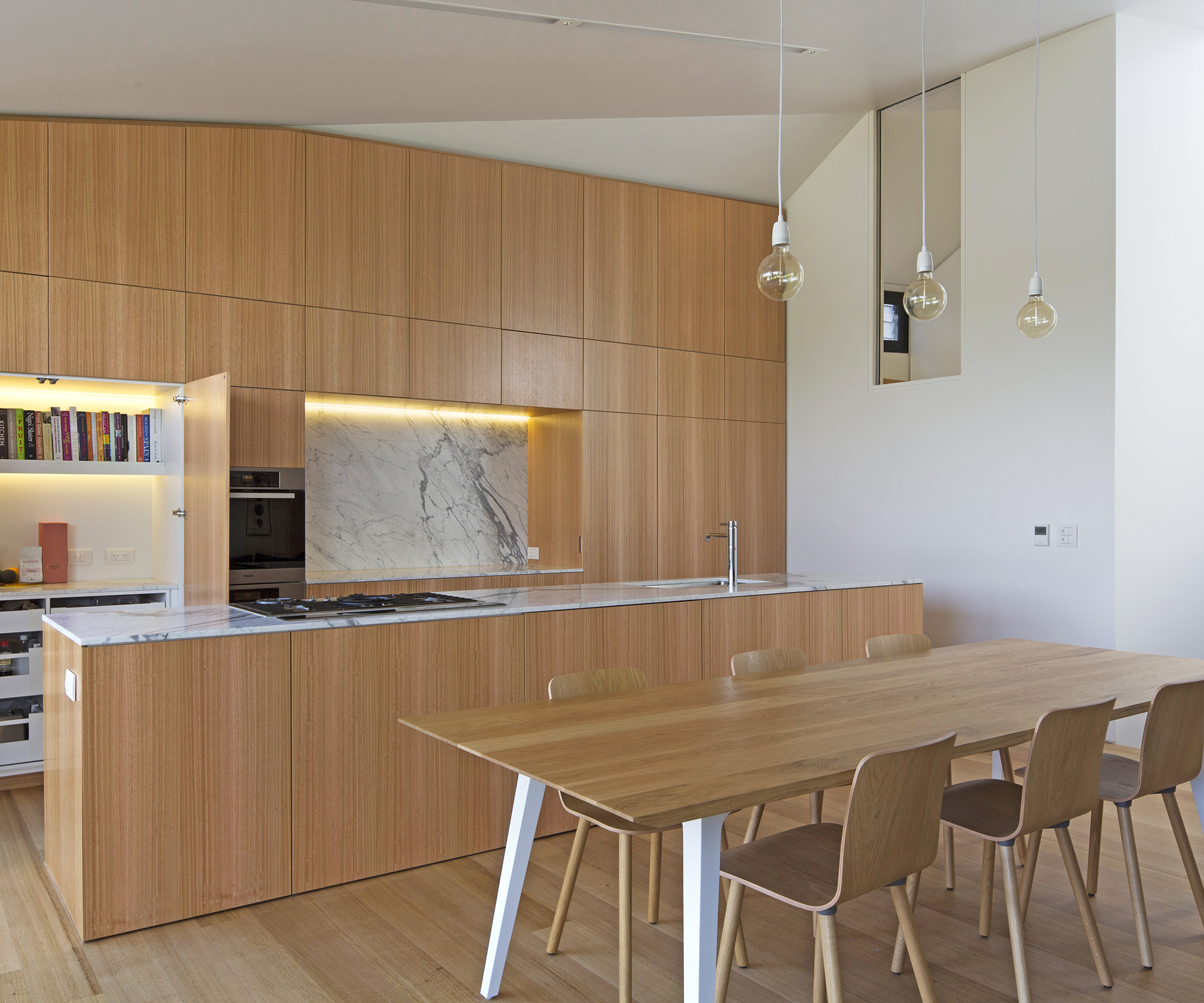
Inside, the living-room wall is just a TV cabinet jump-scaled to be more wall and less furniture. It’s the same for the kitchen on the other side of the open-plan living space. This is also a response to the owner’s particular way of pared-back, streamlined simplicity.
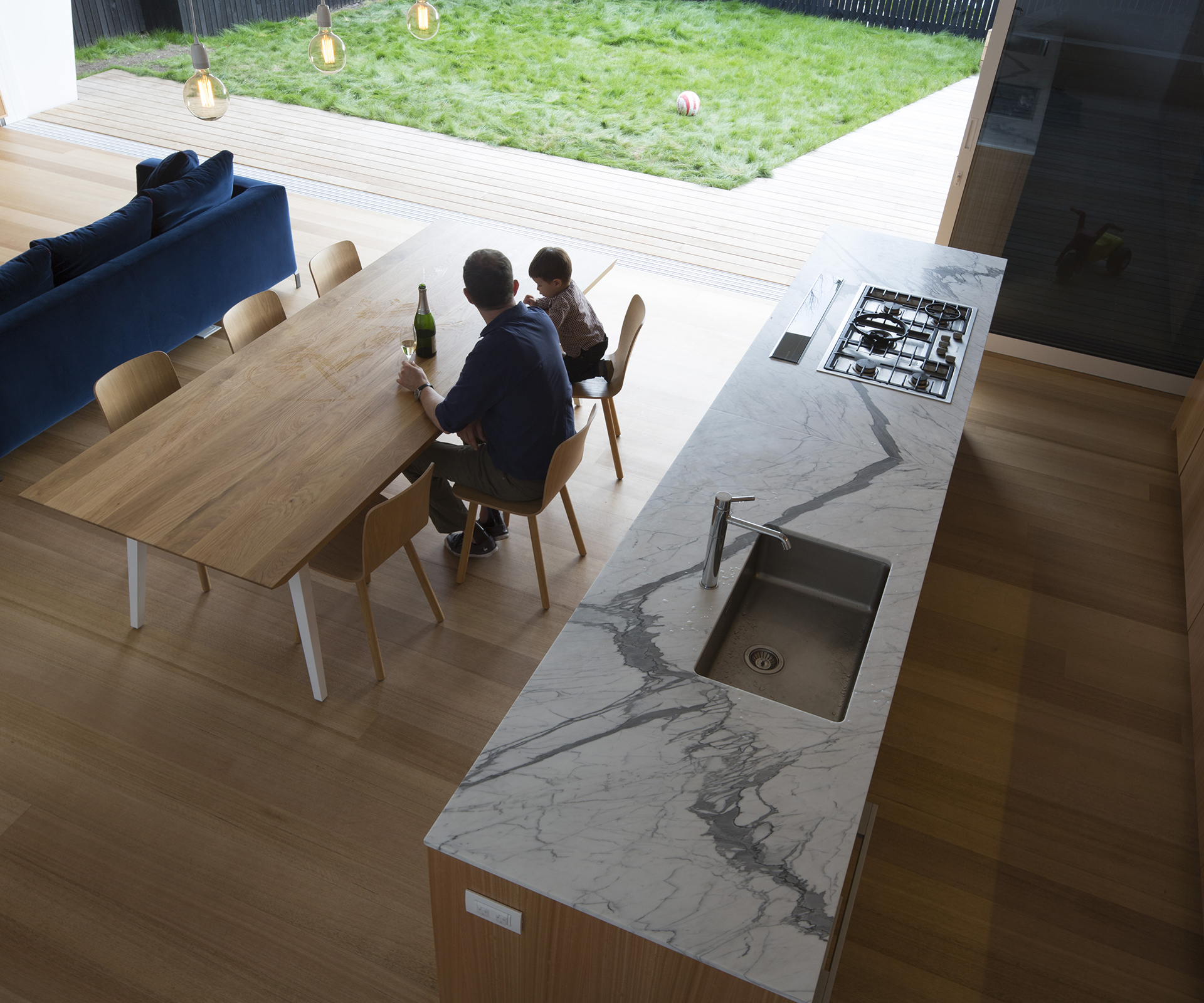
It’s complicated to make simplicity look this good. Was part of the success the fact your clients are engineers and you all have an appreciation for fine details?
The clients have an empathy for ‘apparently’ simple details which are, ironically, not so easy to achieve in practice.
Any tips for choosing timber veneer for kitchen cabinets?
Seal them. I would recommend Carver AquaHit, an Italian non-toxic water-based product. As good as any polyurethane – I know from the knocked-over wine glasses on our office ply furniture.
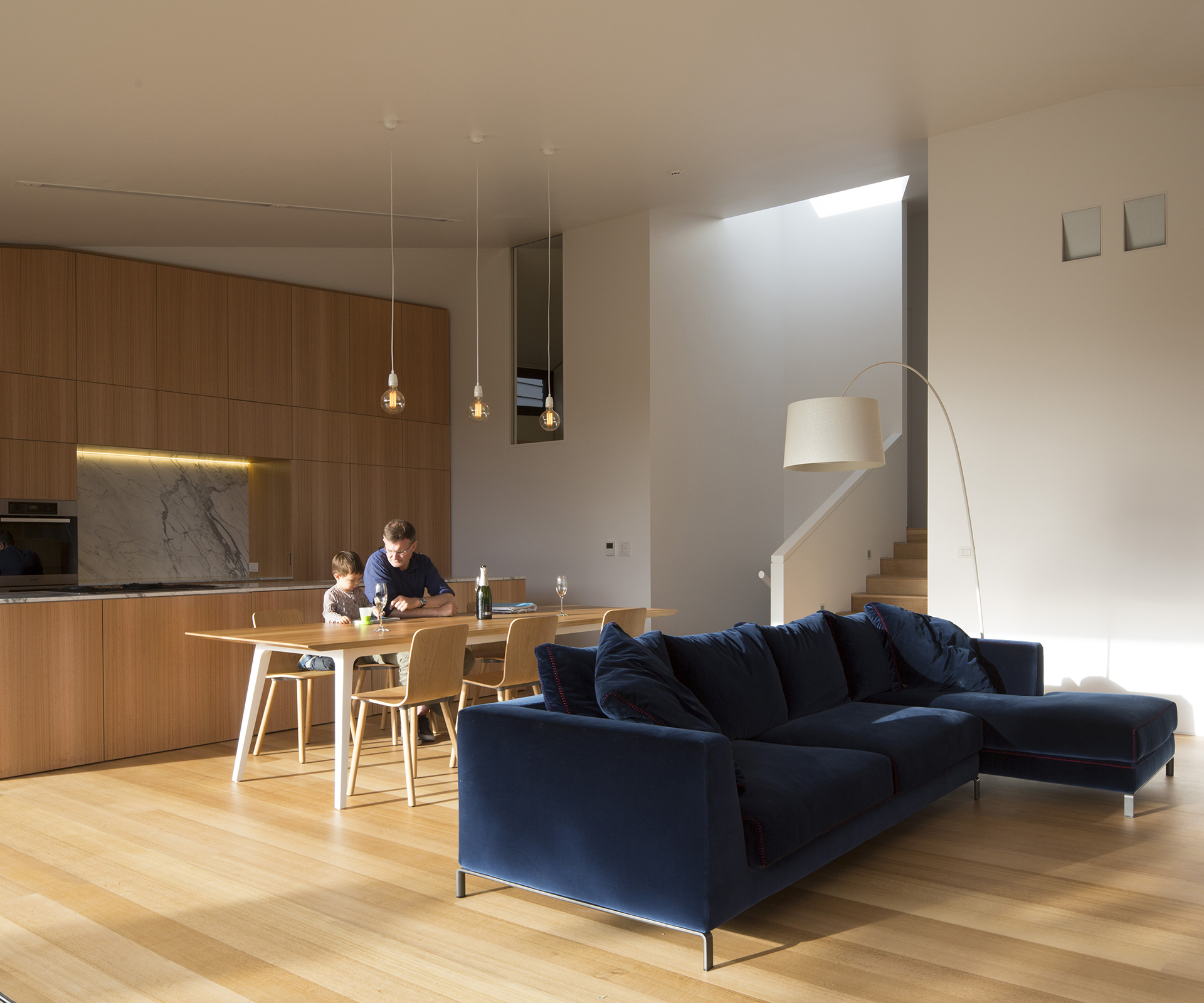
The consent process for the house took 10 years. What changes in kitchen design have you seen in that time?
Kitchens in New Zealand are both internal and external. Next time we will be able to wheel the peninsula kitchen component outside. Technological advances today can provide for ‘plug-in’ plumbing.
Design details
Benchtop and splashback: Honed Statuarietto marble.
Cabinets: Cabinetry design by WHAT_architecture, built by MMi using Tasmanian oak veneer from Bestwood.
Dishwasher: Fisher & Paykel DishDrawers.
Flooring: Tasmanian oak from Herman Pacific, installed by Wood Floor Solutions.
Fridge: Miele.
Internal hardware: Blum.
Lighting: Klik fluorescents integrated with halogen downlights; Brightlight recessed LED strip lights from JA Russell.
Oven and cooktop: Miele gas cooktop, oven and combi-microwave/oven.
Tapware: ‘Pan’ by Zucchetti from Robertson Bathware.
Table: ‘Soul’ table by Nonn from Simon James Design.
Chairs: ‘Hal’ chairs by Jasper Morrison for Vitra from Matisse.
Watch HOME’s editor Jeremy Hansen explain the ‘Villameter’.
[jwp-video n=”1″]
Photography by: Patrick Reynolds.
[related_articles post1=”44149″ post2=”45182″]
