A group of 1970s townhouses in Freeman’s Bay, Auckland, offer lessons in smart planning that most cities still seem to ignore
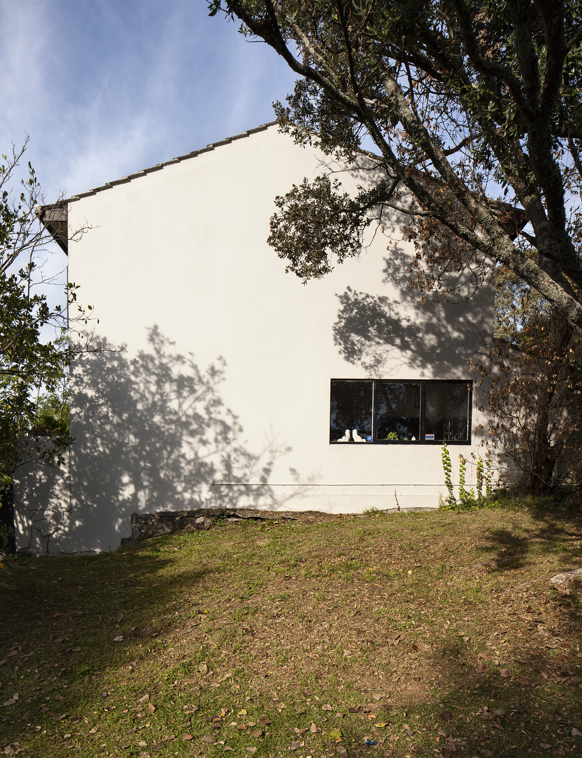
These Freeman’s Bay townhouses are an example of density done well
Year 1970s
Location Auckland
Architect Angus, Flood and Griffiths
When the firm Angus, Flood and Griffiths designed this townhouse and its many neighbours in the early 1970s, with an elevated balcony looking out to the street, they probably didn’t imagine that the view would one day take in the spire of the Sky Tower. Instead of a focus on the emerging cityscape, the designers were channeling Old Blighty.
This development in the inner-city suburb of Freemans Bay has 31 two-storey homes that are grouped, terrace-style, around a shared common lawn. The designers hoped to recreate the community feel of an English village. This suburb was once on the shores of a stream-fed bay, as indicated by one of its Maori names, ‘Waiatarau’ which means ‘waters reflecting shadows”. Post-European settlement, however, the infilled land became a notorious slum where prostitutes plied their trade alongside opium and laudanum dens.

This collection of homes was to be the blueprint that broke this festering mould. “The architects were incredibly democratic. They designed modest homes with human scale. Each was the same size: it was comfortable yet egalitarian,” says resident Joanna Wickham, a photographer and interior stylist, who consulted architect Dion Gosling of Studio 106 to renovate the townhouse. Wickham’s parents own the home, which they purchased originally as a city escape for when they visit from Taranaki.
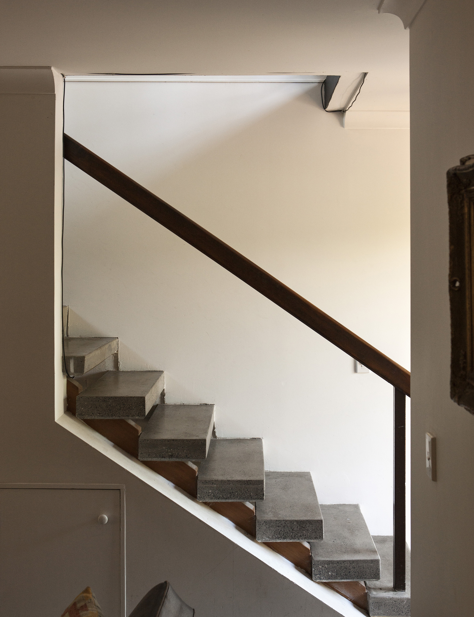
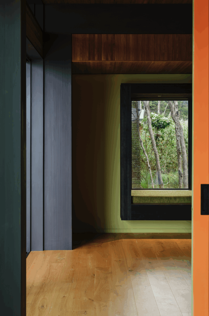
The townhouse showcases the brutalism of concrete-block construction, while a clay-tiled roof channels a Mediterranean mood. Slatted timber soffits ensure the roof cavity is well-ventilated. But Gosling is more impressed by the home’s spatial characteristics. It isn’t a large floorplan, but the spaces have proportion and grace. Downstairs, the living, kitchen and dining room are grouped around the stairwell. Upstairs, an elegant landing is a multi-use zone.
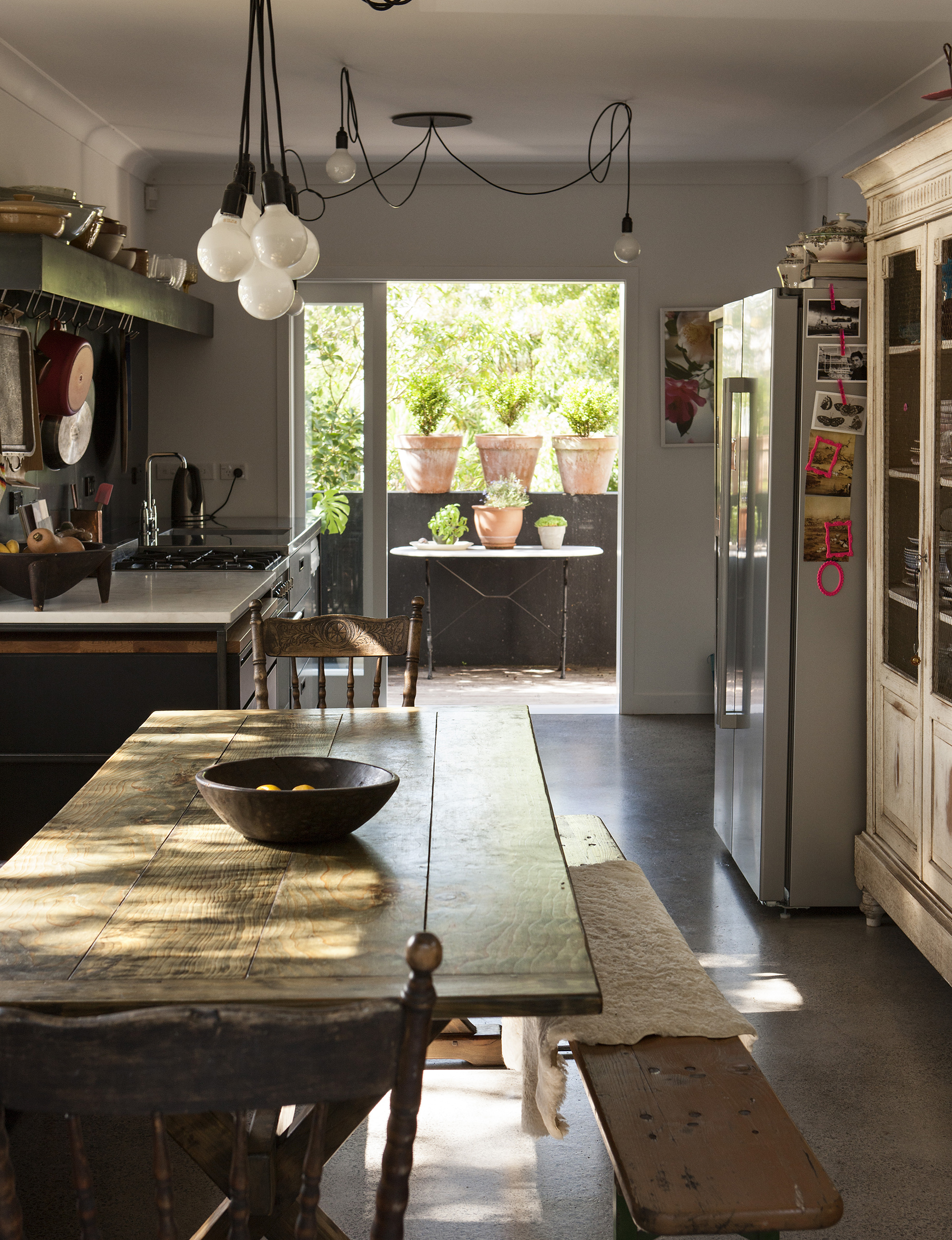
The renovation was done on a strict budget. The kitchen, once a mishmash of MDF and veneer-clashed cabinetry in an L-shape that cut the flow to the dining zone, was the first success story. “We took to it with sledgehammers over a weekend,” says Wickham.
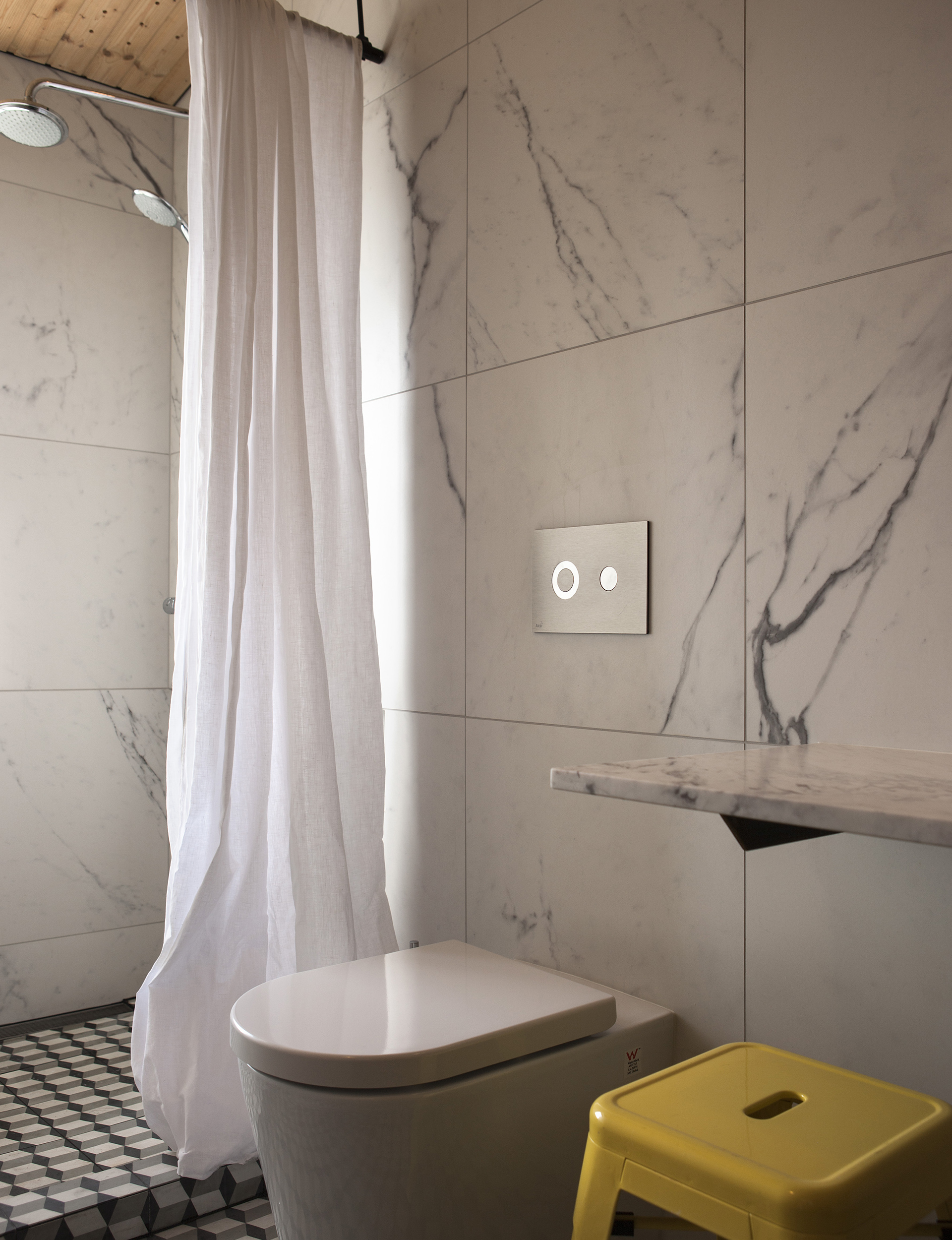
Inspired by a working restaurant or café-style kitchen, Gosling honed the concept of ‘Beautility’ – the merging of functionality and style. Industrial-steel freestanding units make up the cabinetry but the eye-stopping hero is the waxed black-steel splashback. Next on the hit-list was the upstairs bathroom, where smooth marble walls now combine with the warm texture of Nordic spruce-paneled ceilings.
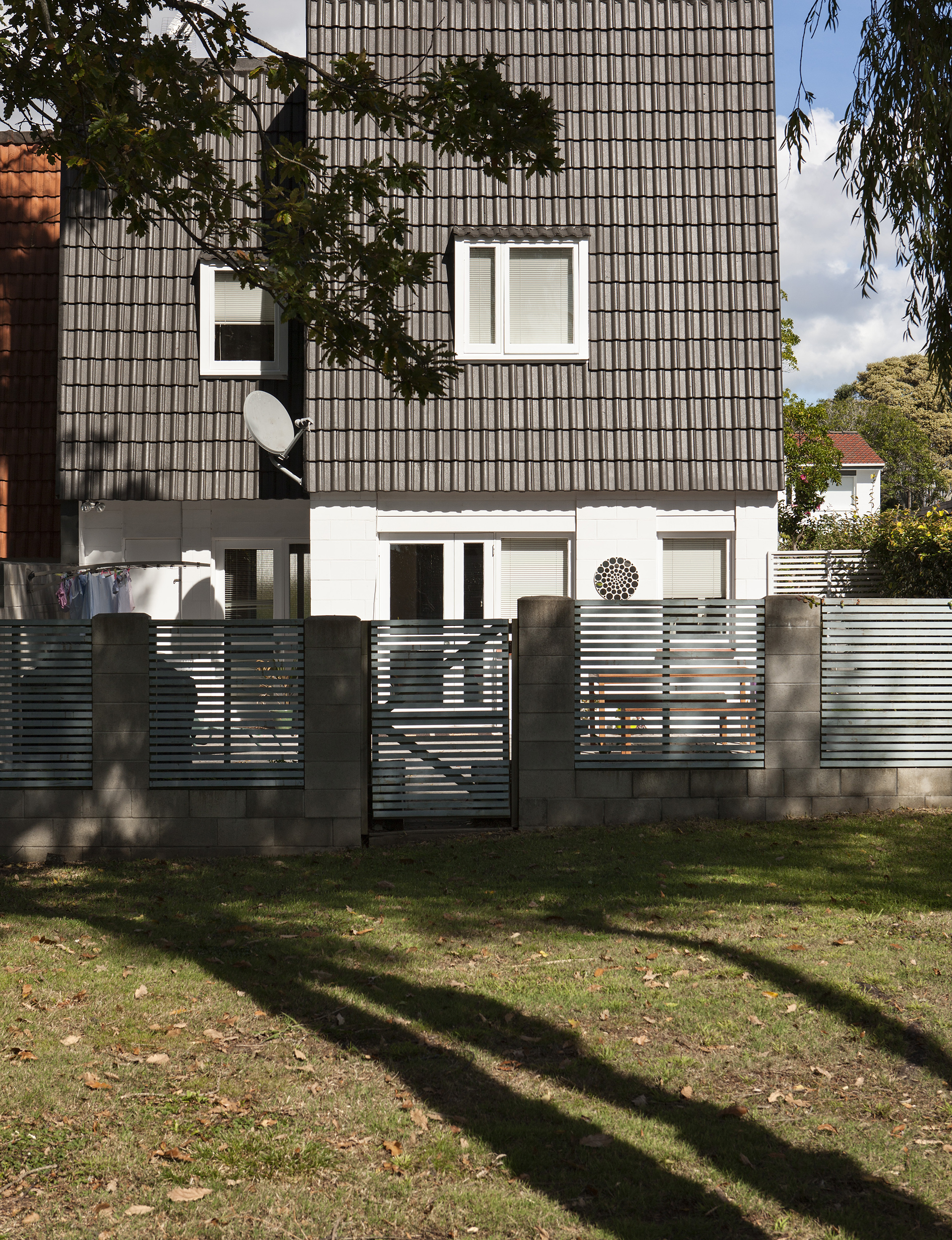
Outside, a small courtyard captures the northwesterly sun, but the real magic is the green area that the townhouse shares with its neighbours. A gate off the courtyard leads to a small path, then a few steps to the car-free oasis that is invisible from the street. This is how medium-density developments can work, with all the units connected to a car-free green space in which all the residents can relax. A casual committee of homeowners takes care of the grounds and organises occasional get-togethers.

Developers take note: couldn’t this be a better suburban model than your acreages of barely detached homes with measly strips of green around them? Much of the rest of the neighbourhood was designed to this blueprint, part of a council-led attempt to clean up the area in the 1960s and 1970s. The proximity to the city means that prices have risen far outside the affordable range in recent years, but the fundamental notion of clustering homes efficiently together around a shared piece of land could be applied anywhere. C’mon city planners, let’s try this.
Words by: Claire McCall. Photos by: Simon Devitt.
[related_articles post1=”61401″ post2=”61451″]
