This family home may be petite, but it cleverly provides the owners with everything they need
Family home, Wellington
Architects: First Light Studio
Floor area: 86m2
It almost sounds like the perfect brief. “They wanted to do something small, clever, good quality and not too expensive,” says Eli Nuttall of Wellington’s First Light Studio, about his clients’ desires for their house on a sub-divided site in Seatoun.
[quote title=”We pride ourselves on doing” green=”true” text=”smaller, smarter and better” marks=”true”]
The clients had spoken to a few design-and-build companies, but felt their desires weren’t quite being met, so they turned to the First Light team for a solution. “We pride ourselves on doing smaller, smarter and better,” Nuttall says. “We could design a space around them that was a great place to be in.”
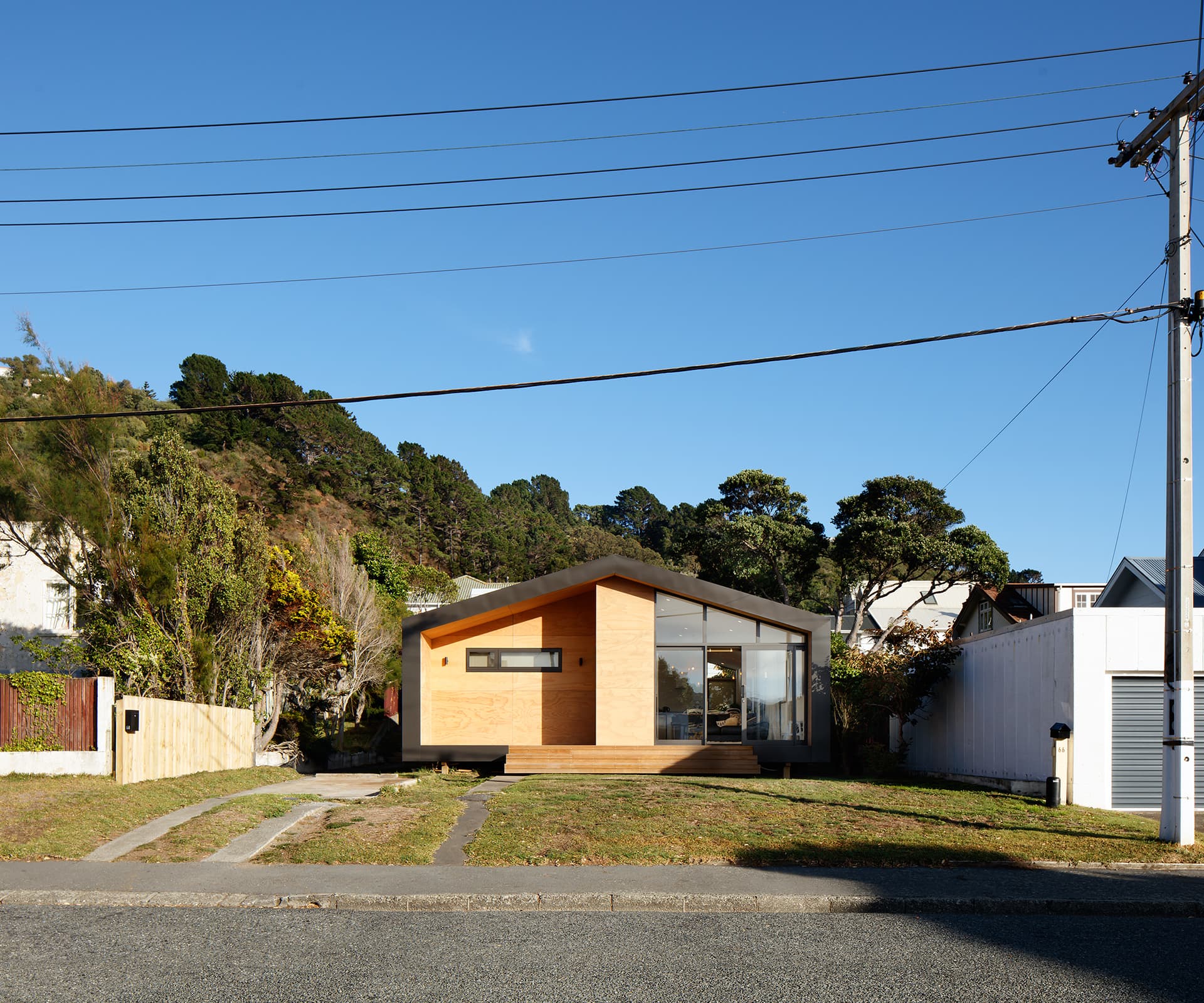
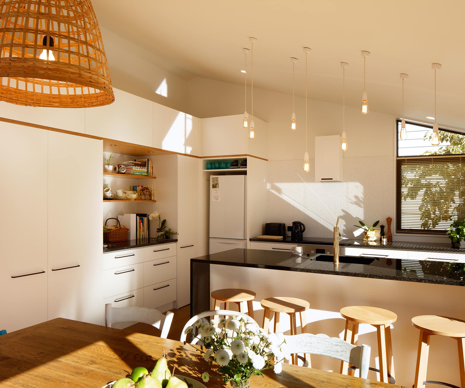
The 86-square-metre, two-bedroom pad Nuttall designed for his clients, a couple with one child, packs a lot of living into its small frame. It turns its eastern face to the street and morning sun, lining up living, dining and kitchen areas under the high ceiling of the home’s northern face. The bedrooms and bathroom were tucked along the southern side, with small slot windows for ventilation and skylights for natural light.
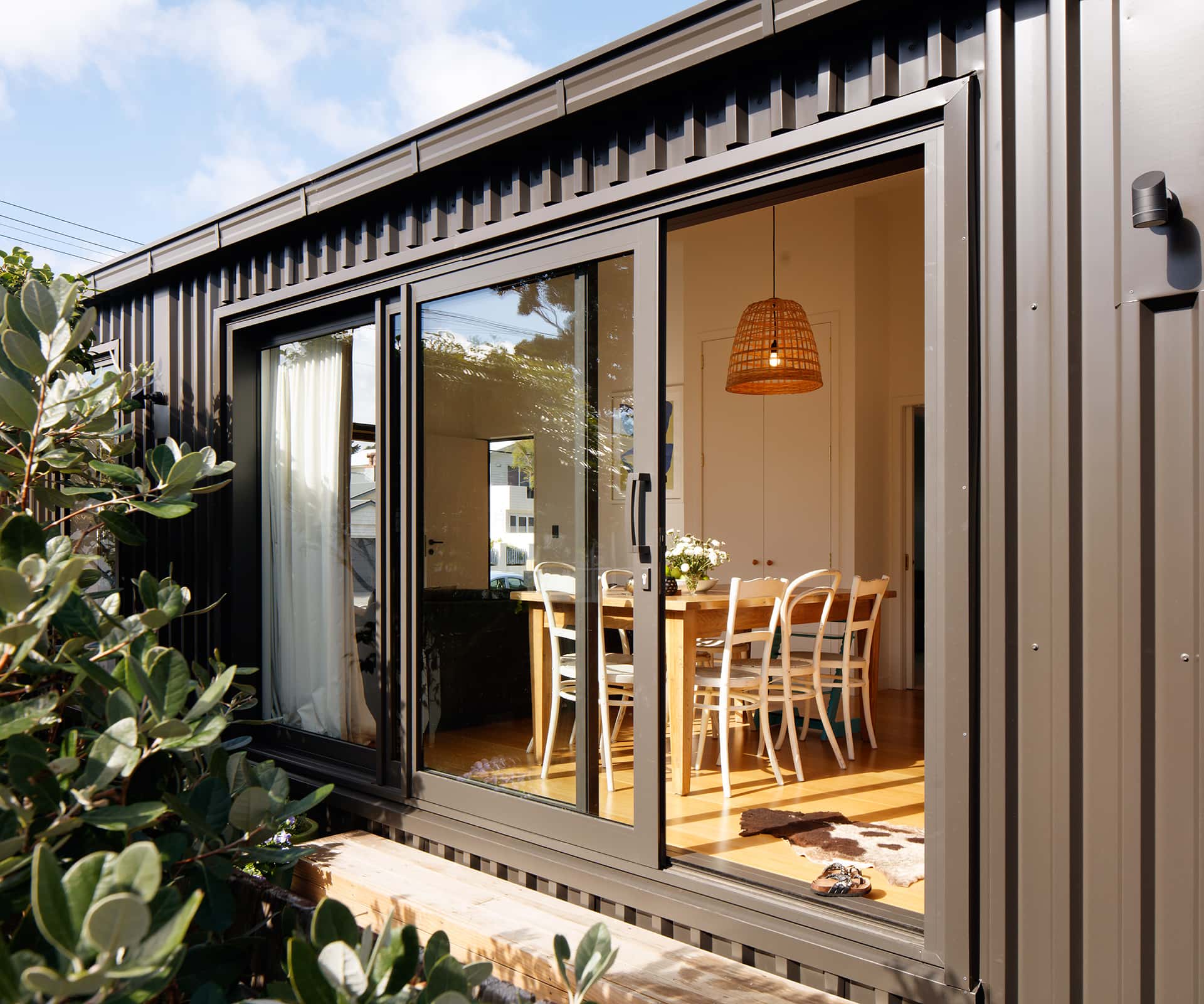
Warmth and comfort were high priorities for the owners – some of the money saved by creating a small home was reinvested in high levels of insulation and quality materials. The First Light team heavily insulated the floor, walls and ceiling (the walls have an R value of 3.2, while the ceilings are R3.6, well above minimum energy efficiency standards in the Building Code) and the clients spent a little more on thermally broken joinery (double glazing and frames with a cavity to minimise heat loss and condensation).
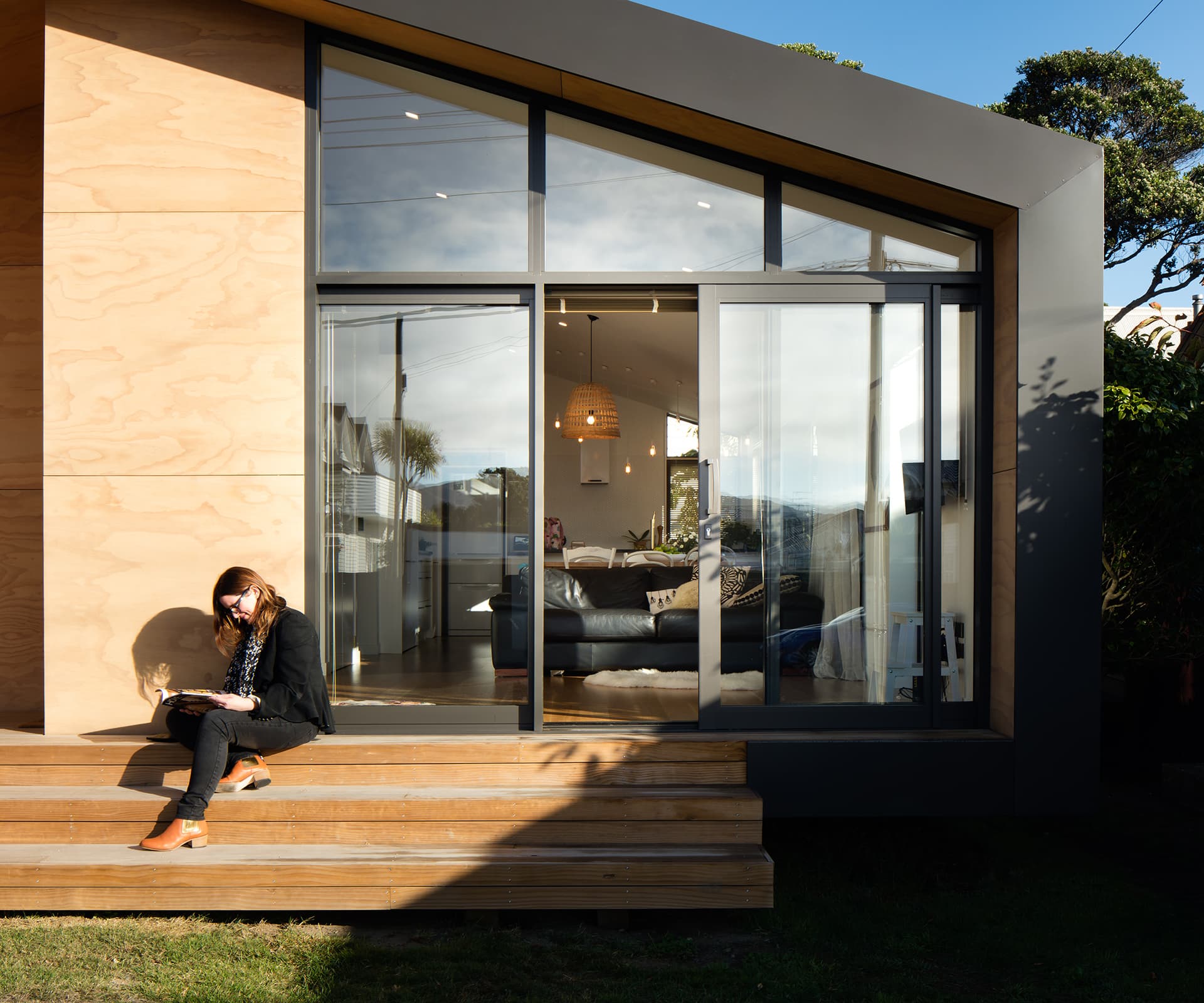
The home is lifted on piles, rather than sitting on a concrete slab, with under-floor wool insulation. The exterior is wrapped in Colorsteel, while the entry reads as a warm, ply-clad cutaway, with steps to the lawn – the perfect place to sit and soak up the morning sun.
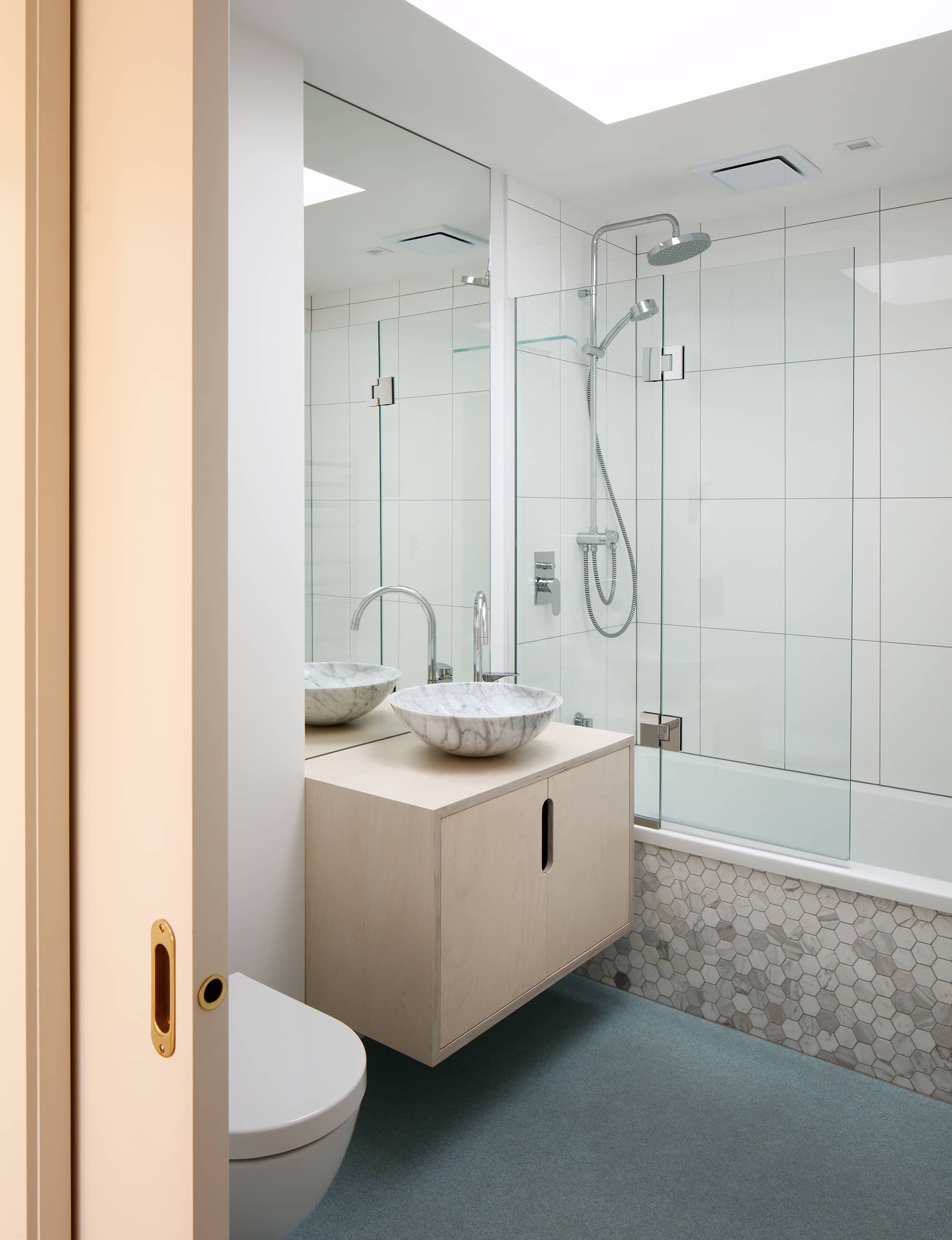
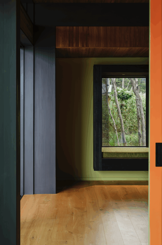
Inside, the truss roof was arranged to allow higher ceilings over the living spaces – a luxurious sense of volume – and lower ones in the bedrooms and bathroom.
[quote title=”It’s not about” green=”true” text=”building big” marks=”true”]
Circulation was kept to a minimum. It’s efficient, but never feels mean. “It’s not about building big,” Nuttall says. “Something small can deliver a lot more than its footprint might lead you to believe.”
Words by: Jeremy Hansen. Photography by: Jason Mann.
[related_articles post1=”52441″ post2=”36914″]

