Floor to ceiling tiles and refined function create a generous feeling of space in this small Christchurch bathroom. Tobin Smith discusses how he streamlined his design

How minimalist design took this small bathroom to the next level
Designer: Tobin Smith, CoLab Architecture
Location: Christchurch
Brief: An efficient bathroom with luxurious touches in the designer’s own home.
Describe the project in two sentences.
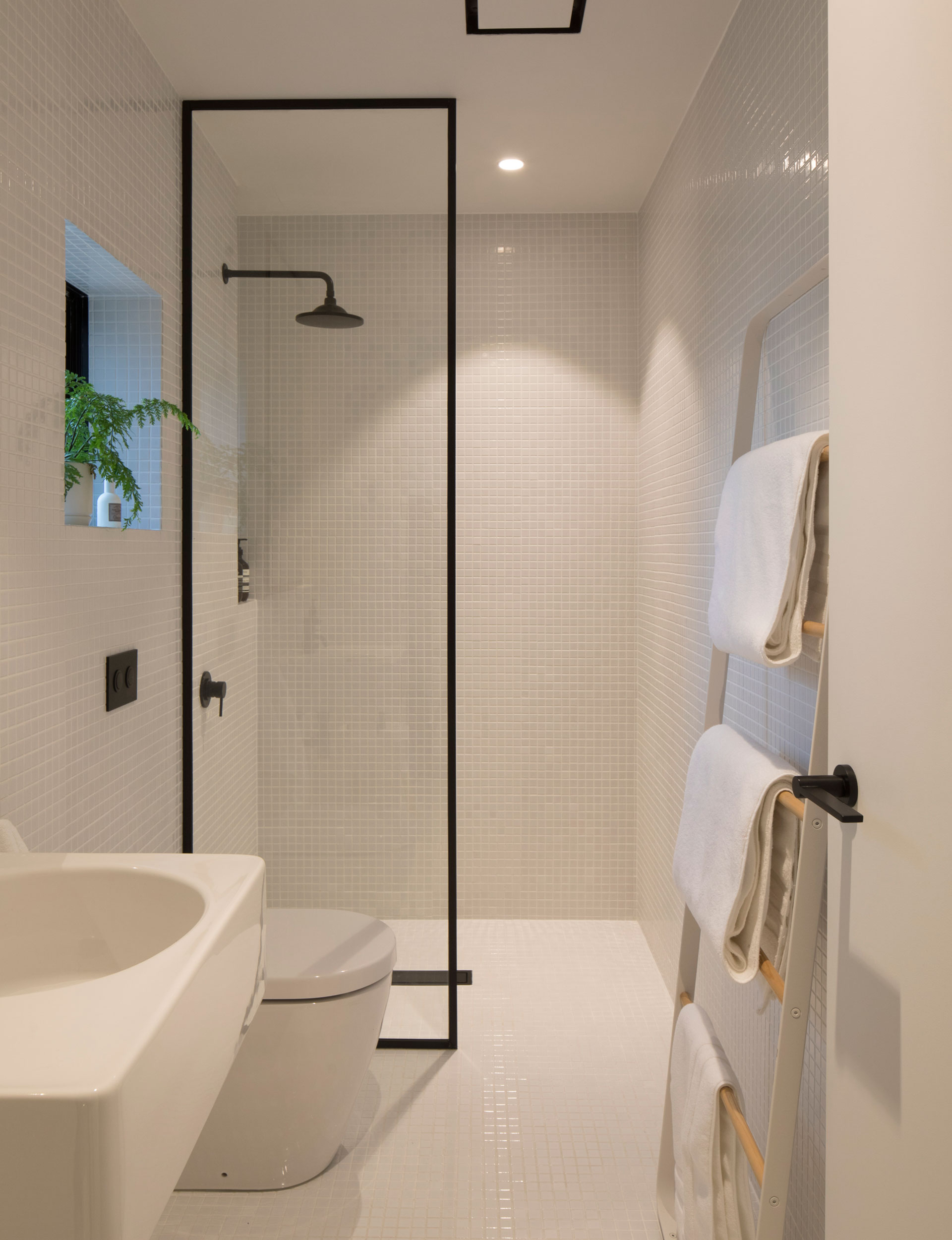
Our bathroom is a model of efficiency that aims to accommodate the essentials with a hint of luxury. Custom storage and simple fixtures create an open environment that maximises the usable floor space.
What are important elements to consider when designing a bathroom for a small space?
Good storage is always key, alongside the selection of appropriately scaled fixtures. Using a simple wall-hung basin free of cabinetry below, or a toilet suite with a concealed in-wall cistern, can reduce visual clutter and give the room a greater sense of space.
This room is understated but still has a feeling of luxury. How can this best be achieved when cost is an issue?
Prioritise the things that are important to you and remove the things that aren’t – remembering that luxury can be achieved by removing items as well as adding them. For example, rather than attempting to accommodate a bath that would squeeze up the available space, we opted for a large shower with a flush, tiled entry. Also, shop smart and select items that are both design and cost appropriate, and consider what is fixed and what is removable. In this instance, the free-standing towel rail by Menu and a stool by Tim Webber are pieces of furniture that could, if we wish, come with us if we decide to move house.
How and where have you accommodated storage?
The storage is built into the wall above the basin and is concealed behind a mirrored push-to-open cabinet door. The location of this cabinet corresponds with an overlap in the wall construction, meaning that additional depth could be claimed within the cabinetry, greatly reducing the storage pressure on the remainder of the space. Small tiled recesses are located beside the basin and within the shower to hold everyday items.
What was the starting point for the materials chosen?
We wanted this space to be cohesive with the interior in the rest of the house. On that basis, the colour scheme was always going to be predominantly white. We selected very small mosaic tiles for the floor and wall to give the bathroom a rich texture, but to also blur the proportions of the space. We chose black tapware to complement the black aluminium window joinery, and this also sits beautifully alongside the birch plywood cabinetry.
Words by: Suzanne Dale. Photography by: Patrick Reynolds.
[related_articles post1=”76078″ post2=”72119″]


