Inspired by a nearby cemetery, architect Ken Crosson designs simple yet sculptural home outside Coromandel town that contrasts with the landscape

A white brick home in Coromandel town artfully gets back to basics
A few years ago, Deborah Hide-Bayne and Duncan Bayne bought a corner acre of land just outside Coromandel town. They went looking for an architect to build them a home but continually came up short, finding every project they loved was built on the West Coast of the United States. Eventually, after much trawling online, they found a little ‘bach on wheels’ designed by Ken Crosson of Crosson Architects: a tiny, wood-and-steel construction, it was designed in such a way that it could be moved on the section as its owners’ needs changed. The Hide-Baynes were even more delighted when they found it was built not on the other side of the Pacific but at Whangapoua, a 20-minute drive away.
Although they own a building company and had already built a house up the road for themselves, the couple had never worked with an architect. They Googled what to do, wrote a very formal brief, then sent it off, expecting Crosson to say no thanks to their modest budget. “We tried to focus on our needs and how we wanted to use the spaces,” says Hide-Bayne. “We didn’t want to be prescriptive at all about how it would look.”

Something clicked: Crosson knows the area well – his own bach at Otama won our Home of the Year in 2003 – so he said yes on the spot. More unusually, the design he came up with drew inspiration not from timber sheds or baches, but from the nearby cemetery, where old marble headstones rise up out of a grassy lawn. “The contrast between the white marble and the green is fabulous,” he says of the idea. “It’s the antithesis of what we usually do – we’re always about melding and settling, but this was a context where we could contrast. It’s sort of town, sort of not, so we didn’t think we needed to blend in.”

The site is in a green valley just out of town proper and down the road from Driving Creek Railway, which was built by the late potter Barry Brickell to supply clay to his pottery, and still operates today. Hide-Bayne is the curator there, and Bayne – now a builder – used to work for Brickell as a potter. So the obvious material to build the house was brick. “It has such a nice human scale,” says Crosson. “It’s a modest little house and I liked its reference to pottery in their background.”

The house is simple – built from brick and white-painted plasterboard and ply, with floated and oiled concrete floors – yet artful. It’s long and thin, never more than 4.2m wide, and strung out in a line. The Hide-Baynes had a specific set of priorities around space: they wanted a separate living room with a fireplace, and a kitchen-dining space. They wanted their bedroom close to their young son Jack’s room, and they wanted a separate bedroom and studio space with its own bathroom for visitors – Hide-Bayne’s mother visits from Britain for up to six weeks at a time, and Bayne has older children from a previous relationship.
“We do lots of entertaining but I really value my privacy,” says Hide-Bayne of the layout. “We wanted the private spaces to be really obviously private and the public spaces to be really obviously public.”

The plan neatly fits into three ‘sentinels’ – little white brick boxes with monopitch roofs. They’re small, tall buildings, connected by glassy walkways that neatly demarcate the different zones but allow a connection between them. The first sentinel houses a workshop with a studio, bedroom and bathroom above. The second contains the kitchen-dining area, with two more bedrooms and a bathroom above by the glazed entrance. The third is a double-height, vaulted living area with a fireplace. It’s beautifully logical, yet with generosity and drama – a tight plan with no wasted space. “They’re tiny little rooms really,” says Crosson, “but they work.”

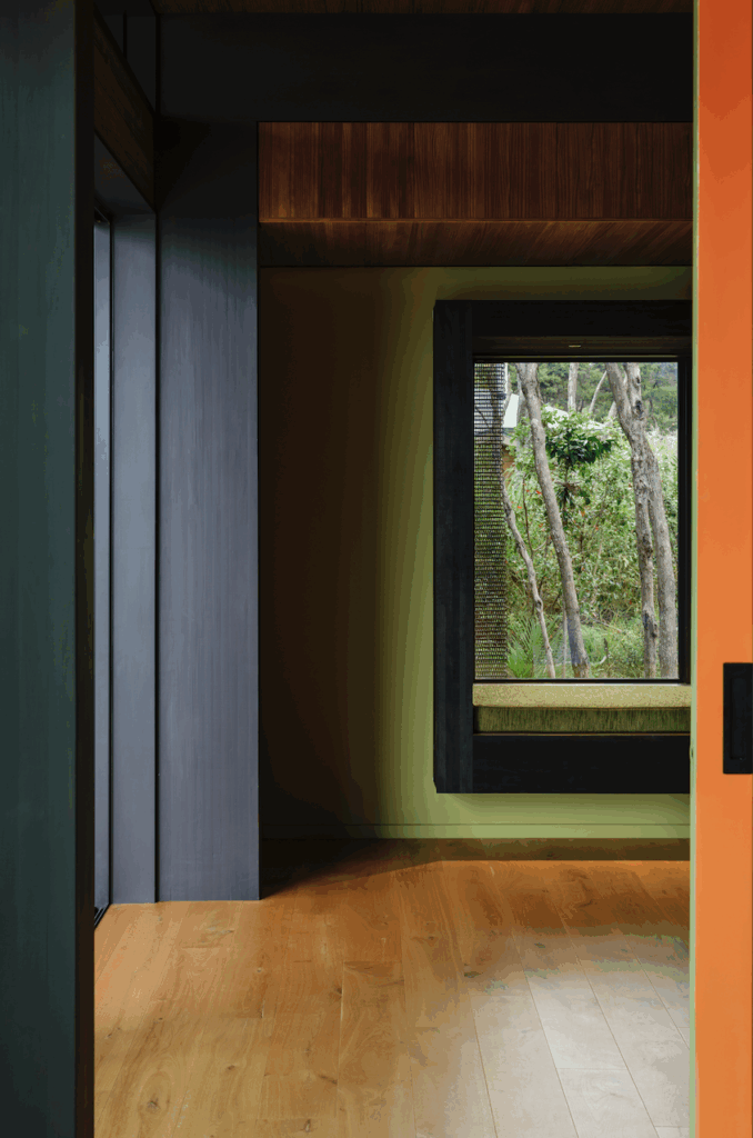
Windows are important: the narrowness of the sentinels allows light and views on at least two sides of every room; high windows wash light across the ceiling in the living area. Views are directed across the valley through doors and windows, including carefully thought-out punctures on the south side. “You don’t want lots of glass on that side but you want moments that help define spaces. I think it’s really engaging like that,” says Crosson.

That’s partly due to admirable interior restraint – small spaces feel enlarged by the clean use of materials. The kitchen is birch ply and stainless steel with concealed appliances on oiled concrete. Upstairs, the flooring is made from New Zealand chestnut, sourced from 1930s plantations. Resene ‘Appliance White’ is used across window joinery, walls, skirting and the brick exterior. The starting point was the powder-coating available for the windows – Crosson and his clients worked back from there to ensure that no single element would dominate. “It’s a sculptural form,” says Crosson of the move. “It’s about the form more than anything else. We abstracted and resolved and unified it.”
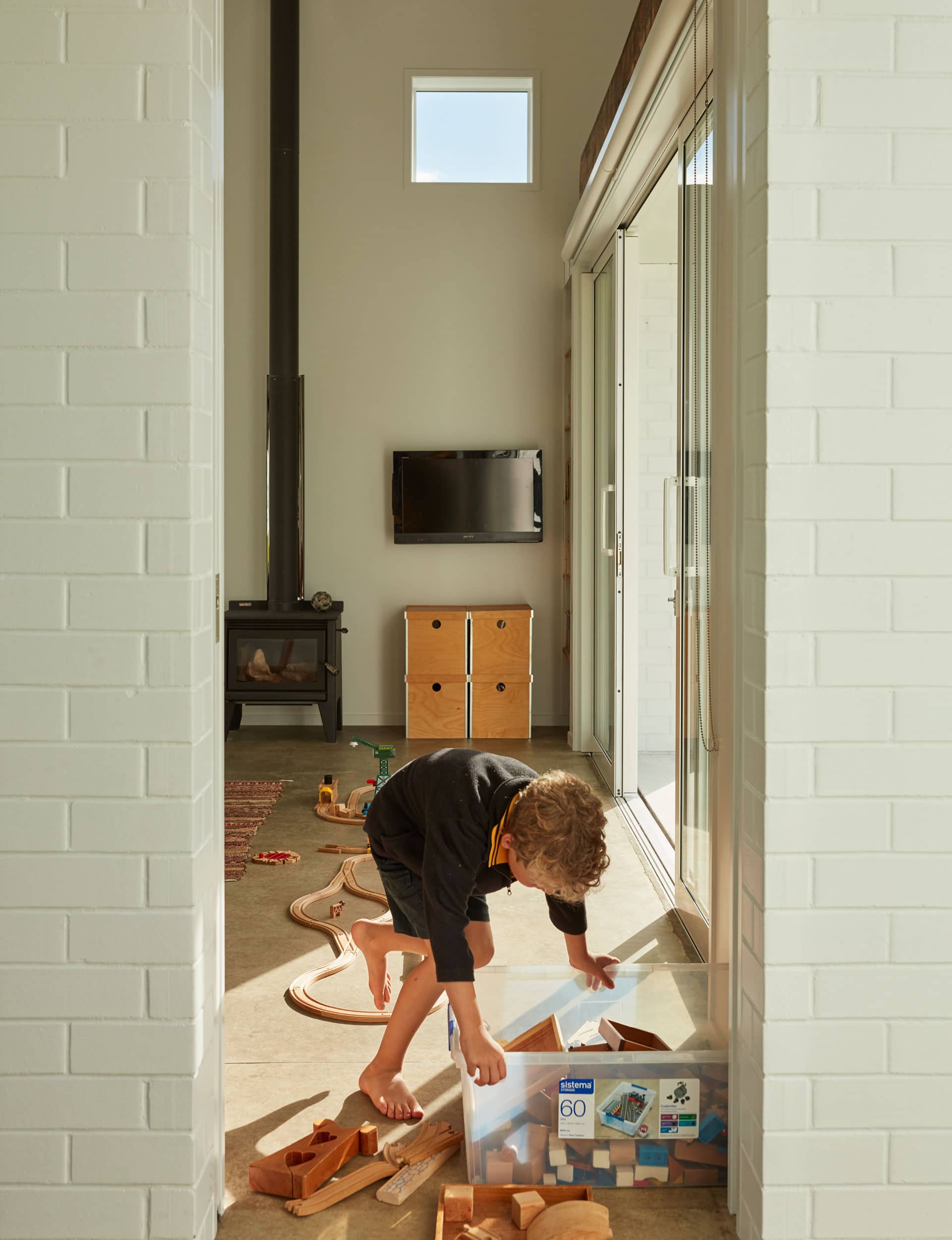
Bayne and his small team of builders built the house – meticulously and carefully, never diverting from Crosson’s plan. “It was designed for them,” says Crosson, “but his toil and labour made it a family home. They were all involved. And we loved that.”

Words by: Simon Farrell-Green. Photography by: Sam Hartnett.
[related_articles post1=”78034″ post2=”78016″]
