
Architect Henri Sayes discusses the careful line he walked to add a respectful extension to this 1930s duplex state house

Henri Sayes on how he added a seamless extension to a 1930s Deco home
Project: Duplex Extension
Architect: Henri Sayes
Location: Pt Chevalier, Auckland
Brief: Extend a 1930s duplex state house to provide a living space, new kitchen and en suite.
Q&A with Henri Sayes of Sayes Studio
There was a lot wrong with the original, but what was right?
You don’t often come across Deco houses in Auckland, and while small and awkward on the inside, the exterior had good proportions, interesting materials and a well-considered composition. It was in original condition, no bad 80s renovations to peel back, which was a great place to start. It was very compartmentalised, but the spaces worked well to be re-purposed as bedrooms. It also had a generous front yard, a great section, with a big old puriri tree. And it had great owners with great design sensibilities.
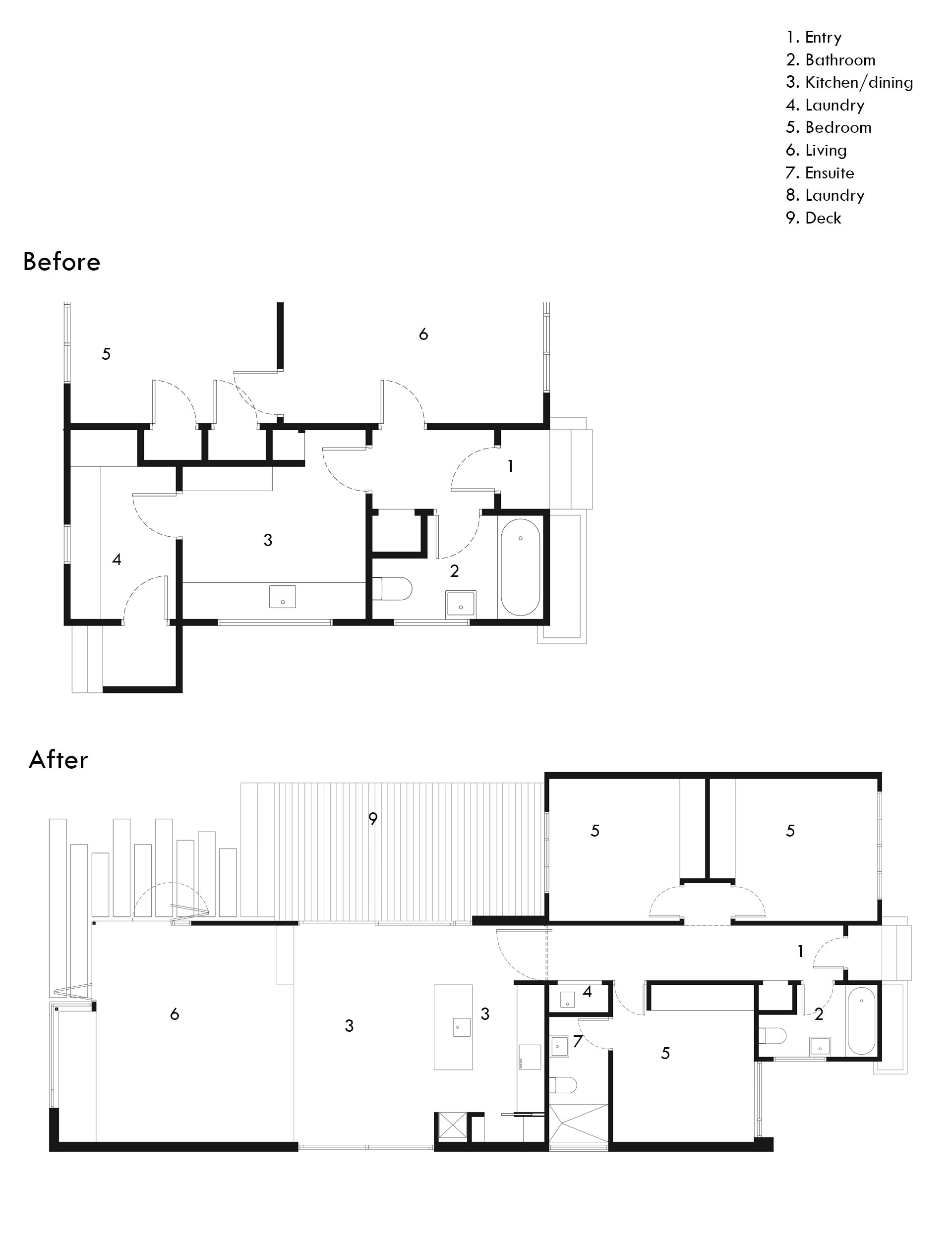
How much work did you have to do to the old house?
We tried to alter as little as possible. We made minor internal adjustments between the two bedrooms. We decided it would be better to spend money on the extension rather than sink it into costly rework.
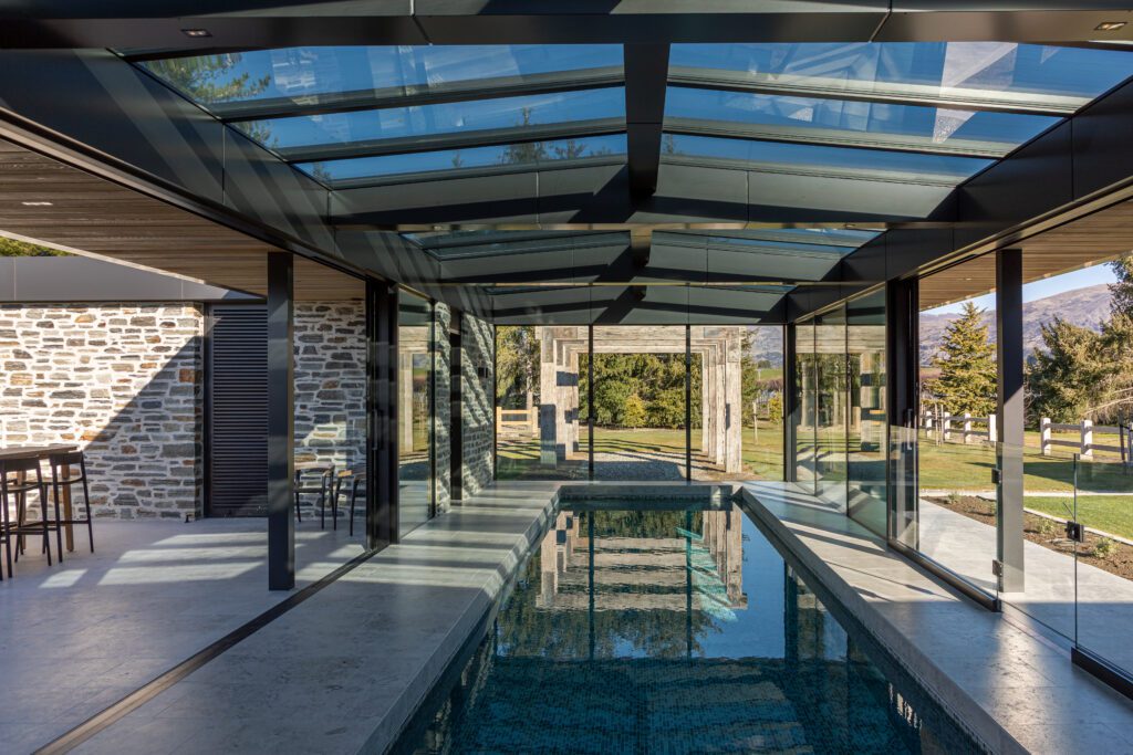
[gallery_link num_photos=”5″ media=”https://ct3fd3fhh2t45fd1m3d9sdio-wpengine.netdna-ssl.com/wp-content/uploads/2018/02/pointChev.jpg” link=”/inside-homes/renovations/modern-extension-state-house-nz” title=”Read the full story here”]
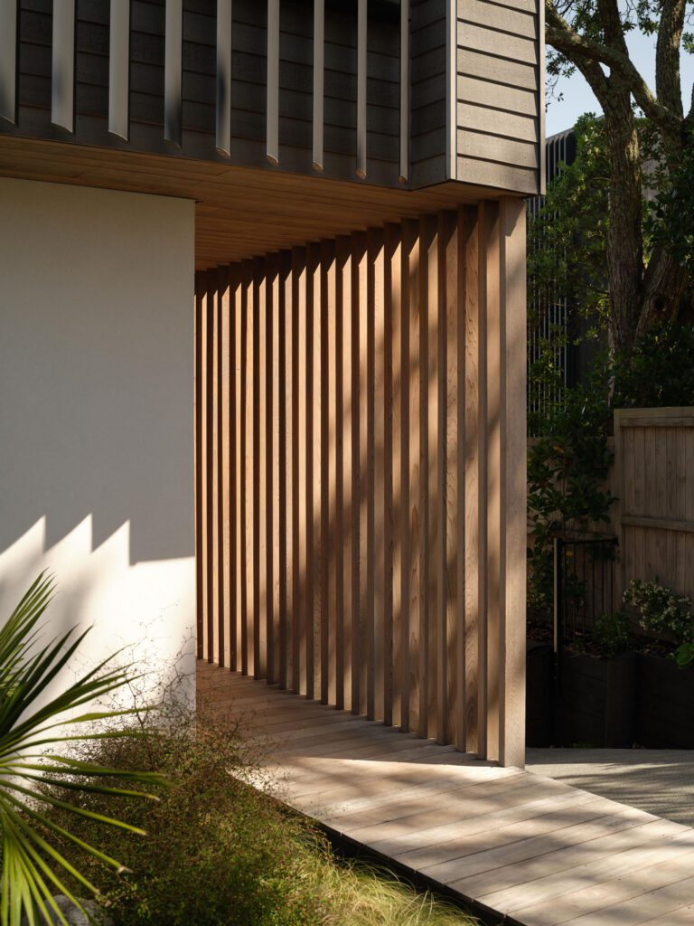
You walked a careful line between heritage and new. Why?
To me, a good extension is one that complements the existing house. The extension is modern, but it plays off the original materials, the solidity of the form and the composition of the elevations, creating a sense of continuity between new and old. They shouldn’t compete. Equally, the new shouldn’t slavishly copy the heritage to create that sense of continuity. It’s about teasing out the core idea of the heritage element and carrying that through, rather than just copying a decorative element.
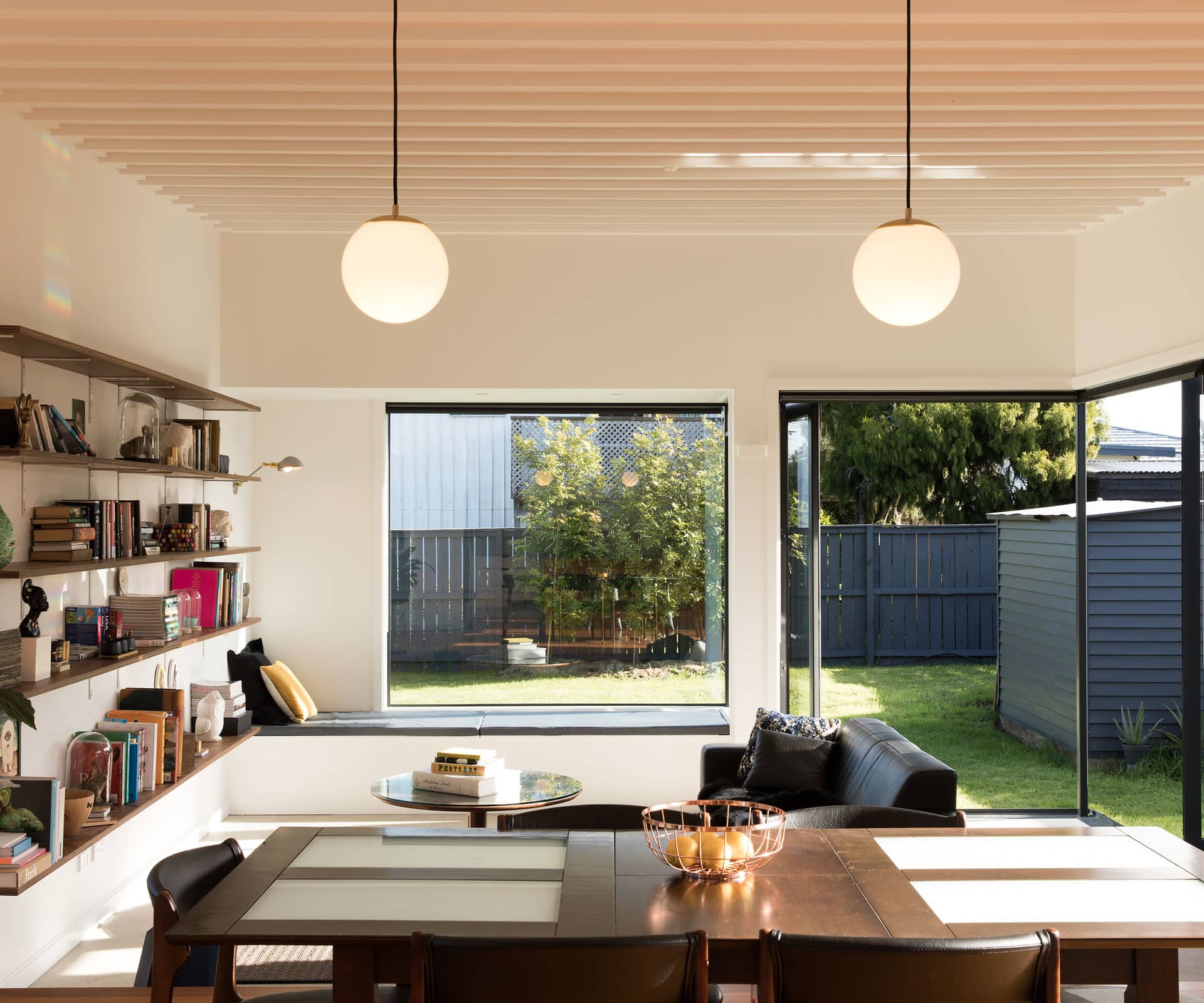
Having the living area on the lower level is key – tell us about that.
The site is quite long and thin, so we tried to push the new building work as far to the south as possible, which led to a very linear plan. To counter this, we were looking to create some spatial contrast along the extension’s length. From the existing timber floor, which extended out to become the dining and kitchen, the floor level then drops two steps to a concrete slab in the living room. It gives a bit more volume to the space, but also a more contained, intimate feel. It also provides casual seating on the edge of the living area, and engages more with the back yard.