“The owners cook a lot, so it’s a working kitchen,” says Wellington architect Mary Daish of the space she refitted in a 1920s bungalow in Lyall Bay
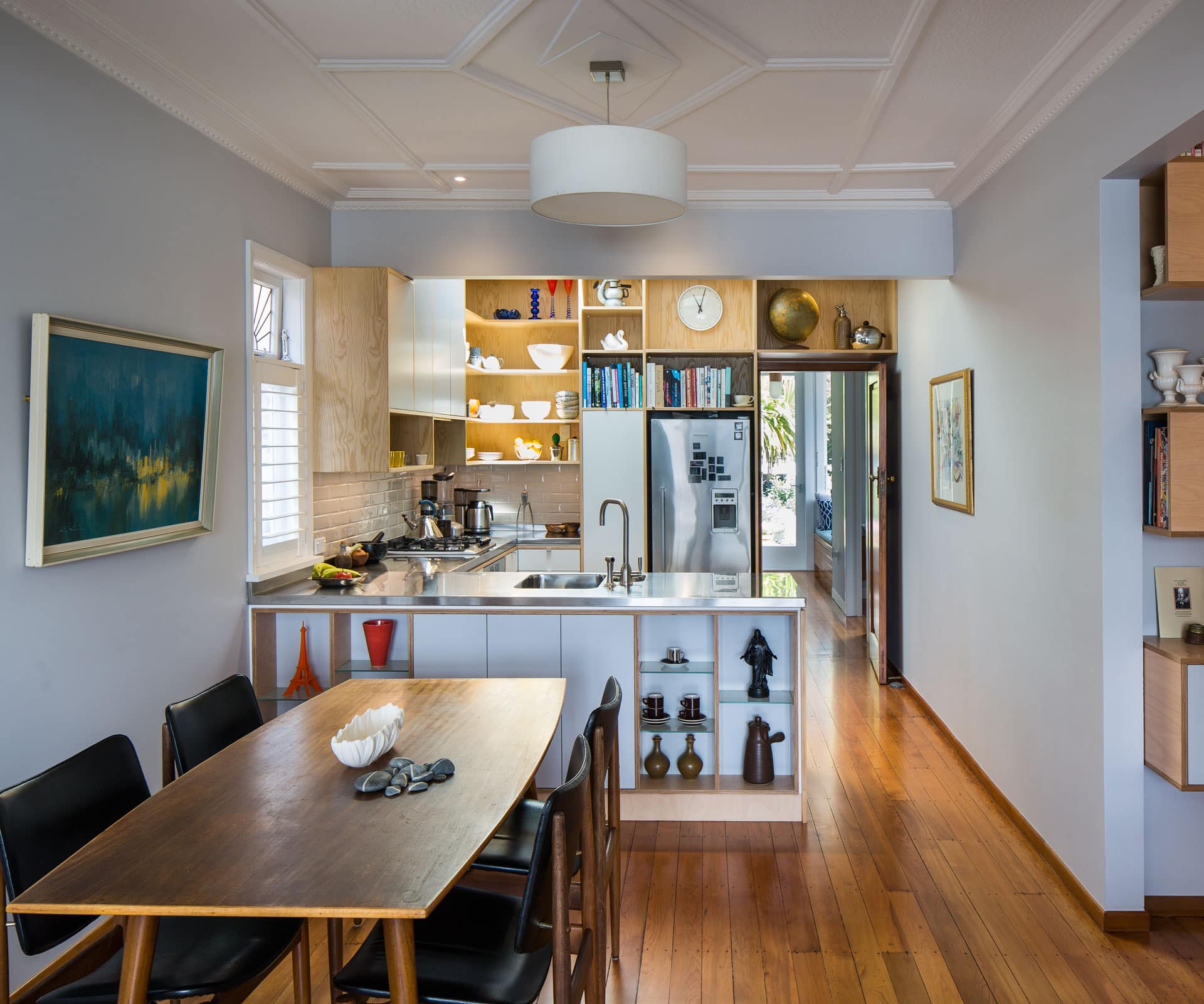
Creative cabinetry takes centre stage in this bungalow kitchen reno
Project
Lyall Bay kitchen
Architect
Mary Daish Architect
Location
Lyall Bay, Wellington
Brief
Rework the kitchen in a 1920s bungalow as part of a renovation of the house.
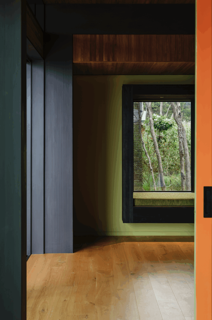
The project was part of a renovation in which Daish neatly reworked three small bedrooms and an oversized bathroom into two bedrooms with a dressing room and a redesigned laundry. The kitchen sits in the middle of the home, looking through the living area to the beach across the road. It’s also linked to a sheltered backyard through a new glass door and window seat that ushers light and warmth into the house. “Just that one little move can make all the difference to how you use your house.”
It’s a small space, how did you get more elbow room?
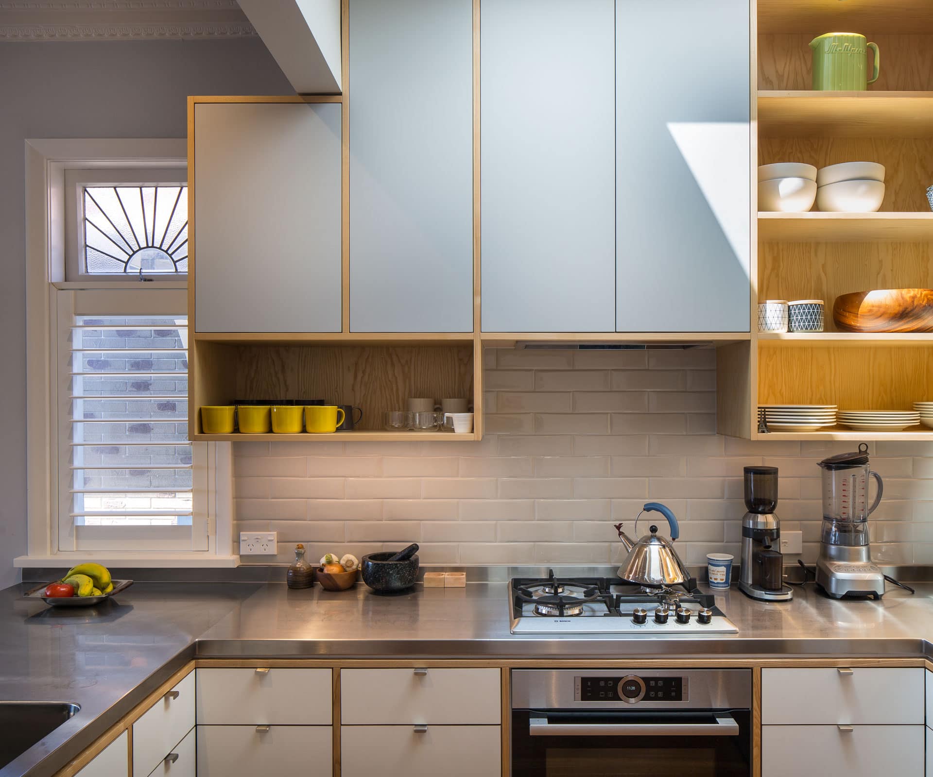
Mary Daish: The kitchen is where it was originally and we didn’t move the hob or sink, but it had a weird triangle-shaped bench. We straightened it up, put a stainless steel bench on and got the storage working well. We got rid of an awkward appliance garage with bifold doors, so now it wraps around into a U. We took the shelves up to the ceiling above the bench and built drawers below the bench – there’s also a skinny pantry with a ‘SpaceTower’ unit by Blum and triangle drawers in the corner.
Tell us about the cabinetry.
We wanted to express the joinery carcass by pulling through and framing the drawers, so you get frames of ash ply. It makes it feel a bit more like a piece of furniture rather than a modern homogeneous kitchen where the drawer fronts are all the same. We were trying to be respectful of some of the existing detailing and not make it feel like a UFO that’s landed in the house.
How did you stop it from feeling busy?
The upper cupboard doors and walls are painted in ‘Tirau’ by Dulux; below bench they’re Futura ply. It’s about making it sit nicely; not introducing too many materials. My mum [food writer Lois Daish] always reckoned you should never have more than three ingredients on your plate – and I’ve taken that as a bit of a design check. Three materials in a kitchen is about right.
Words by: Simon Farrell-Green. Photography by: Paul McCredie.
[related_articles post1=”79132″ post2=”74152″]
