At Moncks Bay in Christchurch, the last house designed by the late David Mitchell is both playful and rational
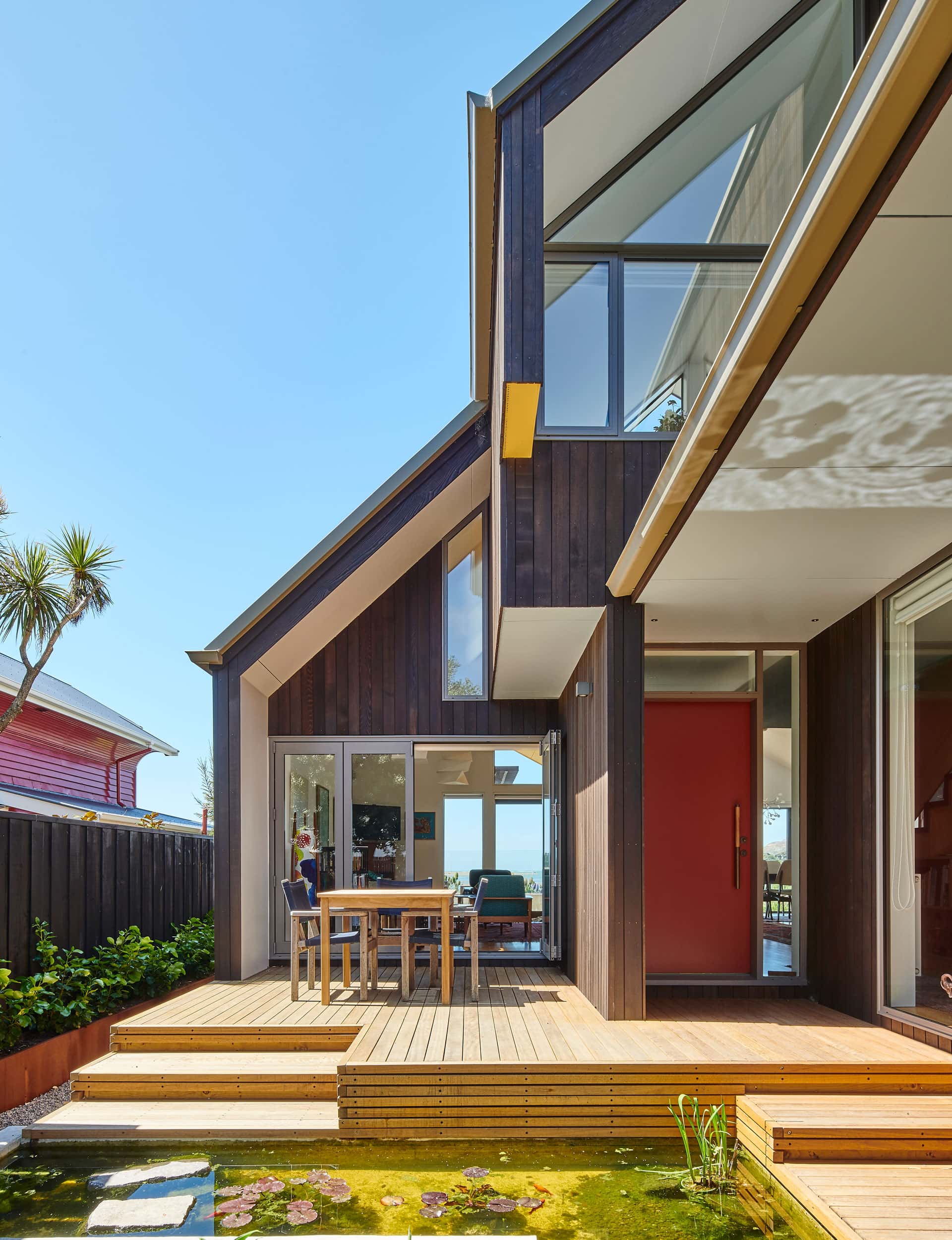
This home at Moncks Bay in Christchurch is both playful and rational
The welcome mat at Olle and Clare Enberg’s seaside Christchurch home hints at a couple of things to expect beyond the front door. Woven, improbably, from 46 metres of rope into an endless Turk’s Head knot, it’s a nod to the subtle maritime theme of this 18-month-old house, the last designed by the late David Mitchell, of Auckland-based Mitchell Stout Dodd Architects.
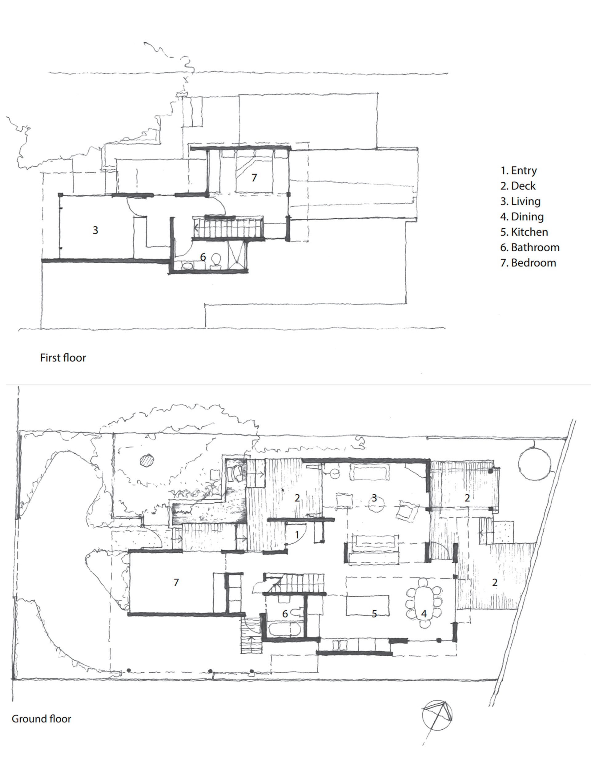
It’s also not a bad metaphor for the masterful way the architect has condensed so much living into such a tricky space – a pinched 312 square metre section between the road and Moncks Bay, with close neighbours and tight height-to-boundary restrictions.
Step inside, jag right, and there – through a large awning window that you open using a rope resembling a sailboat’s mainsheet – is the fast-flowing estuary. People like to say of a house built close to the water: ‘You could catch a fish from the deck’. In the Enbergs’ case, that’s a statement of fact – they routinely observe people casting a line from the narrow grass strip that separates their boundary from the water’s edge.
Before the Canterbury earthquakes, Olle, a master mariner and marine surveyor, and Clare, a Montessori teacher, owned a house on the heights between Moncks Bay and Sumner. When that was red-stickered, they bought a ramshackle fisherman’s cottage on this section and drew up plans to renovate. Three days before they were due to sign a building contract, water from broken infrastructure across the road flooded the place. They decided to bulldoze and build anew.
They’d seen David Mitchell’s work in magazines, enjoyed his inventiveness, intriguing angles and the mix of materials, and spied immediately the nautical motif in several of his houses. Later, they learned that the architect had done plenty of ocean adventuring, a point he had in common with Swedish expat Olle.
The Enbergs visited some of David’s Auckland houses, including two celebrated buildings that he and partner Julie Stout had designed for themselves: an early small, Pacific- and Asian-influenced timber house on a tight site in Heke Street, Freemans Bay, and later, a boundary-pushing concrete and corrugated fibreglass house near Narrow Neck Beach.
The Engbergs took away not only a sense of reassurance that they had the right man for the job, but also inspiration: a signature David Mitchell fish pond they saw at Narrow Neck was immediately added to plans for the entrance. “David also came down and spent a day with us,” says Clare. “The whole process took about a year, and there was a lot of dialogue. We’ve built before, but this was the most pleasurable.”
According to David’s son and architectural partner Julian Mitchell, the Enbergs’ response to David’s initial design was to ask for something even bolder. “They were unusual in that they wanted a building with a very definite, distinctive style,” says Julian. The Moncks Bay house and a contemporaneous build at neighbouring Mt Pleasant are the practice’s only work in the city. “There’s a very Christchurchian quality to this house: it’s David Mitchell being flamboyant in Christchurch.”
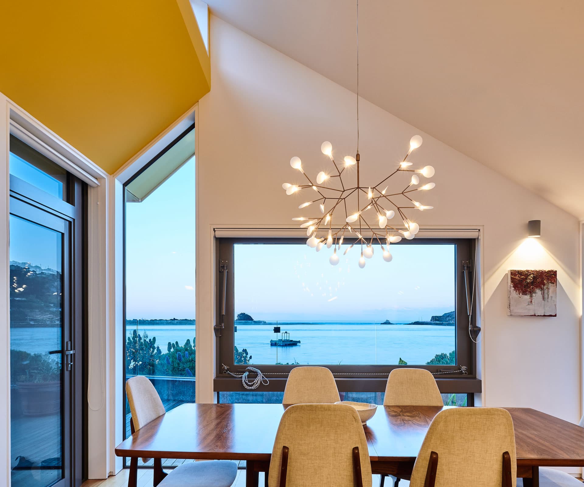
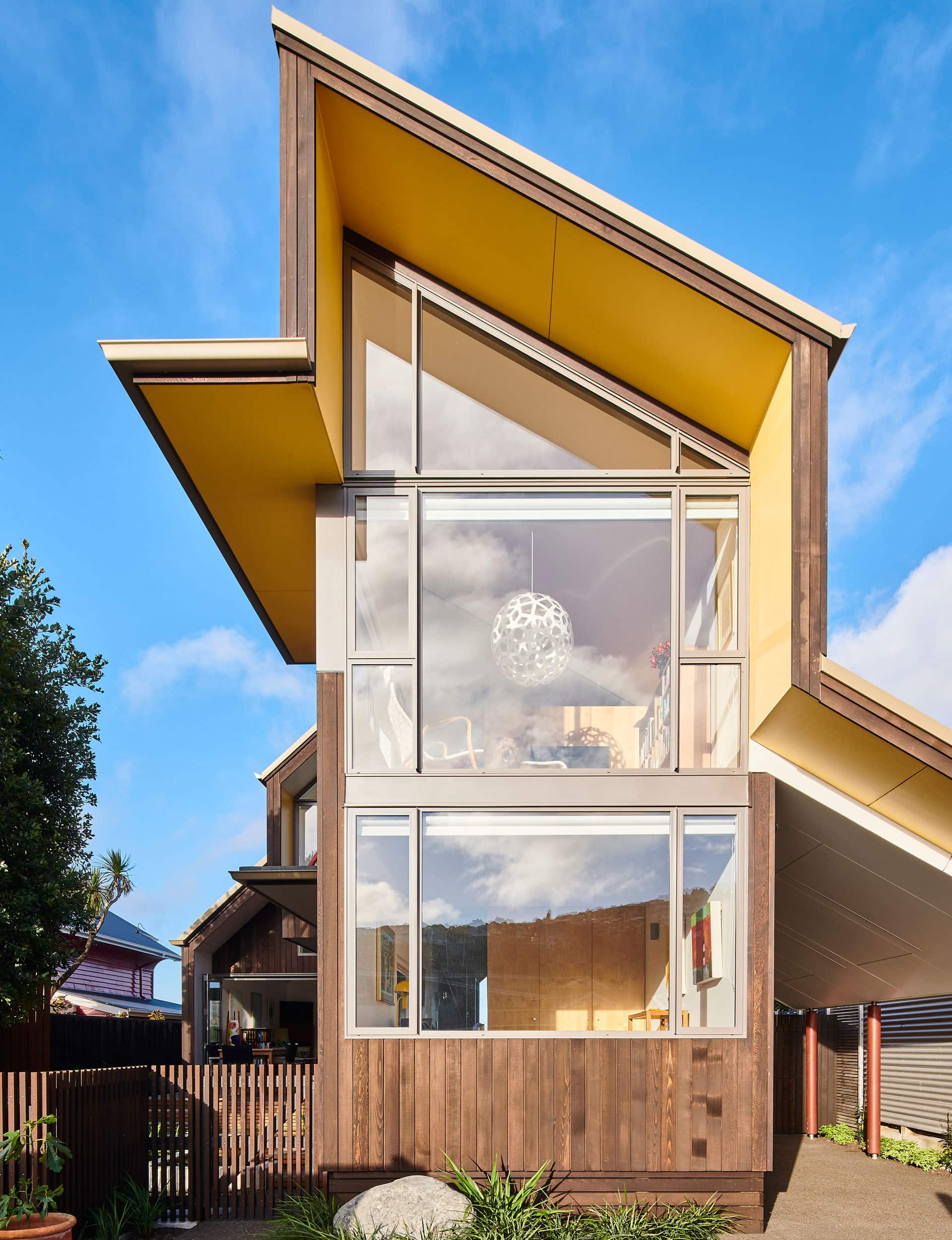
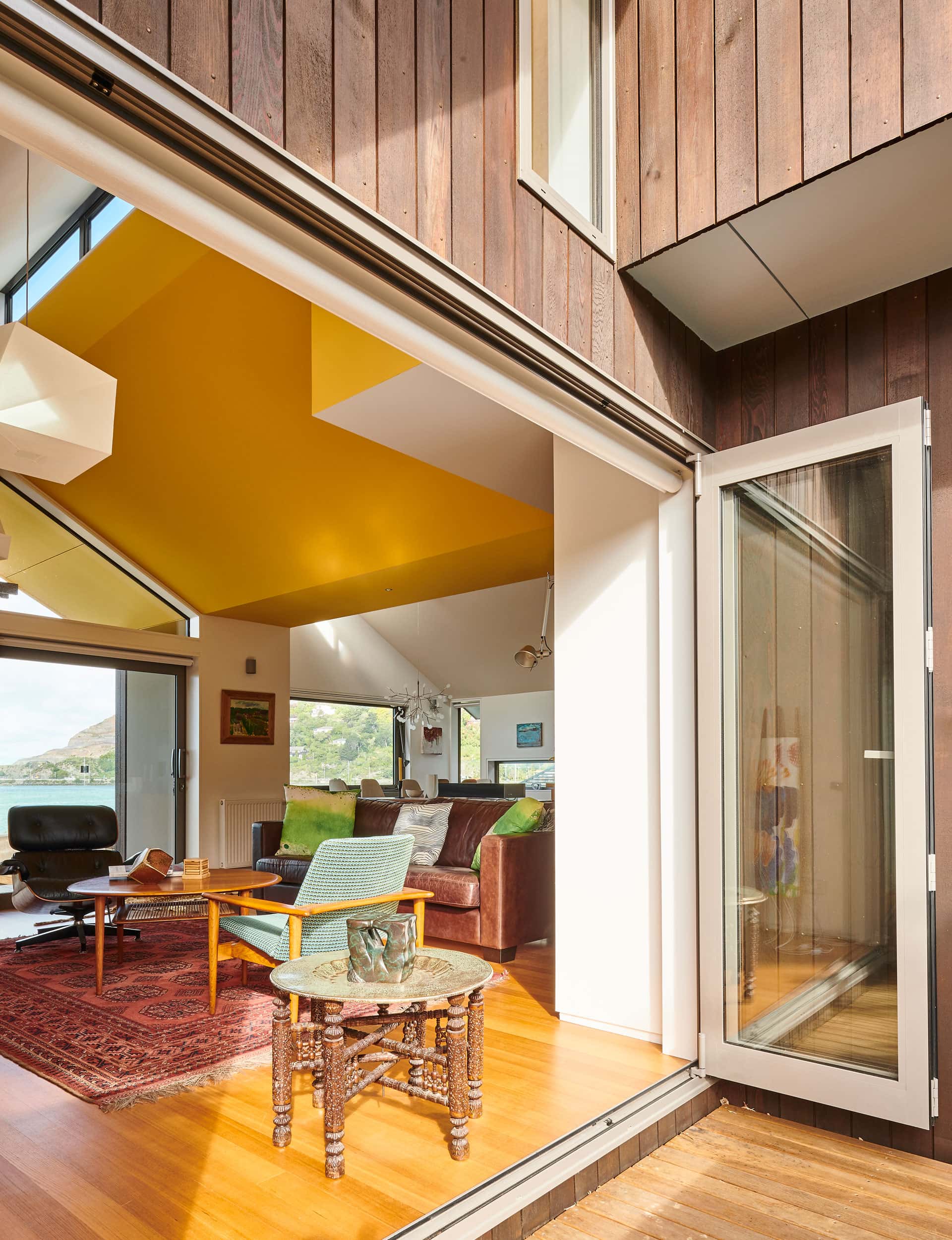
The inventiveness here is achieved as a consequence of, rather than despite, the demanding site. To accommodate the stringent recession planes without compromising a sense of height and light, David split the pitched roofline at the ocean end, scooping out a long, hull-like void to give the upstairs bedroom an unimpeded view of the estuary. When you’re in the kitchen and living area, this floats above your head like the bottom of a ship, painted a cheerful yellow.
“It’s not just a case of two levels that blast right through the house,” says Julian. “Instead, the upper floor is almost slung into the lower one, dropping into the space below in a way that’s slightly reminiscent of Heke Street, although they’re completely different buildings.”
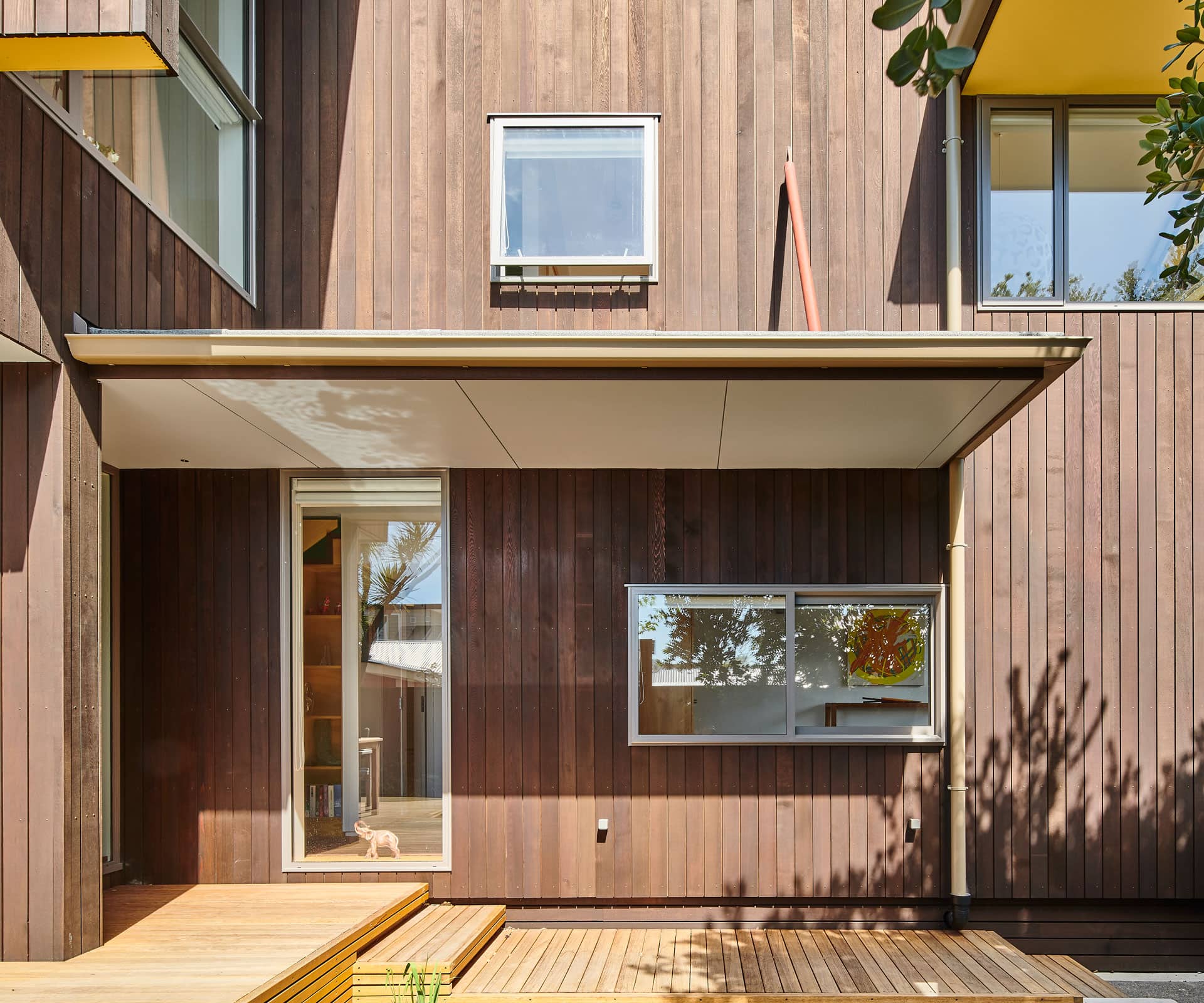
At the roadside, meanwhile, the initial impression is of a much narrower structure, just one room wide, sheathed in an origami exercise of pitched, vertical and horizontal rooflines, the deep soffits all painted that same yellow.
“David would always try to get something particular going, to animate a building with things that push out, like the upturned hull in this house. There’s that DNA of David in this building, a quirky energy. It also has that fairly classic Mitchell manoeuvre, a timber pergola structure out front where the sun is, and a window that flips up to the view.”
Alongside all that obvious architectural charisma, the house evinces an almost Japanese deftness with limited space. “We had to give David measurements for almost everything,” says Clare. “Chairs, table, our stove, our coffee machine.”
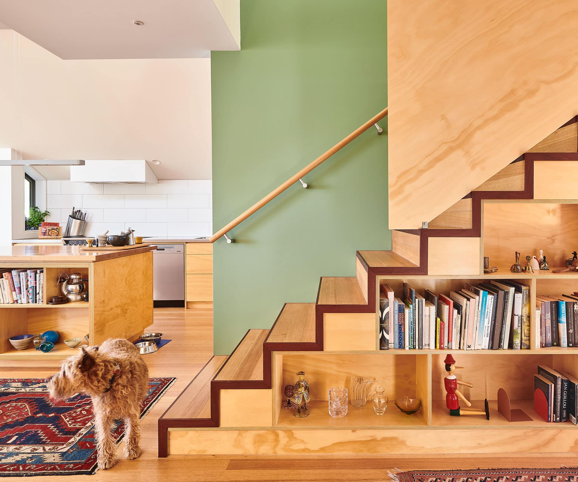
From the stepped bookshelf under the stairway, to a ‘walk through’ wardrobe occupying the space between the bedroom and upstairs sitting room, the design squeezes the last pips. “I think it was fairly testing for him to fit in as much as we wanted,” says Clare, “but he did a wonderful job of it.”
[gallery_link num_photos=”10″ media=”https://www.homemagazine.nz/wp-content/uploads/2018/06/MoncksBay4.jpg” link=”/real-homes/home-tours/david-mitchell-design-christchurch” title=”See more of the home here”]
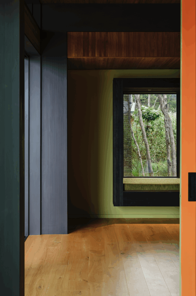
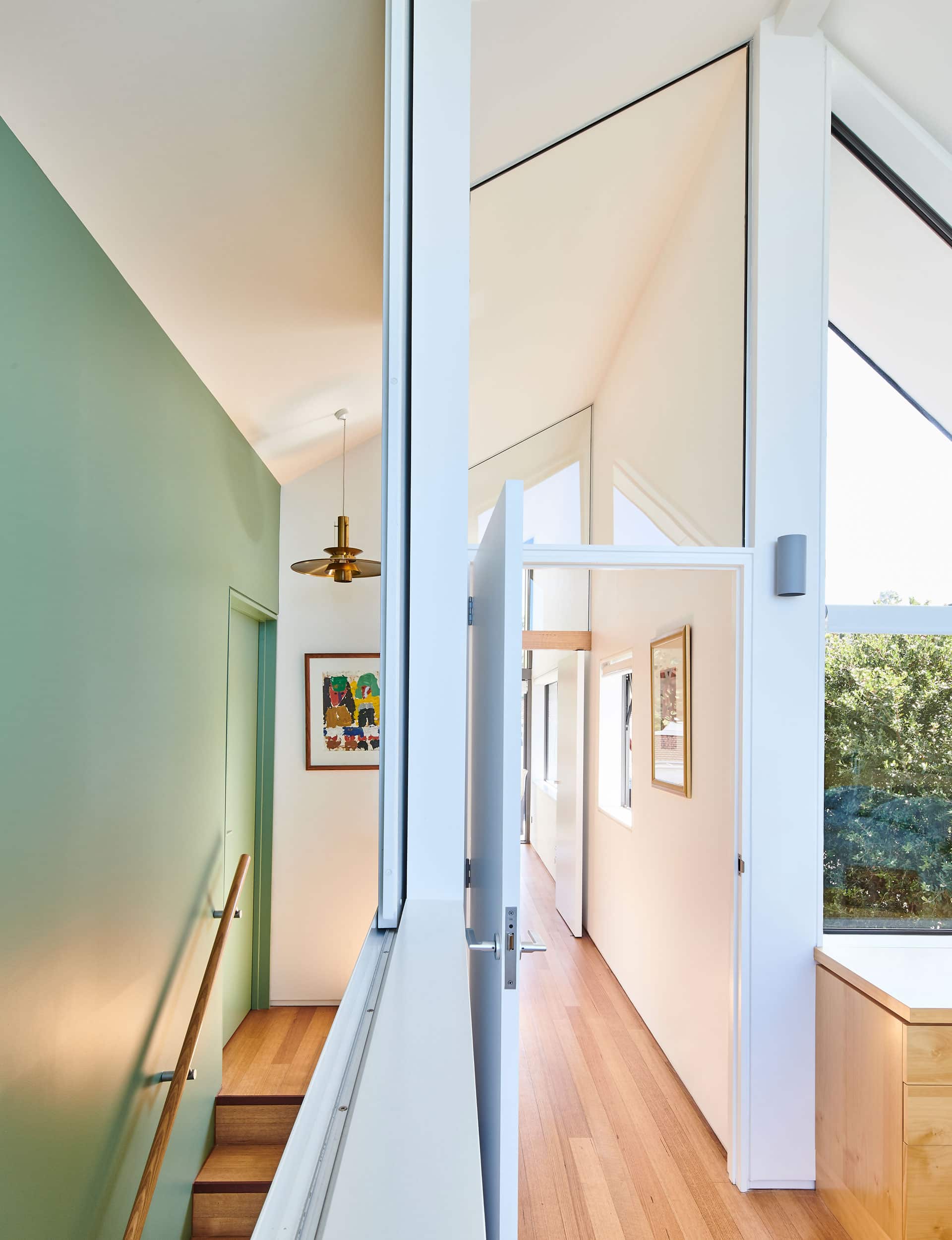
It’s also a house of considered details – or, as Julian says: “It’s quite restrained in doing a lot of things in small, simple ways.” The sliding wall between the bedroom and the top of the stairs, for instance, which the Enbergs can close for privacy when they have house guests; or the pivot door used for the upstairs living room to maintain an uninterrupted line; or the unexpected low-set window in the kitchen wall; or the palette, which sets reds, sea greens and yellows against oiled cedar cladding and a lichen-coloured aluminium roof.
That balance of bold gesture and meticulousness suggests an architect at the top of his game. The Enbergs say they were particularly taken by David’s practice of hand-drawing plans. “He’d do a sketch: ‘This is how it will look from the stairs’,” says Olle.
“Builders loved his drawings because they were incredibly clear to read,” says Julian, who says it wasn’t particularly unusual for practitioners of David’s vintage. “But, then, he was one of the last architects of that generation still working.”
This project is a fitting final act – a clever house, animated by that trademark “quirky energy”, and built about as close as you can get to the sea. Olle, who tends to rise early, has developed a habit of taking his coffee by the estuary-facing window to watch the sun rise. “We moved in and we’ve lived happily ever since,” he says.
Words by: Matt Philp. Photograhpy by: Lucas K Doolan.
[related_articles post1=”80449″ post2=”79012″]
