This family came up with an ingenious villa extension solution to create an open-plan living area with a better connection to the garden
Just about every villa has one: the dreaded lean-to, with sloping ceilings, small windows and a rabbit warren of rooms jammed next to each other. Often derided; usually demolished.
But when it came to reworking this villa in Eden Terrace, Auckland, Natasha Markham of MAUD decided on a much more subtle approach. Instead of demolishing the lean-to, she made her own addition, which she jokingly calls a ‘lean from’, to house a new dining area.
After a few years in the original villa, Markham’s clients found it was inadequate for family life (they have two young children), but the north-facing back yard and tight-knit community meant they were loathe to leave. “The lean-to went down and the garden came up,” says Markham of the previous arrangement, where the back yard was a full metre above the living areas. “They were staring into a retaining wall. There was no connection to the outdoors whatsoever.”
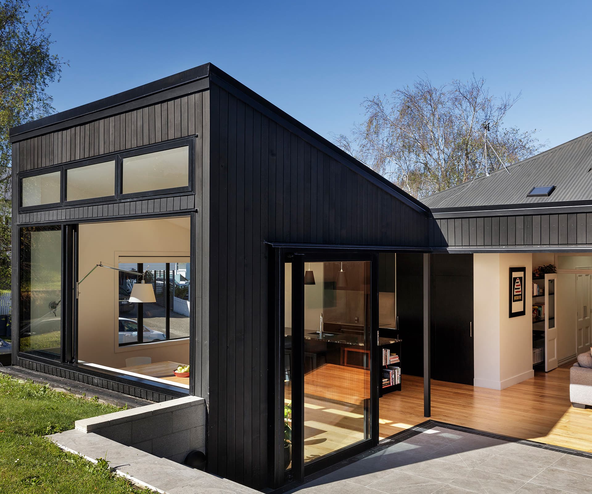
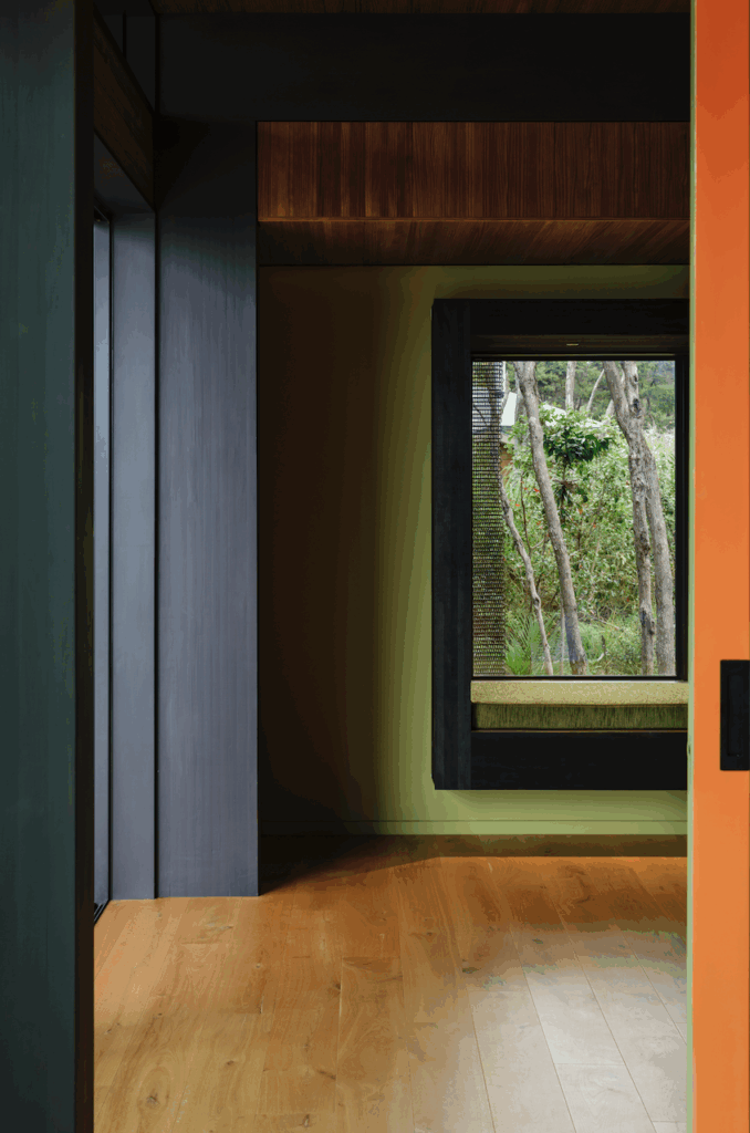
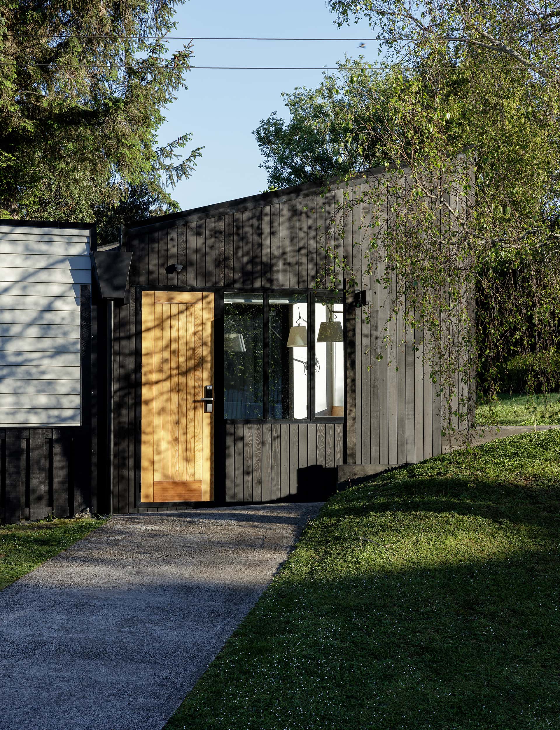
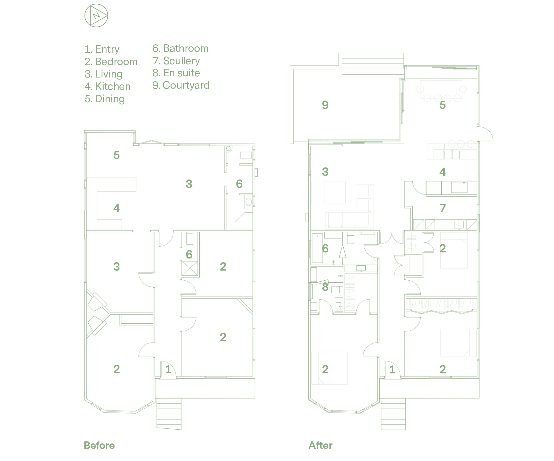
Markham’s design dug a flat area out from the hill and added 25 square metres of space with a soaring roof line, clad in black-stained shiplap cedar and enclosing a small, north-facing courtyard. The new dining room sits below ground level, creating an immediate connection with the garden. In the end, the lean-to was completely rebuilt, with a flatter, higher roof and an open-plan layout, though from the outside its weatherboards read as old, and the monopitch addition reads as new. The L-shaped space runs out to a courtyard through enormous sliding doors that push right back.
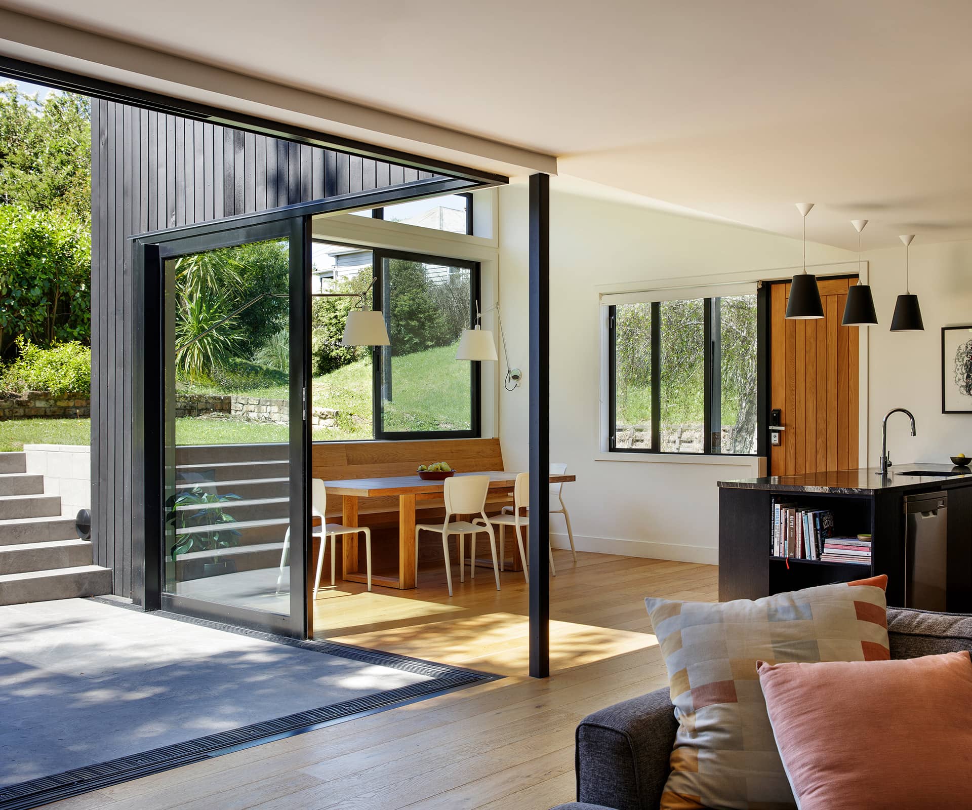
As well as being airy and light, the arrangement creates distinct zones – crucial for families with young children. There are sightlines diagonally across and through the space, glimpses of surrounding villas and street. “It’s private but it all feels very open because the perception of space is to the boundary of the property,” says Markham.
Behind the open-plan kitchen, she tucked in a small scullery and laundry and also redesigned a family bathroom in the main house. Beyond that, the original house remains reasonably untouched, which allowed the budget to focus on other, smarter touches.
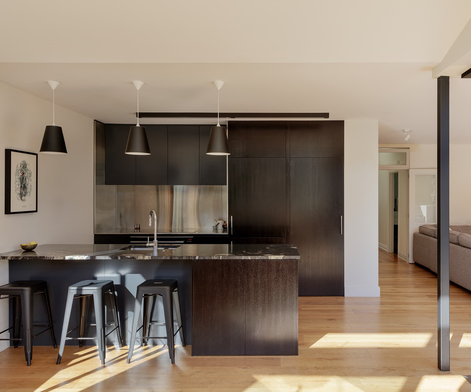
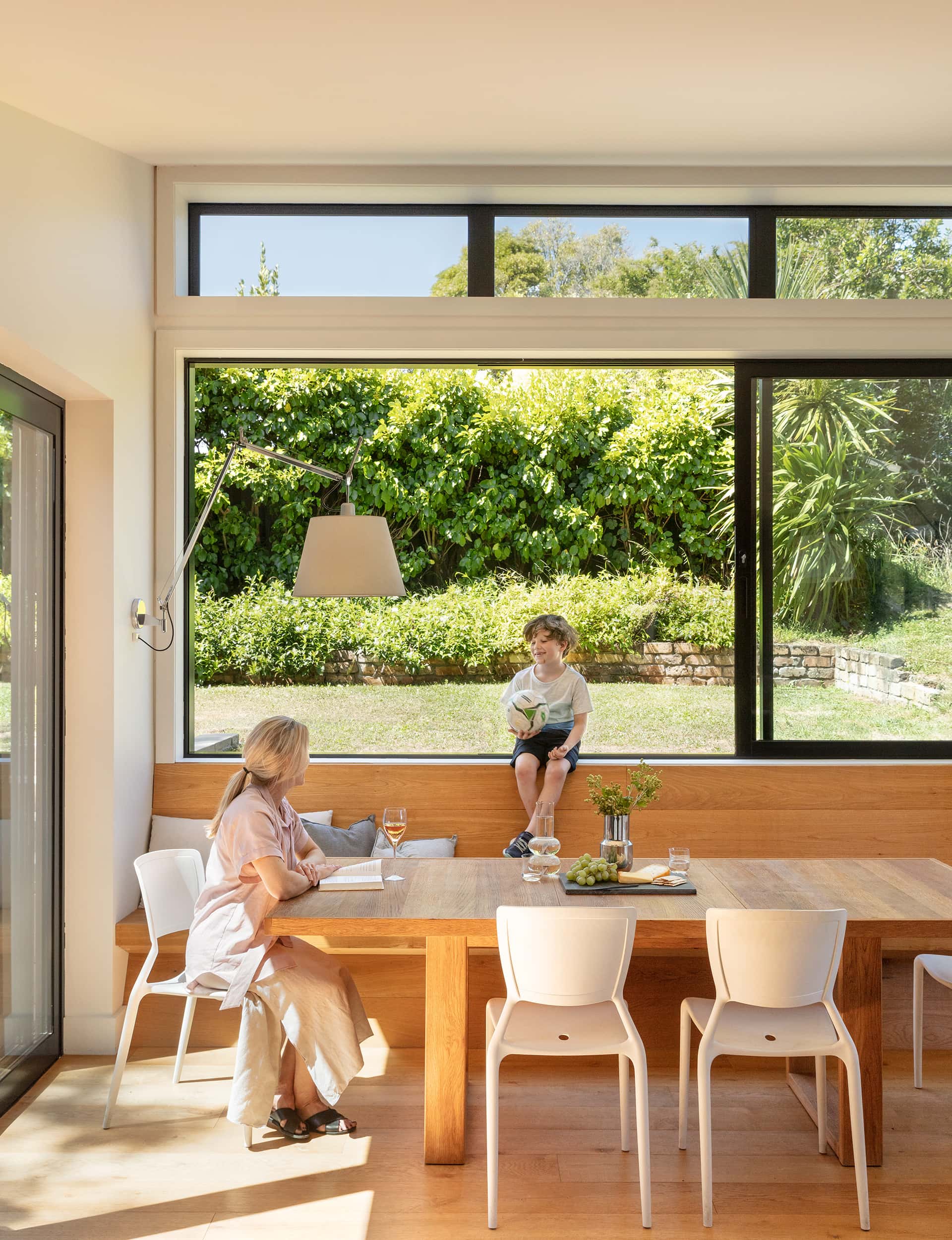
In the kitchen, there’s dark-stained oak cabinetry, a hidden cabinetry door to the scullery, and a granite bench. In the dining area, Markham designed a window seat using the same oak as the floorboards – it seamlessly rises from the floor, folding into form. “It’s a way of taking your eye up and out to the garden,” she says. “It allows you to tuck the dining in there, which gives you a bit more space.” On either side of the table, a pair of cantilevered Artemide wall lamps create intimacy in the high-ceilinged space.
The result? A very compelling solution for inner-city life.
Words by: Simon Farrell-Green. Photography by: Sam Hartnett
[related_articles post1=”80523″ post2=”3504″]
