Inspired by historic gun emplacements on nearby Bastion Point, architect Julian Guthrie creates a clifftop home for the ages. Photos by Patrick Reynolds.
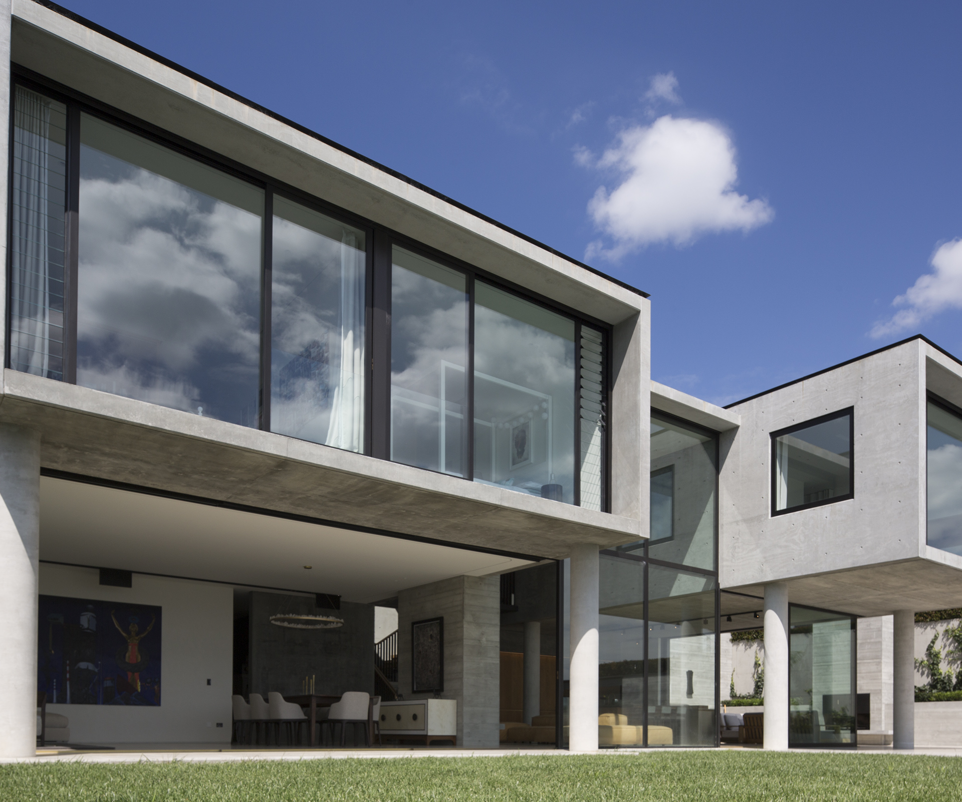
Fearing a Russian invasion in the late-1800s, twin military installations were built on North Head, in the Auckland suburb of Devonport, and across the harbour on Bastion Point, the now-famous headland between Okahu Bay and Mission Bay. The installations were expanded during World War I and remained operational until after World War II. One of the gun emplacements on Tamaki Drive, below Bastion Point, remains to this day. Two levels of heavy concrete, its three walls recede into the cliff-face while its front opens to the harbour, ready for action.
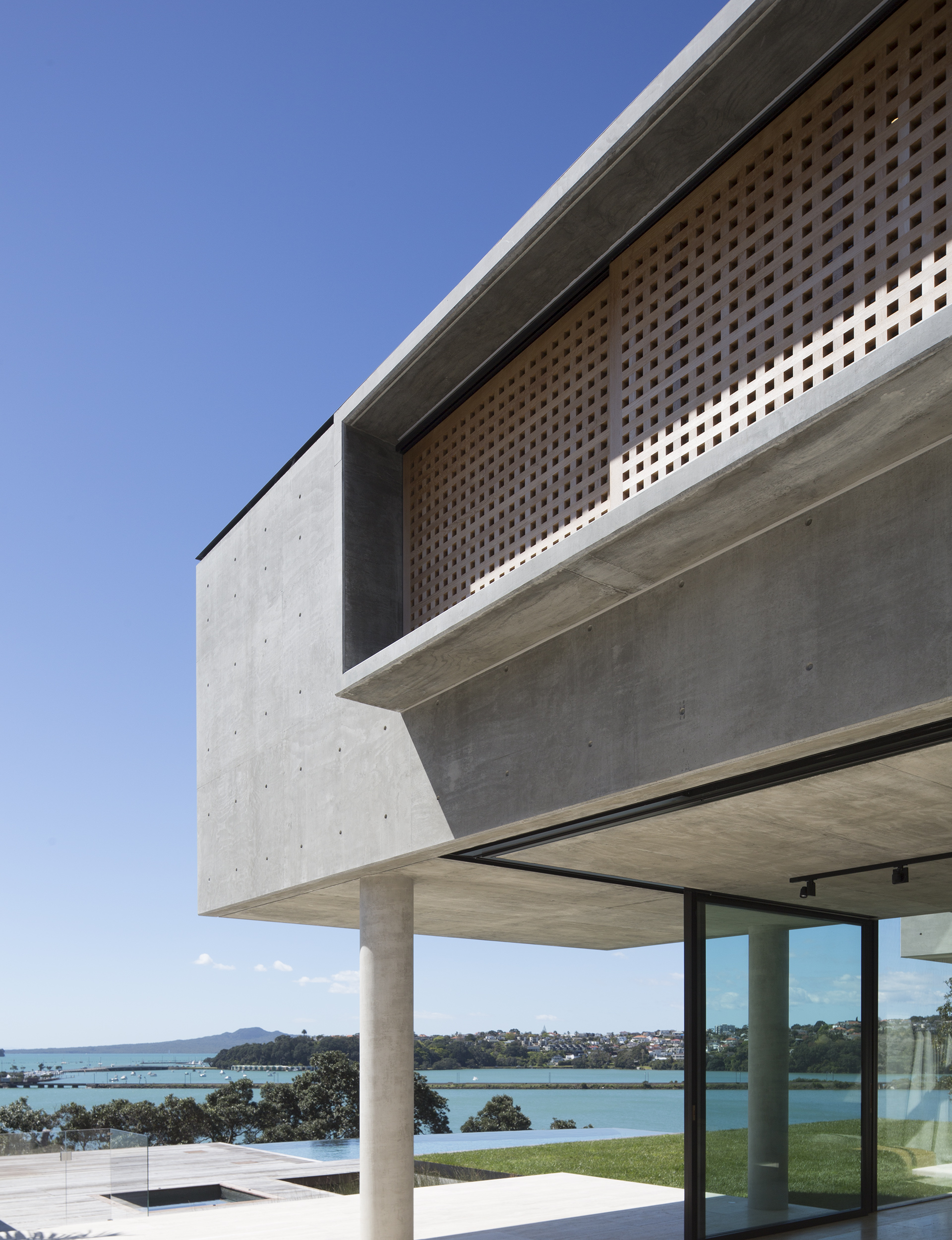
More than one hundred years later, this concrete shell is one of architect Julian Guthrie’s inspirations for a new house above Hobson Bay, just minutes away from Bastion Point. The luxurious home is full of contrasts. The immensity of the concrete contrasts with the fineness of the detail, while its closed street front – heavy walls, fences and gates – is a complete counterpoint to the openness of the north face overlooking the Waitemata Harbour.
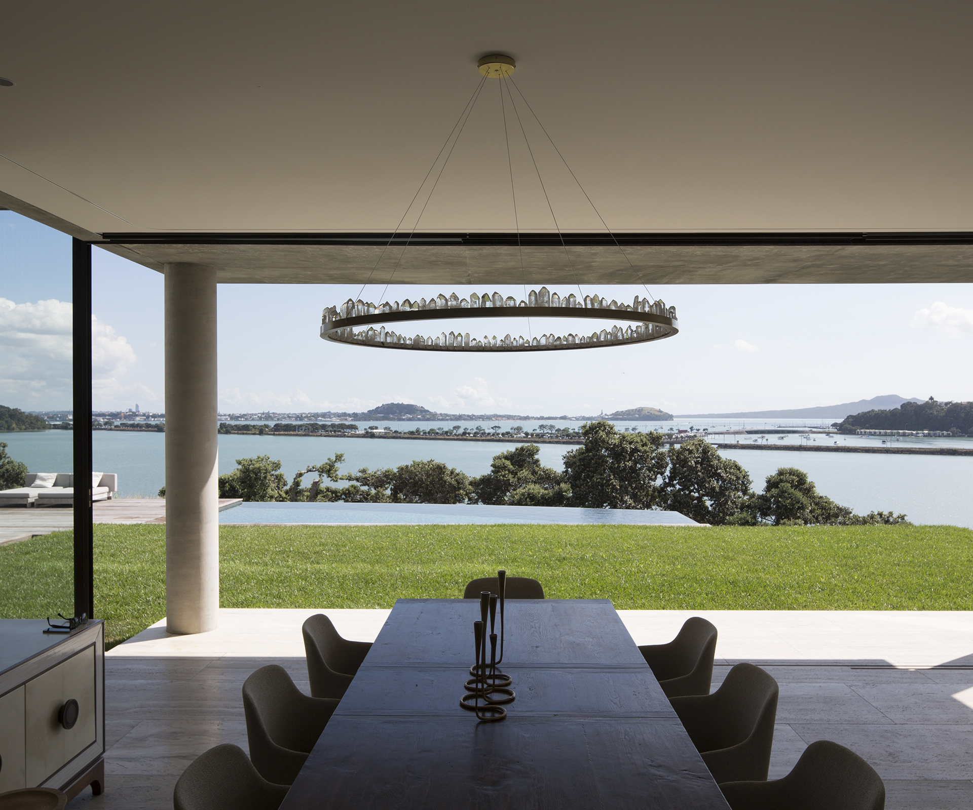
From the road, the house looks like a street-level modernist home with a penchant for privacy. There’s no clear sign that the house extends downward, towards the cliff. There are only the slightest glimpses of the postcard-perfect Auckland view looking due north over a pohutukawa-covered cliff and down to Hobson Bay, the ribbons of Tamaki Drive and the eastern line railway, out over the harbour towards the twin volcanoes of North Head and Mount Victoria.
[gallery_link num_photos=14″ media=”https://homemagazine.nz/wp-content/uploads/2016/02/HOBSON-BAY-HSE_7563.jpg” link=”/inside-homes/home-features/hobson-bay-house” title=”See more of this home”]
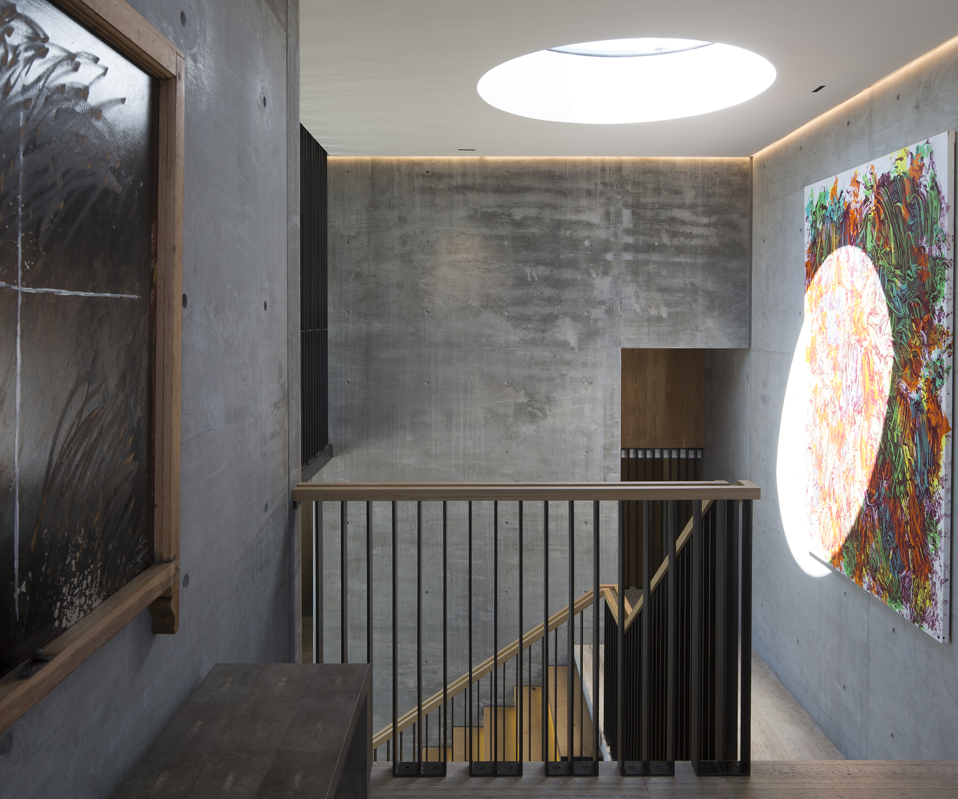
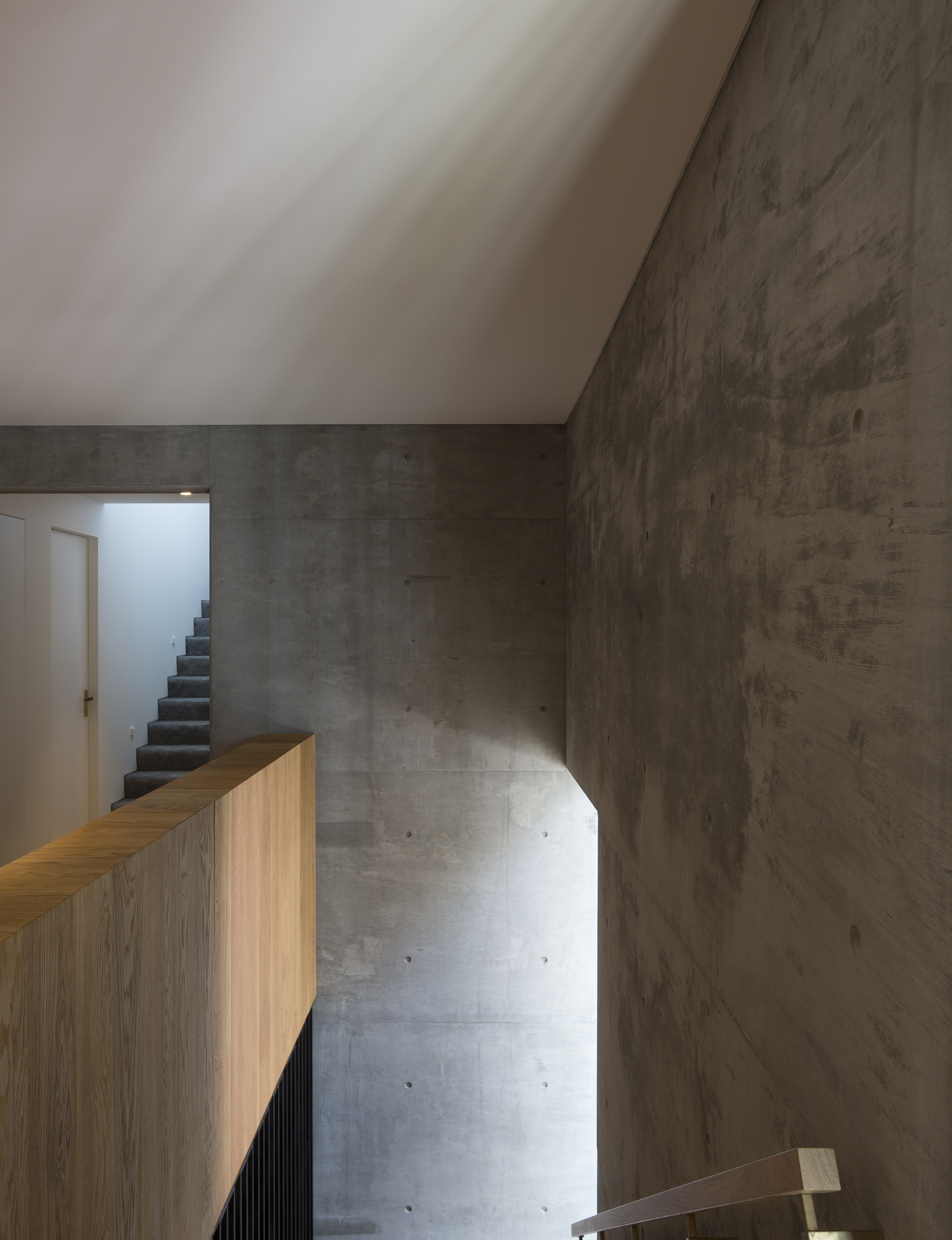
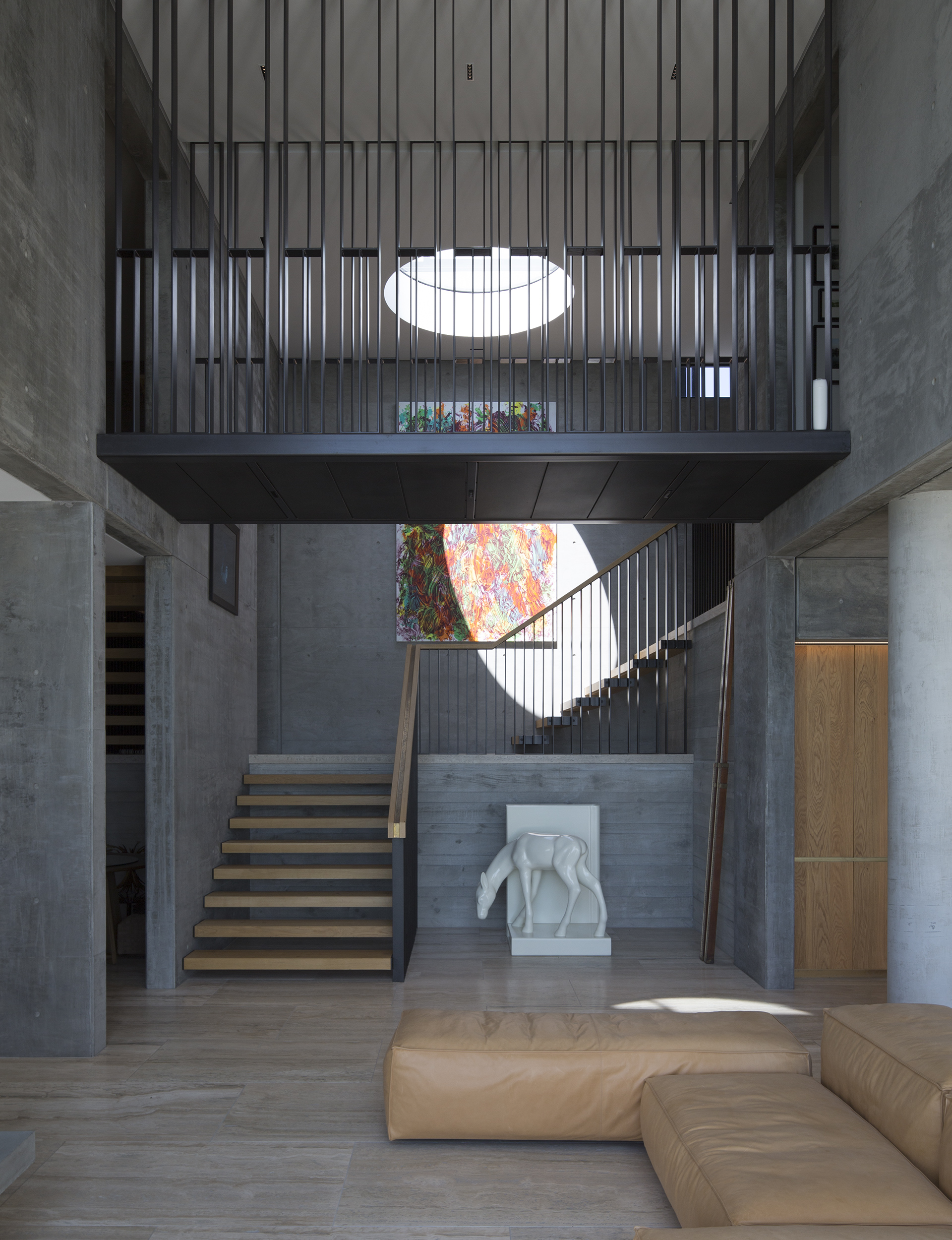
As we tour the house, Guthrie tells me that he wanted the descent from street level into the living area to be gradual so as not to feel “subterranean”. The result is a series of reveals. Entering the house, you descend into the lower floor’s living space via a staircase that turns at a right angle on a landing halfway down. The landing is your first sight of the view, framed by an internal bridge running east to west. Before continuing down into the heart of the house, you can see an almost hidden stairway leading back up to the level on which you entered, where the bridge connects two hallways.
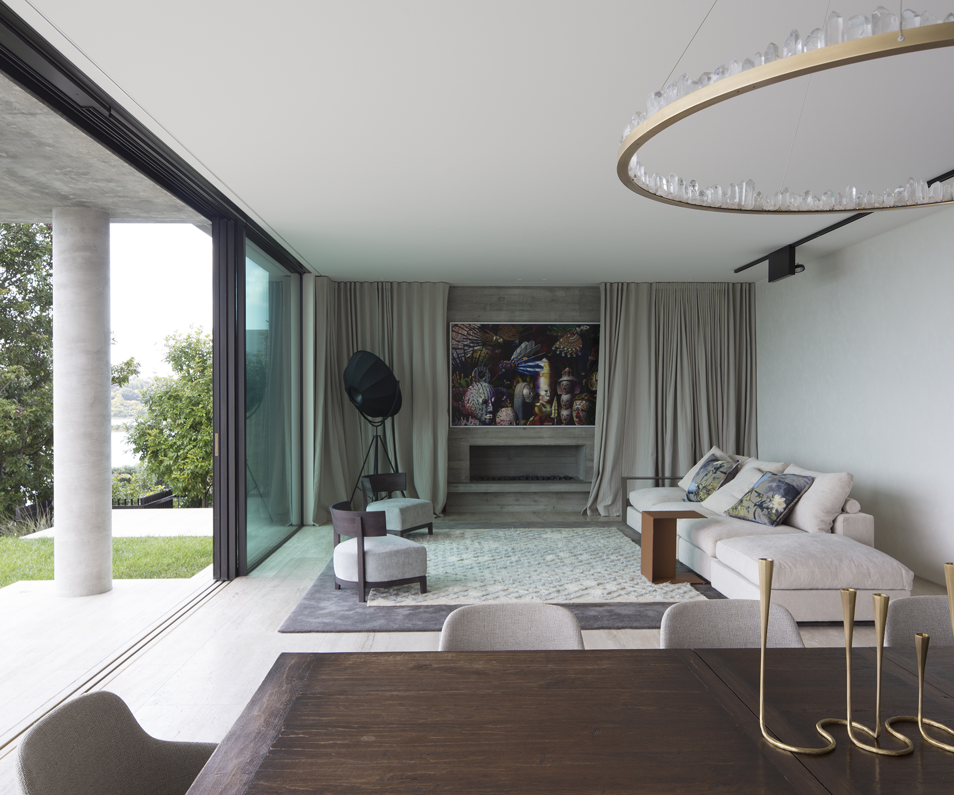
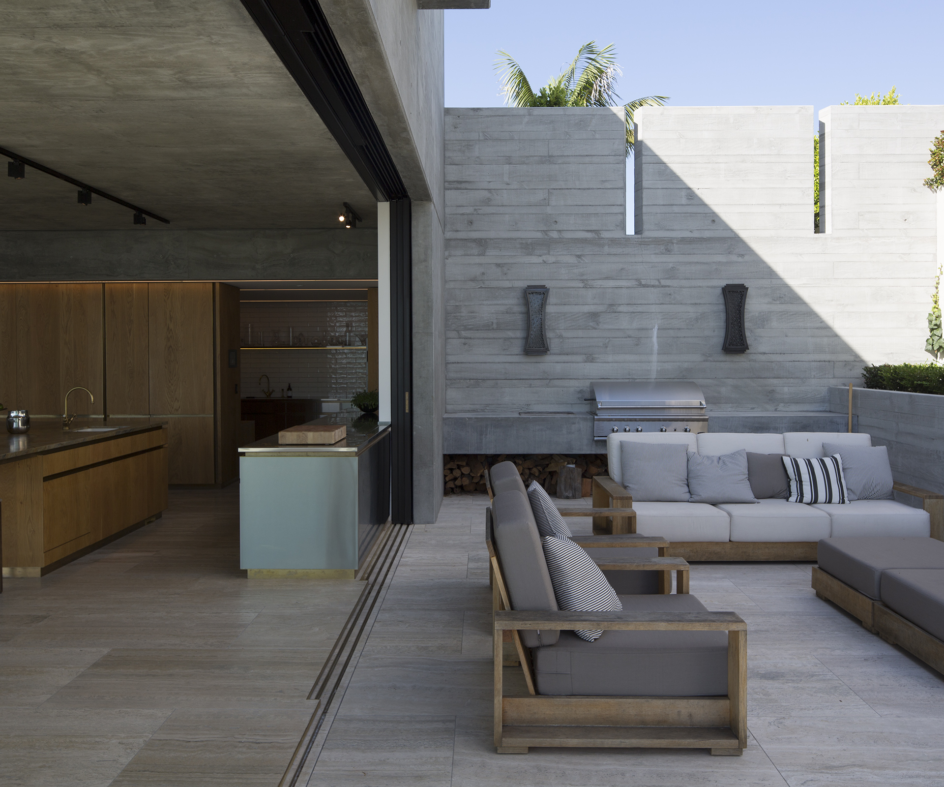
Continuing the descent, you arrive in the hub of the house – a lustrous kitchen (designed in collaboration with interior designer Penny Hay), two large living spaces, two courtyards and three imposing chimneys (one in the courtyard and one in each living space) which anchor the house. The spaces flow together effortlessly, the indoors separated from the outdoors by floor-to-ceiling sliding glass that opens onto the courtyard and lawn. “The clients wanted a flow of different living spaces,” Guthrie says. “They do a lot of entertaining and the children have a lot of friends around, so it wasn’t about having formal rooms or special spaces, but trying to get flow within the house and in the indoor-outdoor area.”
Beyond the courtyards and a moat of swamp grass standing in for fencing, an infinity pool is perched on the cliff’s edge, melding into the water below at certain angles. “The pool forms part of the view,” he says. “We were trying to keep the sense of a series of horizons. – so you’ve got the pool, the layer of pohutukawa on the cliff, the lines of the railway cutting through the bay.” Next to the pool is a cabana, with an entertaining area. From the vantage of the second floor, you see that the cabana is roofed with a steel tray filled with thousands of pebbles so, from above, it becomes “more of a landscape element than a roof, not really a building but something else.”
The lower floor is dominated by concrete, giving the house a cool weight and permanence, but also bringing the outside in to open the interior to the cliff. “Concrete’s been my obsession since university days,” Guthrie explains. “I think in the landscape the concrete works really well. It’s quite neutral. When you look back from the waterfront, this house really just recedes.” Guthrie realised that neutrality fit the clients’ brief perfectly: “They wanted a house that was timeless – obviously it’s contemporary but also uses the brute form and a neutral palette. It’s a building that should have longevity. It’s very classic modern more than very now.”
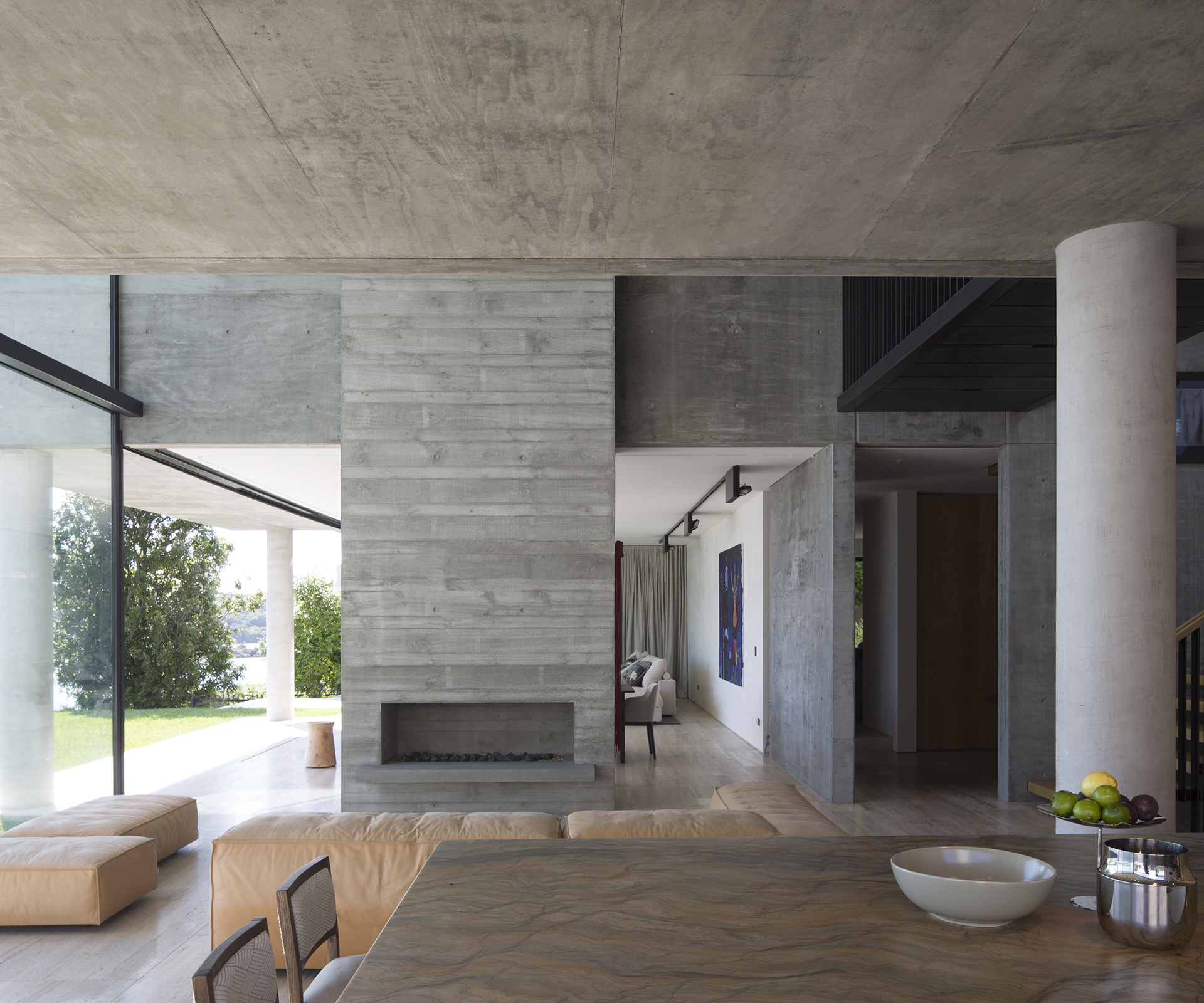
The squareness of the concrete looks sharp and clean. Much of it was prefabricated and cast to give it a timber grain, adding character to what might otherwise look industrial at such scale. Its bulk is balanced by exquisitely refined door handles, taps and rails. The carpentry is all solid oak, the detailing all raw brass that will take on a marbled patina.
On the first floor, level with the entrance, are four bedrooms – the three children’s rooms to the east, the main bedroom to the west over the bridge. The bridge, a cage-like enclosure of geometrically patterned steel, gives a sense of containment, while keeping the view unobscured. Up another floor is a self-contained spare bedroom. On these floors, the masses of concrete give way to stark white plaster walls, unfinished and slightly rough, with a texture that mirrors the grain of the concrete.
With this lavish bunker, you get the sense that Guthrie has answered his own Zen koan: mastering the unmasterable, perfecting imperfection, turning a most unwelcoming structure – a gun emplacement – into a luxurious family home.
Words by: Henry Oliver. Photos by: Patrick Reynolds. Production by: Amelia Holmes.
