Once an old farmhouse, this historic Epsom villa has welcomed a modern addition fit for entertaining.
Beneath a 300-year-old pohutukawa, a 1900s farmhouse is firmly settled on its site. Not much has changed in the villa’s history until recently. It’s a familiar tale: the building with ornate ceilings and architraves, although beautiful, didn’t fit the needs of a busy contemporary family.
The clients, who loved the historic aspect of the home, initially wanted an addition in the same style as the original house but later agreed on a modern interpretation of the farmhouse aesthetic without altering the existing building.
“They had been living in this home for 15 years, and they loved it, but after all that time with a tiny kitchen and an outdoor laundry, they needed an addition that was functional,” architect Andrew Daly explains.
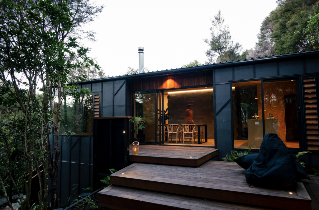
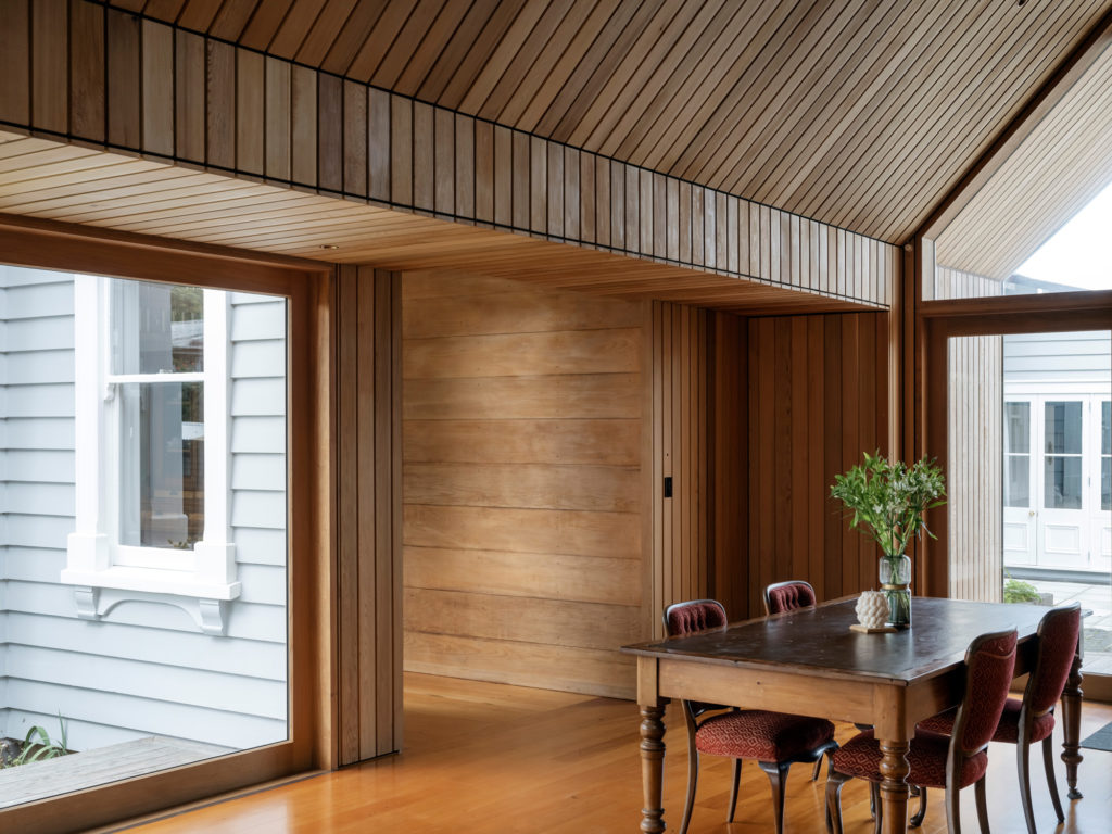
In stark contrast to the villa, the 89m² addition is one of minimalist detailing; it is a more utilitarian space of function and tactile beauty. Housing the new kitchen and laundry as well as an extensive open plan dining and living area that opens out to a large area of decking, the scale and proportions here are a far cry from those in the original house.
Vertical cedar lines the walls and ceiling — an ode, Andrew says, “to the historic nature of old lean-to villa additions”. Recycled kauri floorboards — taken from a building demolished after the Christchurch earthquakes — reflect the light brought in from the large, glazed sliding doors to the north and east, which open the space to extensive decking.
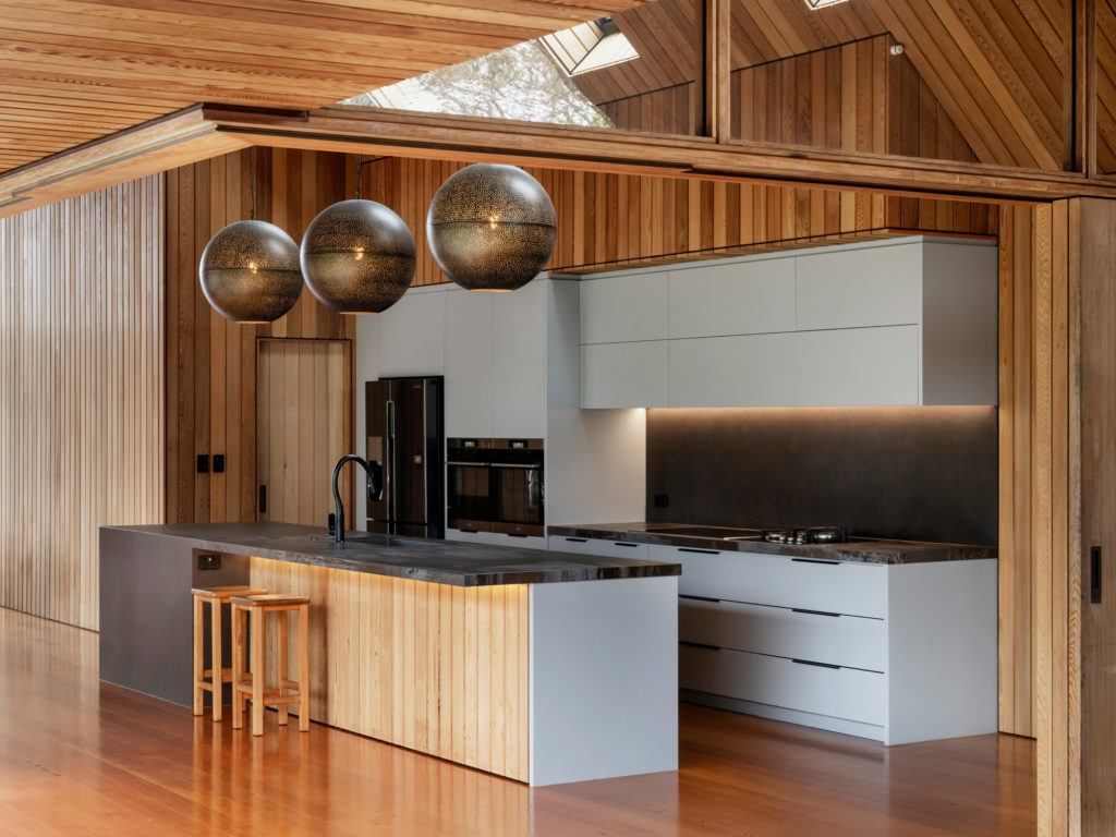
The pitched ceiling is broken by a trio of skylights above the kitchen that introduce light from the west. In the evening, three perforated metal pendants cast a golden hue over the space.
Anchored to the core of the kitchen is a stone island, introducing an industrial aesthetic.
“The design and materiality are a nod to the age of the original house,” explains kitchen designer, Nicola Manning.
Due to the large scale of the island, two slabs of stone were needed.
“I wanted to create the appearance of a monolithic block at one end of the island, which meets the Trillium stone of intense greys,” she said.
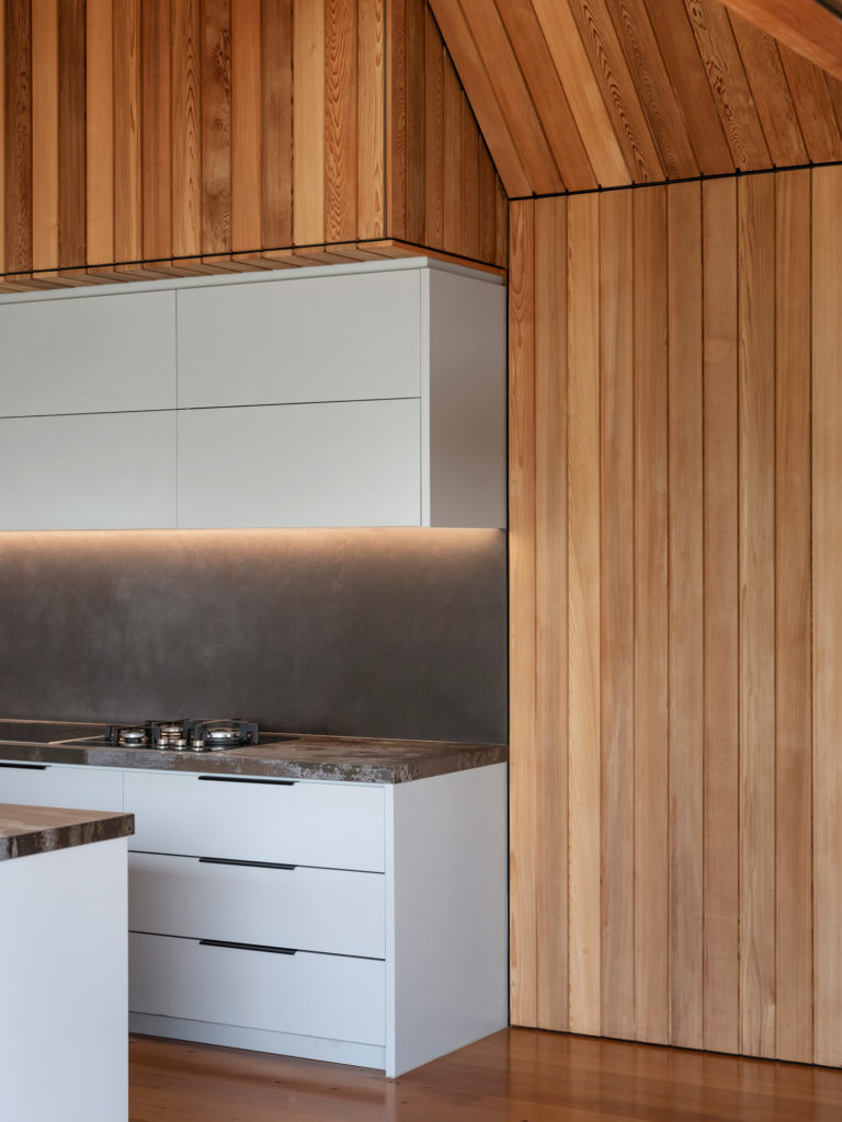
The abstract Trillium stone continues on the back cooktop, where the texture is highlighted by inbuilt flush lighting.
“The design of the cabinetry was to be seamless and linear. The horizontal lines were emphasised to contrast with the vertical aspect of the cedar panelling and the height of the ceiling. We then coated the cabinetry in Dulux Franz Josef Quarter, which was chosen for its tonal match to the grey in the stone benchtop. By a happy accident, this is a similar hue to the steel roofing, so, when looking from the outside into the kitchen, the space is unified with its setting,” Nicola says.
From each part of this dwelling, the presence of the other is viewed through the styles of its time, a fitting reminder of the home’s story.
