It’s uncommon for a fashion line to be entirely produced in New Zealand, but this is key to the ethos behind the Mina brand – the label produces high quality, ethically produced clothing with clean lines and in a signature palette of dreamy colours and natural textures.
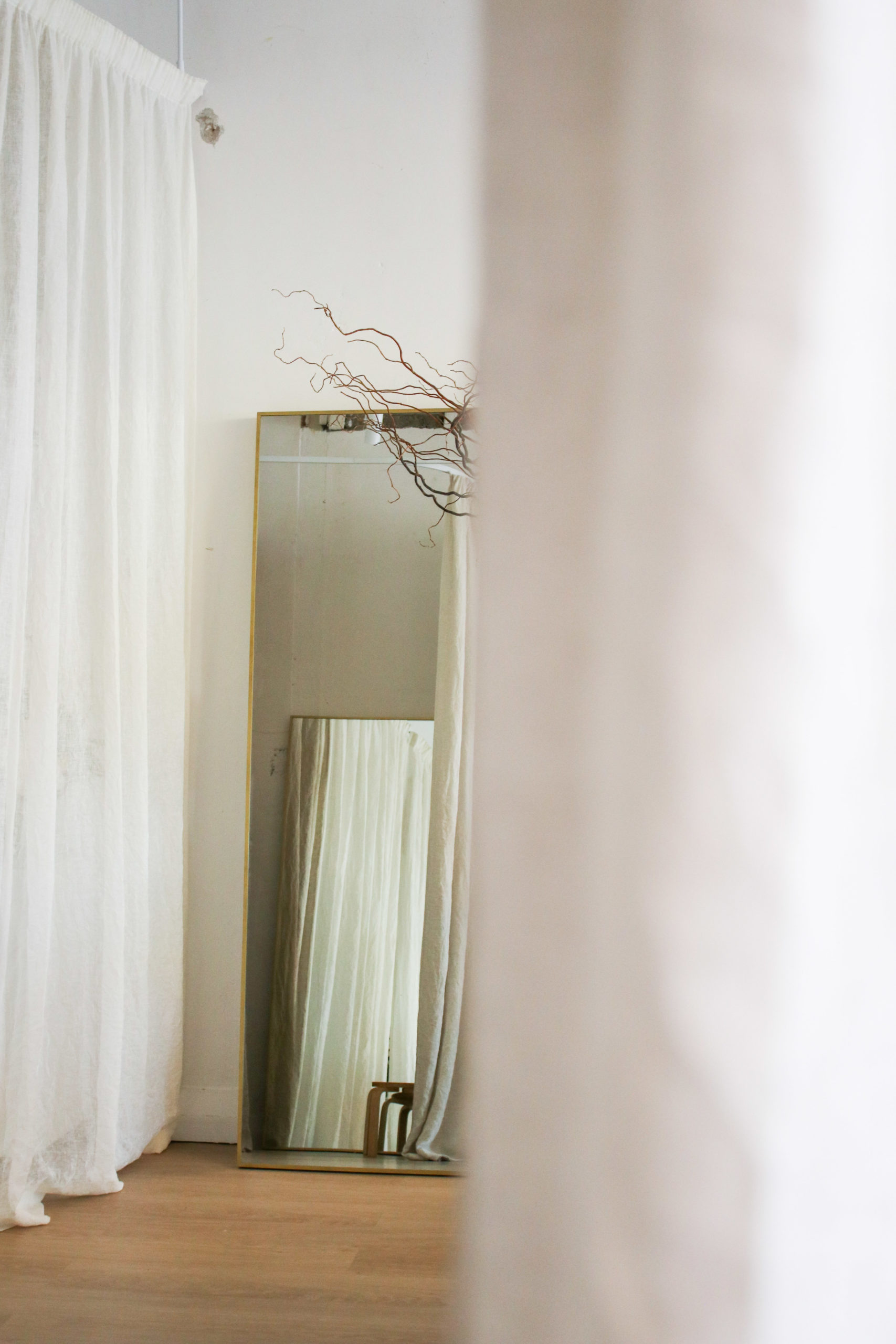
Originally, operating from a “by appointment only” showroom space, Natalie Procter met Think and Shift director James McNab who worked in the same building, and who assisted her in the fit out of the new Grey Lynn store.
Much like her brand, the space had existing layers of texture, and an age-worn patina that played nicely into Mina’s timeless aesthetic.
“We were very lucky to have some texture to play with – some of the walls were scuffed and old historic marks have been left in the building that we’ve kept exposed,” says James.
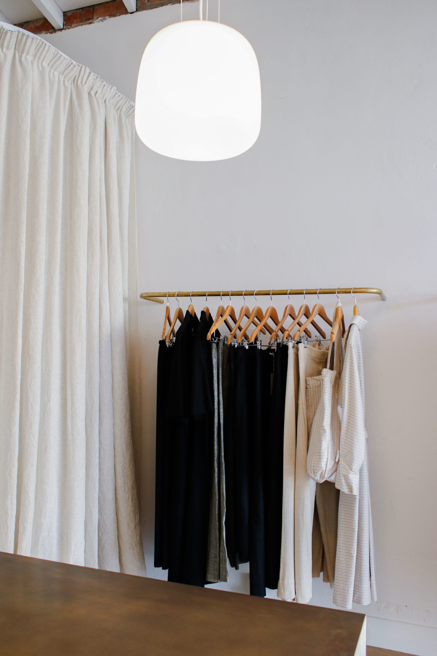
It was this fine balance of revealing and concealing certain elements of the existing space that lets the clothing take centre stage.
The brick walls of the interior are in places plastered in a soft off-white tone, and the original timbers of the space were left exposed.
A counter designed by James is the centre piece of the room, and unlike a traditional counter, was conceived of as a sculptural piece in itself, with its drawers cleverly concealed.
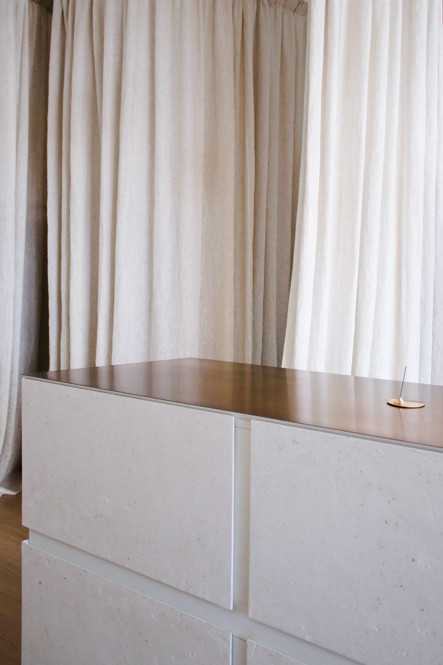
“We blended the drawers into the overall form of the object. So, on one side you see four plastered sections, and that is repeated on the other side so that Nat can walk around it from any direction and access it, without feeling she’s behind the counter.”
The plastered texture on the façade of the counter was crafted by Pilkington Interiors, and special attention to detail was taken around the surface – with discussions about the exact regulation of the peaks and valleys of the plaster.
The counter top is in an exquisitely finished brass surface by Powersurge, and the meeting of the two materials speaks to the character of the fashion brand.
In line with the elegant aesthetic, a single drop of linen in the storefront window with the Mina logo placed centrally on it gives Natalie the flexibility to change mannequins and garments in and out.
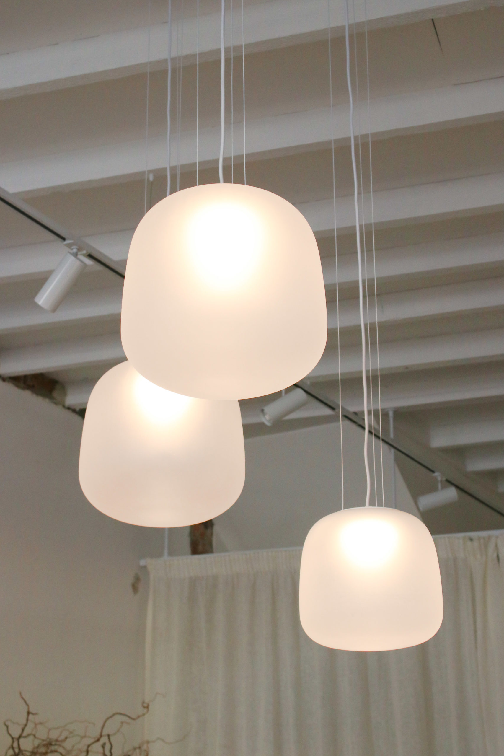
Exquisite artisan lighting from Alex Buckman complements the soft and textural space, while a linen drape separates front and back of house.
“The idea was to keep it pared back, minimal, and really let her texture come through and let that speak, rather than push anything into the space.”
