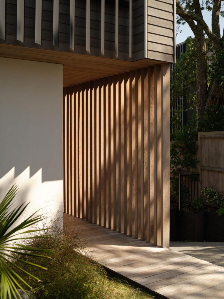
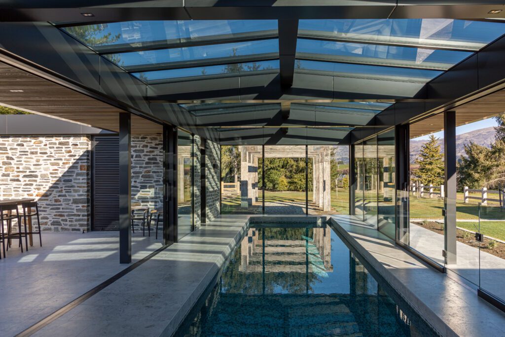
On the hills of Mangawhai Heads, a house of glass, concrete and timber overlooks a panoramic view of the Pacific. Faced with this outlook the kitchen needed to operate at one with the landscape, ensuring not to turn its back on the alluring rural surrounds.
We spoke to kitchen designer Gemma Mills of Fluid Interiors about how the architecture and environs of this home influenced the kitchen design.
HOME: Tell us about the key considerations when designing a kitchen for a rural home. How do these differ from designing for an urban environment?
Gemma Mills: In this rural setting you are always on holiday, the view being the focal point. We needed to provide a large space to entertain guests and family. This was achieved by installing a four-metre island cantilevered at one end to provide a space to perch and stare out towards the views.
When designing for a rural environment, the distance from the local grocer needs to be considered, as space may be required for bulk storage. A scullery or larder might be a practical inclusion. If the client is harvesting their own produce, consideration around the connection to the garden and how the produce might be washed, stored and preserved is likely to be needed.
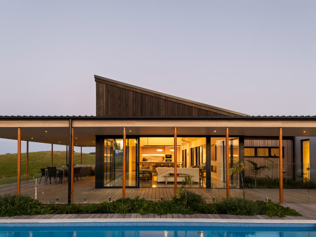
H: The view from this house takes centre stage. How did the home’s surroundings guide your choices for the kitchen?
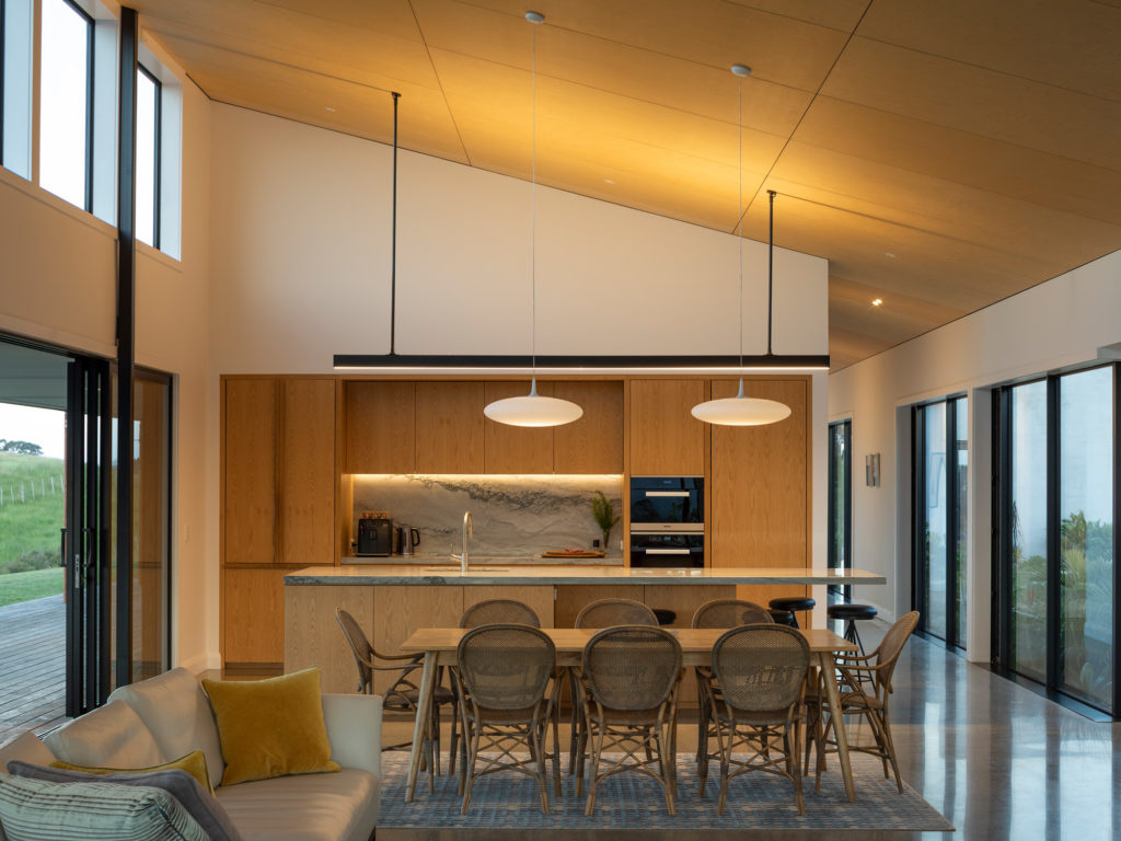
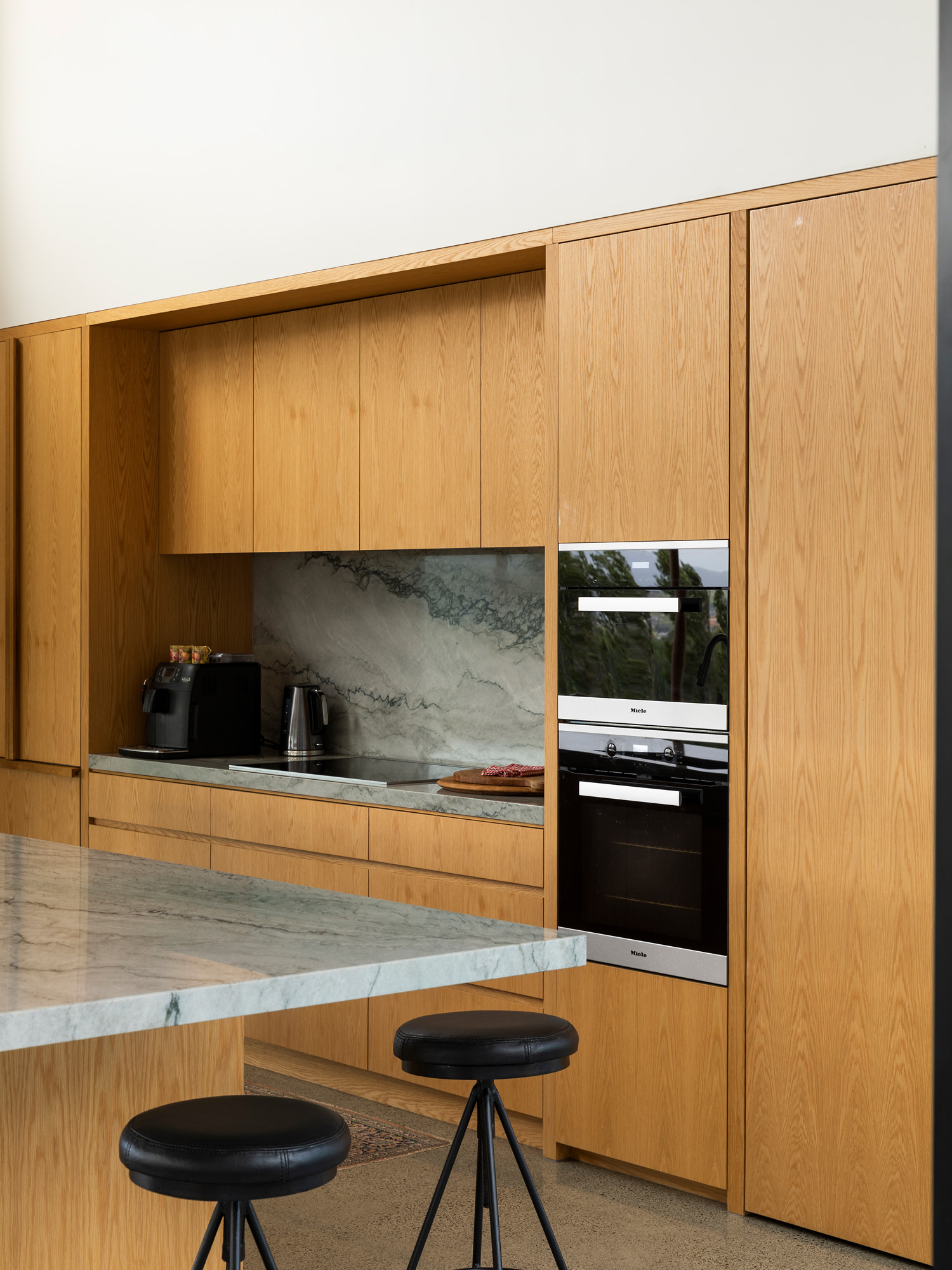
GM: The use of only three materials — oak, quartzite and stainless steel — and integrated appliances kept the design minimal to prevent any interruption from the view. The final touches of soft lighting, handles and finishes keep the space warm, practical and uncluttered.
H: How did the architecture influence your choice of textures, colours and materiality?
GM: Initially, the owner was keen on a white kitchen as his current kitchen had worked so well. After a lot of consideration and discussion, he took the plunge and we returned to the original concept of timber veneer providing the warmth and texture which works so well with the cool benchtop and concrete floor along with the white walls and high stud with ply ceiling creating a nice balance.
When you’re not gazing out at the view in the main living area, you are drawn to one internal wall which displays a beautiful artwork by Sofia Minson, and shelving which ties in with the kitchen allowing space for the client to add personality.
H: At dusk, the ambience is transformed in this home, especially in the kitchen. Tell us about the pieces you chose.
GM: The main lighting over the island benchtop was designed by the talented builder Pete Austin. The custom design works perfectly. The recessed lighting over the benchtops and display shelving allows for warmth in the evenings and accentuates the stone splashback and collected treasures.
