From deep and dark to lively and bright, the New Zealand finalists in the 2022 Dulux Colour Awards are revealed.
Ten New Zealand projects have been named as finalists in the 2022 Dulux Colour Awards, including a clever Coromandel beach house in purple and blue, a Sandringham family home with a bright and jovial kitchen design, and a tiny home in Auckland inspired by the coastal tones of surrounding wetlands.
A small central Auckland home defined by colour and space
Nestled in the backyard of another residence in Sandringham, Auckland, Heron House was designed as a retreat of sorts, an escape for a filmmaker and his partner who spend the majority of the calendar year overseas. The design takes inspiration from the conventional bach functionality, as a place to recharge that also delivers spaces for socialising.
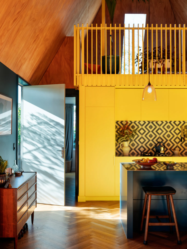
“The Heron House colour palette was all about creating an interior that was bold, fun and rich. It’s a small house with a lot of character as a result,” says Sarosh Mulla of Pac Studio.
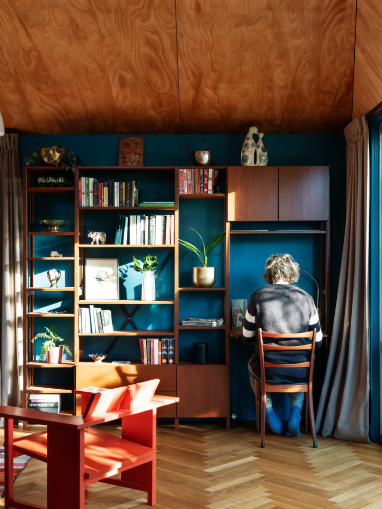
Colour is used distinctly throughout the interiors to define use and function. The kitchen cabinetry and the bannister of the mezzanine above are painted in Dulux Happy, providing a vibrant focal point in the double-height space. The surrounding walls and kitchen island are a juxtaposition to the playful yellow, coated in Dulux Juggernaut, a deep, calming blue creating a sense of intimacy beneath the high ceilings.
A monochromatic coastal Coromandel beach house of purple and blue
Casper’s House, a small holiday home on Mt Paku, Tairua, introduces eccentricity to the conventional bach form. This house, a collaboration between Glamuzina Architects and Dessein Parke is an experiment in colour and form.
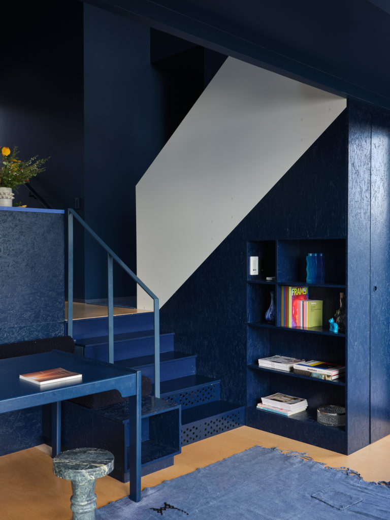
“We have a proclivity here in New Zealand to trend towards greys and whites which can be soothing, but also open a space up and create light,” Natalie Parke of Dessein Parke says. “I wanted to better understand what might happen when you quite relentlessly close a space down and reduce the visual noise, but in a way that still gives space to texture and form, and the visceral reaction that that might produce.”
Known to the locals as the ‘blurple’ house, colour is used relentlessly throughout the interior to soften the angularity of the architecture and as a response to the owners’ brief for a low stimulation environment.
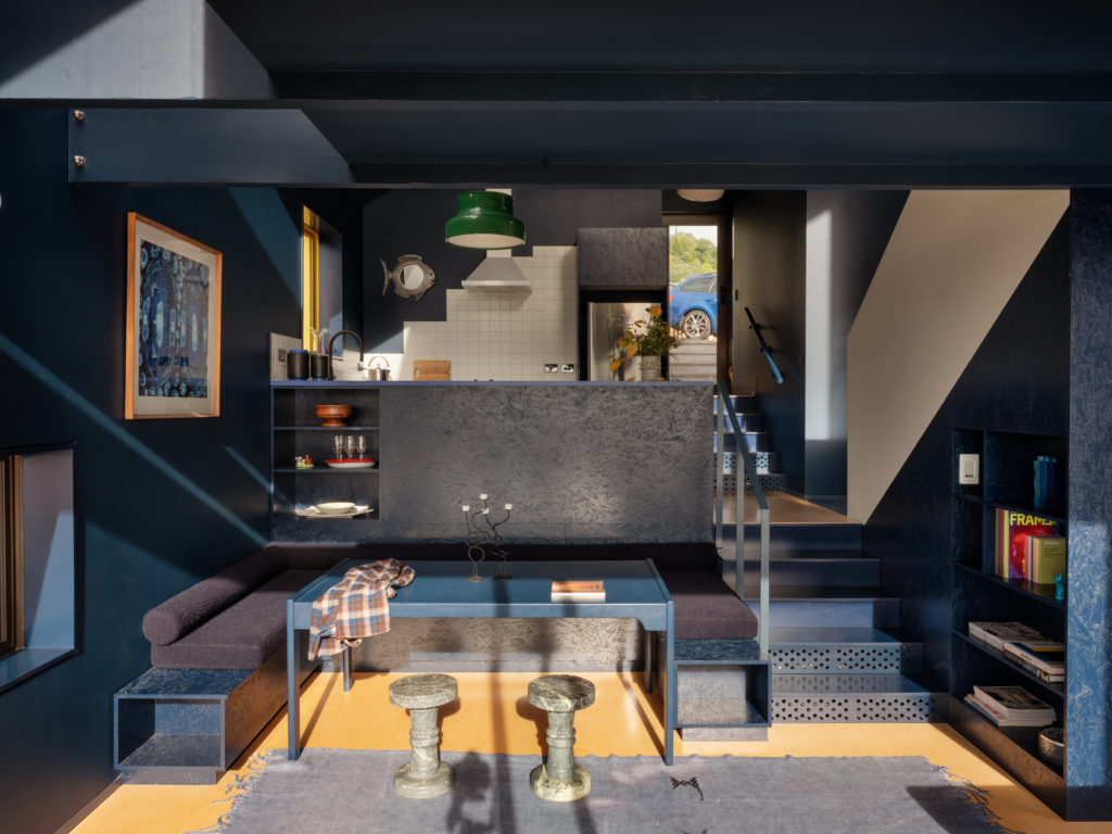
The interior is painted in Dulux Poor Knights, a deep midnight blue, which is broken up with skylights and floor-to-ceiling glazing on the northern elevation. As the light within the tent-like structure filters in, the monochromatic colour is softened as a variety of tones are reflected off the angular surfaces, from white to teal. After dark, the walls are indistinguishable from the night sky.
“In its essence, the blue interior was an opportunity to challenge the concept of ‘a haven’, and thanks to a collaborative working relationship with Glamuzina Architects, and a skilled team, this was possible.”
An Auckland tiny home pays homage to its wetland surrounds
In response to the need for high density living in small homes in central Auckland, Tidy Space by Atelier Jones Design offers style and liveability in a 27m2 self-contained room.
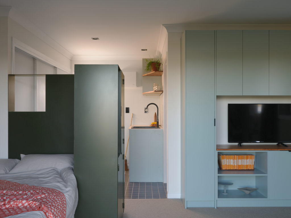
The unit faces Tāmaki estuary, overlooking native mangroves. It is this coastal wetland which inspired the colour palette of Tidy Space.
The brief required a unit with built-in furnishings that would create a sense of warmth and comfort. Dulux Pukekura Park was used on the living room wall, reminiscent of the mud flats beyond, and paired with the soft tones of Dulux Impressionist Blue with which the cabinetry was painted.
“The chosen colours were a way to celebrate the local Tāmaki River and seamlessly link this environmental context to the interior,” says Raimana Jones of Atelier Jones Design. “The balance of soft pastel blue and muted green furnishings and cabinets demarcate the different areas within the space and generate a restful and soothing atmosphere.”
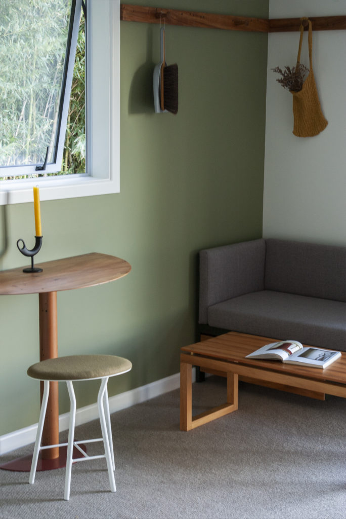
“The forms of the built-in elements of Tidy Space were kept unadorned and functional, giving the space a pared back, utilitarian aesthetic. So, colours played an important role in this scheme – to give the reserved forms an uplifting and inviting touch,” Raimana says.
A coat of vivid Dulux Outrageous Red on the bathroom door and deep orange linen curtains complement and contrast the soft tones of the interior palette, invigorating the spaces without being overpowering.
The Dulux Colour Awards
Now in its 36th year, the Dulux Colour Awards showcase innovative uses of colour across commercial and residential design.
A panel of design industry experts from New Zealand and Australia narrowed down this year’s entries to 103 finalists, selected across six categories; residential interior, single residential exterior, commercial and multi-residential exterior, commercial interior – public and hospitality, commercial interior – workplace and retail and student projects.
“We were excited to see such an exciting and imaginative use of colour in this year’s entries,” says Dulux colour specialist Davina Harper. “Architects and designers have really pushed the boundaries with colour application to create inspiring, engaging – and often surprising – interior and exterior spaces.
“Deeper tones of blue and green were popular amongst residential interiors, showcasing diverse moods in areas and differentiating functional use in a space – from deep and dark, to bright and lively – applied to cabinetry, trims and walls to create a peaceful, relaxing interior setting. Impactful tones and washed walls are also making a presence, bringing a sense of moody sophistication to interiors,” added Davina.
The winners will be announced at a gala event in Melbourne later this year. Read about the winners of the 2021 Dulux Colour Awards here.

