Architect and designer Vincent Van Duysen takes Thomas Seear-Budd on a tour of his home and an accommodation project in Antwerp, Belgium
Vincent Van Duysen has gained international recognition for his restrained spaces that speak to the art of living. The Belgian architect studied in the 1980s at Saint-Lucas in Ghent before moving to Milan, where he worked with Aldo Cibic. Now based in Antwerp, his studio designs residential and commercial architecture, interiors, furniture and products. In 2016, Van Duysen was awarded Belgian Designer of the Year and the Flemish Culture Prize for Design.
Tell us about your childhood and creative path.
I came from a very conservative nest. My family on my mother’s side were all lawyers, whereas there was a little bit more creativity on my father’s side. I think he always wanted to become an architect, he was into collecting art and my parents had friends who were artists. I had both sides – the conservative and creative. As a kid, I pretty much knew I was going to do something creative – it could have been photography, painting, art school or fashion; I was really into fashion. I am still interested in all disciplines related to art.
What’s at the heart of your work?
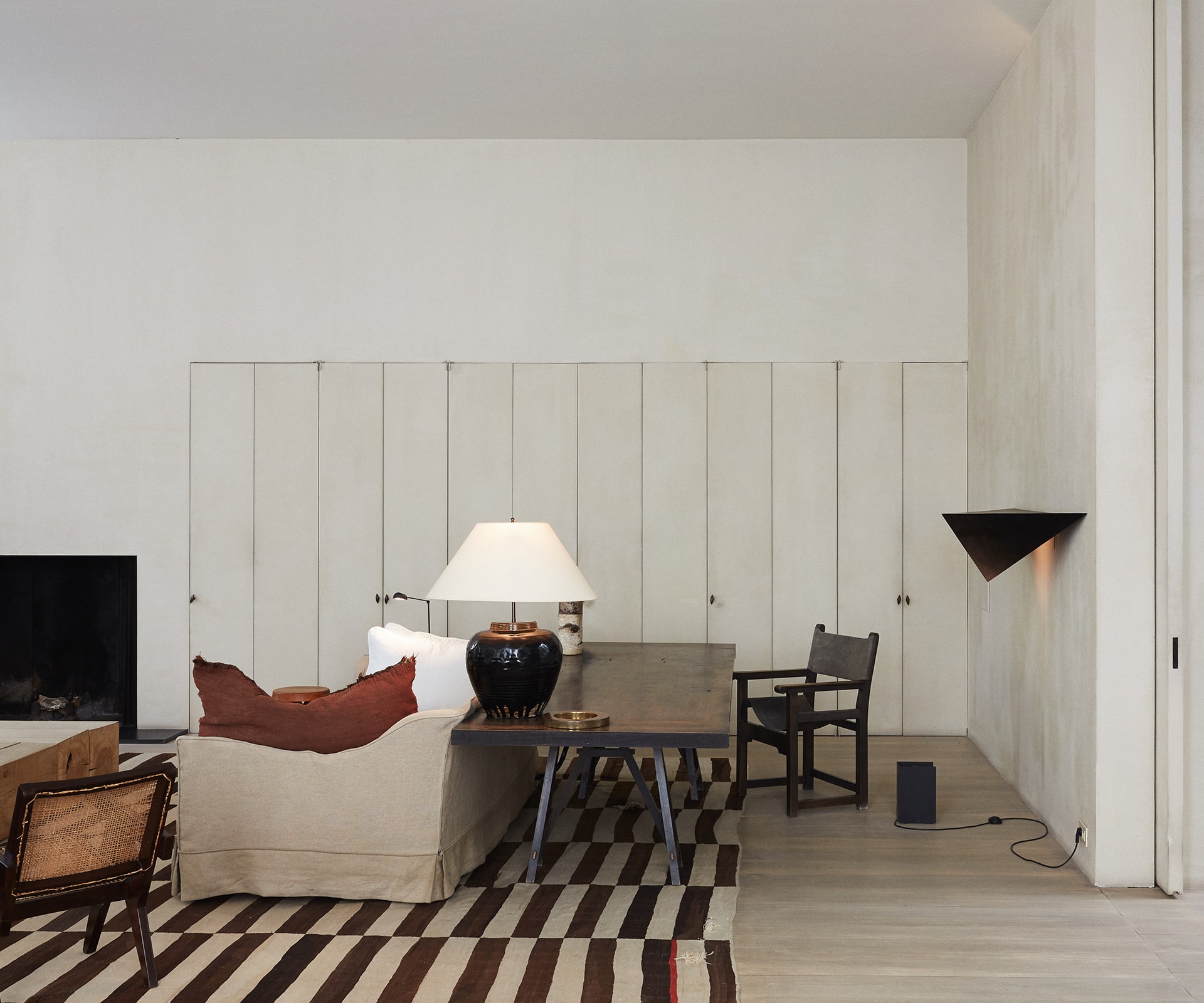
Architecture is more than the structural and mathematical building of space. My mindset is more intuitive and emotional. I create calm and balanced spaces with mass, void and light. I let spaces breathe towards objects, art, animals and human beings. My calm and pure spaces were recognised around 1990 by Ilse Crawford, who was creative director and editor for Elle Decoration UK at the time. I place a lot attention on the senses, whether it’s something you see, taste or smell, it’s all present in my work; let’s call it tactility.
Your work has been connected to other ‘minimalist’ architects such as John Pawson. What are your thoughts around the notion of ‘minimalism’ in architecture?
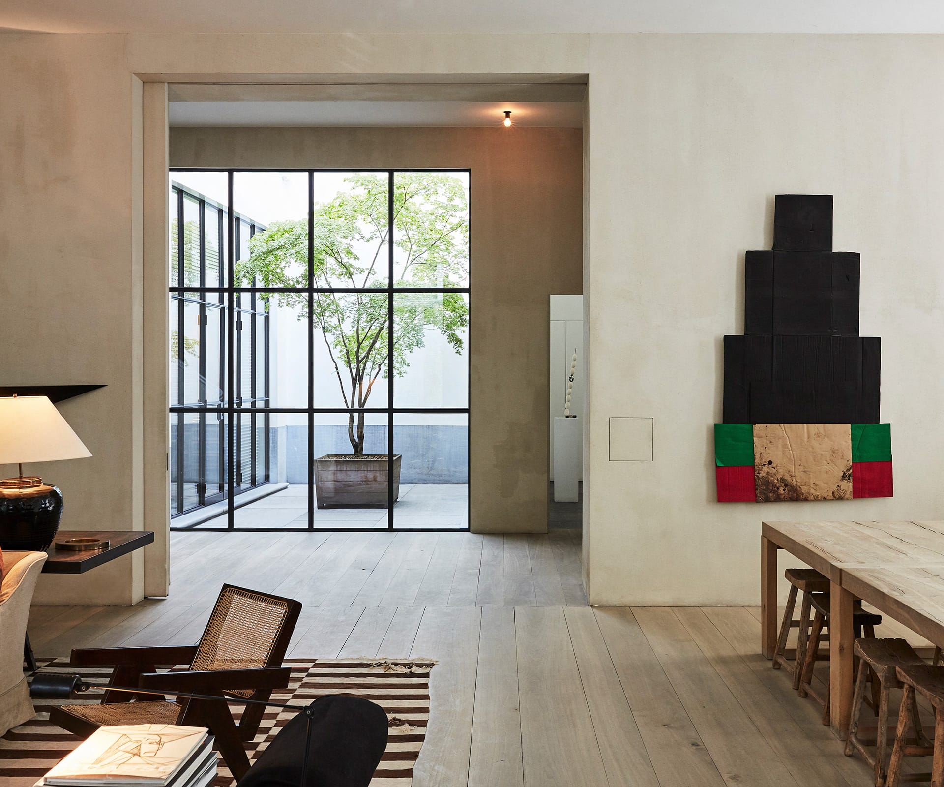
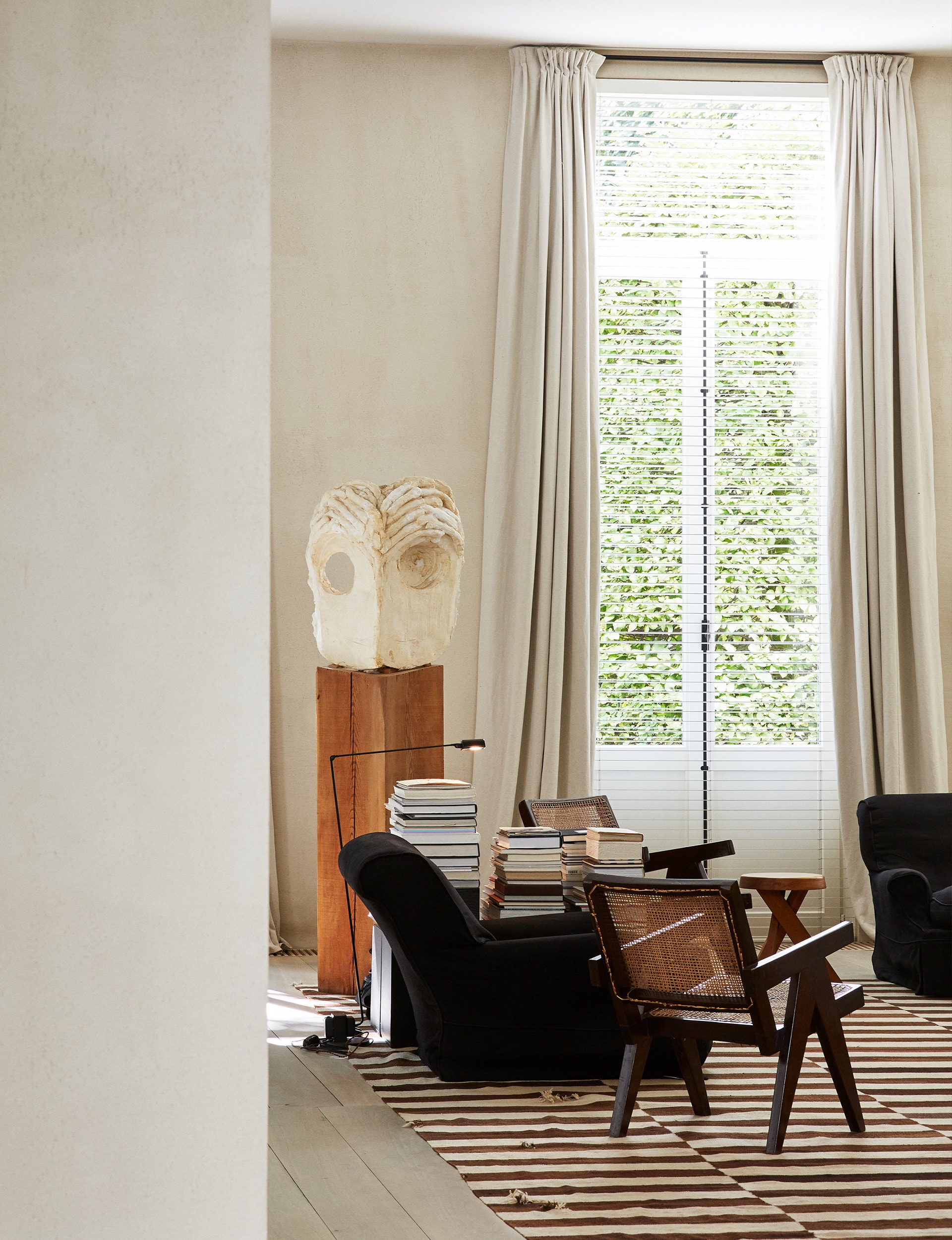
After 1990, my career took off very quickly. I continued in that pared-down, pure style which, at the time, the media referred to as ‘minimalism’. To me, my work isn’t ‘minimalism’ as minimalism belongs to art, to the American stream of minimalist artists like Donald Judd and Sol LeWitt. I was aligned with the likes of John Pawson and Claudio Silvestrin. I really appreciate their purity and contemplative approach to space. However, in my opinion, my work has many more layers and variation. I don’t shy away from displaying beautiful objects that belong to my aesthetic. I’m a big fan of Pierre Jeanneret’s furniture and have been collecting his works for many years. I like to mix these up with my own designs. I try to create a world of contemporary furniture and art that belongs to my spaces.
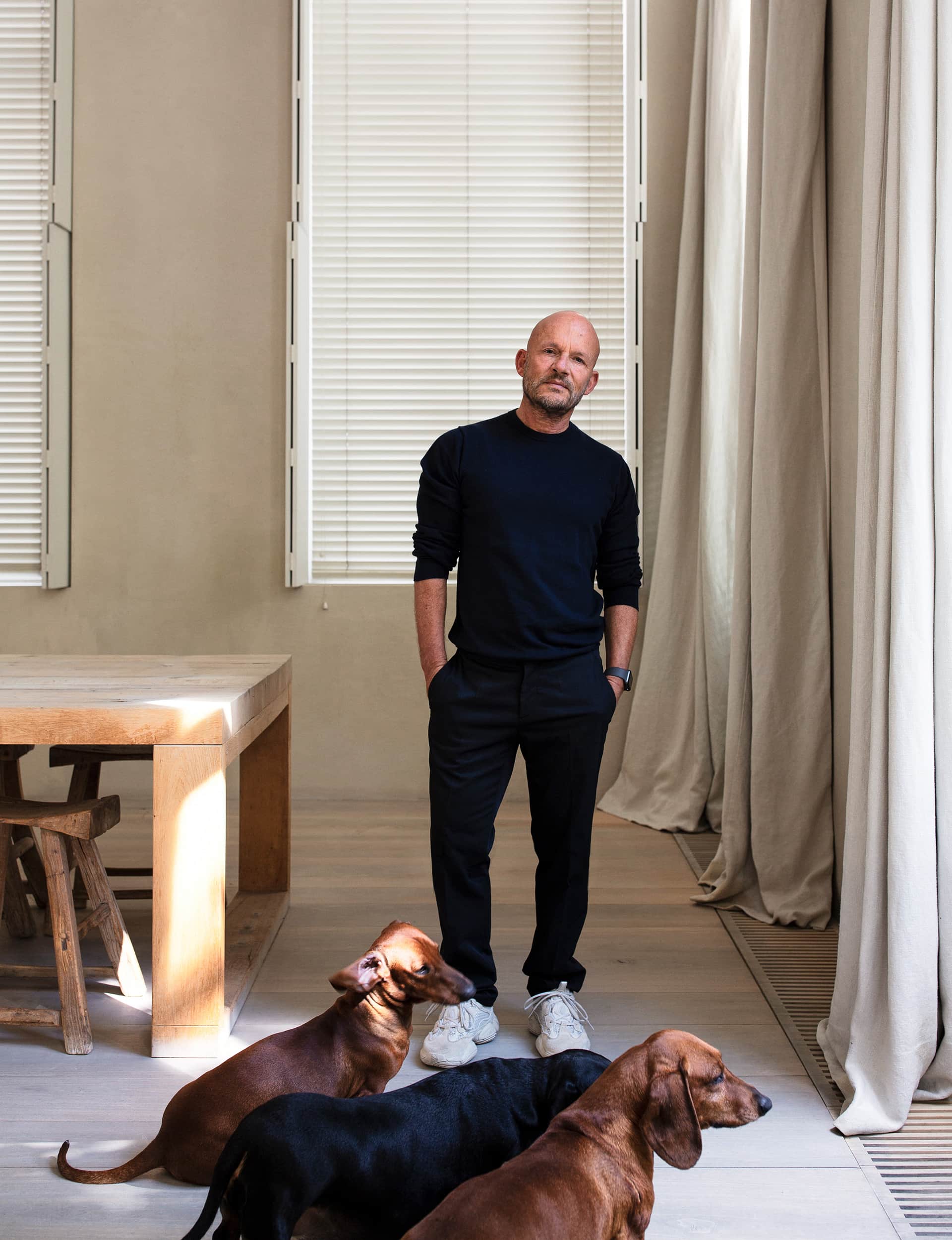
Architecture is a slow art. Do you think interior projects enable you to test your ideas in a quicker fashion?
No, not really. There are a lot of architects who aren’t interested in interiors. For me, being an architect and not being able to work on interiors was wrong. I was looking to the past, I was looking to the Italian masters, I was looking to architects who knew how to work out interiors. From the structure at the beginning to the cutlery that goes on the table and the door handles. I’m attracted to a complete world of design.
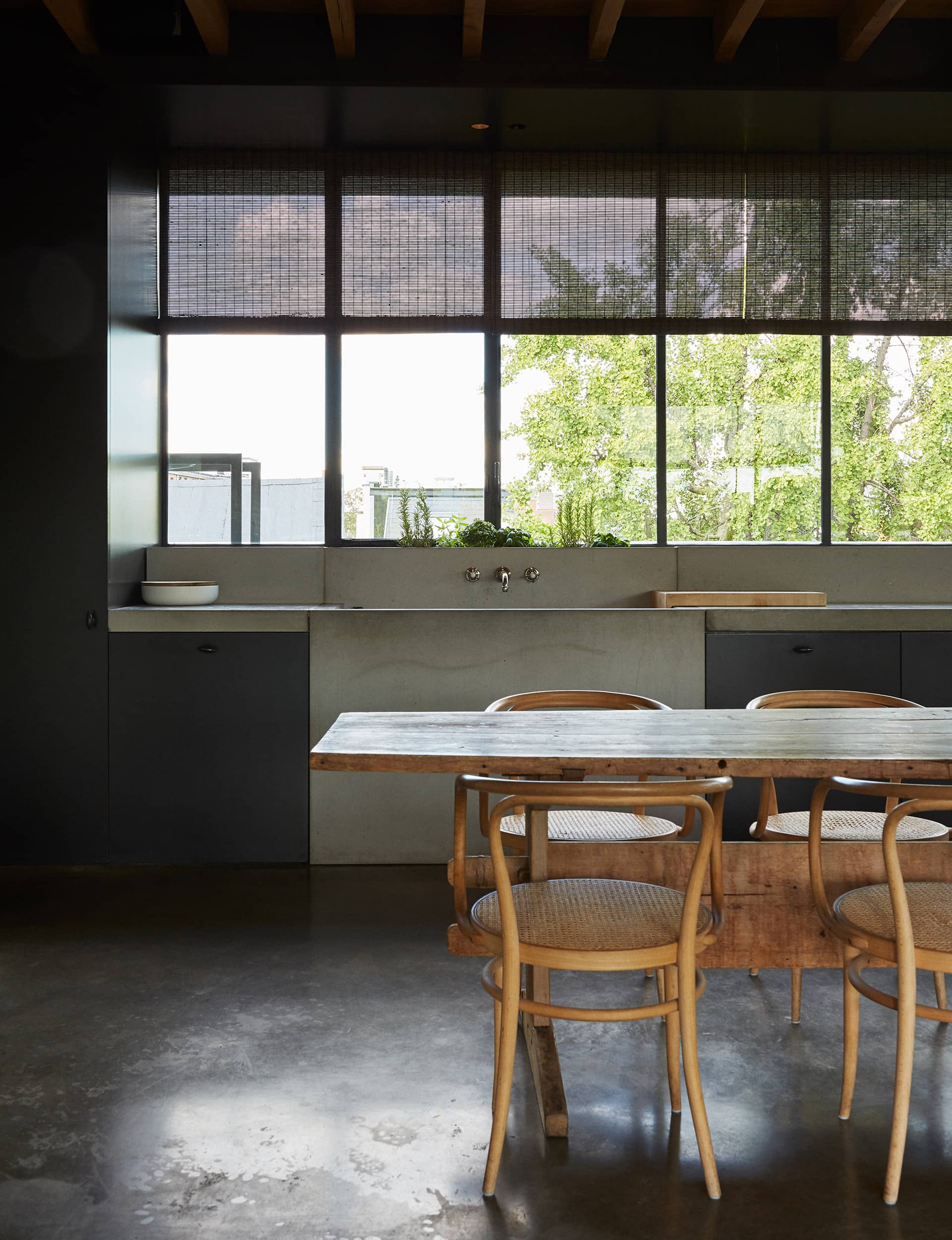
Tell us about your home.
I often passed this place on my way to the office and was attracted to its beauty and grandeur. There used to be generations of notaries living and working here. To make a long story short, the house was for sale. The owner was the widow of the notary and he had a clerk who had lived in the house for 40 years. There was a rule that whenever the house was sold it came with him as a resident. He was a very clever person and I had a very strong connection with him. I respected him and took care of him, I considered it a destiny and also a beautiful time. I’m glad I bought the house and took care of someone until the end of their life. His energy is still around and it’s thanks to him that I’m here.
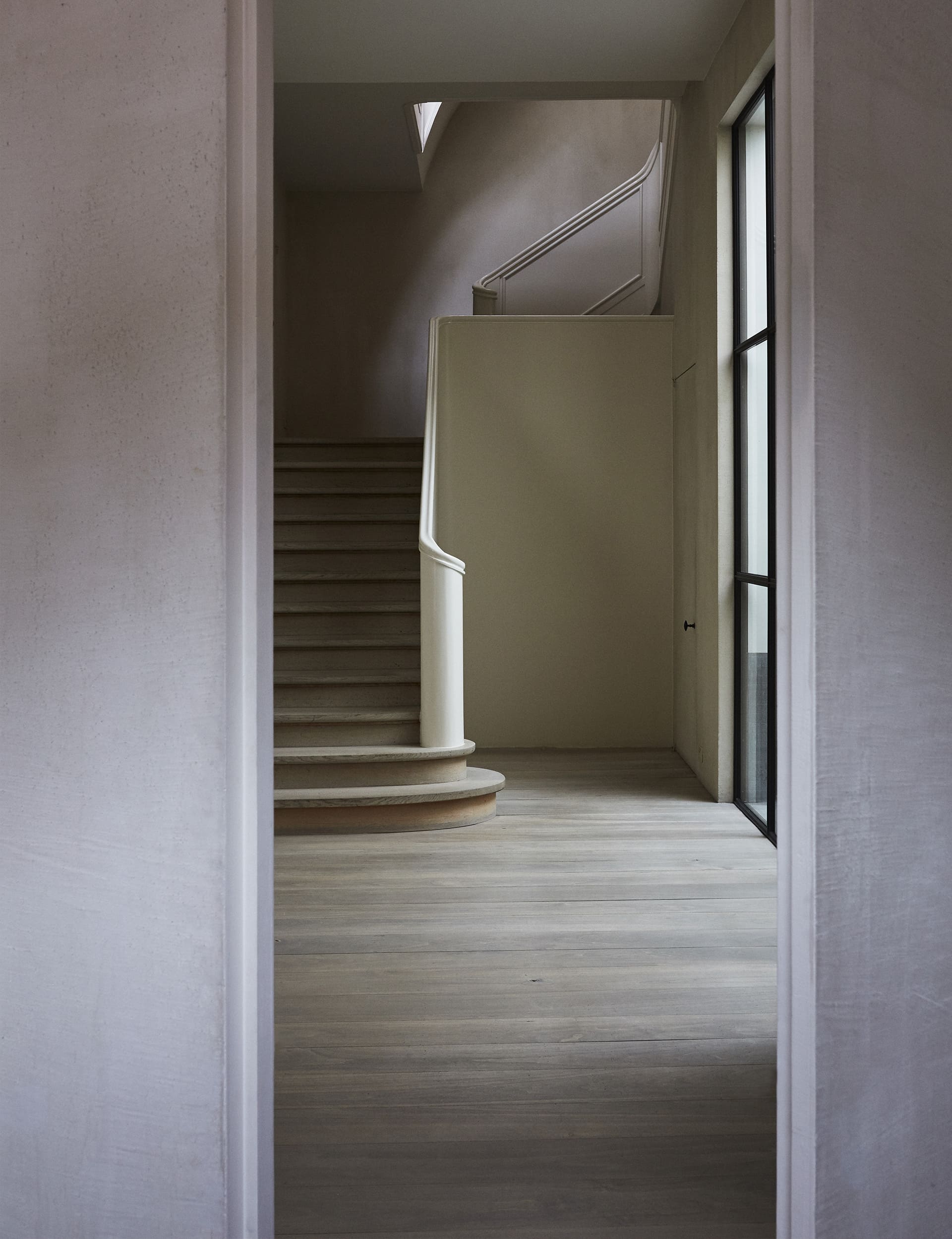
What did the renovation involve?
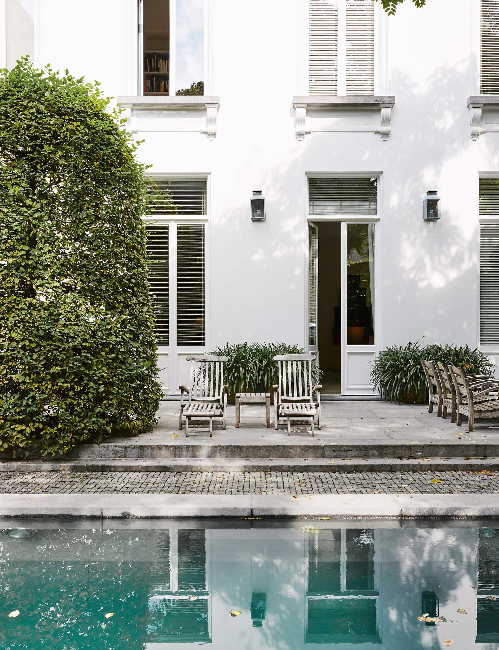
There were offices on the ground floor and living on the first floor. As everything was subdivided into small rooms I had to strip it all out to create a large living room that faced the garden. I was a little scared because the only elements that remained were overall ‘bones’ of the house, which date from the 17th century, the 1870 neoclassical façade and the staircase, a renovation in the 30s and 40s. The staircase is a key structural element with a strong presence, but I was worried about how to integrate it into my design. I incorporated it into the living area rather than the entry axis and stripped back everything around it, making it more pure and allowing it to breathe into the living room. Everyone loves the staircase – it’s the centrepoint of the entire house.
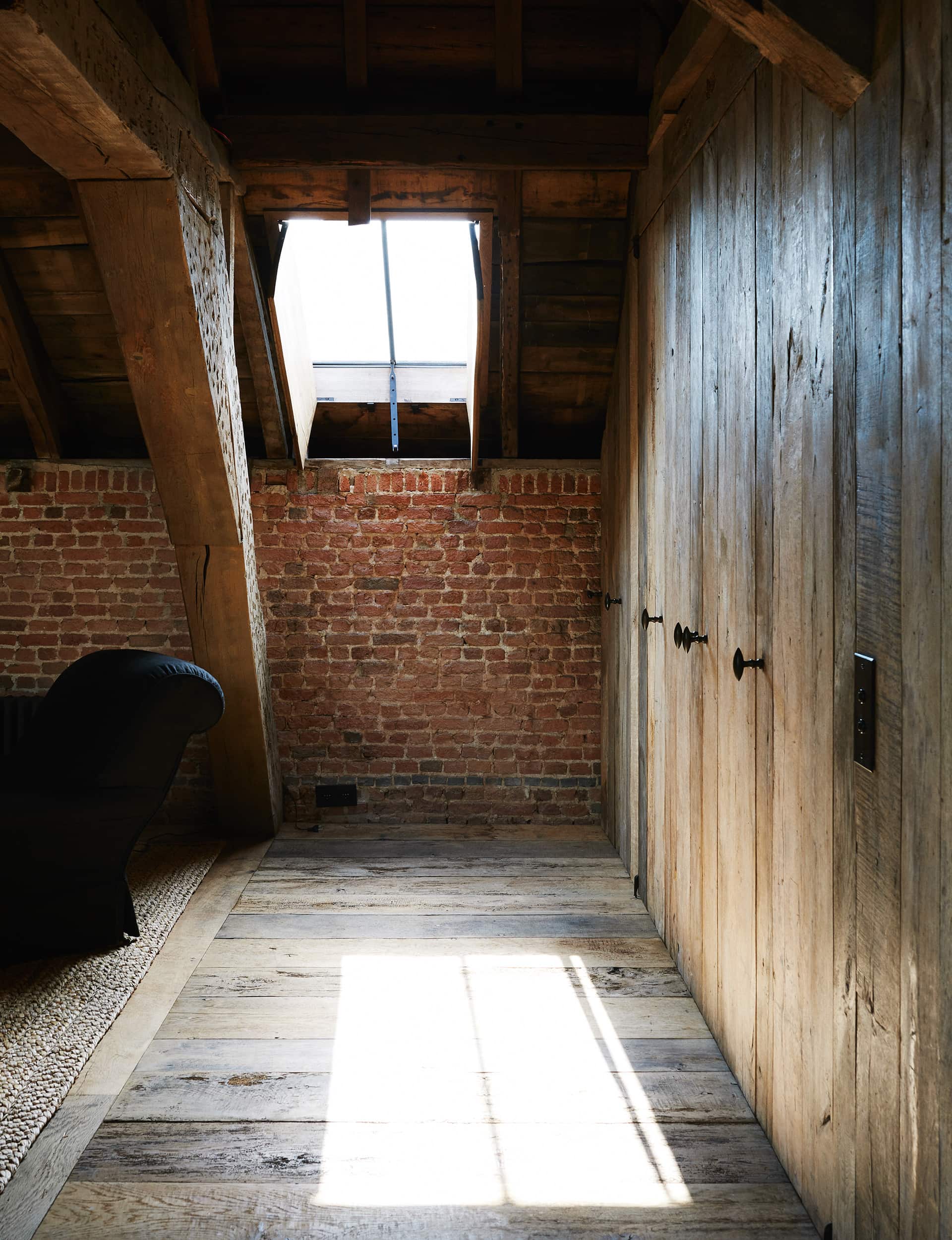
What does the notion of ‘home’ mean to you?
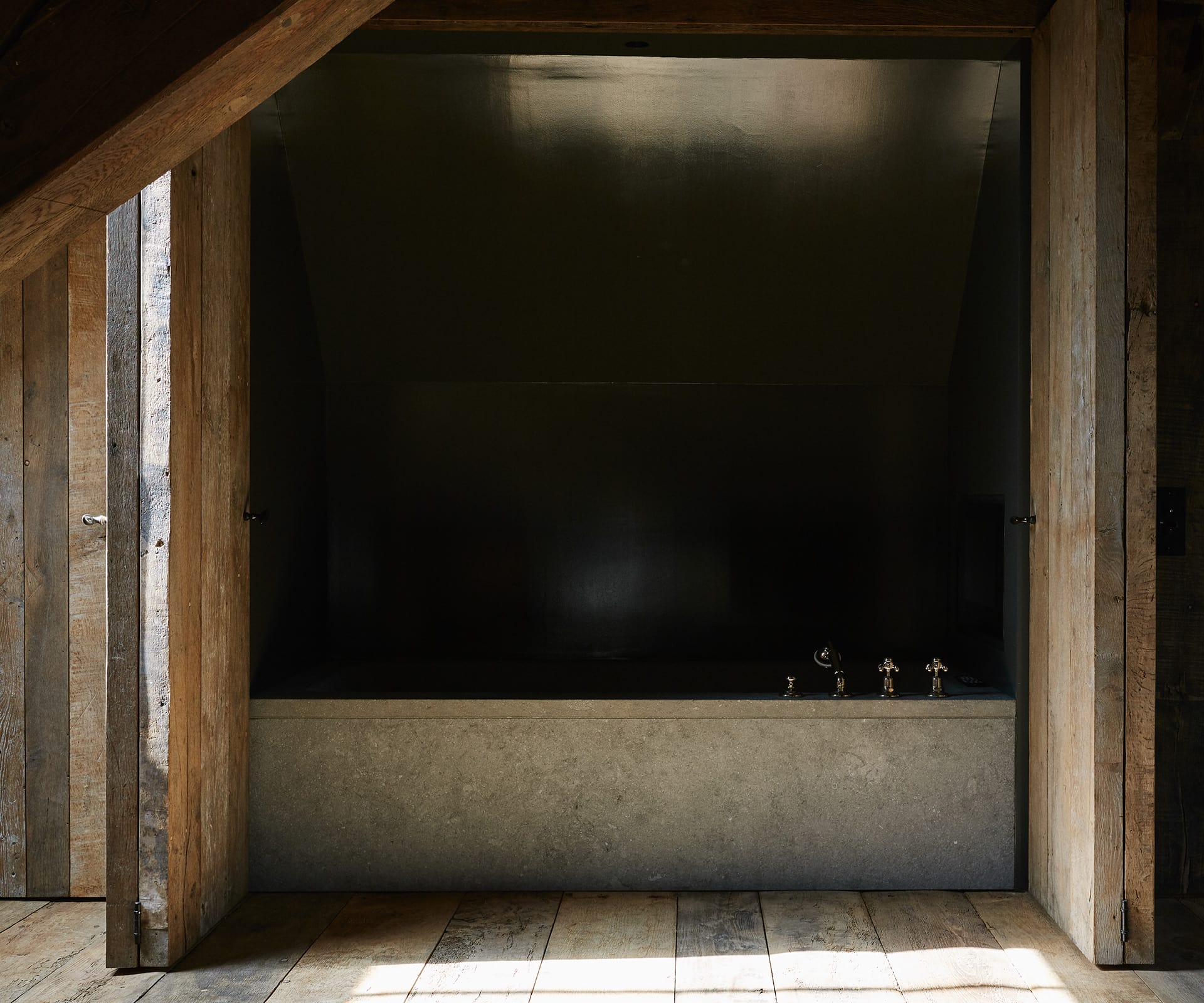
My house is a sanctuary. It’s where I disconnect. Whenever people come in they feel such calm. It’s peaceful; I don’t even need to go on holiday. I travel almost weekly and always go to the same places and rooms because I’m allergic to anything that’s too touristic. Home is the only place I can stop my mind from thinking. That relaxation and calm is what I’m aiming for with my holiday house in Portugal, a new build. It’s very much a blend between art, architecture and nature. During the process I was looking to the likes of Luis Barragan for inspiration. It’s not going to be a white-washed, open house facing the sea. It’s solid, brutal and soft at the same time. It sits into the undulating landscape between the pines.
What else are you working on?
We are finishing my first hotel here in Antwerp called Hotel August. It was previously a convent for Augustinian nuns and is in an historic area outside the main city centre. The family-owned hotel has around 48 rooms, the existing chapel, nuns’ dormitory and gardens. We have beautiful elements to work with, beautiful materials and details we are preserving.
You recently released the book Vincent Van Duysen Works 2009-2018, published by Thames & Hudson.
I’m a big fan of books – besides art, they are almost the only ornament in my house. We live in a fast-track world and consume thousands of images through social media – it’s great to pick up a physical book, to have a moment of peace and reflection. It’s not easy to make something inspiring that people are willing to be immersed in, but I loved the challenge and process.
Words by: Thomas Seear-Budd. Photography by: Thomas Seear-Budd
[related_articles post1=”89299″ post2=”82692″]
