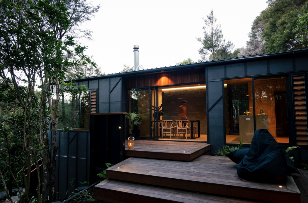
This home in Mangawhai, designed by Studio John Irving, is inspired by a deep seeded internationalism and a subtle, relaxed expression of luxury and leisure.
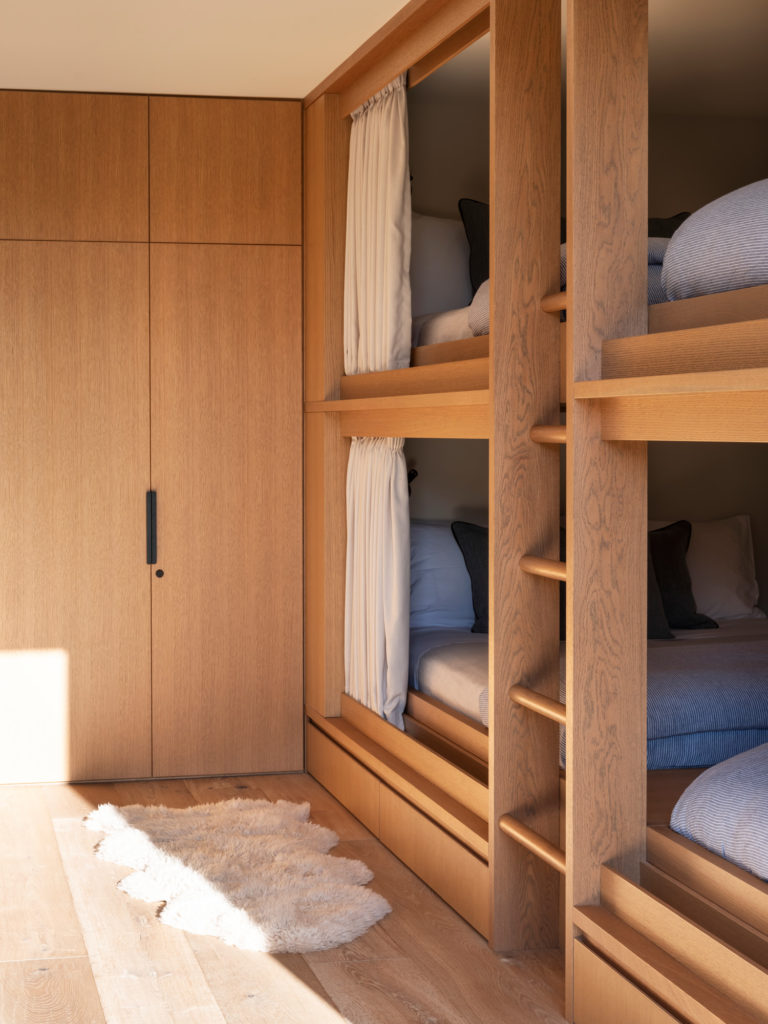
There is a kind of chilled-out, California vibe going on here. The small, uplit bar beside the kitchen has enough tequila to fuel a small revolution. The background music is hip-hop and R&B, with equal measures of smoothness and autotune. Although the house is immaculately styled and maintained — not a leaf of grass seems to be uncombed — the one thing to have escaped housekeeping is an American football wedged inconspicuously in one of the kids’ bunk beds.
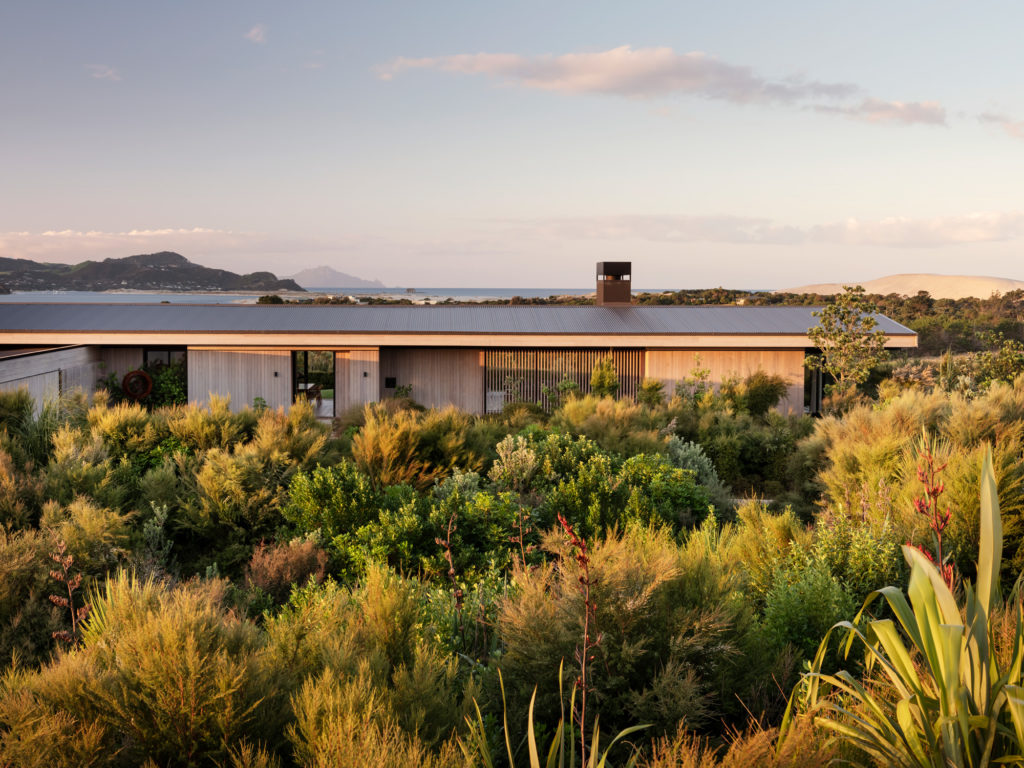
Yet not everything here is an approximation of the United States’ West Coast — where the owners have spent significant amounts of time. It’s as if a Malibu pavilion had been lent a Scandinavian palette, some of Martha’s Vineyard’s self-assuredness, and plenty of that Kiwi, laid-back attitude. Given that the house rests on an impressive, elevated site within the boundaries of a coastal golf club (Tara Iti), the mood is right on point for its intended context.
“We wanted a place that feels like, every chair you see you should be able to just go and sit down and make yourself comfortable and put your feet up; you know, just hang out and relax,” says Jim Rohrstaff who, with his wife Kara, commissioned and owns this home by local firm Studio John Irving. “That’s what people are here to do. The architecture, the design, the style here is very much aimed at that.”
Since coming from the United States to their adoptive New Zealand home eight years ago, the pair have been crucial in helping clients purchase and bring to fruition several houses within the golf course grounds, many designed by some of the most significant local architects as well as a smattering of international ones.
“We always look to have architecture that’s not going to be overpowering to the land,” says Jim. “What you see outside is really what should be dominant, and this,” he continues, motioning to the building, “should really be subservient to the landscape.”
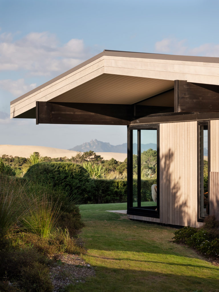
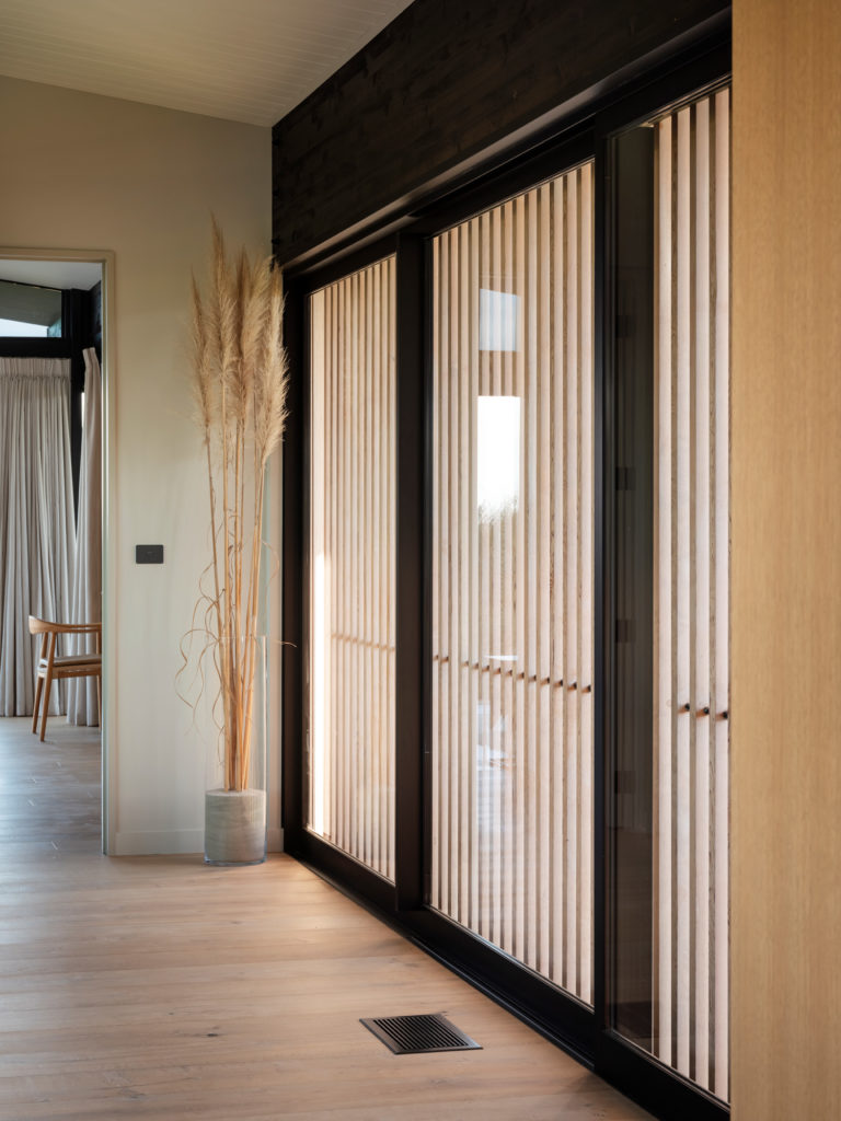
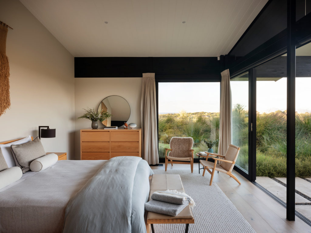
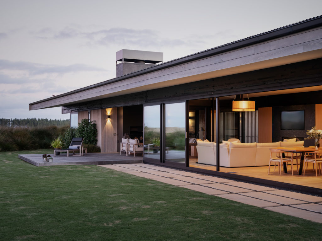
From a small, private driveway, the house reveals itself as a low-lying, L-shaped pavilion encased in light-coloured timber, which somehow blends into the sand dune and verdant topography that surrounds it. The cedar weatherboards vary in orientation: vertical on the bulk of the form, horizontal on the soffits. The latter express the very gentle gable that runs the length of the main pavilion along its central axis and overhangs on both ends, providing shelter and variety. The timber thins out and becomes fin-like on the outside of the windows, lending privacy, shade, and a small glimpse of the Neil Donaldson steel sculpture outside. The west-facing facade is almost entirely glazed, creating an internal contrast of light and dark that emphasises the striking views of rolling hills, links, and ocean in the valley below.
Although not necessarily a complex geometry, the source of the building’s beauty is in its meticulous attention to detail. The selection of materials and the way they wrap around the soffit, the perfect spacings between metal and timber, the colouration and positioning of rods between fins — it all speaks of craftsmanship, both in detailing and construction.
“For me, it was a bit of a nod to California mid-century modern, post and beam architecture,” says its designer John Irving, whom the owners warmly refer to as a bit of a ‘beach bum’ with an architecture degree — “or at least he says he has one!” Jim quips.
The couple’s working relationship began with John designing eight free-standing, two-bedroom cottages on the club grounds as accommodation for visiting members. The cottages are compact and relatively pared back, yet carry within them the certain understated luxury that has come to represent the design language of many of the public buildings here.
Jim reflects on how much he enjoyed the simplicity of those cottages when he stayed there, how functional yet incredibly well detailed they are. So, when it came time for the Rohrstaffs to design this, their first ‘from scratch’ home, they didn’t hesitate in enlisting John.
Besides the members’ cottages, a point of inspiration for this home was the Cheshire-designed members’ clubhouse: a stealthy pavilion some few hundred metres away that seemingly crouches among the sand dunes yet allows direct views to sea beyond.
“We wanted to have that same sort of casual but sophisticated feel that the clubhouse exudes,” says Kara Rohrstaff — who was fundamental in the interior design here, quoting United States designers Herringbone and Jenni Kayne as influences. Kara, a certified interior designer in the States, has had significant experience in the healthcare, retail, and hospitality sectors and acts as the owners’ representative on all design and architecture matters at both Tara Iti and Te Arai, its the new sibling course not far away.
Have there been significant differences between her overseas career and what has been expected of her here?
“The metric system and the smaller dimensions [in NZ]!” she confides, finding humour in the fact that she and Jim would conceptualise what they thought was a small kitchen, only for the architect to point out how large it was in local terms.
In most cases, says Kara, she learned to bring the size down “because my clients are all Americans and I’m an American building here, yet everybody wants their home to be ‘of this place’; they all want it to be Kiwi.
“They didn’t want to just import furniture from Europe, you know; they’ve done that in their house in New York or their home in California. They want this to be New Zealand, and that has become sort of my [design] ethos.”
The architect echoes the sentiment.
“For me, it was an exercise in understanding their desire to merge Kiwi and American ways of living. I learnt a lot about American scale in this place,” says John.
To that end, Kara has been scouring the country in search of what she calls “these really amazing artisans and craftsmen”. She is quick to point out the work of Simon James, Raglan’s WRW & Co., and DBJ joinery as among her favourite finds and collaborations.
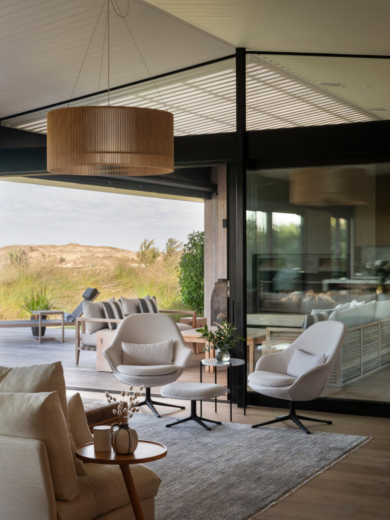
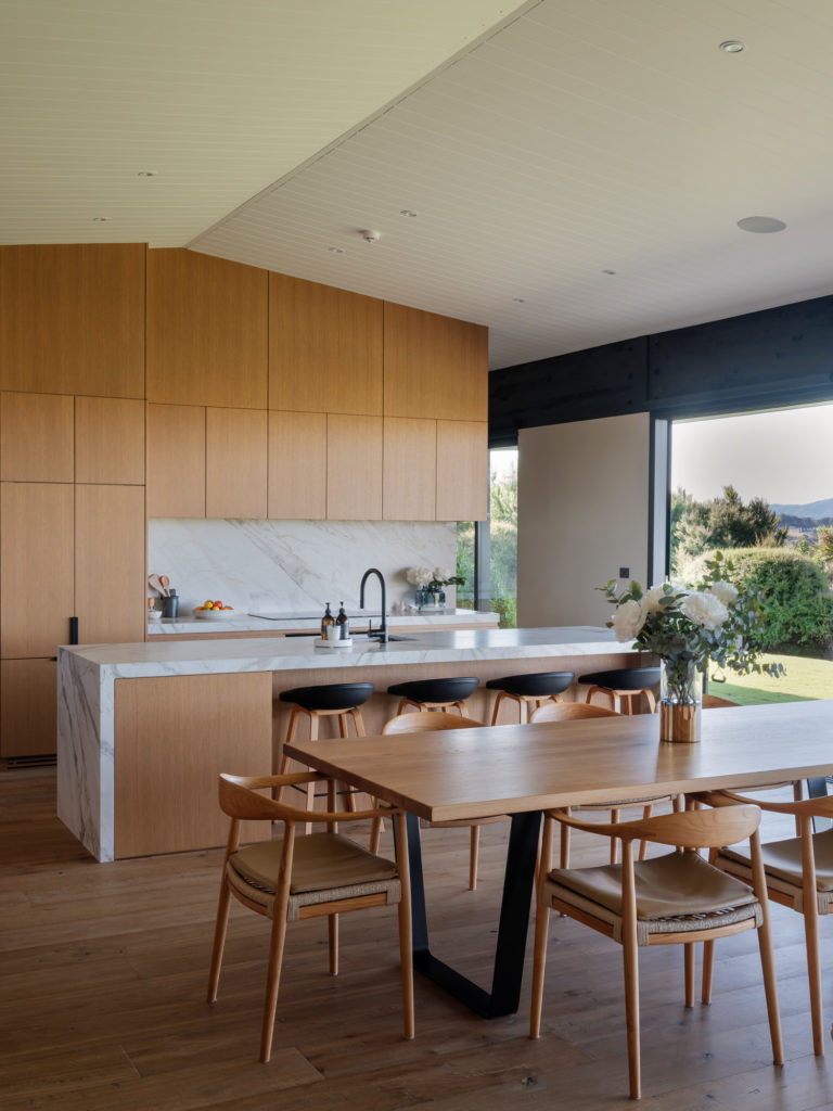
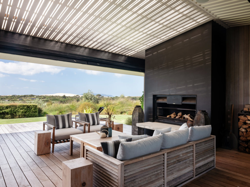
As a result, the interior is a cohesive amalgamation of styles, all working towards a common goal of relaxed sophistication and embedment in the land. In the kitchen, the leathered matarazzo stone — more caramel in tone than its usual grey — blends beautifully with the custom-made cabinetry. Its apex fits sculpturally into the gable above. The living room and the impressive outdoor/indoor seating area are full of varying seating arrangements aimed at both the regular socialising that takes place here and taking in the views. The colour palette is quintessentially fresh, earthy, and a touch rural.
“I would say that we were nomads,” says Jim, “but we are home now.”
The recent New Zealand citizens discuss the homes they have inhabited in Texas, California, and Remuera, and their penchant for taking in the styles and influences of those places and carrying those with them.
“I guess being nomads and travelling a lot, you see things that are appealing to you — whether they’re homes, restaurants, clubhouses, or hotels, and you take little snippets from places that you admire, and try to put your own personality and your own spin on that idea.”
The Rohrstaffs’ next house is currently being designed for a plot not far from here. It is to be what the couple call their ‘forever home’, taking some of their learnings from this one, taking bits from their previous ones, and seeking something unique that is often found within the details rather than just in large design gestures.
