A difficult, yet awe-inspiring site called for a radical solution: breaking a Bay of Islands holiday bach in two.
“About eight years ago, we were scratching around last minute trying to find somewhere to go on holiday and I happened to find this house available in the Bay of Islands. I couldn’t understand why it was still available because it was absolutely fabulous,” owner Roger recalls about the first time he and his wife Louise visited the Bay of Islands.
While they were on that holiday, they discovered that a family friend had some sections for sale near where they were staying.
“That got us thinking, because we fell in love with the place,” Roger recollects.
After a visit to Stahl House — a modernist house in Hollywood Hills, Los Angeles, designed by architect Pierre Koenig, one of the Case Study Houses — two years later, the couple realised the potential lying dormant in a ‘difficult’ site.
“So, we came back from Los Angeles and ended up buying this piece of land,” concludes Roger.
The architect of their house, Richard Naish, executive director and founder of RTA Studio, was an old school friend of Roger’s from New Plymouth. Both architect and client agree that the piece of land was restrictive — it was a constrained site from both a geotechnical and topographical point of view.
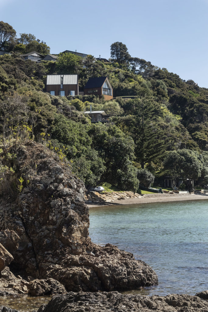
“The site was very steep and bush clad. It had a driveway leading up to it, but it’s on a ridge, quite high up on the headland overlooking the water towards Russell,” explains Naish.
Although the site was a “really challenging little bit of coastal headland,” Naish suggests that often he “finds the more the constraints the greater the creative response”.
Roger and Louise were clear from the outset that what they wanted was a bach rather than a second house. It needed to be flexible for the couple and their two adult children, and able to accommodate anywhere from 2 to 10 people to cater for the inevitable influx of friends during the summer months.
The complex site gave the design team some interesting parameters to work with.
As Naish described it, “The shape of the site and the direction of the view [were] on one axis and the point of arrival was on another. They were probably about 30 degrees apart.”
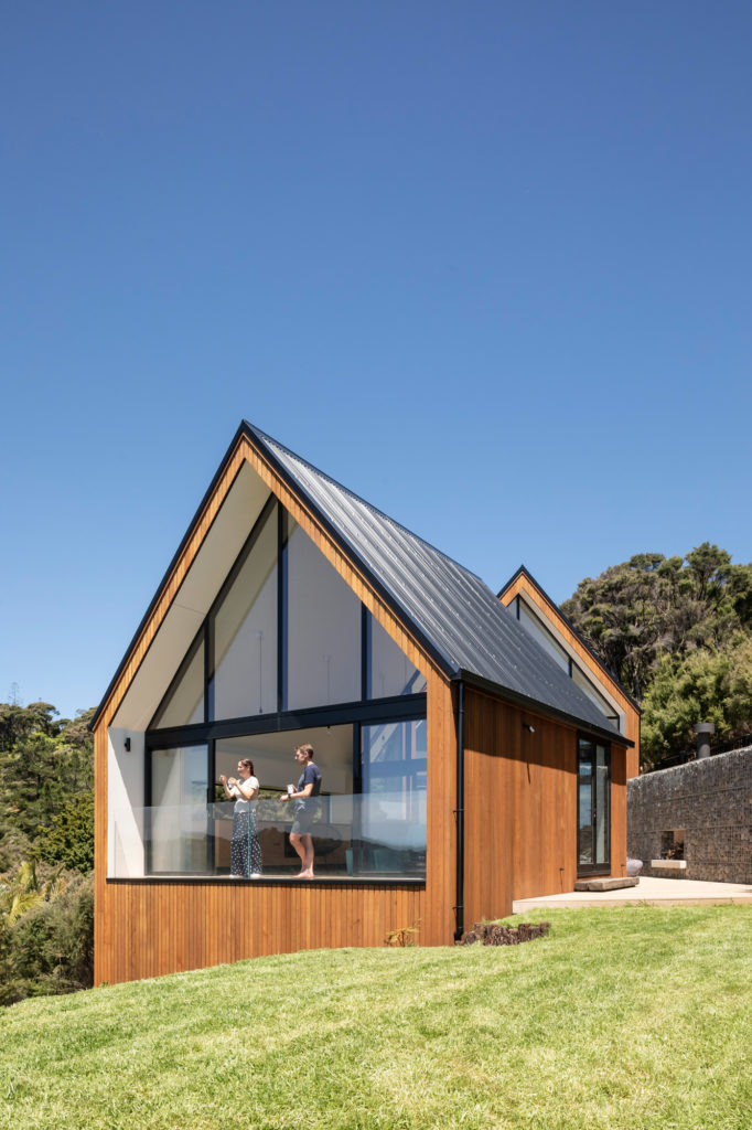
RTA’s response was to take a single form and cut it in half into two pavilions — a front pavilion that was twisted towards the view and an entrance pavilion aligned with the direction of approach to the house. A decision was made to fully separate these two pavilions and to include a decked courtyard between, meaning that walking outside was necessary to get from one to the other. This added to the “… idea that you may actually be camping on the site but with the luxury of a house,” says Naish.
Once these big ideas were solidified the programme fell into place in terms of the functionality of the building. The final home has a footprint of approximately 90sqm, with a total floor area of just under 130sqm.
Roger explains, “It’s really only a two-bedroom house with two identical bathrooms and bedrooms — there’s no master bedroom or anything like that — and then just a whole load of very flexible living spaces.”
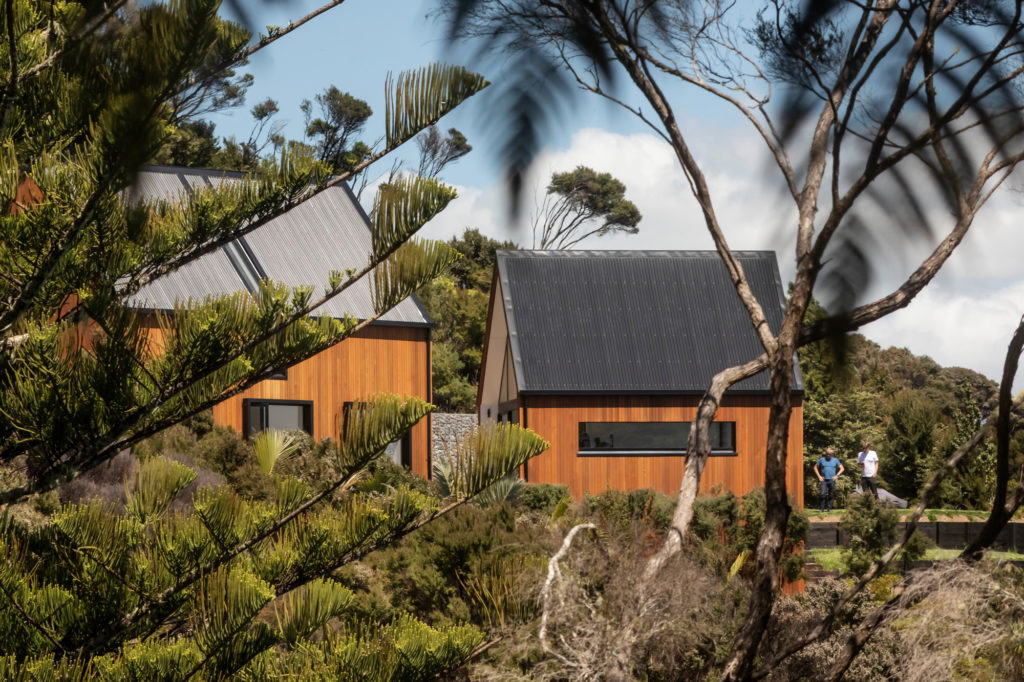
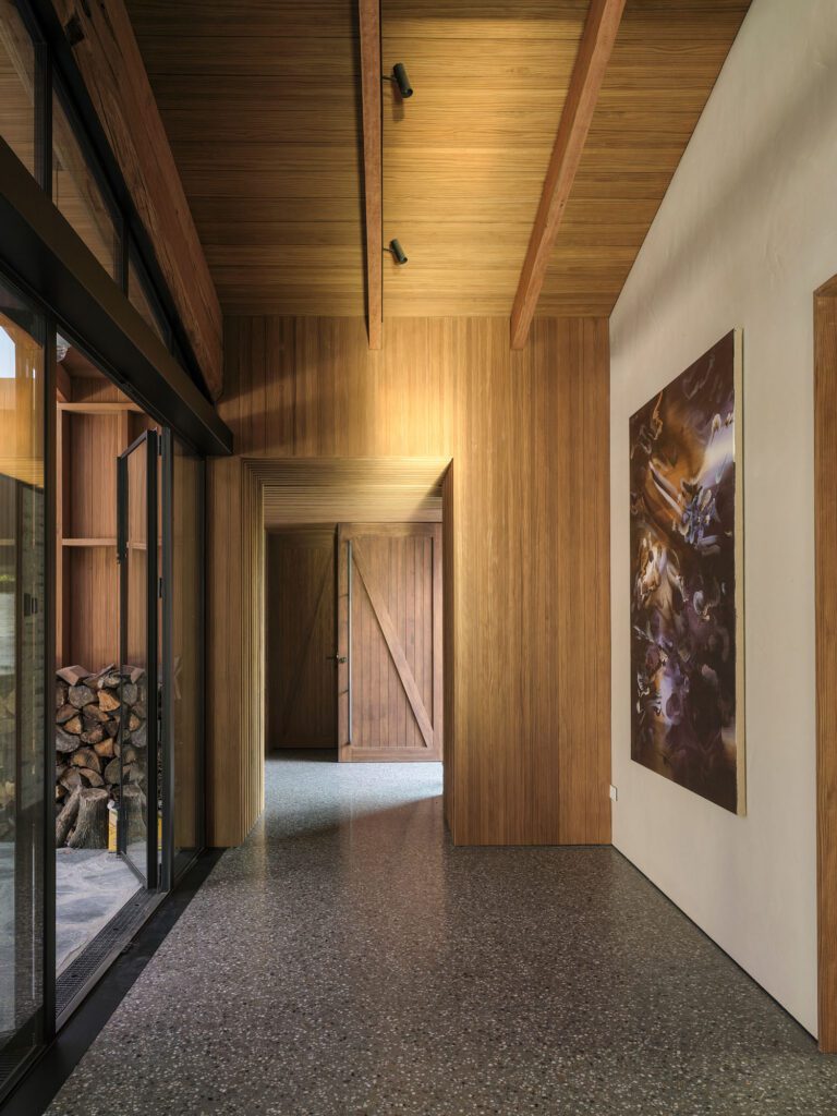
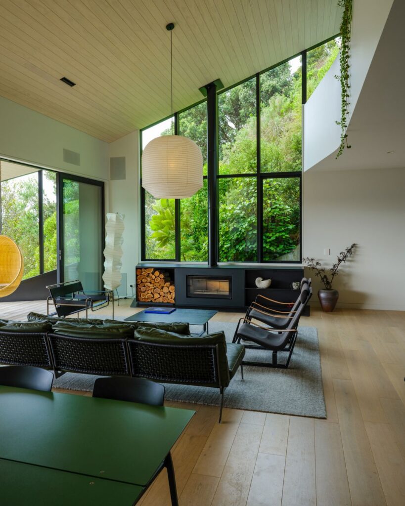
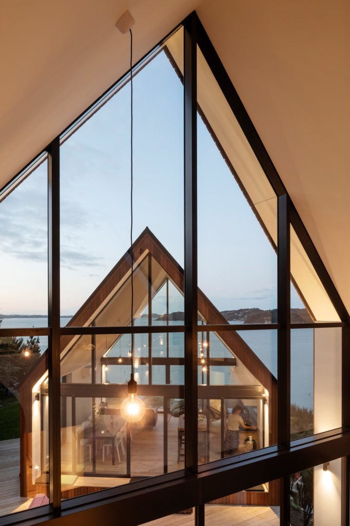
The arrival pavilion is a simple double-height gable structure which contains the bedrooms and bathrooms downstairs and a multi-use mezzanine in the roof space. A corridor leads through the pavilion out into the decked courtyard, which leads onto the living pavilion. The living pavilion is one open-height space which houses the living, kitchen, and dining areas of the home.
Naish elaborates: “When you arrive you are confronted with a fairly plain gabled elevation with an orange door. The orange door leads you straight through the spine of the first pavilion and delivers you to the courtyard, where the second pavilion, which is all about living, dining, kitchen, is slightly raised from that courtyard; [it’s] almost the same form but glazed at both ends. It really sits up there like a bit of a tent.”
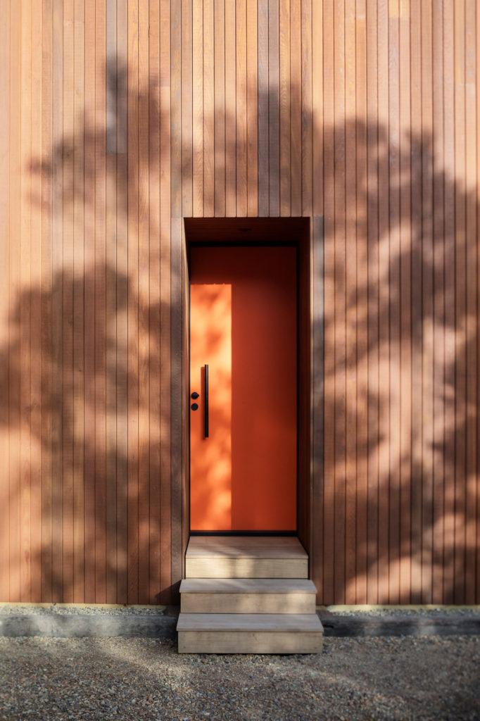
The simple modest entrance, belying what is behind, was a deliberate part of the design.
Roger explains “When you go through the orange front door there is a small narrow corridor which … releases you into the double-height atrium where the spiral stair is. You can see the front ‘tent’ across the deck and the view through it. It offers visitors that wow moment.”
Naish explains the stunning simplicity of the house from the exterior.
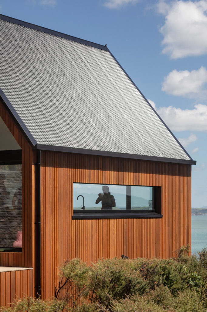
“The exterior is pretty simple. It is vertical cedar weatherboards around all sides of the cladding, corrugated iron roof, a flash of orange at the front door, and then the other three gabled elevations are fully glazed with opening doors, and windows to allow ventilation and views.”
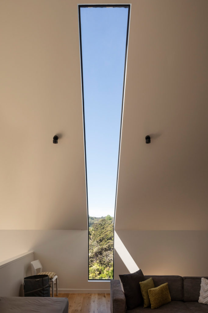
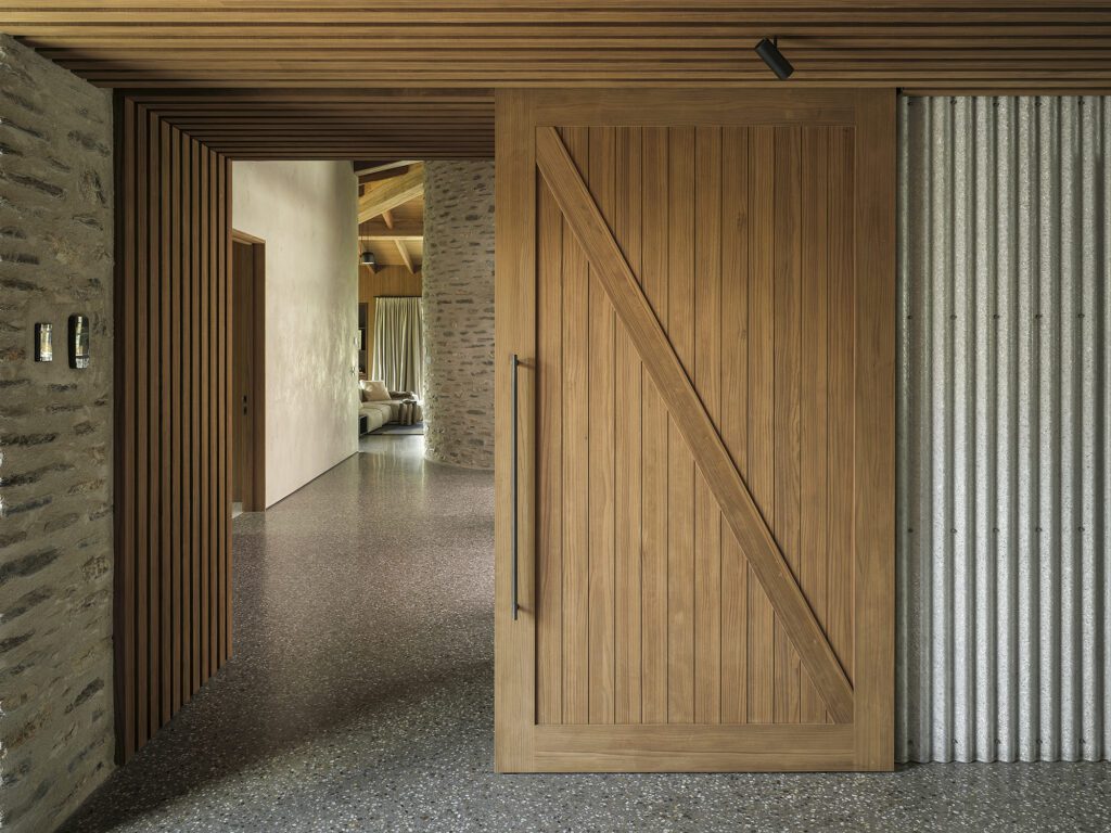
The windows are perfectly proportioned and positioned, and include a striking window that narrowly slices through the length of wall and roof of the arrival pavilion. Naish notes that both forms have a vernacular contextual connection to “the Northland church, the rural shed,” and other local inspirations. The interior is crisp and simple. The ceilings and walls of white plasterboard make for a clean juxtaposition of “white skin to the interior with a rich timber skin to the exterior,” says Naish. Some simple landscaping embeds the home into the site.
“[We] tried to keep as much of the beautiful Northland bush as possible. The landscaping has been done with a lightness of touch,” explains Naish.
About 50m down a “little goat track” from the house is the beautiful beach, which includes a mooring for Roger and Louise’s boat. When asked about the most successful element of the project, Richard Naish recalls being on that serene beach “looking back up on the hill; the house sits there in a very appropriate way in terms of its form and being unobtrusive, and it feels like the right response for a Northland coastal site — that’s the success of the project”.
Words: Melanie McDaid
Images: Patrick Reynolds

