Emma Morris designs a beach house for her parents David and Lien Morris – their first architectural home and one they share with extended family
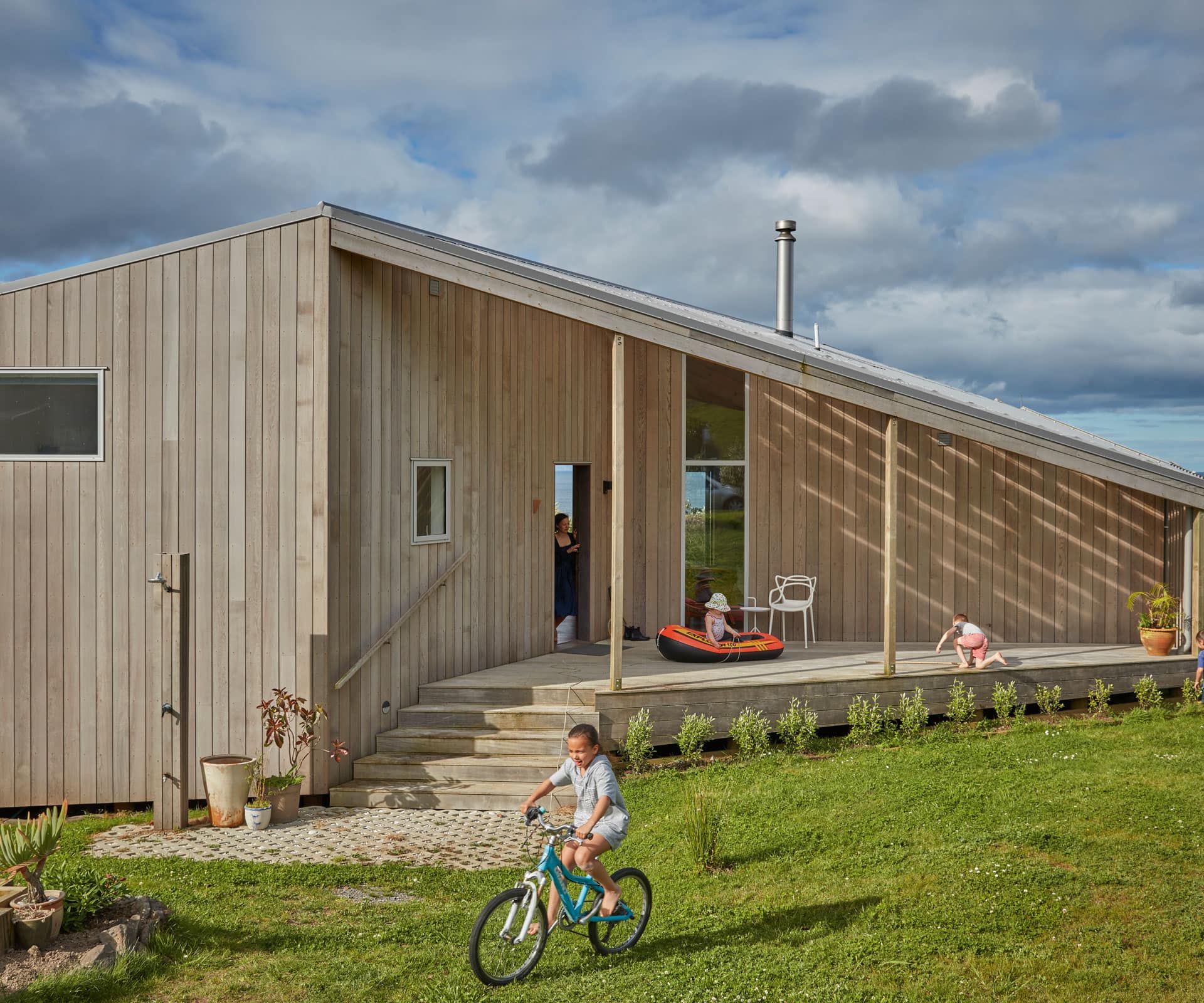
A young architect designs a sloping bach in Langs Beach for her parents
“We bought the section 10 years ago and I said to Emma, “It’s going to stay empty until you come back [from London] and we want you to design the house for us.” That was the understanding, everyone was totally delighted, and we then had to wait. But we were in no hurry, we wanted her to come back and take over, so that was fine.
Emma had gone from New York to London and was working there. Our other daughter Nina was also in London and then my son Paul eventually got there. At that stage, Emma’s information was by email and photographs and she would consult with Nina and Paul. We worked out quite quickly what we wanted because everyone had chipped in. Emma returned about five years ago and went up to the property, sniffed the wind, looked at the sun and got it all right. It was very straightforward because Emma is very straightforward. We very much left it to her – we weren’t the type of client to dominate.
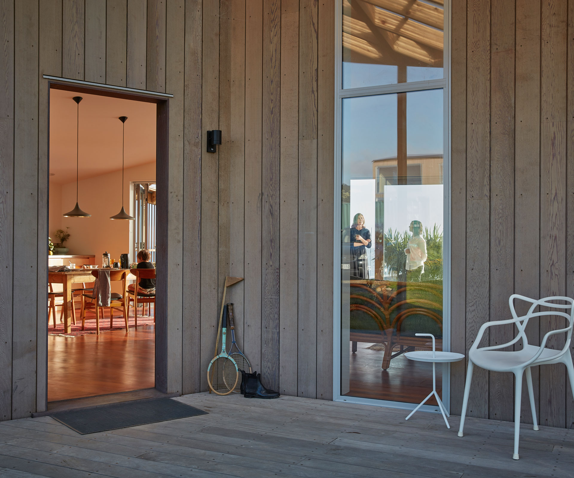
We definitely didn’t want a stylised house, like a lot are these days. We wanted a certain lightness in the construction. We wanted it very open to the air, to the light, to the sunshine, yet with shelter. We wanted a verandah along the length of the house because we’ve got the Hen and Chickens out in front, the Whangarei Heads to the left and Sail Rock on the right – it’s an extraordinary view.
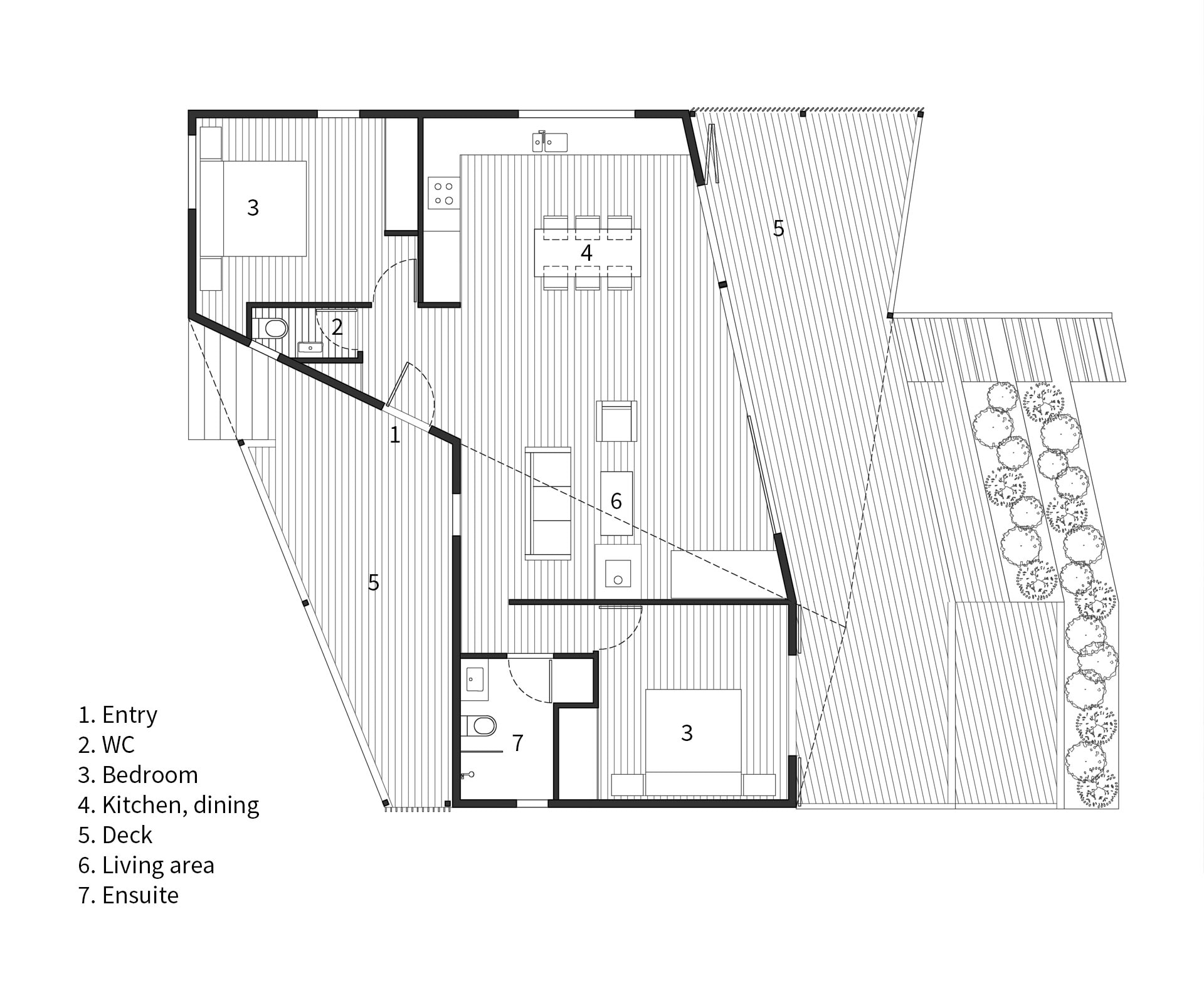
We wanted height for the views and a long, main room where everyone could live in and chat, with a high ceiling so you felt you were in a nice big room. We wanted a woodburner to heat the place in winter. Along the east side of the house is that main room and the main bedroom – they open directly onto the big front verandah and that was key. That’s probably all I said and then the rest flowed from there.
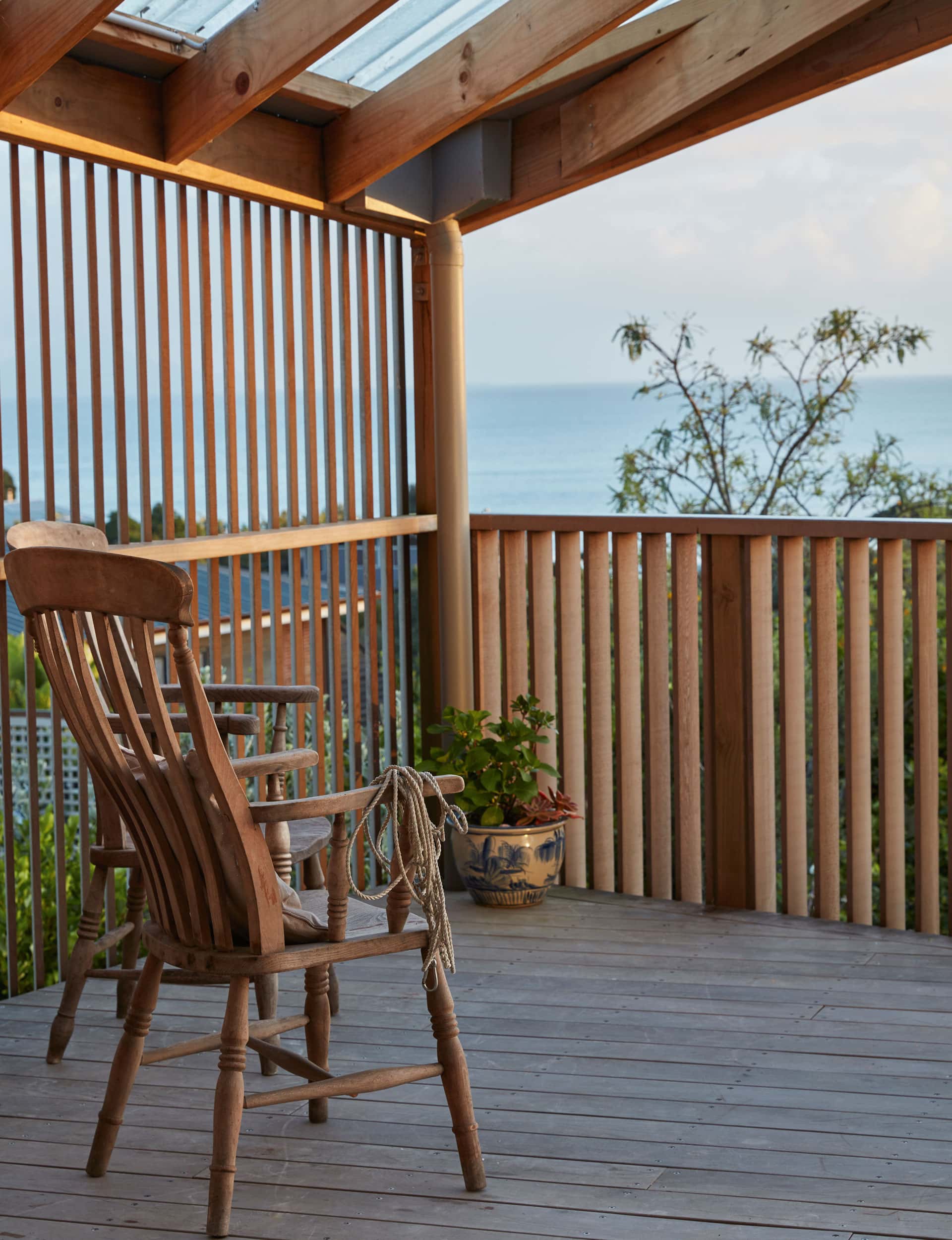
Early on, we had a little mobile hut on site and used it for long weekends. We started planting fruit trees at that stage. Basically, I love fishing and wanted lemons to go with the fish. During that time we became very aware of the wind. There’s a bit of a gully behind Langs Beach and the southerly would swing around and come through the gully – it could get quite cold. From the other direction, of course, is the sea breeze which is wonderful, but we soon realised that by four o’clock the east coast wind can be very strong. That became a consideration in the design and we have a little verandah where we can barbecue or just sit and look towards the west, which is quite beautiful.
Emma couldn’t have got it better. The house functions beautifully, it’s exactly what we wanted. It’s a delight to walk into and has a fascinating roof line; elevated enough for it to be within height restrictions but with interesting angles. We’ve gained more than we thought we would and it’s excellent.
The house sort of nestles into the landscape and as very keen gardeners we’ve been planting quite a lot of native trees and getting the lawns into order. It’s going to nestle in really well. It’s always been Emma’s house – she visited the site and took all that headache away. It’s beautifully built by Lindesay Construction and they used to call it Emma’s little gem. They were delighted, I mean they scratched their heads over some of the interesting angles, but I remember Luke [one of the builders] saying it wasn’t only a challenge, it was a privilege to put Emma’s design in place.”
Emma Morris of Emma Morris Architecture
Tell us what the design achieves.
The intent was to create a crystalline form in a simple and cohesive way. The ridgeline is slightly rotated, which generates shifting geometries and uplifting spaces from room to room. The house is nestled into the landscape, which gives privacy to the outdoor areas, and connects the living spaces with the garden. This design offers a counterpoint to many east coast beach houses, which have little privacy, gleaming glass fronts, and a disconnect to the surrounding land. There’s investment in the structure to give volume, while keeping the fittings and linings economic, and to allow space for change as needs change. For example, the raked ceilings allow for mezzanines to be added to accommodate more family members. There’s also space and wiring for future cabinetry.
Were there any site complexities that dictated the plan?
It’s in a subdivision of 600-square-metre lots, so the challenges were using the side walls and screens to create privacy.
What did you find most satisfying about the project?
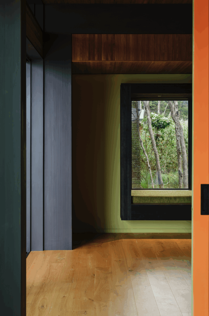
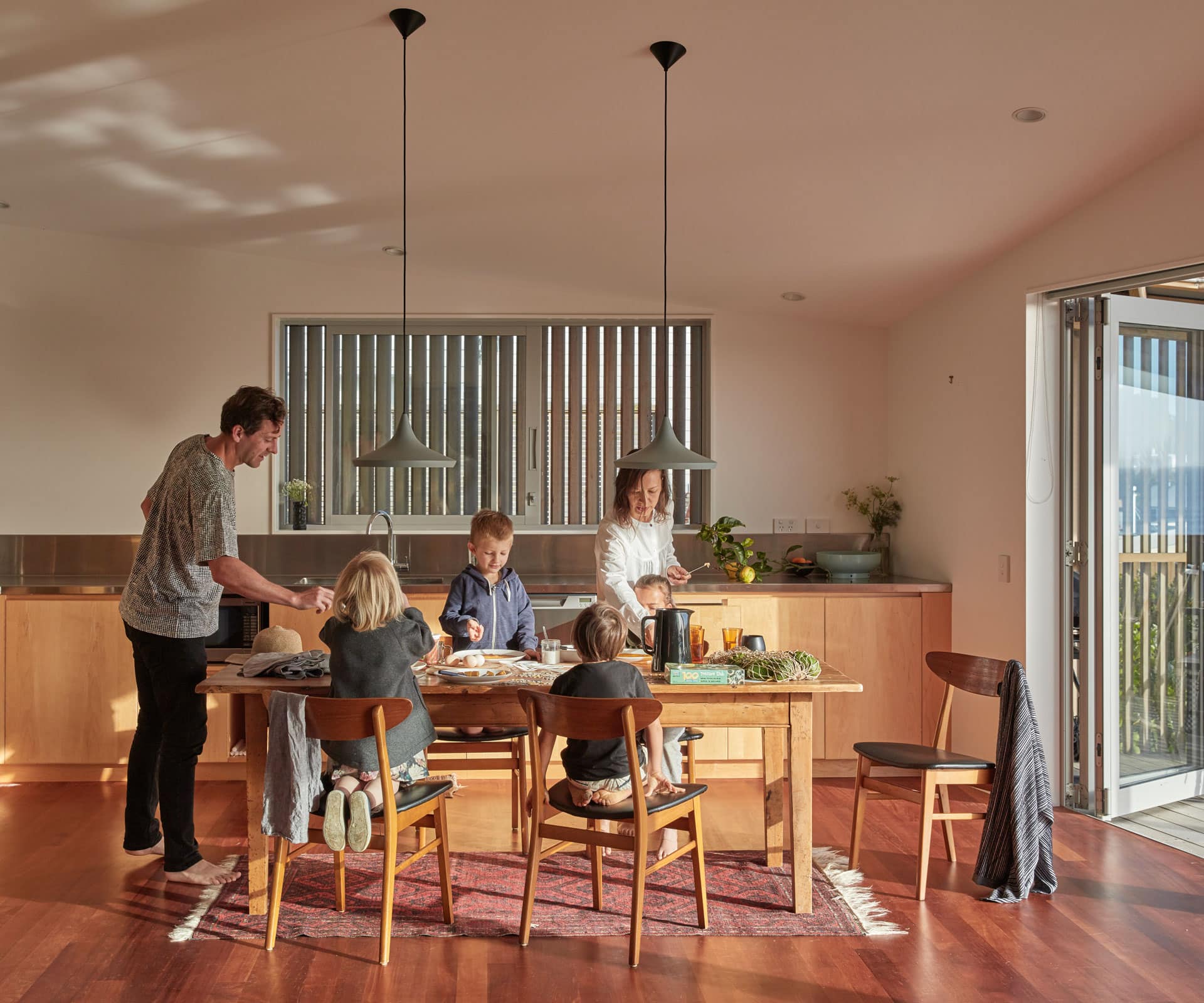
That my parents love to go there. My mother has warmed to the wide Aalto-inspired terraces and tends vegetables in them. I’m lucky to be able to share the experience of staying there with my family and friends, and observing how spaces are used. It’s delightful when the imagined moments of the design phase materialise, such as morning sunlight slanting into the kitchen, the sliver of sun in the evening through a slot window. Even on moody days the colour of the light and shadows changes throughout the day.
Words by: David Morris. Photography by: Sam Hartnett.
[related_articles post1=”74030″ post2=”77691″]
